
A set that disagrees with itself
Adding views to a packet that contradicts itself does not help. It gives a reader more chances to catch it — and “more detail” is the only sentence they have for the feeling.
Nobody in a review meeting is fact-checking your render set. They are doing something much faster and much less forgiving: building one building out of six pictures.
That is the actual cognitive task in front of a board member, a planner, a committee volunteer or a client. They cannot walk the site — it does not exist — so they assemble a model of it in their head from the frames you gave them, in the order you gave them, at whatever speed the agenda allows. And that mental model is not made of pixels. It is made of about six carried facts: the shape of the roof edge, where one cladding stops and the next starts, how the glass behaves, the rhythm of the rail, what happens at the threshold, and what the ground is doing at the bottom of it all.
Then one of the six changes between two frames, and the assembly fails. Here is the important part: they will not diagnose it. Almost nobody outside a drawing office looks at view four and thinks the balustrade spacing has been re-modelled here. What they experience is one degree cooler and considerably more expensive — a small, unresolvable uncertainty about what they are actually looking at. It rarely gets spoken, because there is no ordinary sentence for it. So it comes out as the sentence there is a lot of: we would like to see more detail.
If review comments have felt heavier lately — a fair number of firms tell us they have, and we would not pretend to have measured it — this is the cheapest thing on the list to check, because it costs an afternoon and no new renders. Not whether there is enough in each image. Whether the images agree.
And it is worth seeing why coverage cannot rescue this one. Everything else you can do to a weak packet gets better as you add views: a missing distance, a missing hour, a missing exhibit — more frames, problem closed. Internal disagreement runs the other way. A set that contradicts itself gets less trustworthy with every view you add, because each new frame is one more opportunity for the contradiction to surface. Six careful views that agree will beat twelve excellent views that don’t, every time, and it is not close.
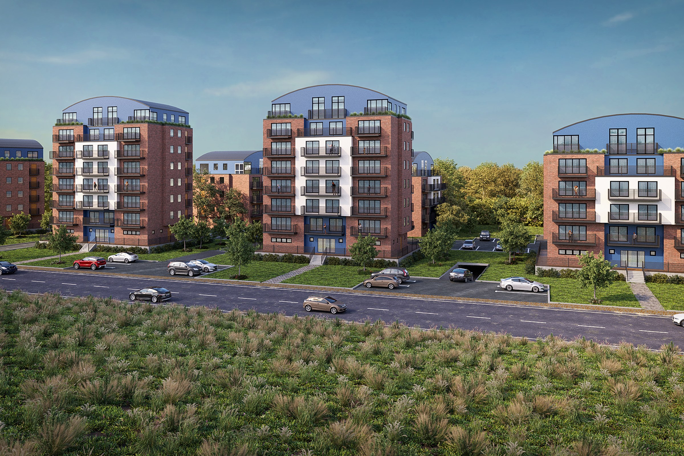
The image at the top of this page is, in effect, a whole set compressed into one frame — three blocks of the same family, the same brick, the same balcony bay, the same curved roof crown, read at three different sizes at once, and agreeing with themselves because the camera never got a chance to leave. That is the standard. Below are the six facts a set has to carry when the camera does leave, and what each frame commits the rest of the packet to the moment it is issued.
What each frame commits the rest of the packet to
In drafting, a match line is where one sheet continues onto another, and the rule is simple: everything crossing it has to line up. A render set has the same line running between every pair of views — it is just invisible.
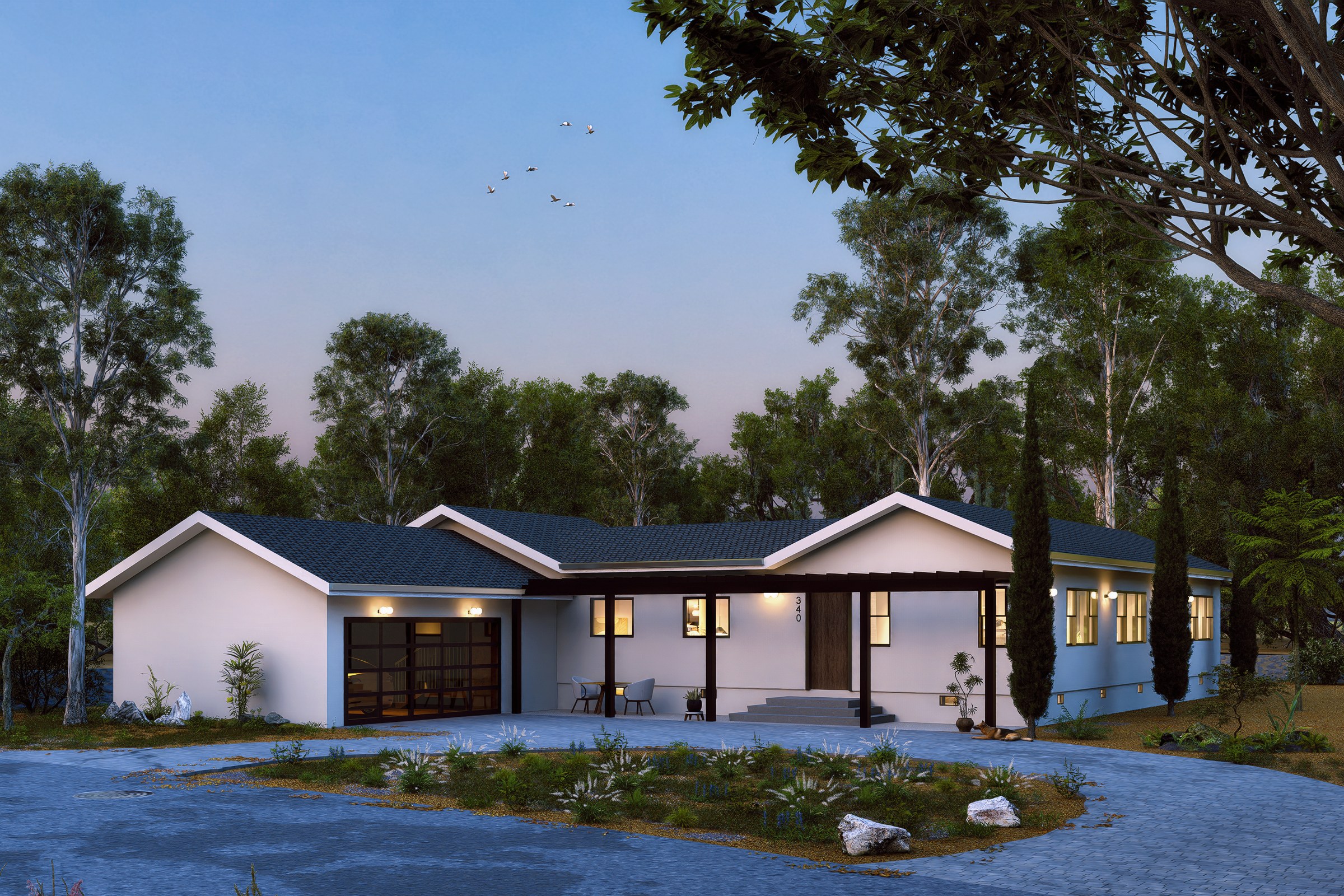
A dark standing-seam roof of shallow intersecting gables; one fascia depth carried right around; a deep overhang on slim posts along the right-hand wing; an eaves line held at one height through three changes of plan.
The same fascia depth and the same eaves height — including in the aerial, where the roof becomes a plane and the overhang reads as a shadow, and from the far kerb, where the overhang is nearly all that survives. If the eaves step in one frame and run level in another, a reader has met two buildings.
The roof edge is the first thing anybody memorises
Before a reader knows a single material, they know your silhouette. It is the cheapest thing to remember and the easiest thing to contradict.
Ask somebody who has looked at a scheme once to describe it and you will get the outline back: low, long, dark roof, big overhang. Not the brick. Not the glazing module. The edge. It is the only part of a building a person can hold in their head without effort, which makes it the first fact a set commits to and the one a reader is most likely to be silently checking in every frame afterwards. The view below commits hard. A dark folded roof of shallow intersecting gables, one fascia depth held right around, a deep overhang carried on slim posts across the whole right-hand wing, and an eaves line that runs at a single height through three changes of plan. That is a decision with consequences — because the moment you go to an aerial the roof stops being an edge and becomes a plane, and the moment you go to the far kerb the overhang is very nearly the only thing still legible. Both of those frames now have something to live up to.
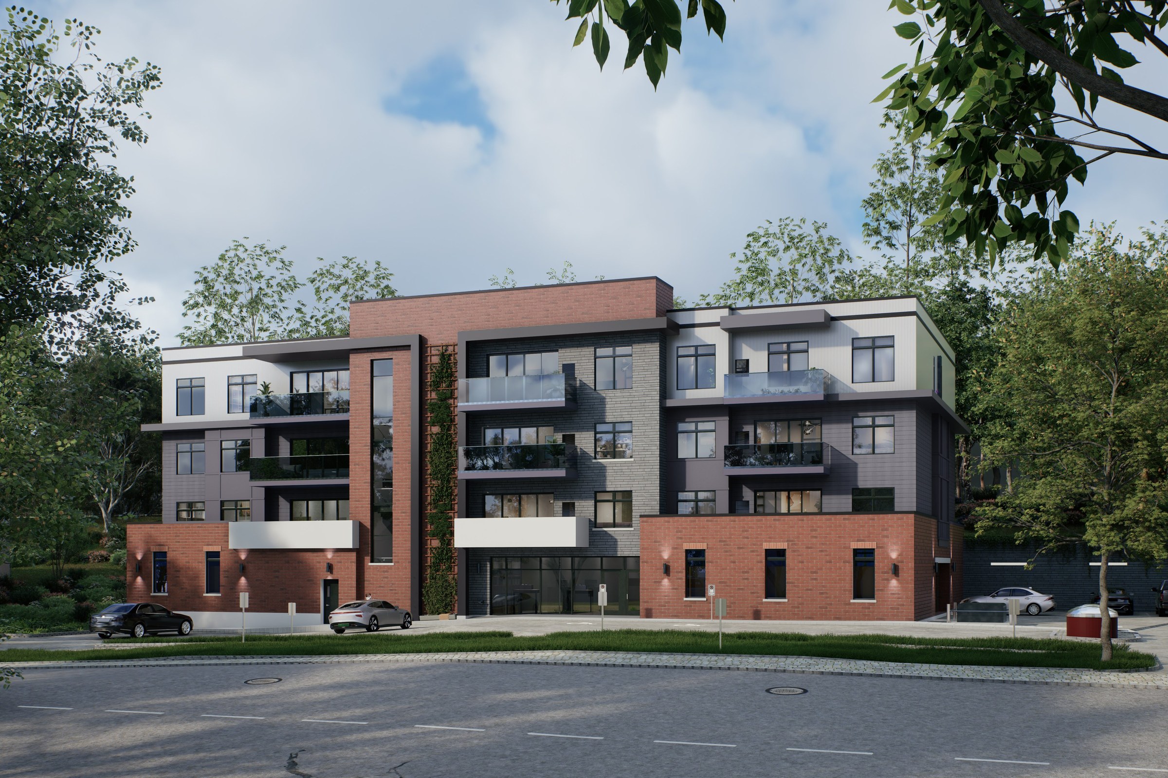
Five claddings on one elevation: dark red brick entrance bay, lighter red brick base, pale stone panel, white render above, charcoal panel returning the corner — each with its own plane and its own edge.
The same five, in the same order, changing in the same places, with the same material in front. Colour drifts a little under different light and that is forgivable. A boundary that moves is not a rendering variation; it is a different elevation.
The joints are the design, not the materials
Nobody argues about whether the brick is nice. They argue about where it stops — and a set that moves the stopping point has redesigned the building without saying so.
A multi-material elevation is a set of decisions about edges: this plane is brick and it ends here, at this line, where the panel takes over and comes forward forty millimetres. That is the part that took three meetings. The frame below has five claddings meeting on one building — a dark red brick entrance bay running the full height, a lighter red brick base, a pale stone panel, white render above, and a charcoal panel returning the corner — and each of them has its own plane and its own edge, which is why the composition reads as deliberate rather than busy. Now consider what that costs the rest of the set. Every subsequent view is holding five materials, five boundaries and the depth relationship between them, at whatever distance it happens to be taken from. Get the brick colour a shade off between two frames and it will pass, honestly; brick moves under light and everybody knows it. Put the render where the stone was and you have not made an error of finish. You have moved a line somebody signed off.
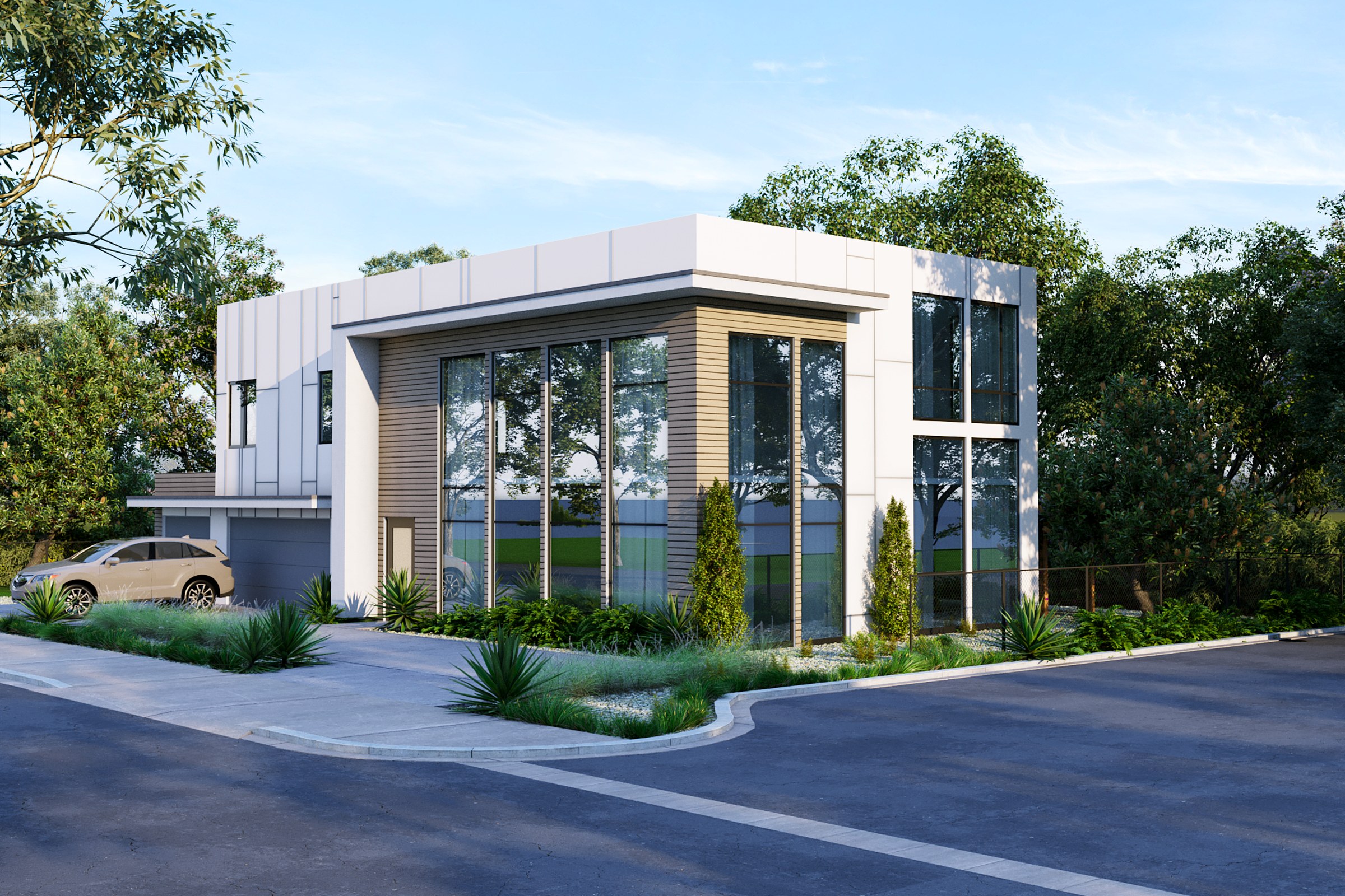
A cool neutral glass with real reflectivity — trees, fence and a strip of far grass legible in it — in slim dark frames on a regular mullion module, with one warm timber-clad reveal turning the corner.
The same spec, behaving differently. Reflection and tint should change with the sky, the angle and the hour — that is the material being honest. The frame colour, the module and the reflectivity value should not change at all.
A material in one frame, a mirror in the next
Glazing is the element most likely to change identity between views, because it is barely a material at all — it is a report on whatever happens to be standing opposite it.
Every other surface on a building looks broadly like itself from anywhere. Glass does not. Turn the camera thirty degrees and it goes from transparent to a sheet of sky; take it at dusk and it goes from a sheet of sky to a warm lit interior; take it flat-on under a bright overcast and it goes very close to black. All of those are correct. That is genuinely what glass does, and a set that renders it identically in six views has done something worse than inconsistency — it has lied about the most alive material on the building. So the fact that has to carry is not the appearance. It is the specification: the tint, the reflectivity, the frame colour, the mullion rhythm. In the frame below you can read the trees, the fence and a strip of the far grass in the glazing, which tells you exactly how reflective the specified glass is, and the frames are slim and dark on a regular module, and one warm timber-clad reveal turns the corner between two bays. A reader who sees clear glass in view one, a black mirror in view three and a blue-green tint in view five is not looking at a building performing under different skies. They are looking at three different orders.
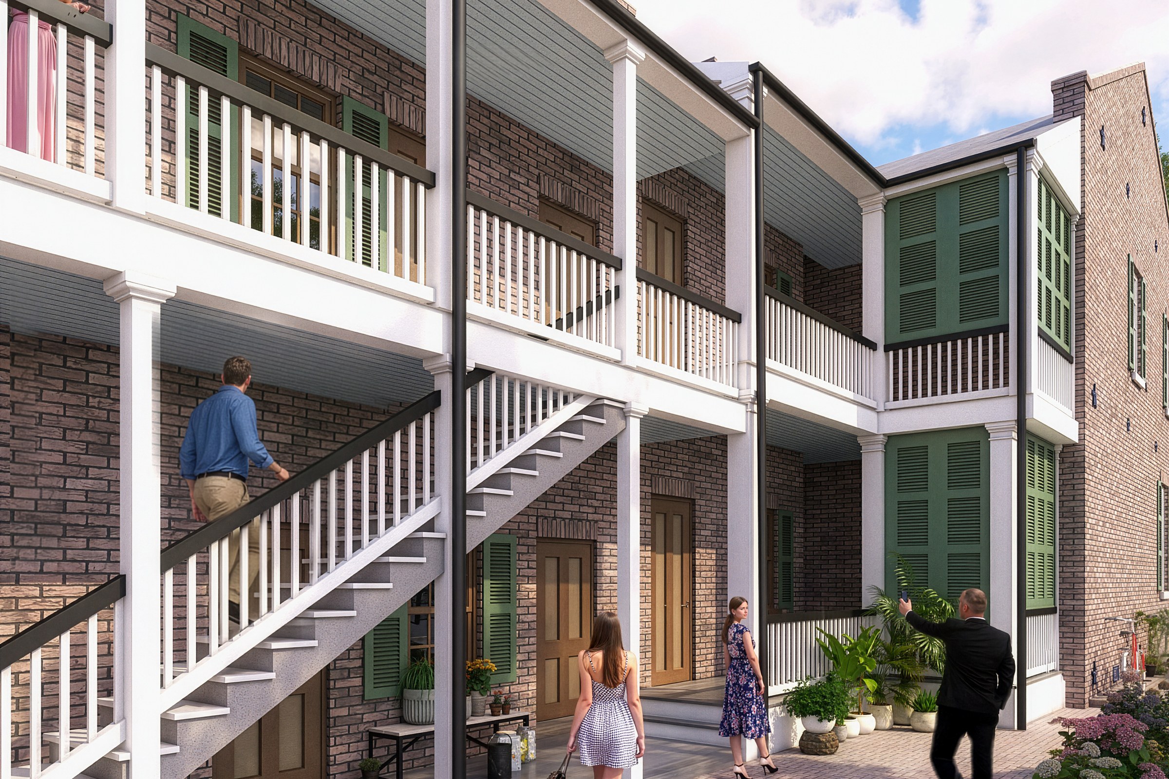
A white painted timber balustrade: square balusters at a set spacing, a flat top rail, a newel at every post, carried along two levels and down the stair without variation.
Identical wherever it appears — same spacing, same profile, same top rail. If a simplified version exists for distant views, it has to be the same rhythm at lower resolution, not a second design at the same one.
Small, repeated, and modelled twice
The balustrade is the classic drift. Nobody counts balusters from the far kerb — but everybody notices when the rhythm changes.
Every set has a component that appears in almost every frame and gets thought about in almost none: the guard, the rail, the handrail, the newel. It is small enough to feel like a detail, repeated enough that its rhythm becomes part of the facade, and — this is the mechanical reason it drifts — it is one of the few things in an architectural scene that is genuinely expensive to carry at full resolution into a wide view, so it is a standing temptation to build a simplified stand-in for the long shots and keep the real one for the close ones. Two versions of anything is two chances to disagree. The frame below is a close read of exactly this element: a white painted timber balustrade with square balusters at a set spacing, a flat top rail, a newel at every post, repeated along two levels and turning down the stair without changing a thing. At this distance the rhythm is the architecture — take the spacing out by twenty per cent in the wide view and the building acquires a different period, which is not a subtle change, and is not the kind of thing a reader forgives as a rendering artefact.
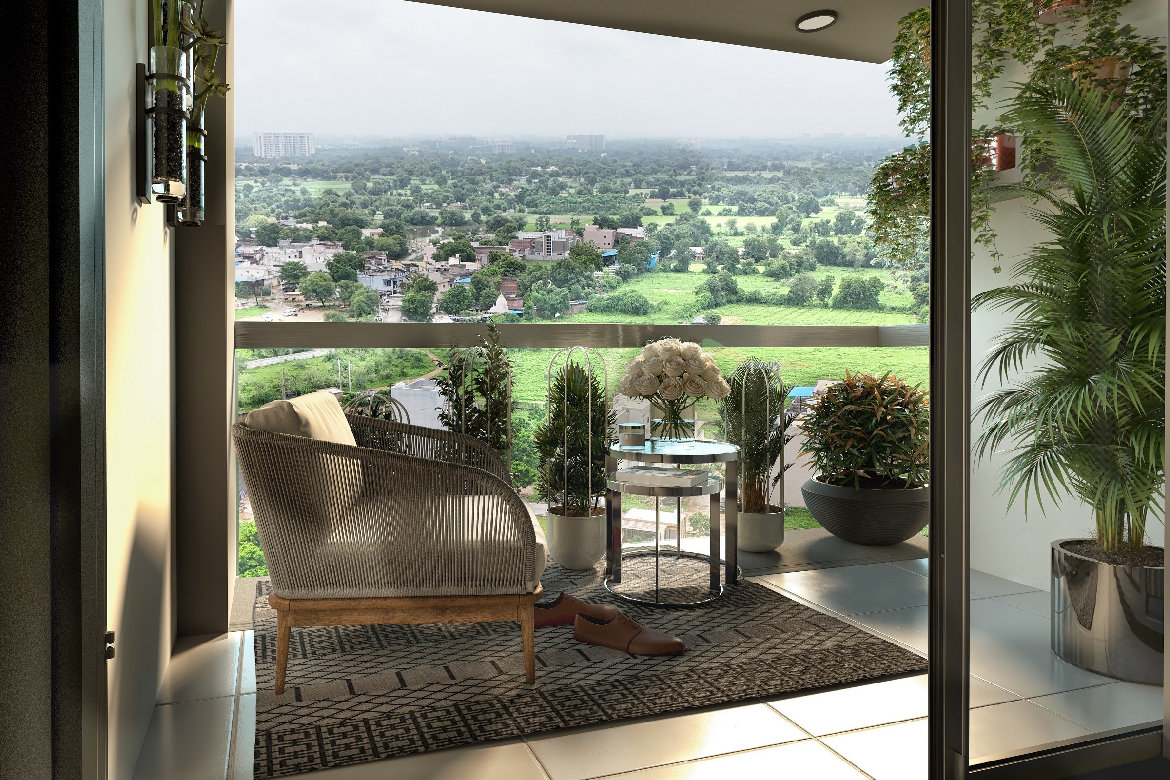
A full-height sliding opening with a slim head close under the slab; interior floor running flat to the frame and continuing outside in a different tile; a balcony deep enough to walk past furniture; planters against a glazed edge.
The elevation is describing this same opening from the other side. Head height, frame colour, balcony depth and whether the floor steps or runs flat have to survive the trip between the interior set and the exterior set — the two sets are made apart and read together.
Two sets, made apart, read together
The interior views and the exterior views are almost always produced by different people at different times. Nobody reading them does that.
This is the one that catches good practices, and it is nobody’s fault in particular. Interiors and exteriors run on separate tracks — separate files, separate weeks, often separate specialists — and the seam between them is a handful of elements that appear in both and therefore have to agree twice over: the size and head height of the opening, the colour and slimness of the frame, the depth of the balcony, whether the floor steps down at the threshold or runs flat through it, whether there is an upstand, what the balustrade is made of. The frame below is standing on that seam. A full-height sliding opening with a slim head sitting close under the slab, an interior floor that runs flat to the frame and continues outside in a different tile, planters standing against a glazed edge, a balcony deep enough to hold a chair and a table with room to walk past. Every one of those is also a line on the elevation. And a reader moving between the interior sheet and the exterior sheet is checking that they add up — not deliberately, not with a scale rule, but they are checking, because a person cannot look at the inside and the outside of the same opening without trying to put them together.
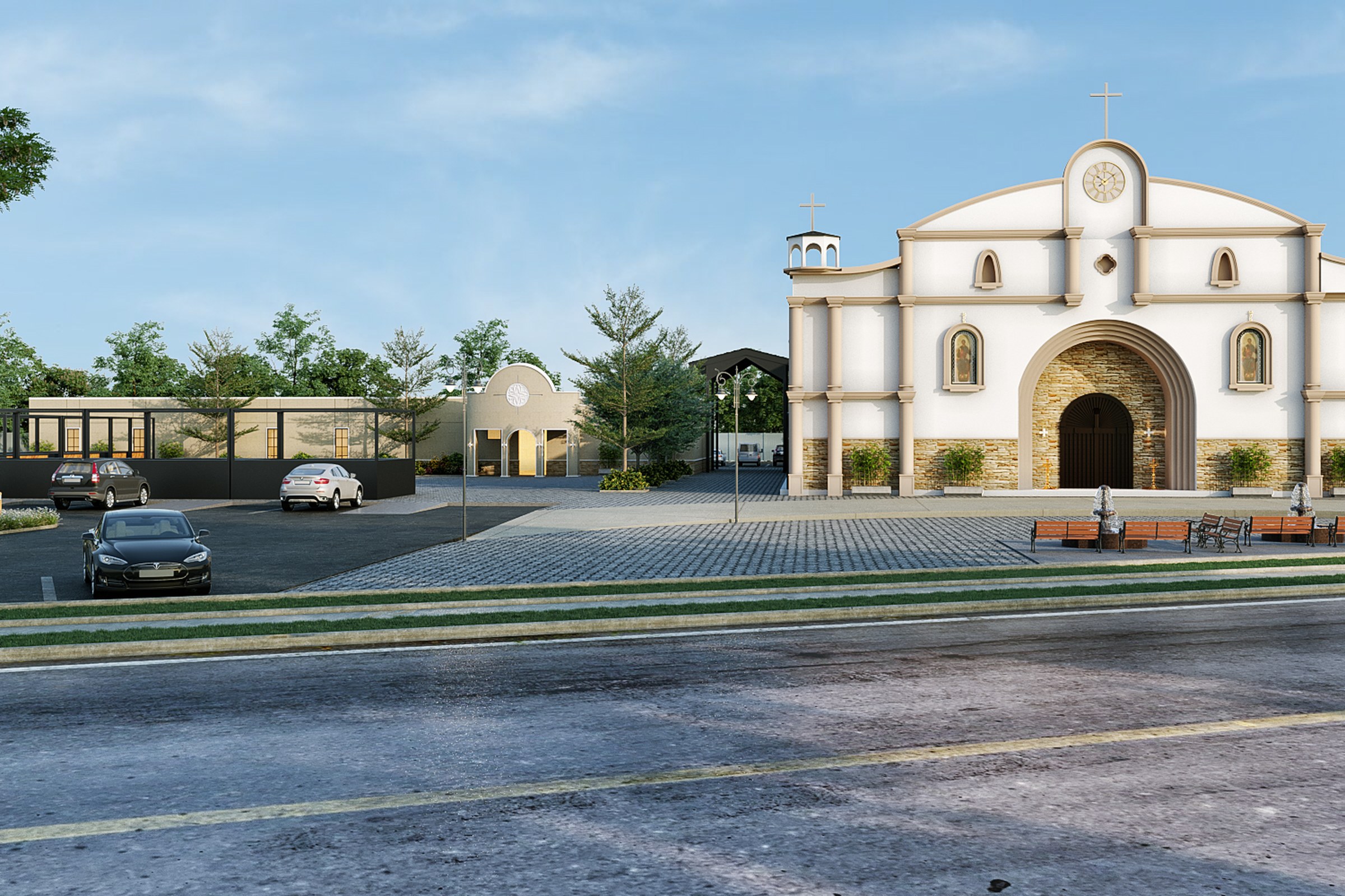
A block-paved forecourt with a banded border; a raised kerb line holding it against the road; lamp columns at a set spacing; benches; trees at a stated maturity.
The same bond, the same kerb line, the same lamp spacing — and above all the same planting maturity. A tree that is fifteen years old in the aerial and two years old at the entrance has answered the screening question twice, differently, in one packet.
Finished last, and it is the first thing an aerial shows
The ground plane is the layer with the least protection: made late, often by whoever was free, and asked to carry more between frames than anything else in the set.
Look at what the ground is doing in the view below. A block-paved forecourt with a banded border, a raised kerb line holding it against the road, lamp columns at a set spacing, benches, trees at a stated maturity. That is not a texture. It is a design, at roughly the same level of decision as the elevation behind it, and it is the layer a reader spends the most time standing on — the near view stands on it, the aerial is almost entirely made of it, and the street view is judged by whether the building meets it convincingly. It is also the layer most likely to be assembled last, under time pressure, from a different reference than the one used a week earlier. Paving bond, kerb line and lamp spacing all carry. Planting maturity carries hardest of all, and it is worth being blunt about why: a semi-mature tree in one frame and a nursery stick in another is not a rendering difference. It is a five-year difference, inside a single submittal, on the exact question — screening, canopy, softening — that the planting was put there to answer.
A packet is not six pictures. It is one claim, made six times — and a reader only has to catch it changing once.
Three reasons, none of them carelessness
Worth saying plainly, because the fix follows from the cause and only one of the three is a process problem.
- 01
A set is not made in one sitting
Six views take days, sometimes more than one pair of hands, and almost always with the scheme still moving underneath them. The fourth frame is made by someone who has learnt things since the first one — which is usually an improvement, and is exactly how two frames end up describing two buildings.
- 02
The same material is doing six different jobs
A brick tuned to read right at forty metres has to also read right at one. A glass set up to behave beautifully at dusk is being asked for noon in the next frame. Every view is a different technical problem, and solving each one on its own terms is how a spec quietly becomes six specs.
- 03
What drifts is what nobody called decided
This is the real mechanism, and it is not a competence problem. An element that was never named as settled gets settled again — reasonably, invisibly — by whoever needs it next. Nothing carries a fact it was never handed.
The third one is where this stops being a technical subject. A studio can carry any fact it is given and cannot carry a single fact it isn’t — so the elements that drift in a set are, with remarkable reliability, the elements nobody ever said were decided.
Ten minutes, before anything is issued
Not a review. A change-detection test — which is a different faculty, and a far better one.
- 01
Give it to someone who didn’t model it
Whoever built the scene has already resolved every inconsistency in their head — that is what building it does to you. Ten minutes from a colleague who has never opened the file is worth an hour from the person who made it.
- 02
Two views, full screen, nothing else open
Not a contact sheet, not a PDF at forty per cent. Same screen, same size, same position. The whole method depends on the two images landing on the same part of your retina.
- 03
Name the element out loud first
“The eaves.” Then flick. Looking for mistakes in general finds nothing; looking for one named thing finds it in about a second. Run the list — line, mix, glass, rail, threshold, ground — one word at a time.
- 04
Flick, don’t compare
Arrow-key between the two. Human vision is extraordinary at detecting change and mediocre at inspecting detail, so anything that moves when it shouldn’t will announce itself. Side-by-side is the weaker test; alternation is the strong one.
- 05
Write it down. Don’t fix it yet.
Because the next question is the one that matters: which of the two is right? A surprising share of the time the answer lives in the drawings, not the render — and that is very much worth finding out on Monday rather than Thursday.
Roof, parapet, plant, and every line the aerial is the only view that can see.
Cladding boundaries and the rail rhythm — the two things that survive a change of distance.
The threshold: head height, frame colour, balcony depth, whether the floor steps.
The same wall in two light conditions still has to be the same wall.
Notice what the repair list never says: render it again, render it bigger, add another angle.
Every fix here is a substitution — one profile, one spec, one component, one planting size, applied everywhere it belongs. The geometry mostly doesn’t move and the cameras don’t move at all, which is why this is the cheap end of a review cycle and a re-render is the expensive end.
It is also, plainly, a check that belongs on our side of the line rather than yours. You should not be the one discovering on a Wednesday evening that the eaves changed height between view two and view five. What we would ask for in return is the short version of what is already settled — the four or five things that are not up for re-decision, whatever they happen to be for this scheme. A studio that has been handed those carries them. A studio that hasn’t will fill the gaps sensibly, quietly and about eighty per cent right, and the twenty per cent is what comes back as adjectives.
And when we do find a disagreement in a set — which happens, on any project of any size — the thing we want to bring back is a question, not a correction. These two frames don’t agree about the balcony depth. Which one is right? That takes about a minute to answer, it is a design question rather than a rendering one, and answering it is very often the moment somebody realises the drawings have been carrying two versions as well. That conversation is worth considerably more than the render it protects.
Seven neighbours, if your question is a different one — those pages all argue about what belongs inside a frame or how far apart the frames stand; this is the only one about whether frame four agrees with frame one: which views belong in the packet, why the comment lands where it lands, how far apart your views are standing, the hour every render is quietly set at, what the loudest object in a frame is saying, the requests no render can answer, and what happens to a submittal after you send it. On the working relationship rather than the packet: the questions worth asking before anything changes and the five-minute brief — that one is about getting the first frame right, this one about the fifth frame still agreeing with it.


