
A render has no line weight
A drawing tells a reader what matters before they have understood anything. A render arrives flat — every object equally sharp, equally lit, equally present. Here is how the weight goes back in.
Open any drawing you have ever issued and you will find a decision nobody in the room will ever mention out loud: how hard you pressed.
Line weight is the oldest interface in architecture and still the most efficient one ever invented. The cut is heavy. The thing behind it is lighter. The thing behind that is a whisper, and the setting-out lines are barely there at all. Nobody is formally taught to read it, and everybody can — hand a section to a contractor, a client, a planning officer and a fourteen-year-old, and all four will look at the same part of the sheet first, because you told them to before any of them knew they were being told.
Then the scheme goes to a render, and that instruction does not survive the trip. A renderer has no opinion. It resolves the entrance canopy and the bin store to exactly the same standard, at exactly the same sharpness, under exactly the same light, because the physics it is solving has no idea which of the two you spent three months on. What comes back is complete, correct and flat — an inventory rather than an argument. Every object in it is making the same claim, which is another way of saying that none of them is.
If review comments have felt heavier lately — a fair number of firms tell us they have, and we would not pretend to have measured it — this is a cheap thing to check before you go back to the machine. Not whether there is enough in the image. Whether anything in it is louder than anything else.
Because that is the mechanic sitting underneath the sentence. A reader who cannot locate the argument has no vocabulary for the fault. Nobody says nothing in this frame is ranked; people do not talk like that. What they can say is that they would like to see more. So they say it, you render harder, and the next image is flatter than the last one — because you added weight to everything, which is the same as adding it to nothing, at three times the cost.
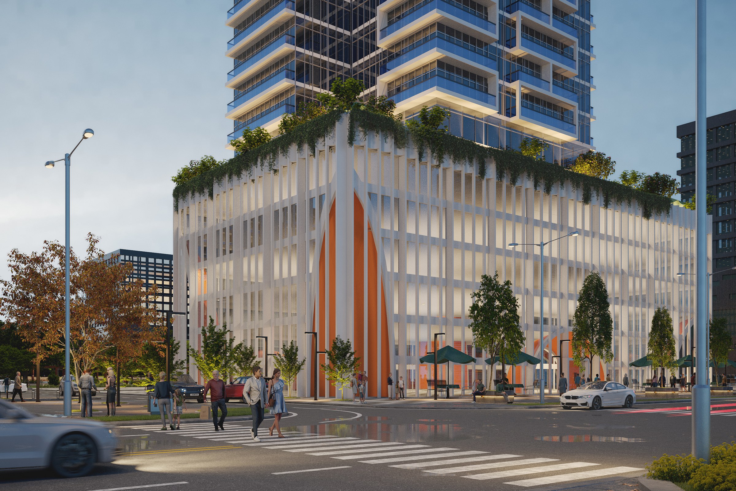
A render has no line weight. It does have five or six other pens that do the identical job, and the craft is knowing which one to pick up. One of them is working in the image at the top of this page: everything in that frame is white, glass, grey or blue except a single tall recessed void at the corner, glowing orange, which is the way in. Nobody had to tell you that. That is the whole trick, and below are the rest of them.
What each frame puts forward, and what it lets fall back
Real views, each with a key to the three weights in it — the same key you would put on a drawing, doing the same job.
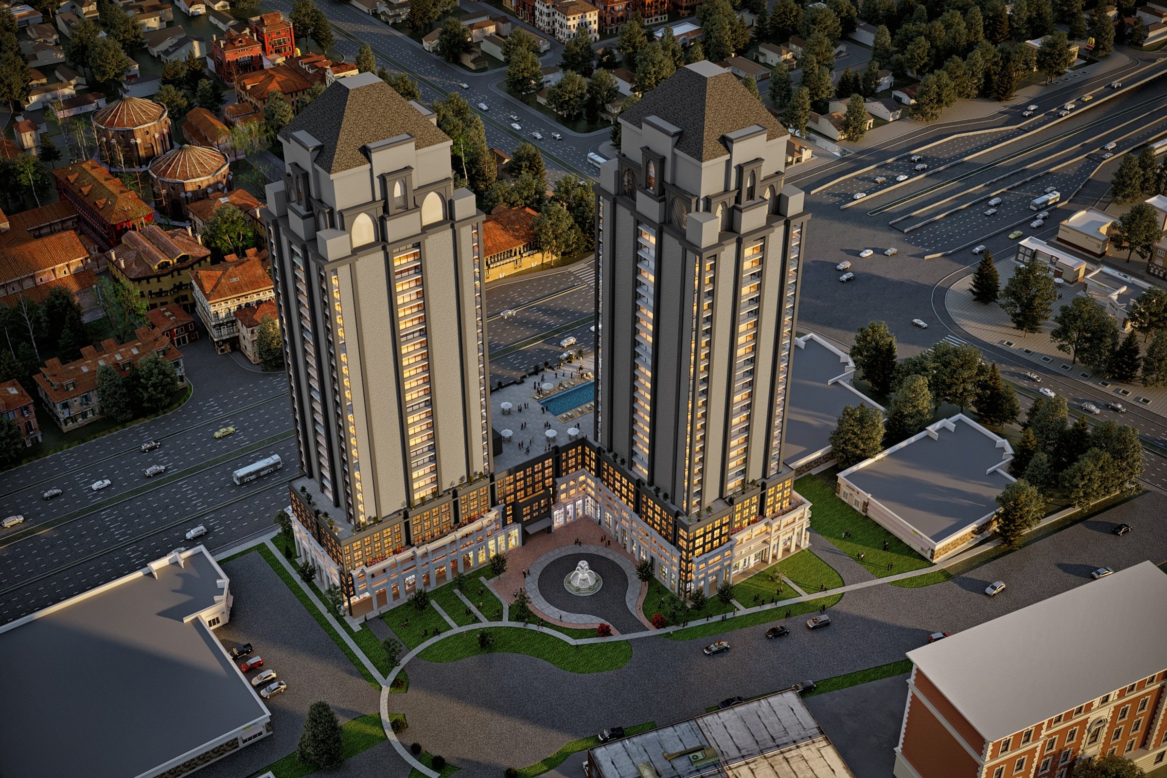
The lit windows of the two towers and the glazed base between them — the only warm value in the frame.
The forecourt, fountain and landscaped setting immediately around the base.
The entire existing city — roofs, boulevards, rail lines, the older brick blocks — present, readable, deliberately toneless.
The sun is the heaviest pen you own
Whatever you let the light land on is what the frame says the building is about. There is no second opinion available.
Value is the first thing a human eye sorts, before shape, before colour, before anything you would call reading. So the brightest region of an image is doing hierarchy whether or not anybody chose it — and in a daylight render with a clear sky, the brightest region is usually the sky, which is not your building. The frame below takes the opposite approach and takes it all the way. It is dusk, the ambient level is low, and the only warm light in the whole composition is coming from inside the proposal: the tower windows, the glazed retail base, the lit forecourt between them. Every existing building around it — and there are dozens, in three directions — sits in one cool grey value with no incident on it at all. Nothing has been hidden. The context is entirely legible; you can count the roads. It has simply been de-weighted, and the result is that a reader who has never seen the drawings knows in under a second which object on this site is the one being discussed.
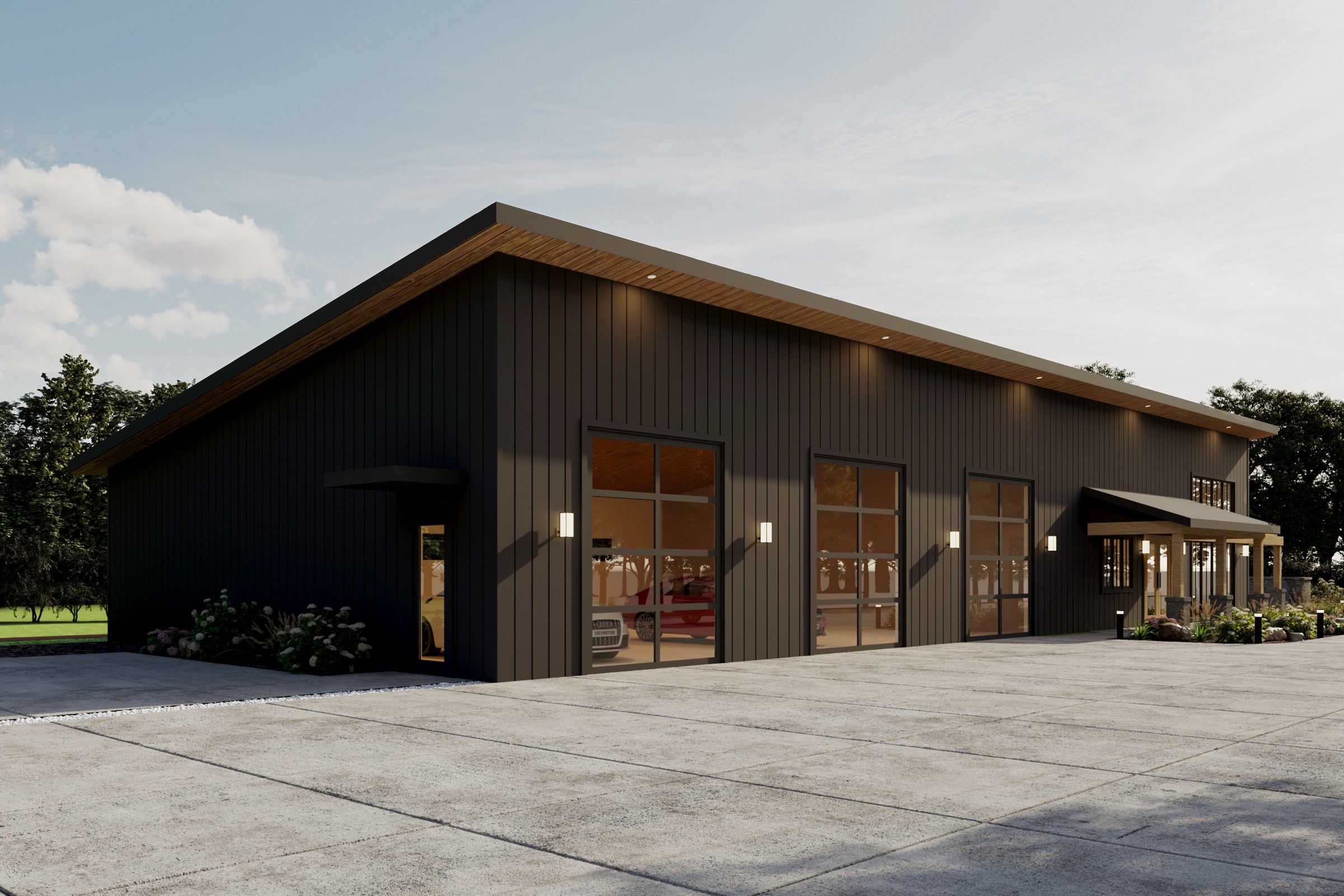
The warm timber eaves line and the three glazed bays cut into the dark flank.
The entrance canopy and lit porch at the far end, the trees breaking the roofline.
The whole black clad mass held as one value, the pale concrete apron, the flat sky.
Poché was never a lack of information
You have been filling things in solid black your whole career and nobody has once complained that the wall lacked detail.
A render has an equivalent and almost nobody uses it, because holding a large area dark feels like an admission that you did not model it. It is the reverse. In the frame below the entire main volume is one near-black plane — no material variation you could point at, no incident, a wall doing the job poché does on a plan. And precisely because it is quiet, three things become loud: the warm timber soffit running the whole length of the eaves, the three tall glazed bays cut into the flank, and the small lit entrance at the far end. That is the building explained in one line, three openings and a door. Try it the other way round — light the black cladding properly, resolve every board and joint — and you get a frame in which the vertical siding is competing with the eaves line for a reader who has eight seconds. Restraint here is not modesty. It is the only way to make three elements matter.
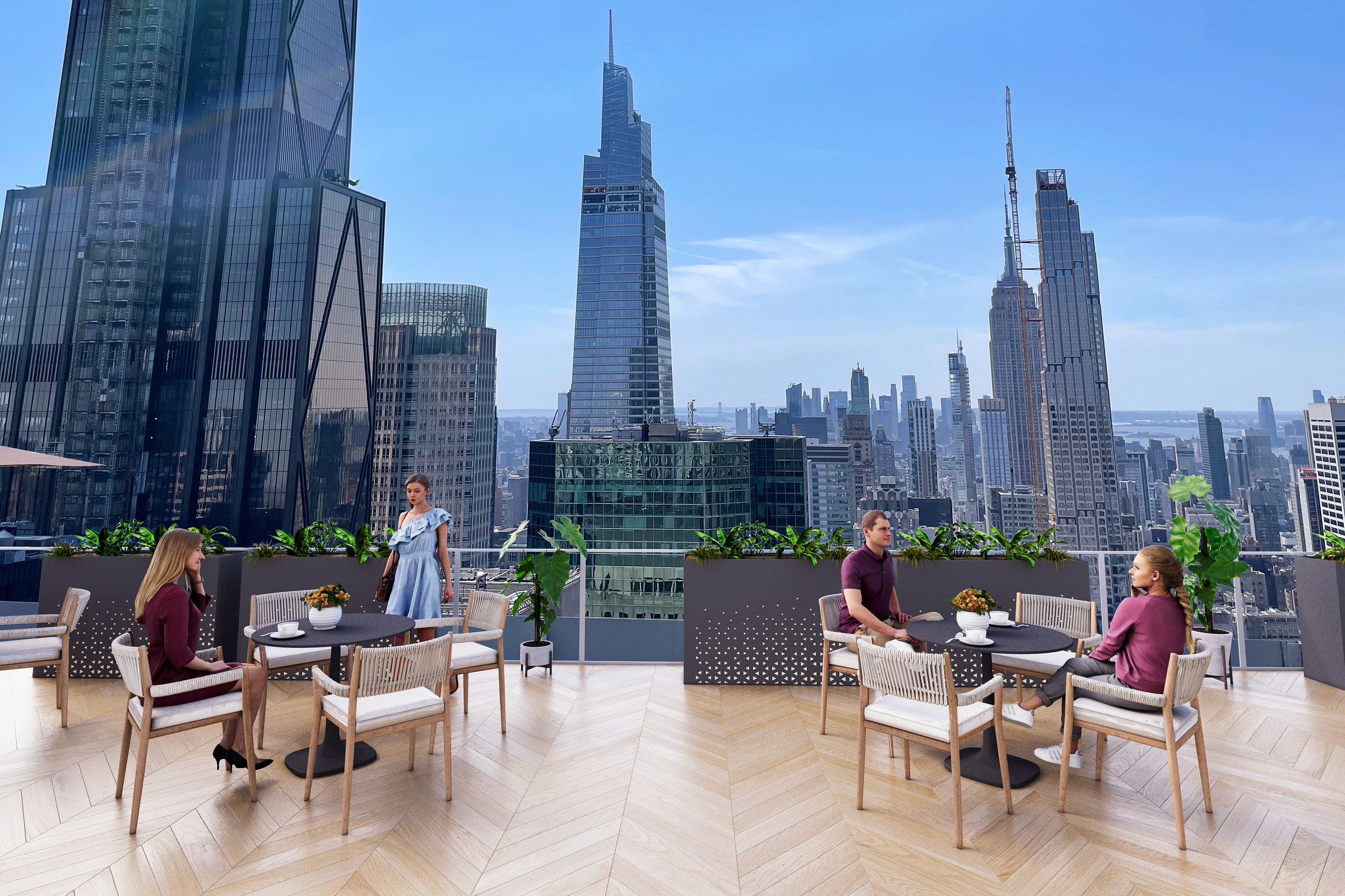
The terrace itself — chevron boards, furniture, planting, and the people at true scale.
The planter run and parapet that draw the edge of the occupied space.
The whole skyline beyond, softened by atmosphere: present, unarguable, not competing.
Near is a hard line. Far is a construction line.
Atmosphere is not a limitation of the medium. It is the reference line you have been drawing since school.
Depth ranks things for free, and the mistake is to fight it — to sharpen the far distance back up because it looks unfinished, and end up with a frame where a building three hundred metres away is competing with the handrail you designed. Look at the terrace below. Everything within a few metres of the camera is drawn hard: the chevron of the boards, the weave on the chair backs, the perforation pattern in the planter faces, the four people at true size doing ordinary things. Everything beyond the parapet is noted — completely present, entirely convincing, and softened by air in the way distance actually behaves. Nobody could accuse that image of hiding the context; the context is most of the frame. But no reader is going to spend their attention out there, because the picture has already told them, through nothing but focus and contrast, that the subject of this view is a floor you can stand on.
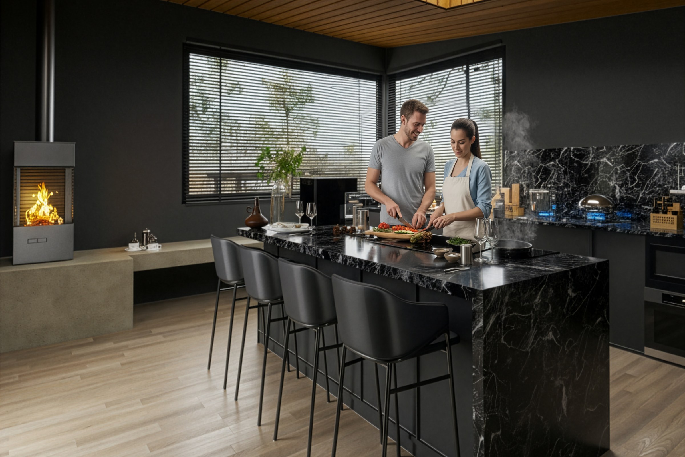
The black-and-white marble island and splashback — the only fully specific surface in the room.
The lit fire, the blinded window band, the two figures at work at the counter.
Matte dark walls, flat joinery, plain oak floor, timber ceiling — all held general on purpose.
One surface allowed to be fully itself
The interior version of this problem is worse, because in an interior everything is close enough to be resolved — so everything is.
Give a room the full treatment and you get a frame in which the joinery, the rug, the art, the stone, the plant, the books and the tap are all rendered to the same loving standard, and the eye — which is not stupid, only fast — reads that as a shop. The frame below does the opposite and it is the reason it works. Almost every surface in it is deliberately held plain: matte dark walls with nothing on them, a quiet oak floor, flat dark joinery, a slab bench with two cups on it. Exactly one surface has been allowed the full performance, and it is the black marble of the island and the run behind it — veining you could describe over the phone, a polish that catches the fire. The material carries the frame because it is the only thing in the frame permitted to be specific. That is not a rendering trick. It is the same decision as picking which detail gets drawn at 1:5.
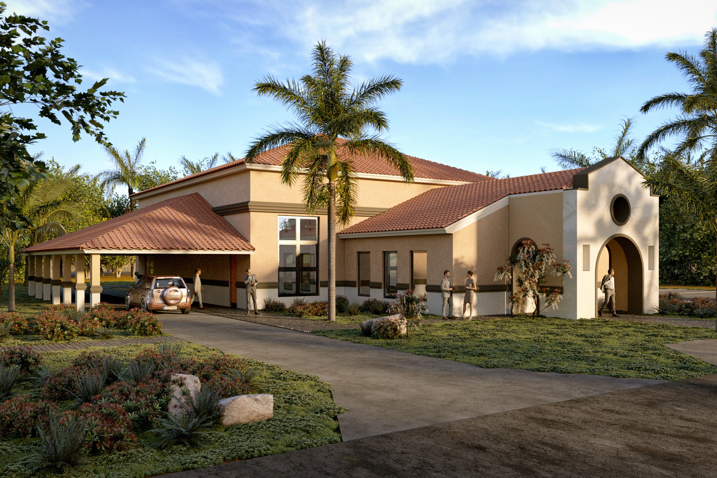
The arched entrance and the figure stepping into it — the end of the sequence.
The covered walk and the pairs of figures along the approach path.
Tile roofs, planting beds, palms and the driveway sweeping across the foreground.
Entourage is not scale. It is a claim.
Wherever you put people is where you are telling a reader the building is used. Scatter them evenly and you have said nothing, at some expense.
This is the instrument most often spent for nothing. Figures get distributed around a frame to make it feel alive — one here, two over there, somebody on a bench — and the effect on hierarchy is precisely zero, because a reader averages them out. Used deliberately they are the sharpest annotation available, since a human figure is the one object in an architectural image that every viewer tracks involuntarily. In the frame below the figures are not scattered; they are strung along a single line. Two at the car under the covered walk, a pair mid-approach on the path, one more at the threshold of the arched entrance. Read them in order and you have been handed the argument of the scheme without a word of text: you arrive under cover, you walk in the shade of the colonnade, you enter on the arch. The building has an entrance sequence, and the people are the ones saying so.
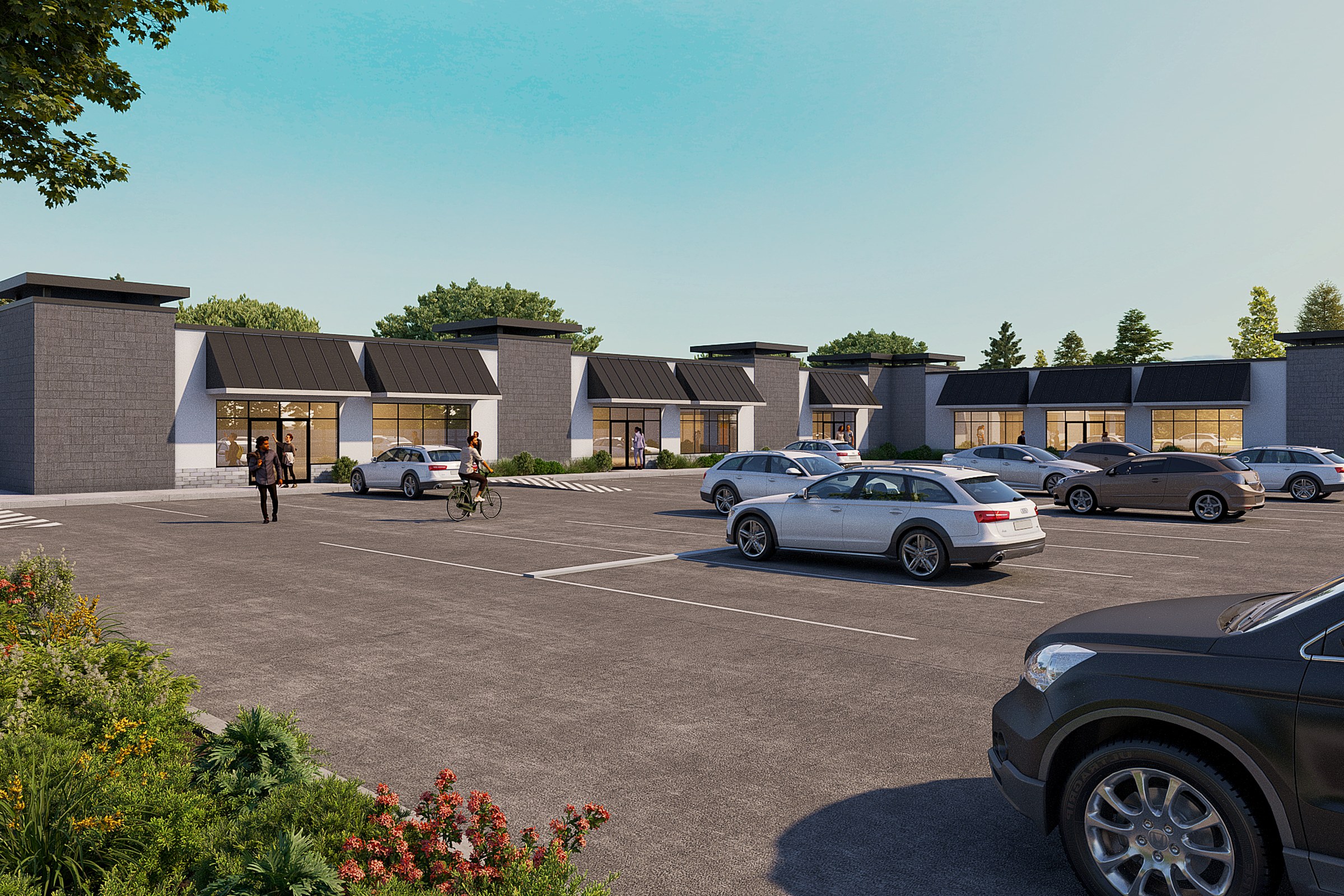
Unassigned. The asphalt takes it by area, having been given it by nobody.
Everything else — storefronts, canopies, piers, planting, parked cars, all at one level.
Nothing. Even the far end of the run is held at the same sharpness as the near end.
Nothing here is wrong, and nothing here is arguing
A control, so the other five are not just adjectives. This is what a frame looks like with the dial at zero.
High even sun, so no surface is separated from any other by value. No foreground and no distance to speak of, so depth ranks nothing. Every material at the same middling resolution. People and cars spread evenly across the width, so the entourage cancels itself out. And by area, the single largest object in the composition is the asphalt. Read it as a site view and it does its job honestly — the lot works, the units read, the approach is clear, and there are days when that is the whole question. Read it as a design view and the thing to notice is not that anything is missing. It is that nothing in the frame is voting. Whatever the idea was in this scheme — the rhythm of the storefronts, the way the masonry piers break the run, the deep dark canopies over each bay — the image is not putting it forward, and a reader who cannot find it will not say I cannot find the idea. They will ask for more detail, and they will be right that something is missing, and wrong about what.
Resolution tells a reader how much you have drawn. Weight tells them what you meant.
Four steps, done before anyone sets a camera
It takes about a minute per view and it is the difference between a frame that argues and a frame that lists.
- 01
Write the sentence
One clause, plain, no adjectives, before anybody opens anything. “The block steps down to the houses on the north edge.” That is a view. If you cannot write it, the view does not have a job yet.
- 02
Circle the noun
Every honest view sentence has exactly one thing it is about. If yours has three, you have three views — which is useful to find out now rather than after they are rendered.
- 03
Find the loudest object
Open the frame, look away, look back. The first thing your eye lands on is the heaviest object: brightest or darkest, sharpest, nearest, or the one with people standing at it.
- 04
Compare the two
Same object, and the frame is arguing your case. Different objects, and you have your revision — and it is a light-and-camera revision, not a modelling one, which is the cheap kind.
The block steps down to the two-storey houses on the north edge.
The step
The junction where the tall part meets the low part
Light — put the sun on the stepping face and hold the rest
The arcade gives the street a covered walk for the whole frontage.
The arcade
The depth behind the columns
Shadow — a colonnade only reads if the void behind it goes dark
You enter on the corner, not off the car park.
The corner entrance
The corner, and only the corner
People — every figure on the approach to it, none elsewhere
The brick is a warm handmade brick, not a machine-made red.
The brick
One square metre of wall at arm’s length
Resolution — one close frame; the rest of the set can stay general
Notice what is not on that list: model more, render bigger, add another angle.
Every repair in the right-hand column is a decision about light, shadow, distance, focus or where six people are standing. The geometry does not move. That is why this is the cheap end of a review cycle and a re-render is the expensive end, and it is why we would rather have this conversation at the start than discover it in round three.
There is one part of it we cannot do for you, and it is worth being straight about. We can read what a frame emphasises — that is a technical exercise anybody in this trade can do in a few seconds. What we cannot see is what you decided. Which of the four options this is. What the client already said no to. Which move the whole scheme is standing on and which two are still negotiable. All of that lives in your head and in a set of markups nobody sent us, and a studio that guesses will produce a beautiful, correct, expensive image of the wrong noun. Then the revision round arrives in adjectives — too heavy, too cold, too busy — and adjectives have no end to them.
Give a studio the sentence instead and the argument shrinks to one object: is the step the heaviest thing here, or is the roof? That is a design question. It has an answer, both of you can see it in the same frame, and it takes about four minutes. Which is, in the end, all that anybody means by working well together — not that nothing needs changing, but that when it does, there is something specific to point at.
Six neighbours, if your question is a different one: why the request lands where it lands — that page is about the softest object in a frame, this one is about the loudest — which views belong in the packet at all, how far apart your views are standing, the hour every render is quietly set at, the requests no render can answer, and which single viewpoint carries a scheme — that one picks the camera position; this one is about what happens inside whichever position you picked.


