
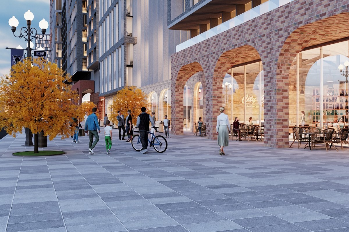
When the board asks for “more detail”
If the comments coming back on your submittals feel heavier than they used to, you’re reading something real — and it isn’t about taste. Here’s what’s underneath it, and the five exhibits that answer it.
Somewhere between the drawings and the meeting, review stopped being an argument about character and started being a test you can fail on a checklist. Across a great many US jurisdictions, discretionary design guidelines — the kind a board debated in the room — have been steadily rewritten as objective design standards: rules a staff planner can verify without a judgement call. On balance that is generous to architects. Predictability is worth a lot. But it arrives with a bill, and the bill lands on the visuals.
Not every jurisdiction has moved, and not every cycle feels this way. But when a packet comes back asking for “more visual detail,” this is usually what’s underneath it — a standard that can be measured has to be shown. A single hero render, however good, shows almost none of them.
From a conversation to a comparison
Nothing here asks for better images. It asks for a different kind of image — and that’s the part most packets are still catching up with.
- A guideline: “compatible with the character of the street.” A standard: a stated datum, a setback above a stated height, a stated glazing ratio.
- Judged in the room, by discussion, against taste. Judged against a written rule — which someone has to be able to check.
- One persuasive hero view carried the scheme. Each standard needs a view that shows whether the scheme meets it.
- The best-looking angle was the one you sent. The angle they named is the one they’ll look for first.
Which gives you the one distinction worth carrying into the next packet: a render is a picture of the building; an exhibit is an answer to a question. Boards are asking for exhibits.
Five views that answer a board, in the order they’ll be looked for
None of these require a heavier model — most are additional cameras in a scene you have already built. What they require is deciding, before you render, which question each frame is there to settle.
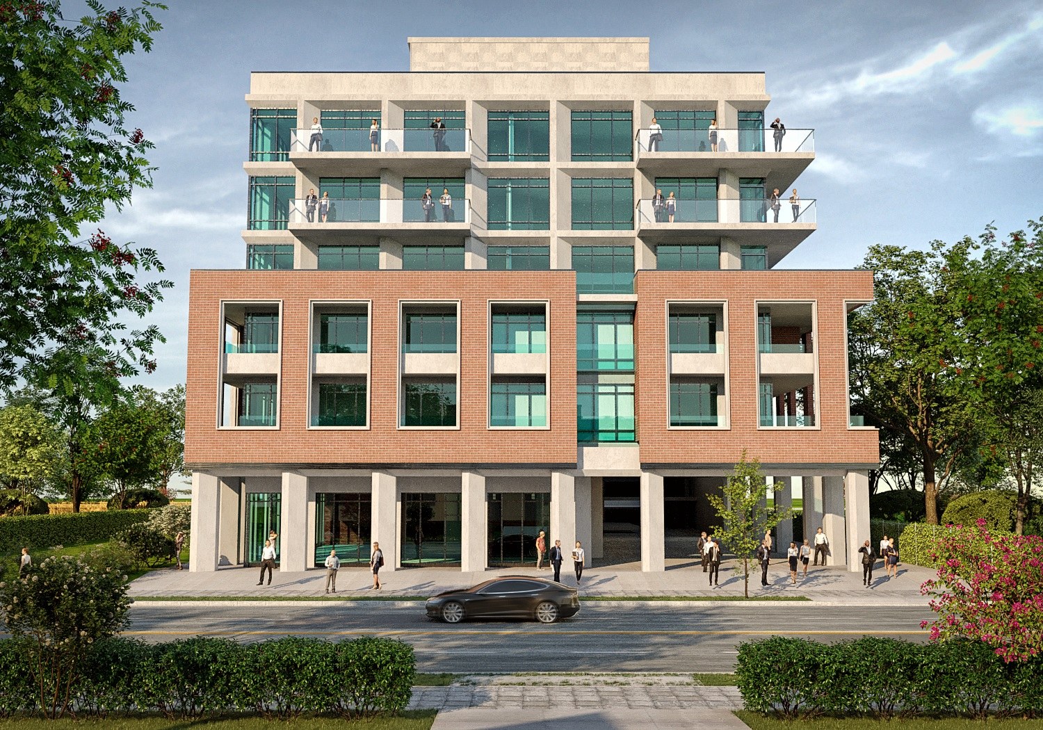
The elevation someone can hold a rule against
A three-quarter hero flatters massing. A near-frontal view lets it be measured.
The most persuasive view in your portfolio is usually the worst one for review. A dramatic three-quarter angle compresses the facade, hides one elevation entirely, and makes a step-back read as a shadow. If a standard says the upper floors set back from the street wall, or that the base reads as a distinct datum, someone has to be able to see that — squarely, with as little perspective distortion as the camera allows. It doesn’t have to be an orthographic drawing. It has to be an image where the base, the middle and the top are each legible, and where a step-back looks like a step-back rather than an artefact of the lens.
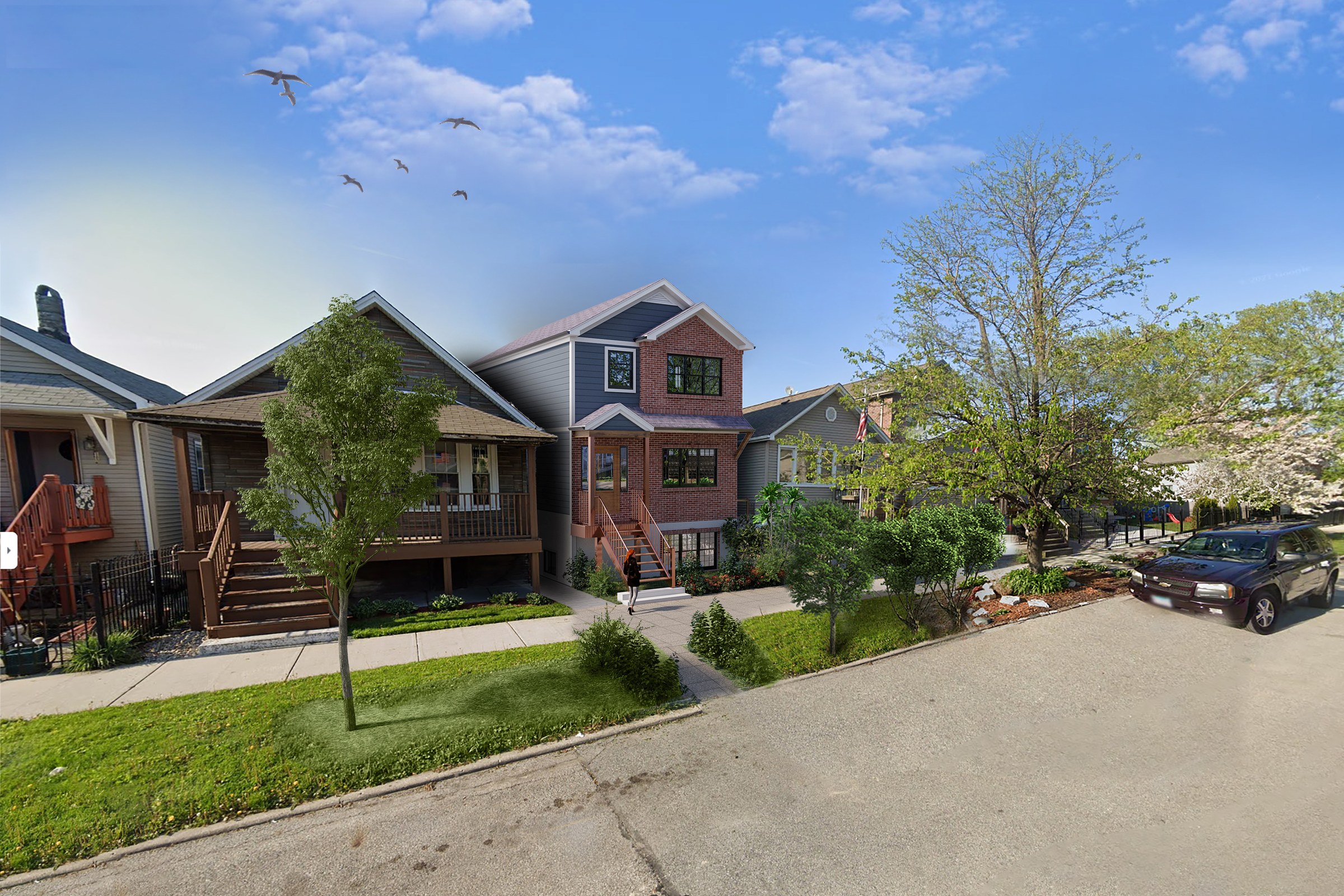
Your building among its actual neighbours
The strongest compatibility exhibit is barely a render at all.
When a packet is asked to show that a scheme “fits,” the answer is almost never another render of the scheme. It’s a photomontage: the proposal composited into a real photograph of the real street, shot at eye level, with the actual buildings either side still in frame. That single image does something no studio render can — it removes the argument. Roof heights, eave lines, setback, the rhythm of the porches, whether the new thing is a neighbour or an intruder: all of it is visible at once, against real context rather than modelled context. It is also, quietly, the most honest thing you can put in a packet, because there is nowhere for the composition to hide.
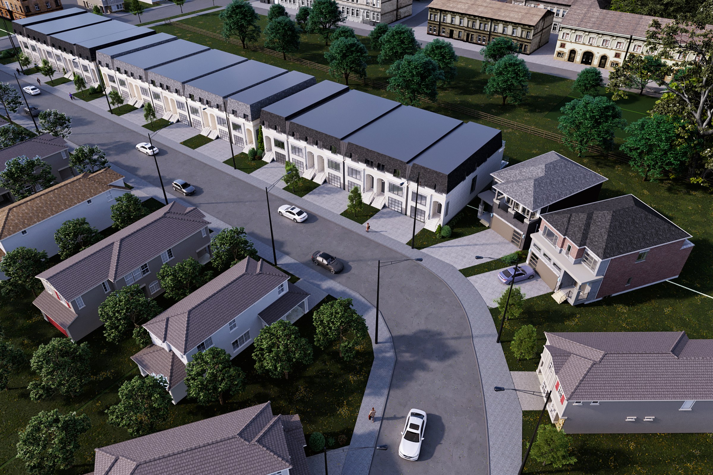
What happens at the property line
Most objections live at the edge of the site, not the front of the building.
Ask an experienced board member where the trouble is and they will point at the boundary. How does a taller building meet a lower one? Where does the parking go, and what does the neighbour see of it? Which windows look into which garden? A frontal view answers none of that; a raised three-quarter or low aerial answers all of it in one frame — footprint, setbacks, the transition in scale, the service side, the way the new massing steps down as it approaches whatever was already there. It is worth rendering even when nobody asked, because it is the view that turns a suspicion into a fact you have already addressed.
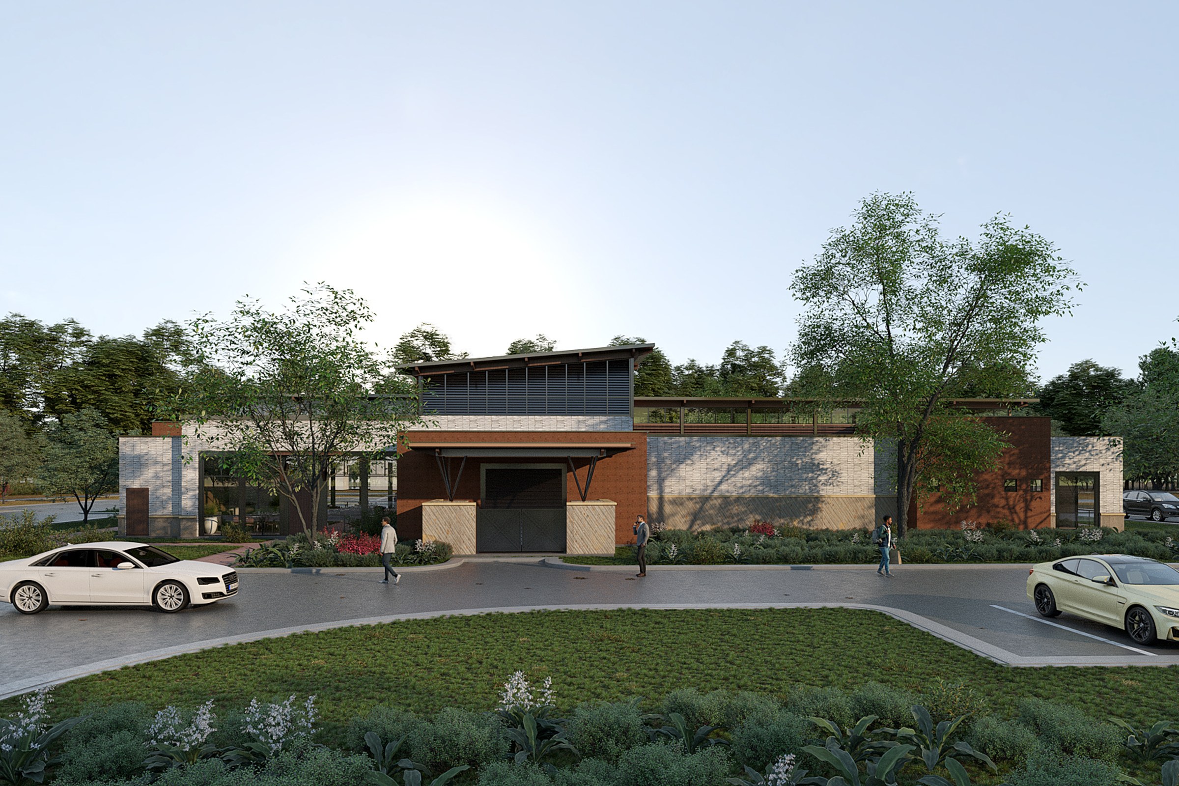
The materials, at the distance they’ll be seen from
A material board is a set of swatches. A board approves a building.
Sample boards answer “what is it made of.” They don’t answer the question that actually gets asked, which is “what will that look like from the sidewalk.” Three finishes that sit happily together as 4-inch swatches can read as a muddle at thirty feet, and the change of plane where one stops and the next begins is doing more work than the colours are. So the exhibit is a render at real viewing distance, in ordinary daylight, where you can see the coursing, the banding, where the masonry turns the corner, and how the palette behaves in shadow. It is also the fastest way to end a materials comment before it starts.
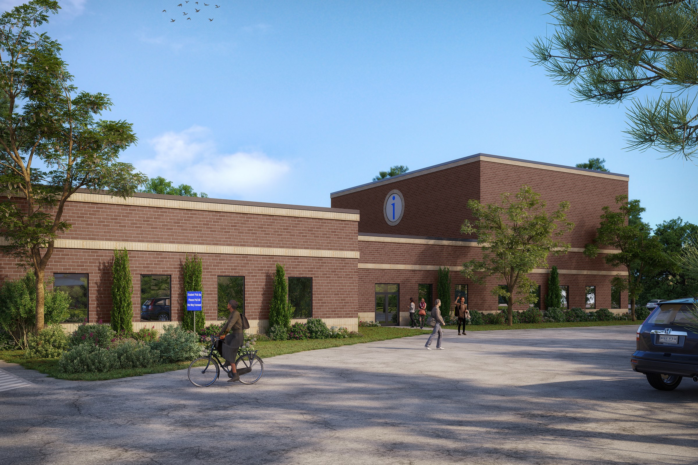
The view nobody wants to render
Boards are experienced. They already know which angle you left out.
Every scheme has one: the long blank side elevation, the service corner, the approach across the parking lot that the building was never designed to be seen from. It is the view you would never put on a website, which is exactly why it is the one a reviewer goes looking for. Leaving it out doesn’t hide it — it just moves the conversation to the next meeting. Including it, plainly lit and without heroics, does two things at once: it answers a question before it is asked, and it tells the room that the elevation was designed rather than left over. In our experience it is the single cheapest way to shorten a review cycle.
Three questions that shorten a review cycle
Ask them of the packet on your desk. They take about a minute and they tend to find the missing exhibit.
- 01
From where?
Does the submittal list name viewpoints? If it does, render those first — before the one you like.
- 02
Against what?
Point every view at a specific standard. A view that proves nothing is a view that invites comment.
- 03
What did we not show?
Whatever you skipped is the elevation you’ll be asked for. Cheaper to render it now than to re-submit.
A worked example of what a full set looks like on a real civic scheme: the facade package we build for design review.
A board isn’t asking you to make the building more beautiful. It’s asking you to make it checkable — and that is a rendering brief, not a design one.


