
A board will always ask about the vaguest thing in the frame
Which means the fix is almost never more detail. It’s the same detail, set to the level you’ve actually decided — and a line that says which parts aren’t decided yet.
Sit in enough review meetings and you notice something about the phrase “more detail.” It is almost never a considered request for a heavier drawing. It is what a reader says when their eye keeps returning to a part of the picture that has not settled — and the sentence comes back attached to whatever happened to be near it.
Which is worth knowing, because it changes the response. If comments have been arriving heavier lately — and plenty of firms tell us they have, though we would not pretend to have measured it — the instinct is to render harder everywhere. That is expensive, slow, and quietly dangerous: a photoreal image is read as a commitment, so every extra thing you draw is an extra thing you can be held to.
Detail isn’t one dial. It’s one per element.
Every element in a submittal sits at one of three levels of decidedness. The trouble starts when what you drew and what you decided are set differently.
- 01
Decided
Draw it all the way.
The thing actually under review — the massing, the street wall, the entrance, whatever you came to get agreed. It should be the most resolved element in the picture by a visible margin.
Too littleUnder-draw it and you invite the exact question you came to close.
Too muchYou cannot over-draw a decision you have already made.
- 02
Directional
Draw the family, not the item.
You have settled a character and a rhythm — a warm brick base, a dark metal upper, a punched opening — without settling a product. Draw at exactly that altitude: the palette reads, the specification does not.
Too littleUnder-draw it and the palette reads as undecided, so someone decides it for you.
Too muchOver-draw it and you have specified something in public that you have not specified on paper.
- 03
Open
Draw it neutrally — and say so.
Tenant signage copy, planting species, fixture selections, the colour of a door. Genuinely undetermined at this stage, and nobody is expecting otherwise until your image quietly claims otherwise.
Too littleLeave it blank with no note and it reads as an oversight rather than a stage.
Too muchInvent a specific answer and you have handed the room a specific thing to object to — or to attach a condition to.
So the honest brief isn’t “make it more detailed.” It’s draw every element at the level it has actually been decided — and let the caption carry the rest.
Where the eye lands when it isn’t satisfied
None of these are modelling problems and none of them need a longer render. They are the five spots where images habitually drop a level without anyone noticing — and where the comment reliably arrives instead.
Where two materials meet
A settled palette has settled junctions. Draw them.
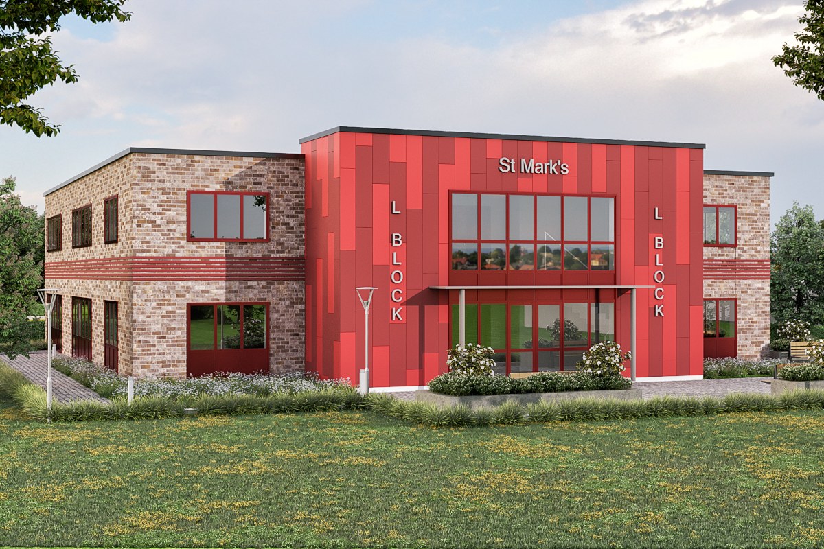
Reviewers read buildings the way bricklayers do — at the joins. The corner return, the reveal, the band that carries around, the point where a bold volume lands on a quiet one. It is a strange fact of review that a palette everyone already agreed on will still generate a materials comment if the seams are soft, because softness at a junction reads as a decision not yet taken. The frame below does the opposite: a red composite-panel entrance volume set hard against multi-tone brick wings, with a banded brick course carrying across at first-floor level and the window frames picked up in the same red. Nothing about it is expensive to draw. It simply refuses to be vague at the one place a reader looks first.
The large plain wall
A big empty field will collect the whole room’s attention.
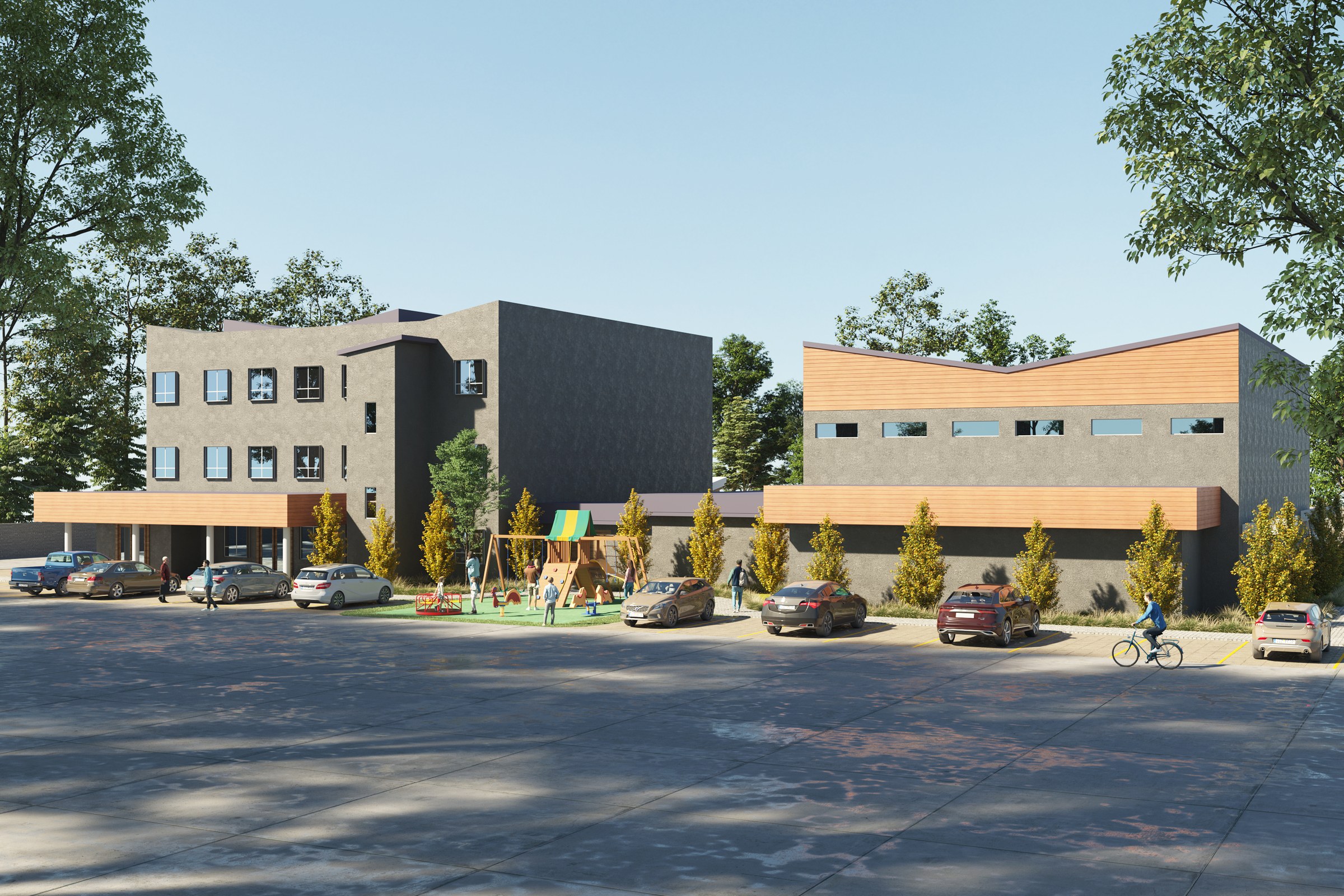
Every scheme has one — the flank, the plant enclosure, the wall you cannot open because of what is behind it. Often it is entirely correct, and the design is better for it. The problem is that a picture does not distinguish between a plane that is blank on purpose and a plane nobody has got to yet, and a reviewer looking at an otherwise articulated elevation will land on the quiet part and ask what happens there. In the frame below, two carefully modulated wings — punched windows on the left, a timber-banded upper on the right — sit either side of a large dark unbroken flank. If that flank is doing a job, one line in the caption closes the question before it opens. If it is not, better you find that out in your own office.
The twelfth unit, not the first
Nobody is judging your bay. They are judging the run.
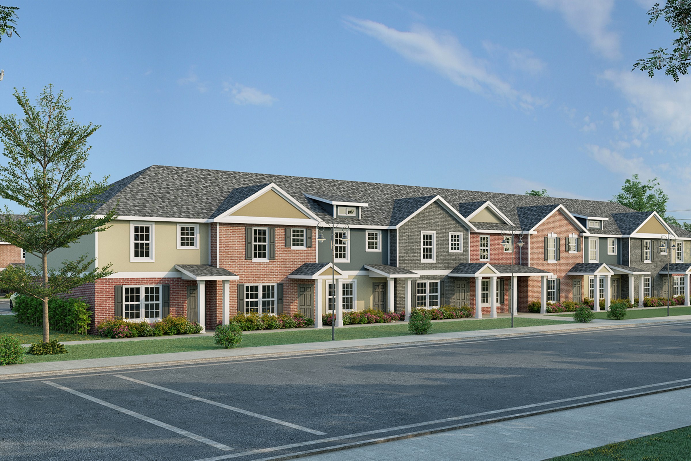
Show one beautifully resolved unit of a repeating scheme and you have answered a question nobody asked. The thing a board is actually testing is whether the variation is designed or decorative — whether the rhythm holds for the length of the street, or whether three good bays are followed by nine copies and a blunt end. So draw enough of the run that the pattern is legible, and draw the end condition, because the end is where a repeat usually fails. Below, the cladding changes bay by bay — olive render, red brick, grey shingle, cream — under a shifting gable rhythm with porch canopies, and it is only by seeing several bays together that you can tell the variation is a system rather than an accident.
Where your site meets someone else’s
A resolved building on a vague site produces site comments.
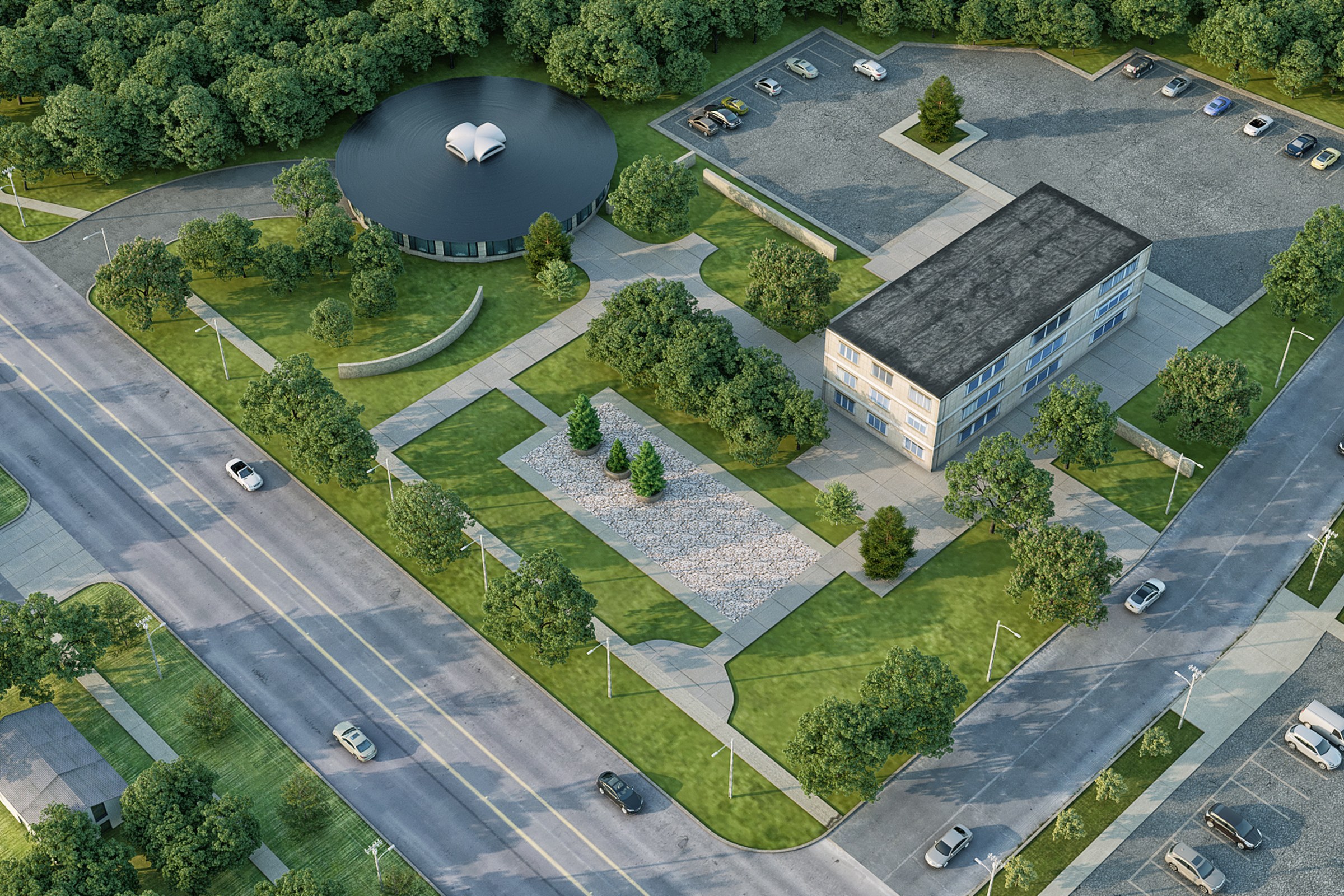
This is the most common mismatch we see: a facade drawn to within an inch of its life, sitting on a ground plane that fades into green mush about ten metres out. Reviewers do not read a building in isolation — they read the frontage, the setback, where the cars go, what the neighbour gets, and what happens at the property line. If the drawing goes soft exactly where those questions live, the questions arrive anyway, only now they arrive as a request for a study you did not budget for. The aerial below carries the whole thing at one level of care: the two buildings, the plaza between them, both parking areas, the road frontages on two sides, and the ordinary house sitting at the corner of the site.
Everything below the eye line
Kerb, stripe, island, canopy. This is where “pedestrian experience” lives.
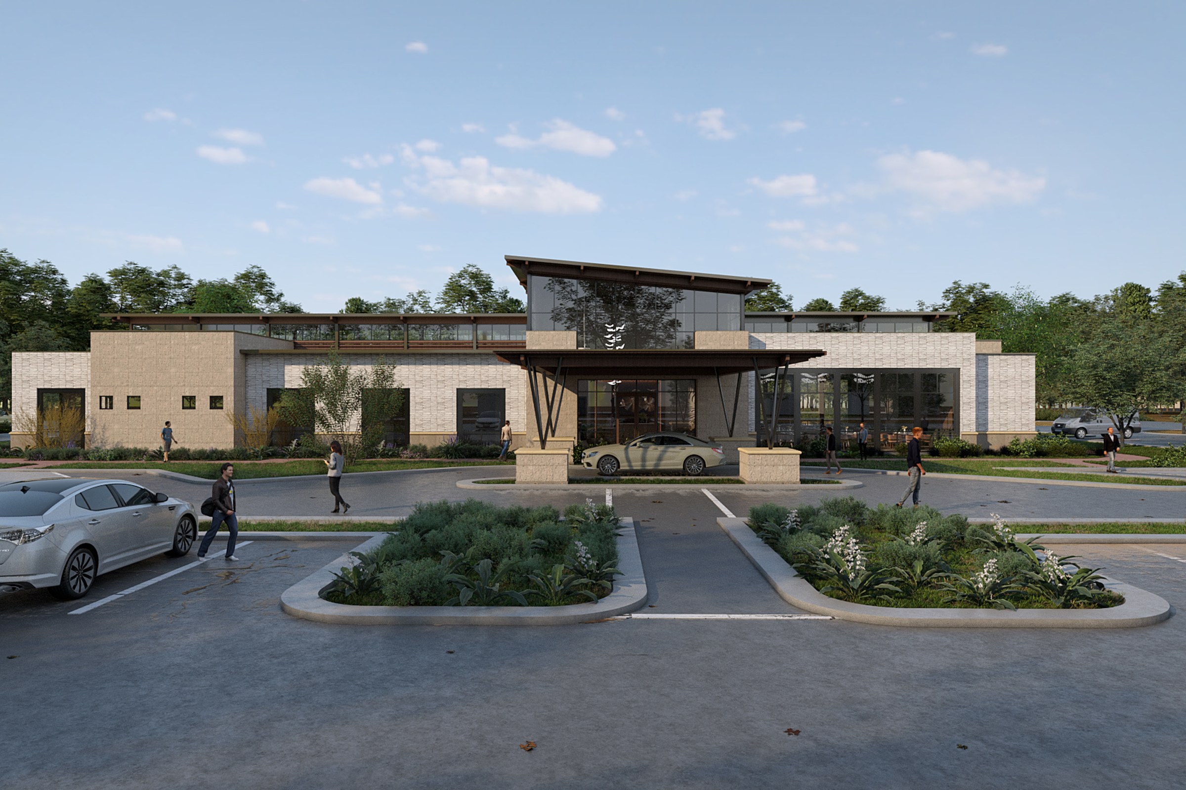
Ask where the harshest comments come from and it is rarely the roof. It is arrival: how you get out of a car, whether there is shade, whether the walk from the bay to the door is a walk or a negotiation with a drive lane. That whole argument sits in the bottom third of your image, which is also the part most often left generic because it is not the bit anyone enjoys modelling. The frame below spends its attention there — planted islands with real kerbs, marked bays, the drive lane under a deep timber-lined canopy on angled steel struts, and people at the scale they would actually be. You can answer half a page of comments simply by not leaving the bottom third of the picture to chance.
Three lines that do a render’s worth of work
Half of what gets asked for as “more detail” is really a reader trying to work out how finished the picture is meant to be. You can just tell them. Put the right line under the image and the ambiguity stops being theirs to resolve.
- Decided
“Shown as designed at the current submission stage.”
Says the image is the proposal, not an impression of it.
- Directional
“Material family indicative; final selections to follow with the construction documents.”
Buys you the palette without buying you the product.
- Open
“Signage, planting species and fixture selections not yet determined; shown indicatively.”
Turns three future objections into one sentence of housekeeping.
Two neighbours to this one, if the question is a different one: which exhibits actually belong in the packet, and what happens to your images once the packet leaves your desk.
“More detail” is rarely a request for more work. It’s a reader telling you where your picture stopped deciding.


