
Your render is now a public document
If the comments coming back feel heavier than they used to, part of the answer has nothing to do with the board. It’s everyone the board publishes to.
There’s a moment nobody pictures. Your render leaves the studio as a wide, clean file on a monitor you trust — and arrives, some weeks later, as a compressed page in a printed packet, on a wall in a room with the lights up, in a crop you didn’t choose, on the phone of someone who lives two doors down and has strong feelings about parking.
None of that is new, and not every jurisdiction works the same way. But it is the least-discussed reason a submittal comes back asking for more: some of those questions are being asked about a degraded copy of an image that was perfectly clear when you sent it.
Where the image actually goes
You control the first station on this list and none of the others. Every one of them takes something out of the picture.
- 01
Your monitor
Calibrated, full width, 100%. The only place it will ever look exactly like this.
- 02
The submittal PDF
Downsampled and compressed, bound in behind forty pages of drawings and forms.
- 03
The staff report
Someone else decides which image goes in — and which part of it.
- 04
The hearing room
Thrown onto a bright wall, seen from the back row, with the lights still up.
- 05
An inbox
Forwarded to neighbours. Opened on a phone, one thumb, three inches wide.
- 06
The record
Searchable and quotable, long after anyone remembers the meeting.
Which reframes the whole brief: you are not sending an image — you are sending every degraded copy of it that anyone will ever see.
What a picture loses on the way to a decision
None of these need a heavier model or a longer render. They’re decisions about contrast, value, silhouette, framing and literal-mindedness — all of them free if you make them before you hit render.
It will be projected badly
Contrast survives a projector. Subtlety does not.
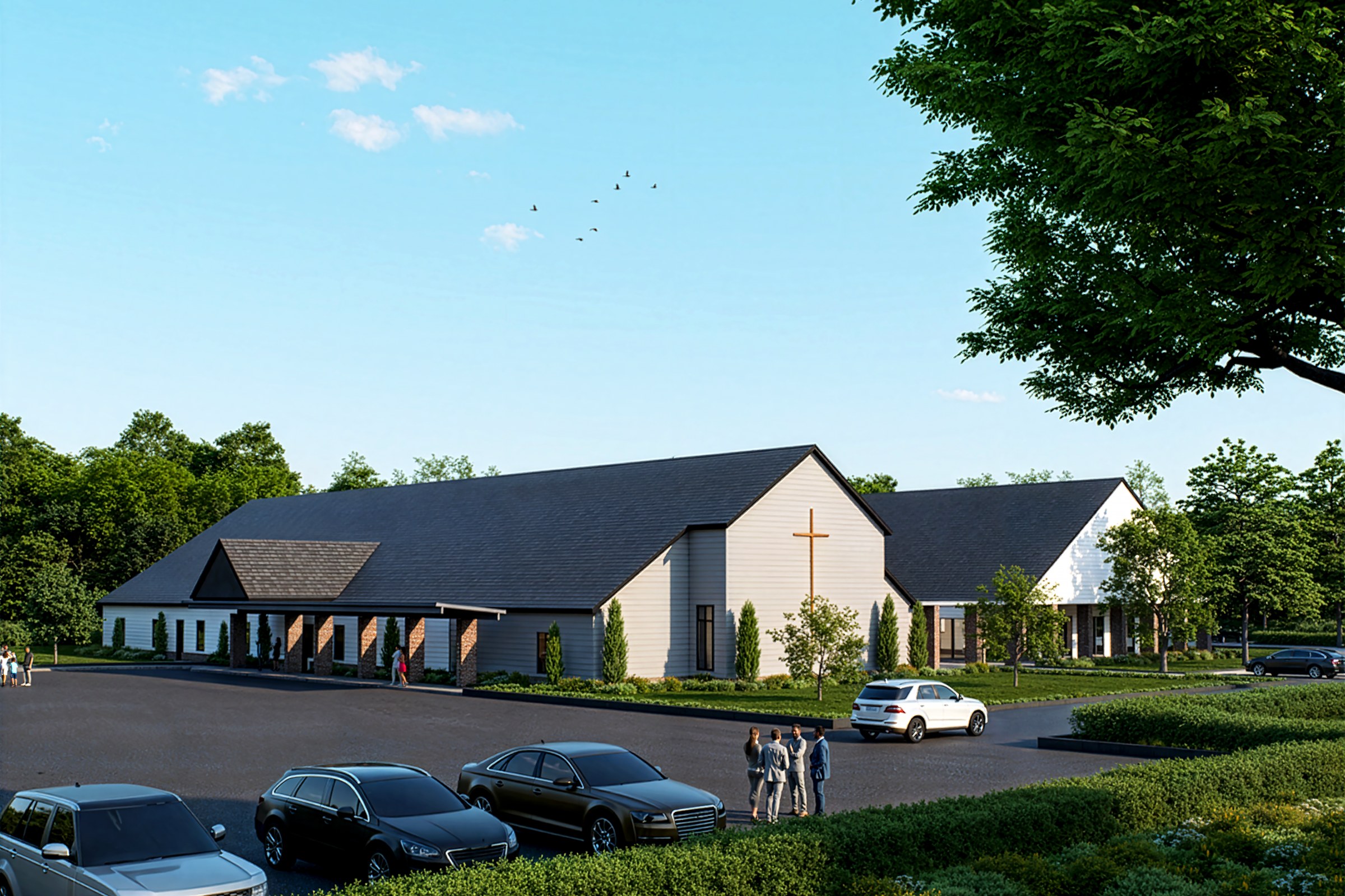
A hearing room is not a gallery. The lights stay half up so people can read their papers, the screen has been grey for years, and the nearest thing to colour management is whichever cable was in the drawer. Everything you loved about a dusk render — the slow gradient from warm interior glow to deep sky, the quiet separation of two dark materials — collapses into a single muddy field about four metres from the projector. What comes through is value structure: a light thing against a dark thing, shapes big enough to read from the back row, and enough air around the building that its outline has somewhere to sit. Send that frame, and the room is looking at the building instead of squinting at a smear.
It will be printed without colour
Agenda packets come out of a mono printer. Ask what’s left.
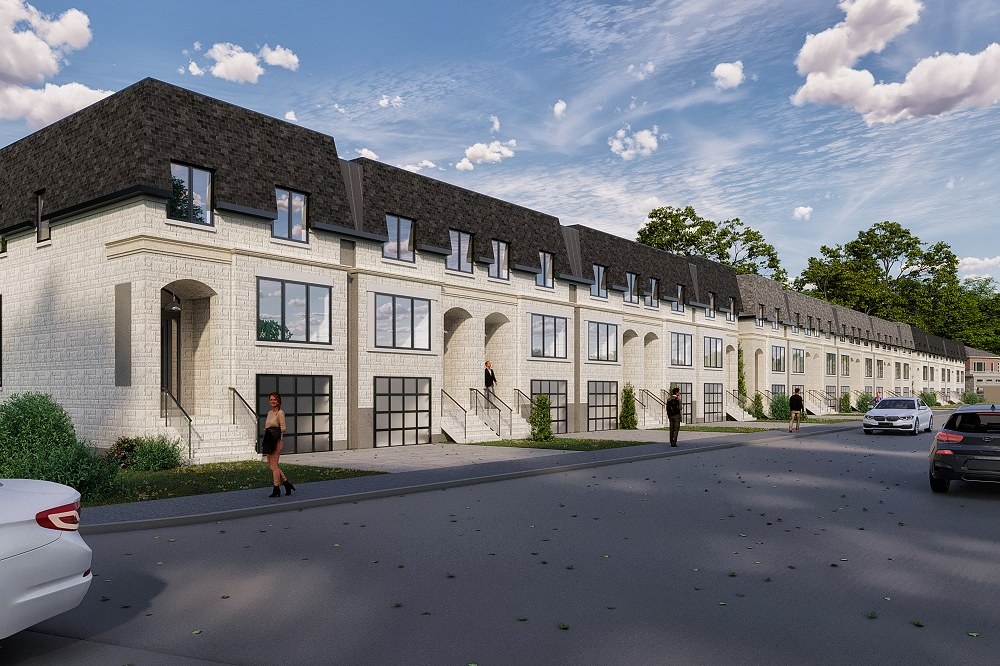
This is the cheapest test in the business and almost nobody runs it. Desaturate the image before you send it. If the facade argument was a warm brick base set against a cool metal upper, greyscale returns one continuous field and the argument is simply gone — not weakened, gone. The fix isn’t to abandon colour. It’s to make sure every distinction that matters also exists in value: the base darker than the middle, the reveal reading as a shadow rather than a hue shift, the openings punched deep enough to hold their own tone. A scheme that survives being photocopied is a scheme that survives everything else too.
It will be judged at three inches
At thumbnail size, only the silhouette makes it out alive.
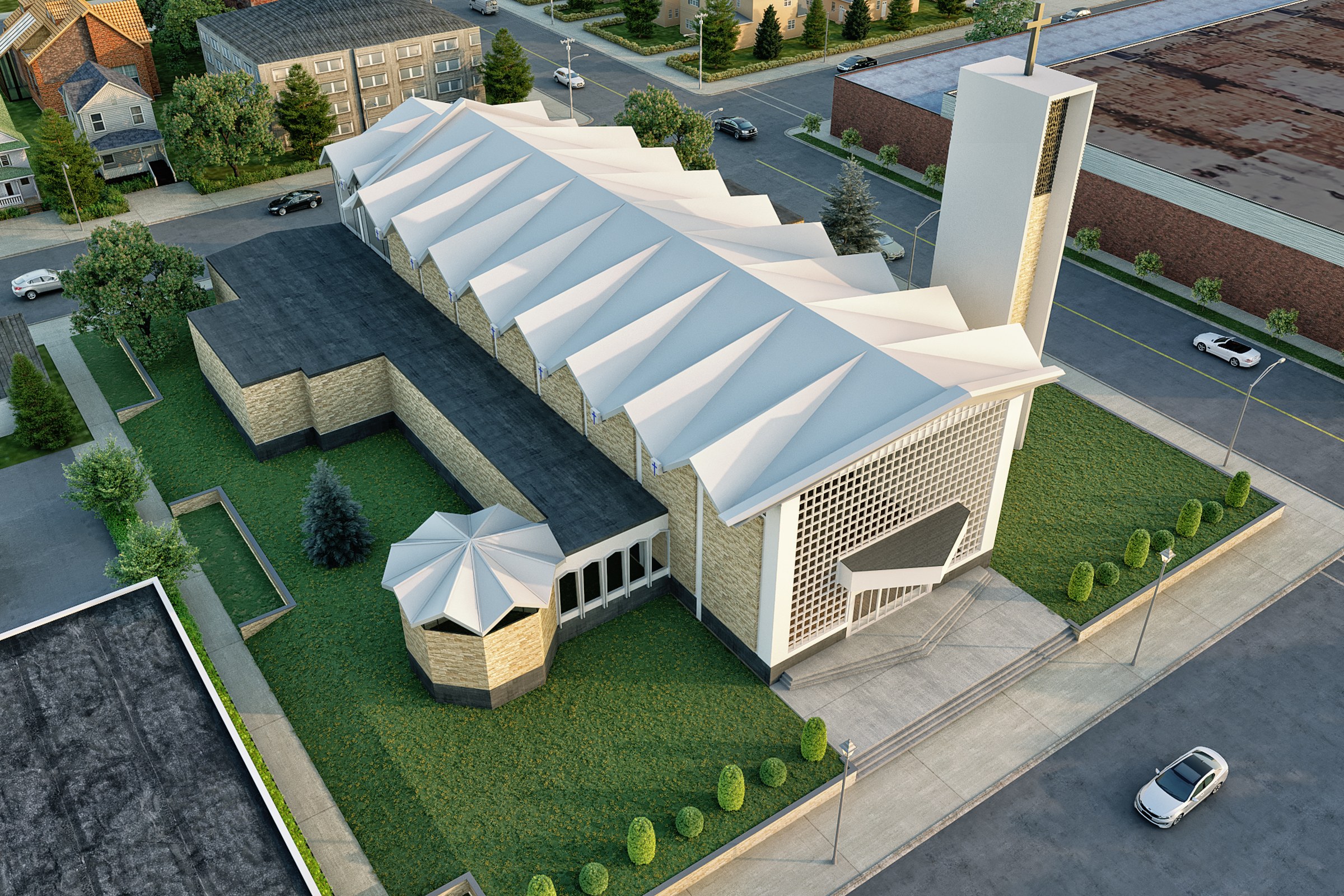
Long before anyone opens the packet properly, someone forwards a link and someone else forms an opinion on a phone, at the bus stop, at the size of a contact photo. Materials are gone at that scale. So is entourage, so is glazing detail, so is every hour you spent on the soffit. What remains is outline and one dominant subject — and that first impression is remarkably hard to move later. Which is worth knowing while you are still choosing the camera: if what makes the scheme good is a roof profile, a tower, an entrance, then compose so that thing owns the silhouette rather than competing with three others for it.
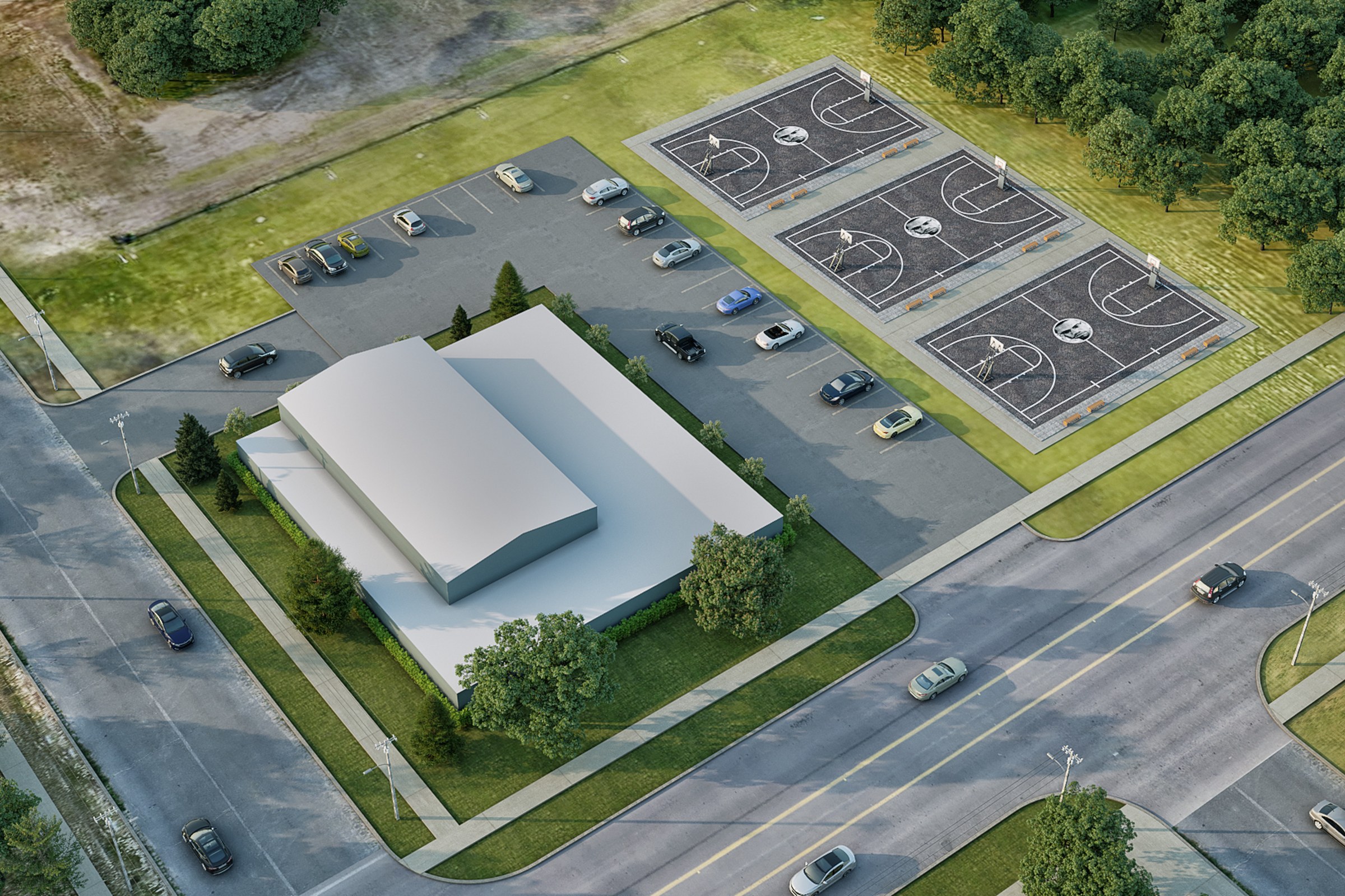
Someone else will choose the frame
Put the contested fact in the middle, not at the edge.
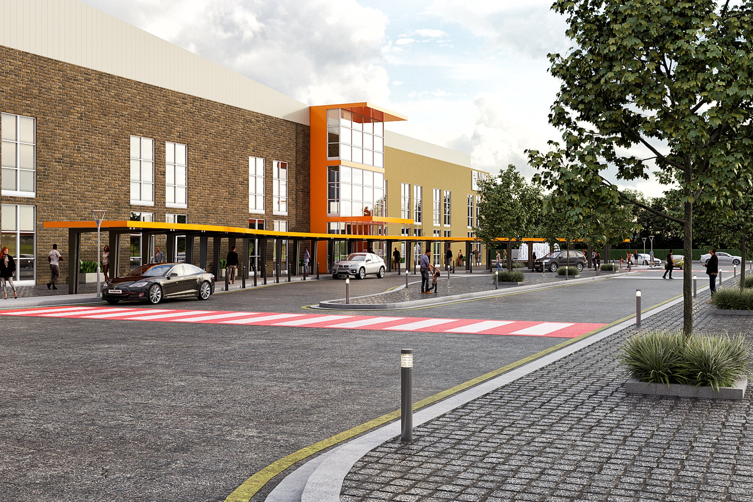
Once an image is in a staff report it gets re-cropped to fit a column, a slide, a template — by someone with no stake in your composition and no idea which part was the answer. The frame below only works whole: the building, the parking it generates, the courts, and the street edge it presents are all in the same picture, which is exactly the point and exactly the risk. Take a third off either side and the parking argument leaves with it. So decide in advance which single fact must survive re-framing, seat it near the centre, and leave enough margin that the image can lose fifteen percent from any side and still say the same thing.
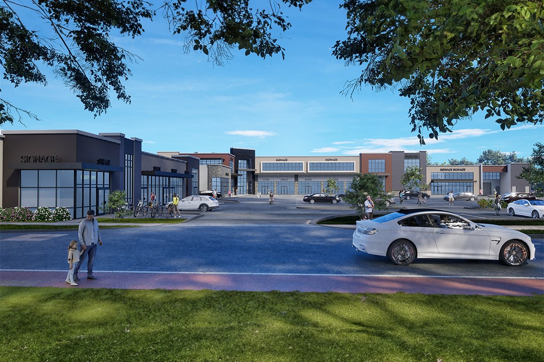
It will be read literally
To you it’s a study. To a neighbour it’s a promise.
The people who turn up to hearings are not reading your image the way your studio reads it. Nothing is provisional to them. Placeholder signage reads as signage. Four cars in a lot reads as a claim about traffic. A tree drawn at twenty years’ growth reads as shade that will be there on opening day. None of that is dishonest of you and all of it is normal mid-project — the frame below is a perfectly good working view with the shopfront text still unresolved. It is simply not the frame to put in front of a room that will take every element at face value. Walk the image once as a literalist would, and fix what you find; it costs an afternoon and saves a meeting.
The five-minute survival test
Run it on the frame sitting on your desk right now. It takes about as long as making coffee, and it tends to find the one image that was never going to make it.
- 01 Squint at it. If the massing dissolves at a squint, it will dissolve on a projector.
- 02 Desaturate it. If the argument disappears in grey, it was being carried by colour.
- 03 Shrink it to a thumbnail. Whatever is still legible is what a neighbour will actually see.
- 04 Crop fifteen percent off every side. Is the fact you most need to prove still inside the frame?
- 05 Show it to someone who isn’t an architect. Ask what the picture is promising. Their answer is the comment you’re about to get.
And if the question is which views belong in the packet rather than whether they survive it: what “more detail” usually means, and the five exhibits that answer it.
An image that only works on your monitor is an image that works in exactly one room — and it isn’t the room.


