
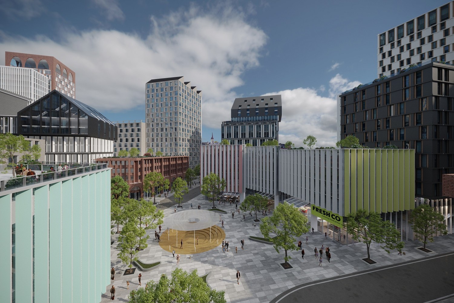
Every packet has a missing middle distance
Planners named the housing that vanished between the single house and the block. Review sets have their own missing middle — and it is the exact range a human being occupies.
There is a moment every architect recognises. The images are good. Nobody in the room disputes that they are good. And somebody still says, evenly and without malice, that they would like to see a little more detail.
The instinct is to hear that as a comment about quality. More often it is a comment about distance. A person builds a mental model of a place by moving toward it — from the map, to the street, to the door, to the thing they can touch. In a review, your packet is the only movement available. If two consecutive images sit three hundred metres and three metres apart, the reader has to teleport, the model never assembles, and the only sentence available for I couldn’t get from that picture to this one is: we’d like more detail.
And if those comments have felt heavier lately — plenty of firms tell us they have, though we would not pretend to have measured it — it is worth checking the geometry of the set before you go and render harder. Rendering harder is the expensive answer to a question about arrangement.
Six places a reader can stand
Each rung answers one set of questions completely and refuses the rest. That refusal is the point: no single view can be asked to carry two distances at once, however good it is.
- ~300 m
01The overhead
ClosesWhat the site touches — frontages, neighbours, where cars arrive and where they leave.
Cannot touchAnything at all about being there. Nobody will ever stand at this rung.
- ~40 m
02The far kerb
ClosesWhether the thing belongs on this street — height, rhythm and weight against what is already built.
Cannot touchA single material. At forty metres brick and panel are the same substance.
- ~20 m
03The turn
ClosesHow the massing turns a corner — depth, setback, what sits in front of what.
Cannot touchThe ground plane, and everything that happens on it.
- ~10 m
04The arrival
ClosesGetting out of a car and finding the door — canopy, signage band, drive aisle, the first ten steps.
Cannot touchThe walk itself, once you are out of the car and past the kerb.
- ~3 m
05Body distance
ClosesWhat it is like to be in the space — width, light, shade, whether a person would linger.
Cannot touchA specification. Nothing here is precise enough to hold you to.
- ~1 m
06Arm’s length
ClosesJunctions and materials at the only distance they are ever really judged — sill, reveal, coursing, the return at a corner.
Cannot touchThe whole. At a metre the building has disappeared entirely.
Read down that list and the usual advice inverts. The question is not how detailed is my packet. It is how far apart are my views — and a set with a two-hundred-metre hole in it will generate comments no amount of resolution can close.
What each distance is actually for
Six real views at six standing positions. Not a house style — a demonstration that each range answers something the others physically cannot.
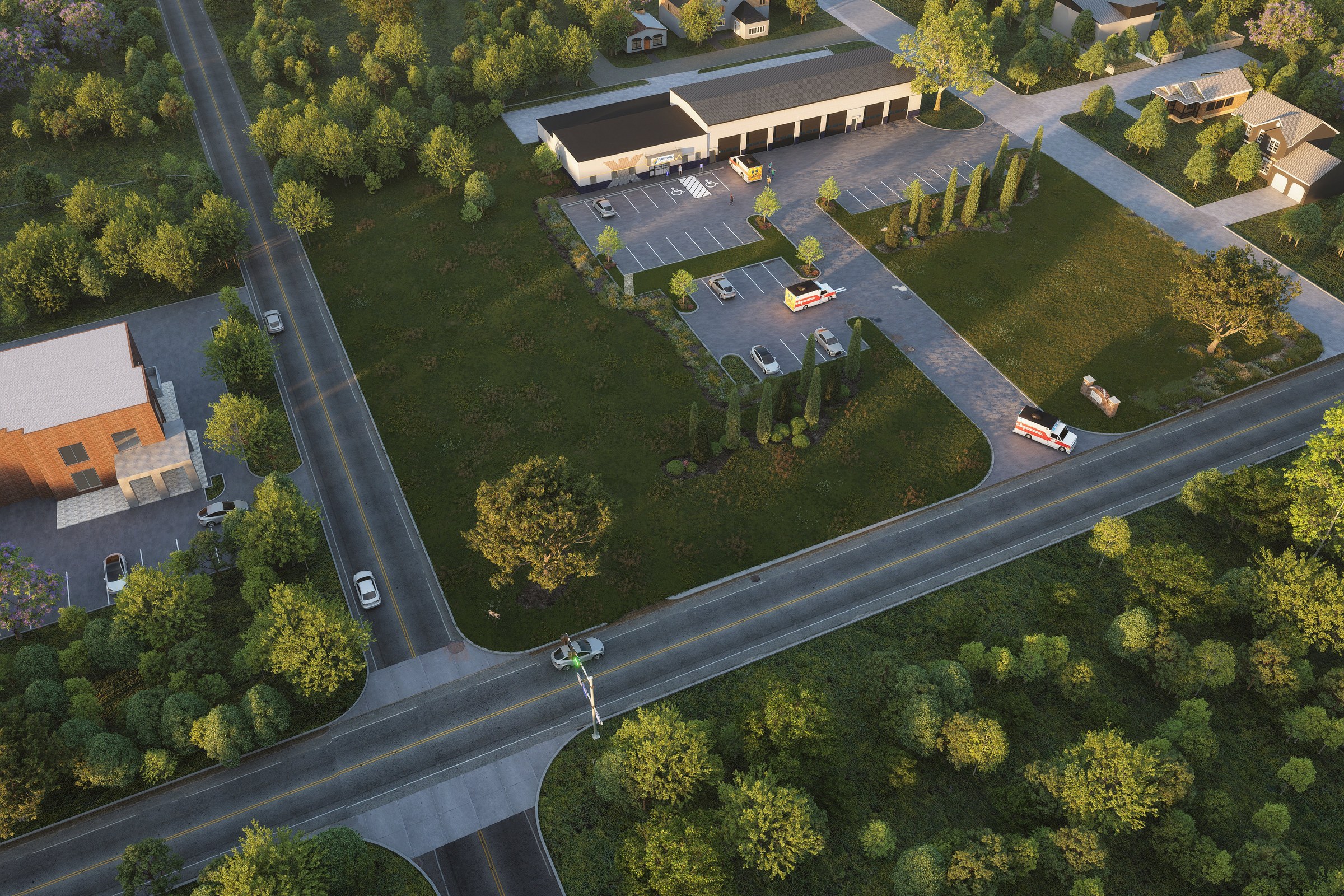
The view nobody will ever have
It answers the planner’s questions and none of the public’s.
Start with the strange one. An overhead is the only image in the packet that corresponds to no human position whatsoever, and it is still usually the most useful thing in it — because the questions it closes are the ones a staff report is written from. Where does the site meet the road, on how many frontages, and what is on the other side of each. Where the cars come in, where they stop, and how much of the ground they take. What the neighbours are, at what scale, at what distance. The frame below carries all of that at one level of care: two road frontages meeting at a signal, the proposal and its parking, mature trees kept along the edges, and ordinary houses and an existing brick building sitting right at the property line. What it cannot do — at all — is tell anyone what the place feels like. Which is fine, as long as the next image is not also two hundred metres up.
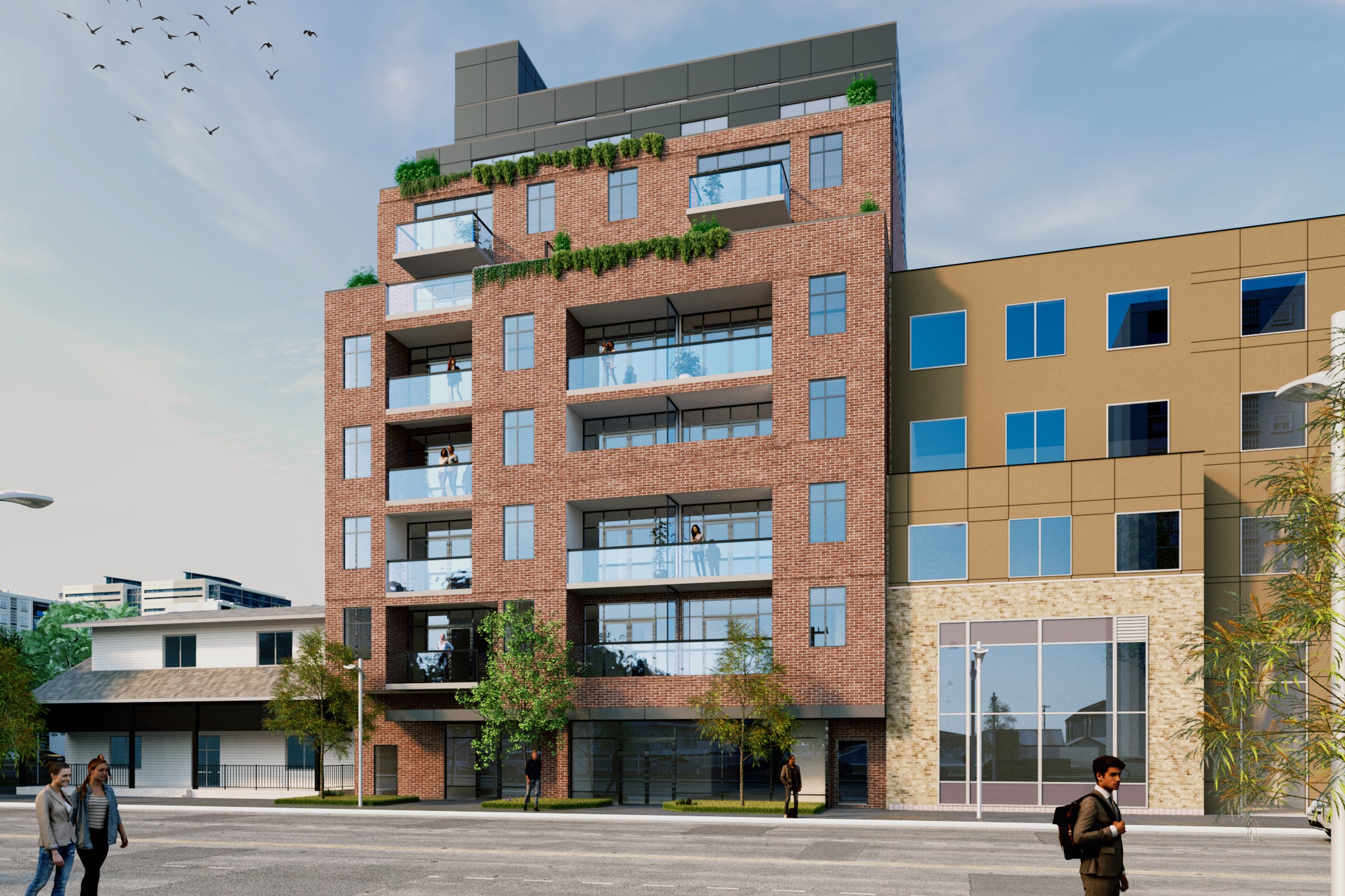
Standing on the other side of the street
The first rung a real person occupies — and the one packets skip most.
This is where somebody actually first sees a building, and it is astonishing how rarely it appears in a submittal. From the far kerb you are not reading materials; you are reading whether the thing belongs. Is it the height of its neighbours or a storey out. Does the rhythm of its openings agree with the street or argue with it. Does the top do something, or does it simply stop. Every one of those is a question a board will ask, and none of them can be answered from a hero three-quarter view taken from a position no pedestrian could reach. The frame below sits squarely at that distance: a brick infill block between two existing buildings — a low white one on the left, a taller tan one on the right — with the sidewalk, the street lamps and people at their true size. You can settle the belonging question in one look, which is exactly what the view is for.
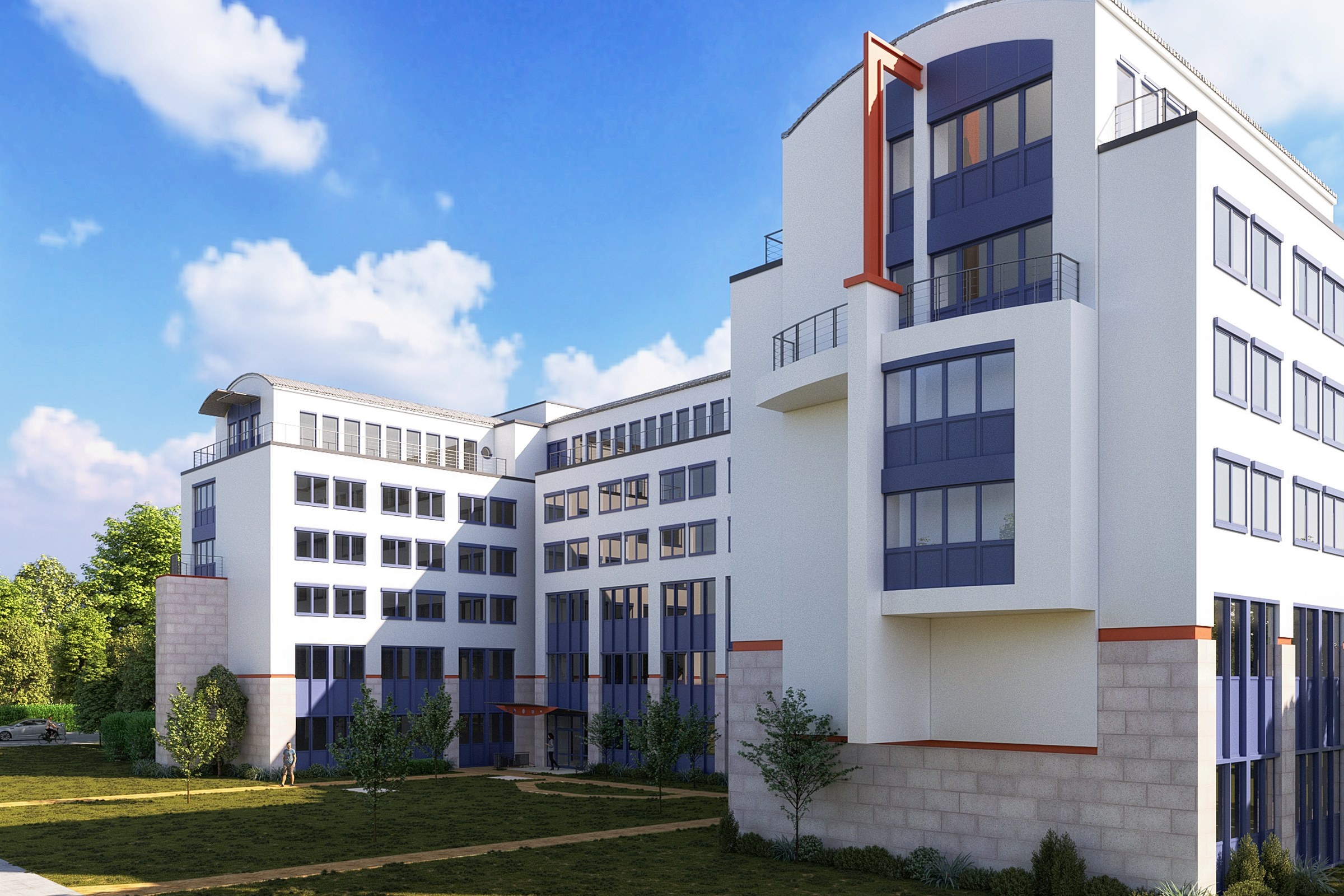
Where the building stops being an elevation
Two faces in one frame, or the massing stays theoretical.
Somewhere around twenty metres a building stops being a drawing of a facade and becomes an object with a back to it. This is the rung that answers depth: which volume is in front, how far the upper floors are set back, whether that projecting bay is a real move or a graphic one, and what happens where two elevations meet. Boards ask about corners more than almost anything else, partly because a corner is where a scheme’s discipline shows and partly because it is the one thing a flat elevation drawing genuinely cannot convey. In the frame below the whole geometry is legible in a single look — the curved end volume, the stepped bays, the deep reveals, the way the render band lands on the stone base — because the camera is far enough back to see two faces at once and close enough that the depth still reads.
The last ten metres of a car journey
For most American schemes, this is the real front door.
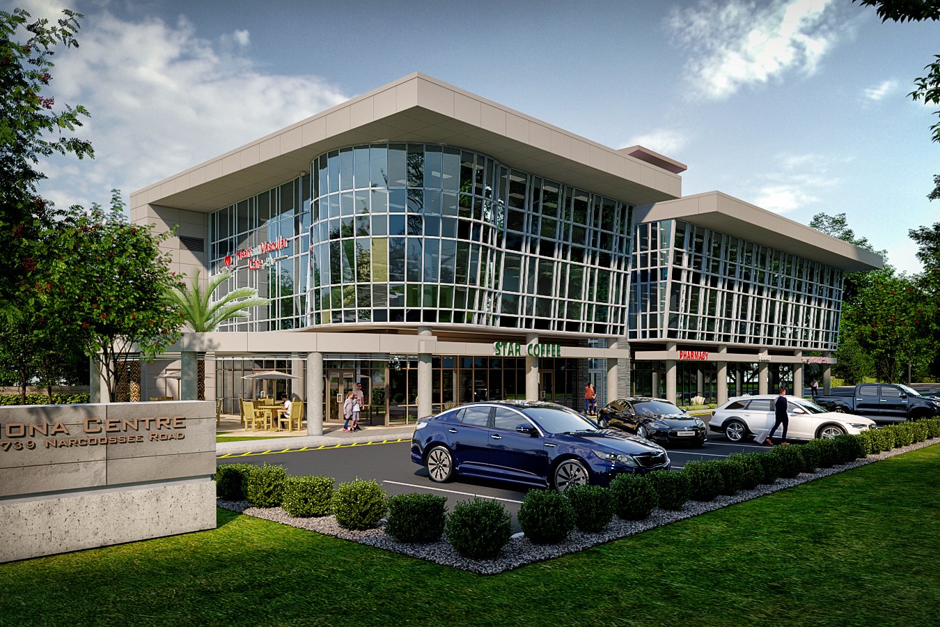
Wherever people arrive by car — which in a great many US submittals is everybody — there is a rung between the street and the building that decides how the place is experienced, and it is almost always drawn generically. Where does the drive aisle run. Where do you actually stop. Is there cover between the bay and the door, or is there a negotiation with moving traffic. Is the entrance findable without signage doing all the work. This is also where the harshest comments tend to land, because it is the part of a scheme a reviewer can picture their own family standing in. The frame below spends its attention there and it shows: the drive lane and marked bays, the planted kerb islands, the colonnade running the full frontage, a stone monument sign at the entry, café tables under the canopy, and the glazed corner drawing you toward the door.
Inside the space, not looking at it
The rung where “pedestrian experience” stops being a phrase.
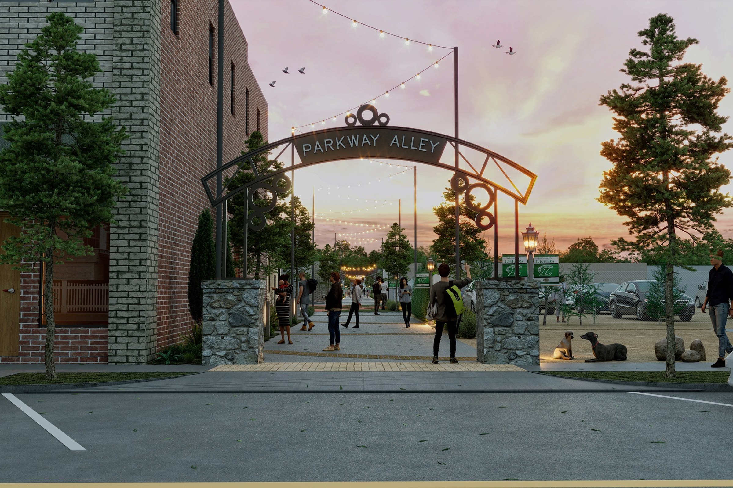
At three metres the building leaves the frame and the place arrives. You are no longer assessing a proposal; you are standing in it, and the things that matter become width, enclosure, shade, light, whether the paving changes underfoot, whether you would slow down here or hurry through. It is the hardest rung to fake and the most persuasive one to include, because a reviewer who can feel the space stops interrogating the drawing. The frame below is exactly that view — under the gateway, string lights overhead catching the last of the sun, the lane narrowing between a brick flank and stone piers, people at true scale standing about in ones and twos, a couple of dogs, banners on the lamp posts. Nobody looking at it is thinking about massing. That is the point of the rung: it answers a question the other five cannot reach.
The distance materials are actually judged at
One close view spends less than a materials board and settles more.
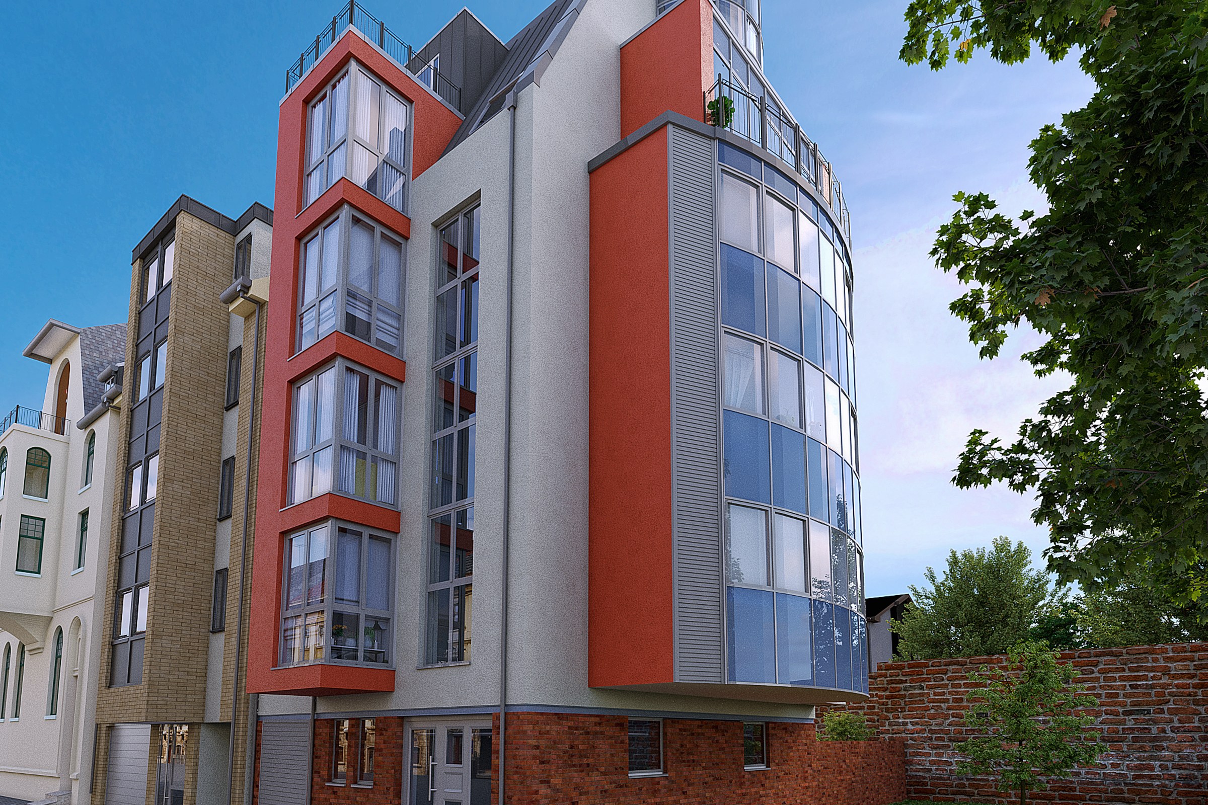
The last rung is a metre away, and it exists because material comments are never really about the material. They are about the junction: how a panel returns at a corner, how deep the reveal is, where a banding course dies into a soffit, what the window sits in. None of that survives at forty metres and none of it can be inferred from a swatch. One tight frame usually retires an entire round of questions — and, handled honestly, it also tells the room how far you have actually committed, which is a useful thing to control rather than leave to interpretation. The view below is at that range: the curved glazed bay meeting a ribbed grey panel, a flat red render field turning the corner beside it, a brick plinth with a wide sill running under the whole thing, and the neighbouring building close enough to compare against. Everything a materials question would ask is already in the picture.
Plot your last packet and the hole shows up
Write the approximate distance under every view you submitted. Sort them far to near. You are not scoring the images — you are looking for the space between them.
The pattern we see most often
An overhead, a cluster of hero views, and one detail — with nothing at all where a person stands.
An even walk
The same number of images. Nobody has to teleport between two of them.
Illustrative — a sketch of a pattern, not a measurement of anything.
The repair is usually the cheapest thing in the set. Two views close most gaps: one from the far kerb, one at body distance. Neither needs new modelling, new material work or another lighting pass. They need a camera moved to somewhere a person could actually stand — which is, in the end, the only place any of this is ever judged from.
Three neighbours to this one, if your question is a different one: which exhibits belong in the packet at all, why the request lands where it lands, and what happens to your images after the packet leaves your desk.
“More detail” is often just the only sentence a reader has for I couldn’t get from that picture to this one.


