
Two angles are a conversation
A single render can only collect a verdict. It takes a second one before anybody can say why — which is where your design intent has been hiding all along.
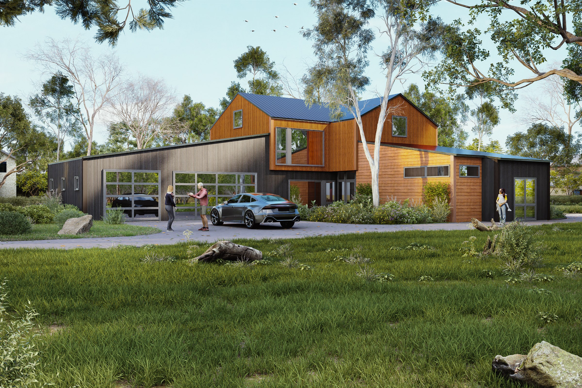
You have already decided how you feel about the house at the top of this page. You have seen one photograph of it.
That is not a criticism of you; it is how images work. A single finished render does not arrive as information. It arrives as a proposition — complete, resolved, faintly triumphant — and a proposition only takes two responses. You can accept it, or you can object to it. There is no third door. And because there is nothing in the frame to measure it against, an objection has nowhere to go except into adjectives: heavy. cold. busy. a bit much.
Every architect and interior designer we work with knows the week that follows. The adjectives cannot be answered, because they are not claims about the building — they are the shape of a feeling that had no vocabulary available to it. So the reply gets drafted and redrafted, the studio guesses at what was meant, a revision goes back, and the same adjective returns attached to a slightly different image. Two rounds in, everybody is being very polite and quietly furious. Nobody in that exchange is being difficult. They have simply been handed a format that can carry approval and complaint and almost nothing else.
Design intent very rarely dies in the render. It dies in the thread underneath it.
The fix is embarrassingly cheap, and it is not a better render. It is a second one. Two frames of the same scheme create something a single frame structurally cannot: an axis. The moment there are two, the eye stops judging and starts comparing, and comparison drags reasons out of people whether they intended to give them or not. “It looks heavy” becomes “it looks heavy from the drive and right from the garden” — and that is not a complaint at all. That is a design question, with an answer, that the two of you can now have out loud in four minutes.
Below are five pairs from our own library. Each is two genuine views of one scheme — no before-and-after, no trickery, just the second frame most sets never send. Under each, the sentence that frame tends to produce on its own, and the question that only exists once both are up.
The same building, twice — and what the second frame unlocks
Read the two captions first. Then read the gold line underneath, which is the only sentence in each pair worth a phone call.
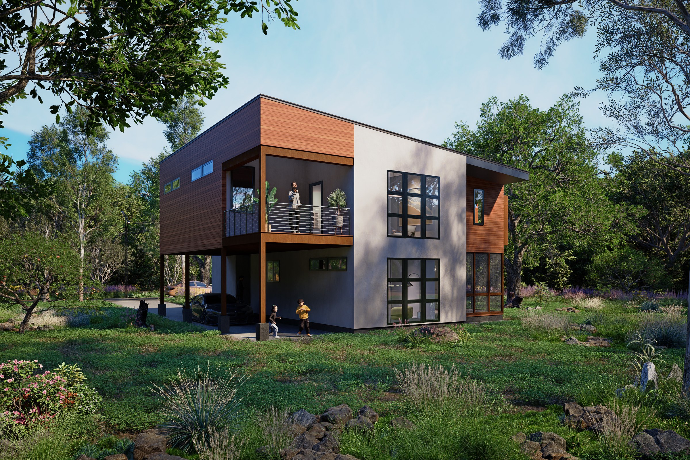
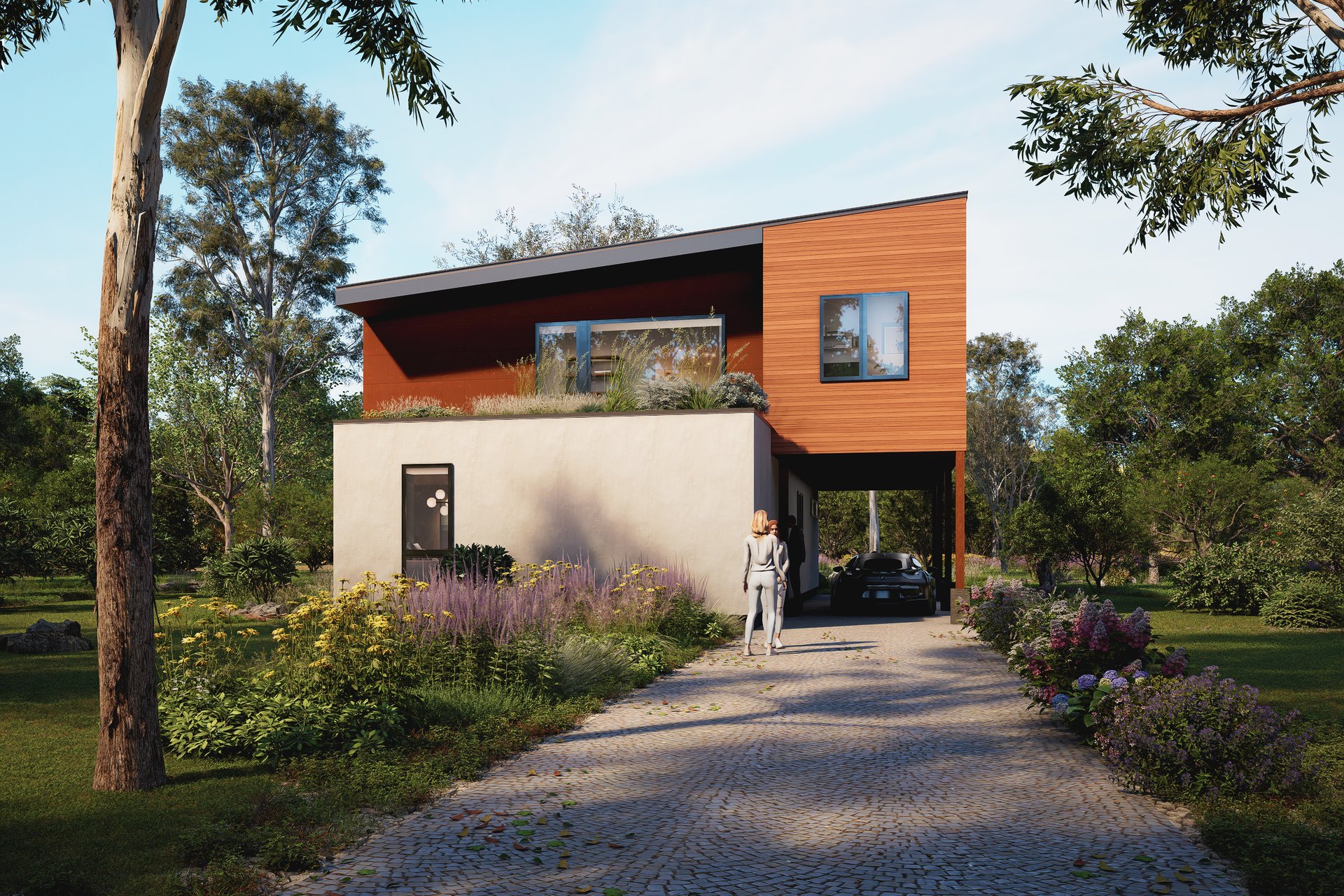
“The upper floor floats.”
“The upper floor is sitting on top of me.”
Which of those two moments are we designing for — and how many seconds a day does each one last?
The same cantilever, two weights
Nothing changed but where the camera stood.
Mass is not a property of a building. It is a relationship between a building and a person, and it moves when the person does. From the meadow this upper box reads as a plane held clear of the ground — the posts disappear, the shadow under it does the work, the whole house looks lighter than it is. Walk up the drive and stand beneath the same element and it is not a plane any more, it is a ceiling: you are under it, the void reads as a mouth, and the word that arrives unbidden is heavy. A one-frame set has to choose, and whichever frame it chooses quietly becomes what the building is for everyone who was not in the studio. The pair does something a single image cannot: it makes the trade discussable. Thinner posts, a lighter soffit, lifting the deck a course — all of those are real moves, and none of them is worth making until everyone in the conversation has agreed which of the two readings the project is actually being judged on. Nine times out of ten the architect already decided that months ago and simply never had an occasion to say it out loud.
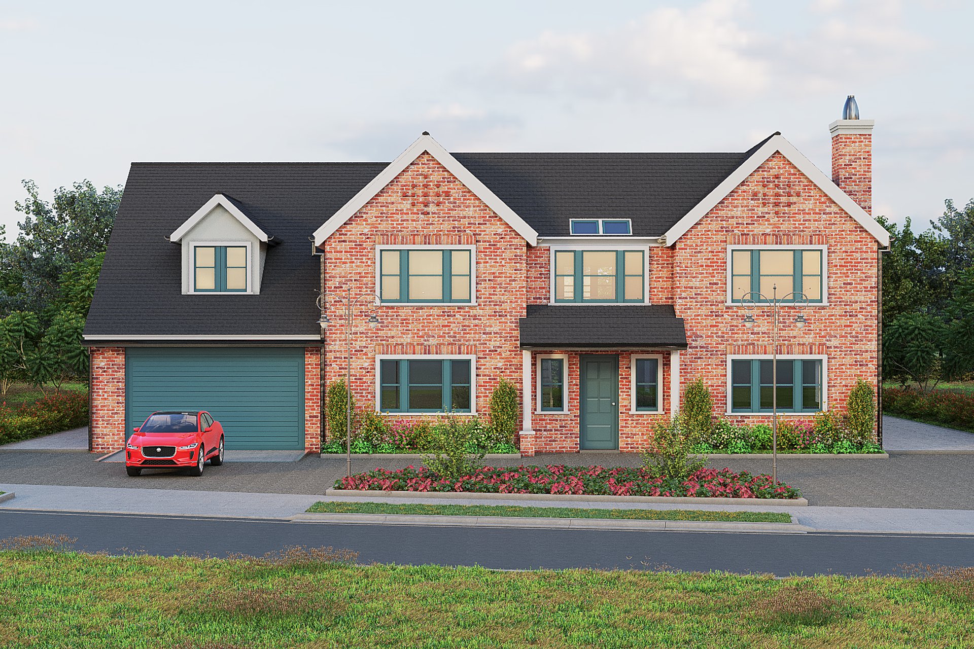
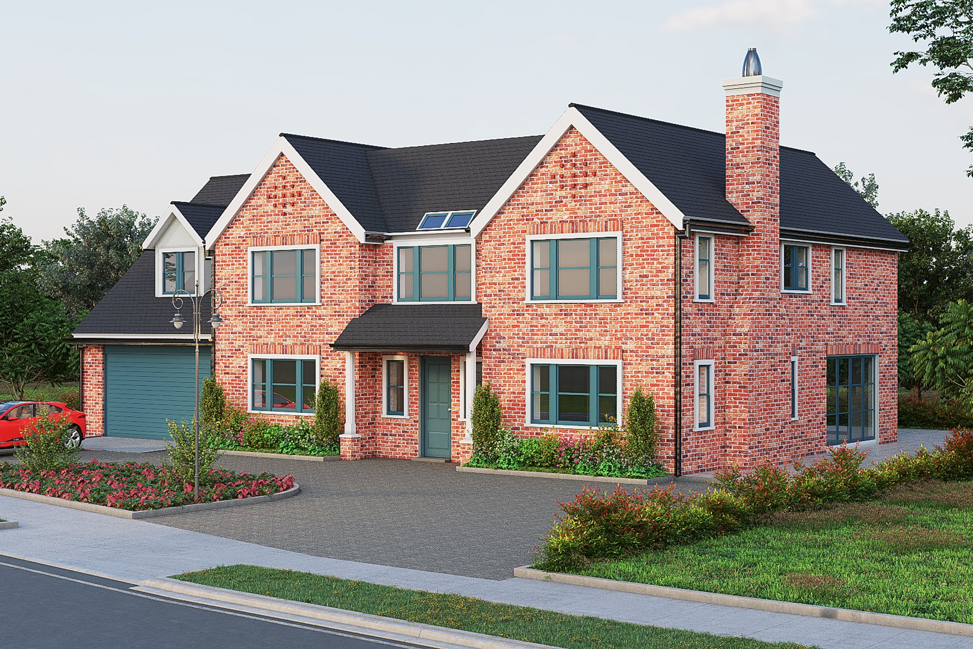
“The window rhythm looks a bit off.”
“Oh — it turns the corner.”
Are we resolving an elevation, or a building — and which one will anyone actually meet first?
A frontal frame is a drawing of the façade. Not of the building.
Compress a scheme into one plane and every note you get back will be about that plane.
The near-frontal view is the most obliging image in archviz: it is legible, it is symmetrical, it photographs the design the way the design was drawn, and it is almost useless for a conversation. Everything that makes the scheme a building — the chimney stack running up the flank, the depth between the two gables, the way the entrance is recessed, what happens where the plot turns — is inferred rather than seen. So the notes that come back are notes about a flat composition: window rhythm, the colour of a garage door, whether the porch reads as central. All legitimate. All shallow. Step around to the corner and the same client is suddenly talking about massing, about the return elevation, about what the neighbours on the side road will see — which is what the drawing set is going to have to resolve anyway. Show only the obliging frame and you get obliging notes, and you will spend a revision round tuning the surface of a building nobody has yet had a chance to discuss.
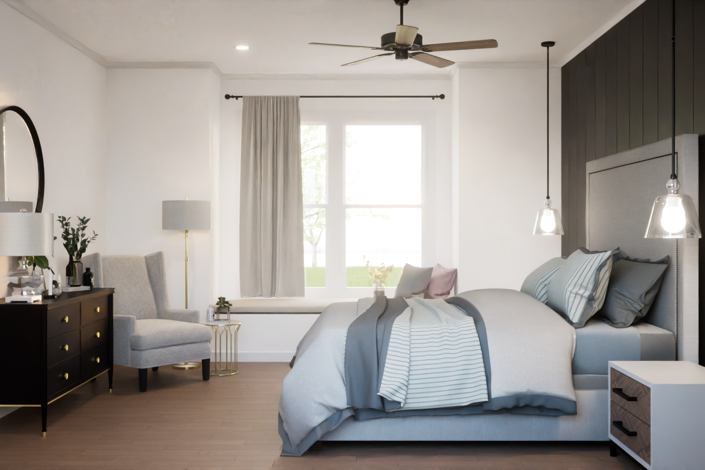
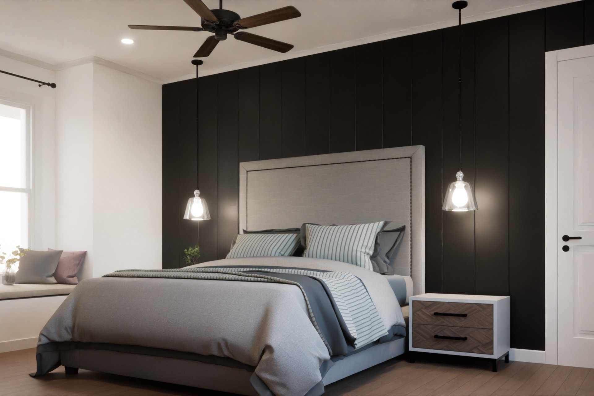
“A lovely light bedroom.”
“Why is the bedroom so dark?”
How much of this room is the dark wall allowed to be?
One of these frames contains the idea. The other contains the room.
An interior scheme usually has exactly one move in it. Half your views will not show it.
This is the interior failure in its purest form, and it is the one that costs designers the most goodwill. The move here is a single full-height dark panelled wall behind the bed; everything else — the cream walls, the pale bedding, the window seat, the warm floor — exists to make that wall land. The first frame is taken from in front of the panelling, so the panelling is a sliver: the room reads pale, calm and utterly safe, and it will be approved instantly, for a reason that has nothing to do with the design. The second is taken looking at it, so the wall is most of the image and the room reads dark and committed. Neither frame is a lie, which is exactly the problem. Sent alone, either one starts a conversation about a room that does not exist — one client signs off a pale bedroom and is startled later; another kills a dark wall they were never shown the point of. Put both up and there is only one question left, and it is a good one: proportion. How much wall, how high, how far it wraps. That is a question a designer answers with a drawing rather than a defence.
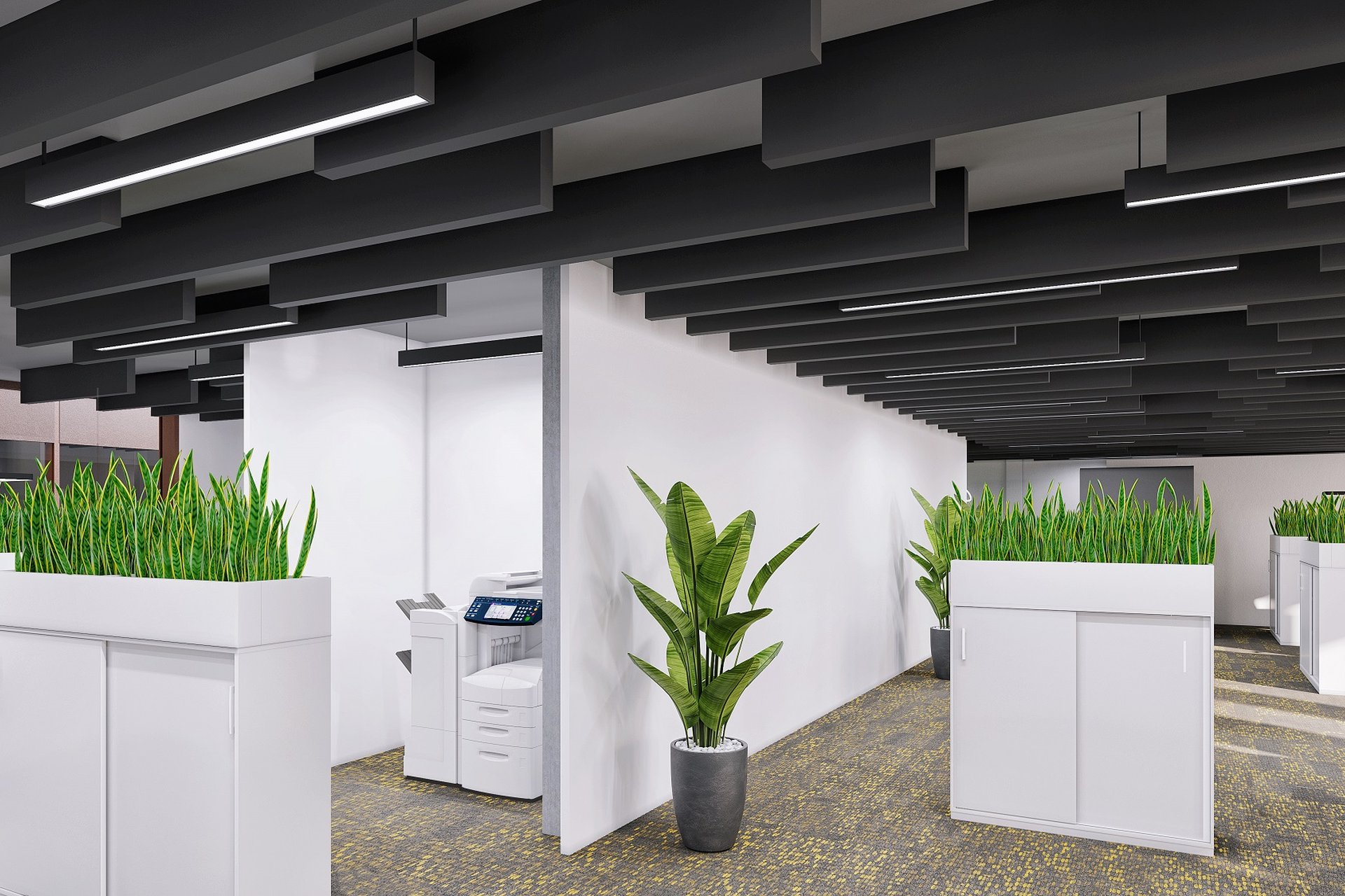
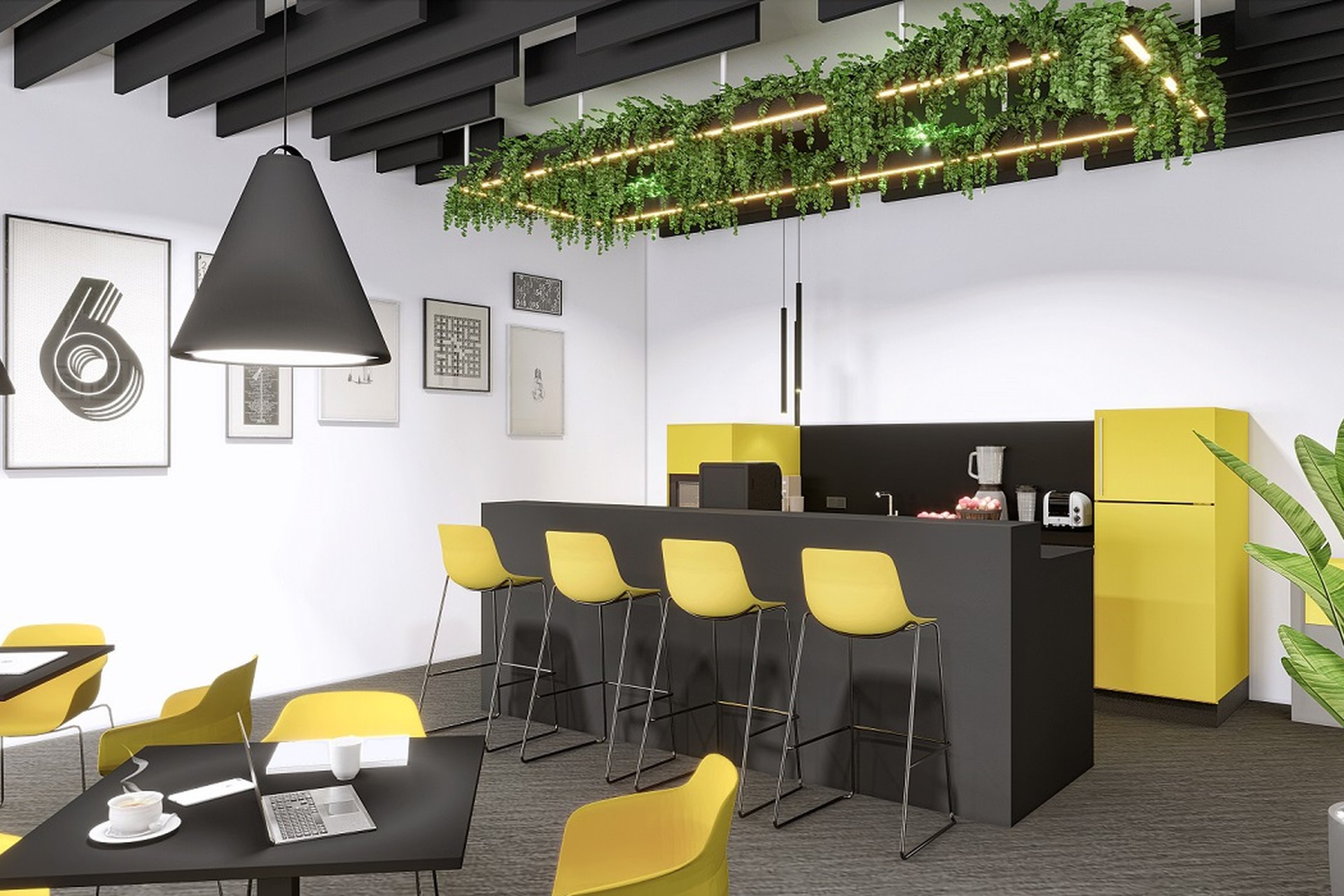
“Fine. It’s an office.”
“Love it — keep the yellow.”
Are we approving how it works, or how it looks — and which of the two do we need to still be right in three years?
The plain frame and the pretty frame approve different things
Only one of them survives the furniture schedule.
A workplace scheme carries two arguments at once. There is an organisation — how the floor is divided, where the acoustic relief sits, how far anyone has to walk to daylight, what the ceiling is doing — and there is a palette. The wide frame carries the organisation, and it is deliberately unglamorous; nobody puts the printer on the cover of a deck. The corner frame carries the palette, and it is the one that gets forwarded, screenshotted and pinned. Send only the corner and a client falls in love with yellow and is surprised, much later, by a plan. Send only the floor and there is nothing to want, so the scheme drifts and the sign-off never quite happens. One of each is not a bigger package; it is a more honest one. It lets the person approving know which of the two things they are approving, which is the difference between a decision that holds and a decision that gets quietly reopened when the furniture arrives.
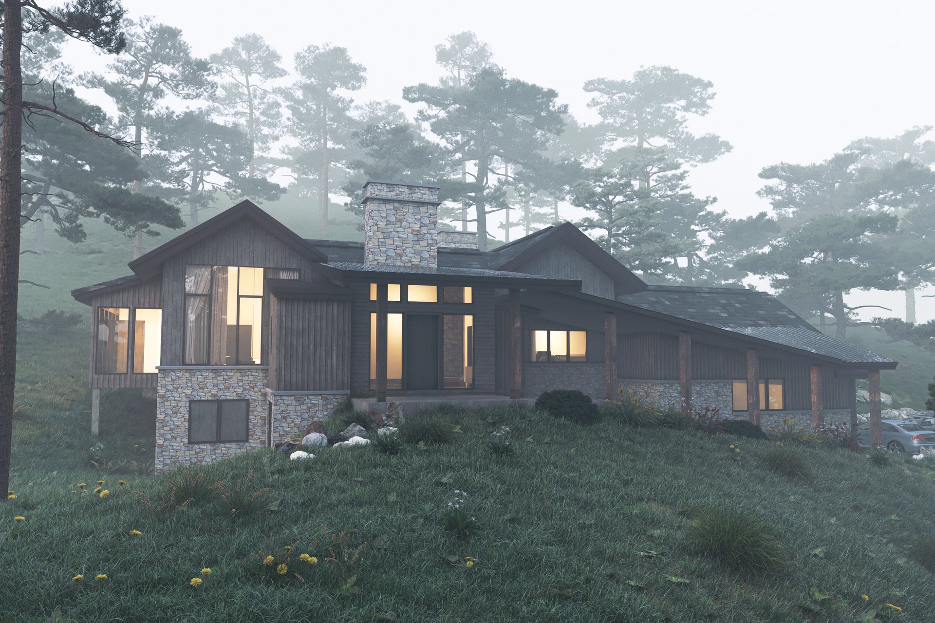
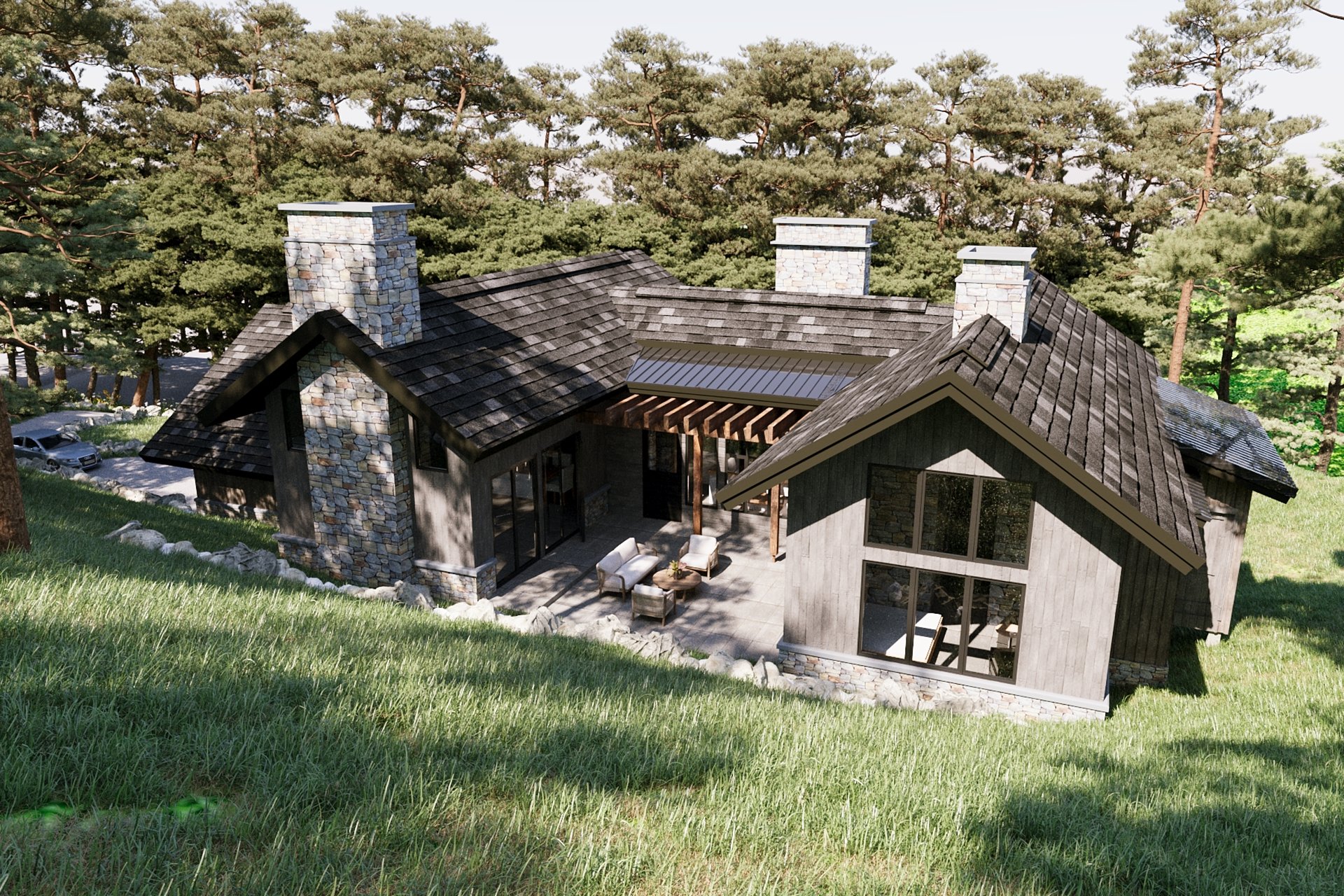
“This is beautiful.”
“The roof is very busy.”
Is the reaction to the building, or to the fog?
Atmosphere and information rarely travel in the same frame
And a client is entirely allowed to not know which one they are reacting to.
In the misty frame, three-quarters of the information is simply gone. The shingles are a texture, the stone is a tone, the pines are a suggestion, and the whole lodge is a warm-lit silhouette on a cold hill. It is genuinely lovely, and it is very close to useless as a basis for a decision. In the sunlit frame the design has nowhere to hide: you can count the shingle courses, read all three chimneys, follow the pergola, see exactly how four roof planes meet. Same building, same materials, opposite jobs. Worth saying plainly — these two also differ in where the camera stood, not only in the weather, and that is precisely how it happens in practice: nobody re-renders the moody angle in flat light for the sake of rigour, so mood and design arrive welded together and any reaction to one is partly a reaction to the other. The pair unwelds them. It is a slightly uncomfortable thing to send, because the second frame is the one where a detail can be criticised — which is the whole argument for sending it. Praise for the misty frame is not approval, and criticism of the sunlit one is usually about something you can fix in an afternoon.
One render is a proposal. Two are a question. Only one of those can be answered without an argument.
Three things that only ever arrive out loud
Two frames turn adjectives into questions. They still can’t tell you which question was urgent, what was already settled, or what any of it costs to change. That part has never once survived an email.
- 01
Priority
Which note is load-bearingIn an email every comment weighs the same, because a list has no volume control. Out loud, the one that actually matters arrives in the first thirty seconds — usually before anyone has finished the pleasantries, and often in a half-sentence the writer would never have typed.
- 02
Tolerance
What is decided, what is still openNo email volunteers this. Asked directly, in a room, everybody answers it happily: the roof pitch is fixed, the cladding is a placeholder, the landscape is a hope. Ten minutes of that saves an entire round of us carefully rendering somebody’s assumption.
- 03
Cost
Minutes, hours, or a re-renderKnowing which changes are cheap changes what people ask for. It is the single most useful thing we can give away, and we would rather give it away early than have it discovered at the end of a revision cycle nobody enjoyed.
What a two-angle call actually is
Not a demo, not a deck, and nobody from sales. It is the shortest way we know to have the conversation this whole page is about, using whatever is on your screen today — your model or one of ours.
- 0–3 min
The pair goes up
Two angles of one scheme, side by side, and no commentary from us. You say what you see first — including, please, the unflattering half.
- 3–10 min
Which reading matters
Where people will actually stand, which of the two the project is being sold from, and what the second frame just made discussable that the first could not.
- 10–15 min
Decided vs open
We mark, out loud, which parts of the image are your design and which are our assumption. You correct the assumptions. That list is usually shorter than either side expects.
- 15–20 min
What each move costs
Honest units — minutes, hours, or a genuine re-render — against every change named in the previous fifteen. Then you decide what is worth doing.
Twenty minutes, two frames, and a list of what each change really costs. If the honest answer is you don’t need us yet, that is a perfectly good outcome and we will say so.
None of this is an argument against a beautiful single image. The hero frame is the one that makes someone want the building, and wanting it is most of the job. The argument is narrower: a hero frame is a closing instrument, and it is being asked, in most practices, to do the work of a working instrument as well. Give it a partner and it goes back to what it is unbeatable at — while the second, plainer frame quietly absorbs every note that would otherwise have arrived as an adjective.
Neighbours, if your question is a different one: how to choose the single angle that carries a scheme (this page is its argumentative sibling — that one picks the best frame, this one says no single frame can hold a conversation), the five minutes of brief that prevent the first round going wrong, and why a render reads as real, and why it usually isn’t the building.


