
What Stops a Scroll When the Building Doesn't Exist Yet

A buyer decides whether to stop in about the time it takes to blink twice. The building they’re judging isn’t there yet, so the picture has to be the building.
Nobody scrolling a feed is looking for your project. They’re looking for a reason to stop. With off-plan work there is no site to visit and no sample flat to walk through, so whatever appears on the screen for those first seconds carries the whole scheme.
That sounds like a marketing problem. For an architect it is mostly a design problem, and that is good news: the things that earn the pause are the things you already decided. The risk is that a rushed image throws them away.
Here are the three that matter most, and what each one asks of the render.
1. The silhouette has to read before the detail does
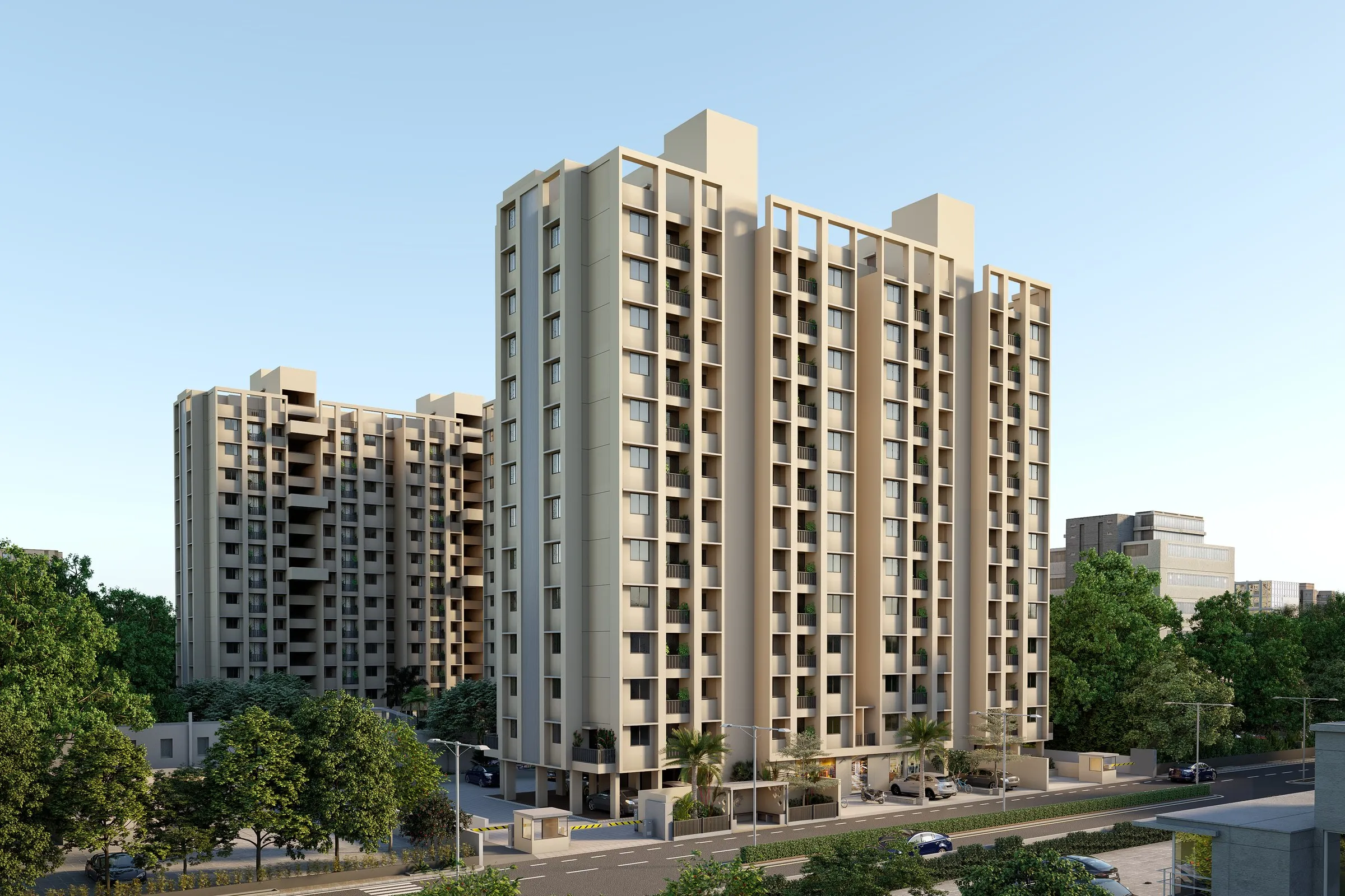
On a phone, a building is a shape first. The rhythm of the balconies, the way the crown steps against the sky, the way the two blocks sit relative to each other: all of it registers before anyone could name a material.
That is worth protecting. A frame that crops in too tight, or tilts the camera to make the tower feel taller than the drawings say, trades a true silhouette for a dramatic one. The honest version, like the one above, lets the massing do the work: a clear sky, a camera at a believable height, and the repetition of the facade doing what the architect intended it to do.
What to ask for: the view from which the building is first seen in real life, not the view that flatters it most.
2. Context is what makes it feel like a place
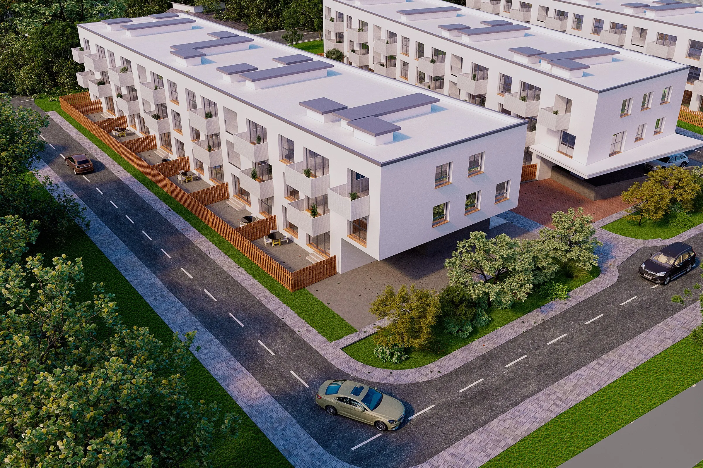
A building alone on a white background is an object. A building with a street, a fence line, a few cars and a line of trees is somewhere a person could live.
This is also where design intent quietly survives or doesn’t. The relationship between the ground-floor terraces and the pavement, the way a covered parking edge meets the road, the setback from the neighbouring trees: none of these are decoration. They’re the parts of the scheme that answer “what would it be like to come home here?”, and a buyer feels the answer even if they couldn’t say why.
What to ask for: the surroundings drawn from the real site conditions, with the plan’s own landscape and access shown as designed.
3. Human scale beats polish
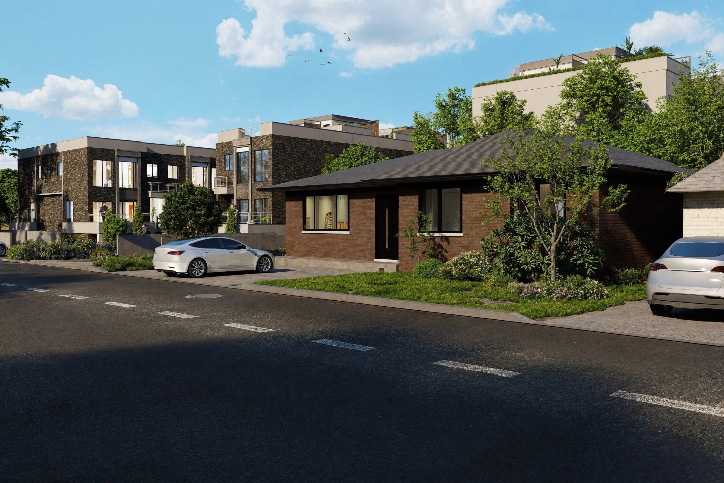
The images that hold attention are rarely the shiniest. They’re the ones where you can tell how tall the doorway is, where there’s an existing neighbour in frame, where the windows are lit and a person is standing on a balcony.
Showing the new homes beside an ordinary existing house is a small act of confidence. It says the scheme isn’t hiding from its surroundings. It also keeps the image honest, which matters when a buyer will eventually hold the finished building up against the picture.
What to ask for: one frame at street level, at the height a person would actually see it, with the neighbours left in.
The brief that keeps all three intact
If you’re commissioning visuals for an off-plan launch, a short brief goes a long way:
- The approach view. Where does someone first see this building in real life? Start there.
- The context to keep. Name the neighbours, trees and street edges that are part of the story and shouldn’t be tidied away.
- The fixed points. The proportions, materials and balcony or terrace details that are not up for reinterpretation.
- What is still open. Say so plainly. A good collaborator will leave undecided things undecided rather than inventing them.
Revisions then become a conversation about whether the picture matches the building you designed, not a negotiation about taste. That is the difference between a visual partner who reads the drawings and one who redraws the scheme.
Working on a scheme that’s about to go to market? Tell us the approach view and what must not change, and we’ll send back a free angle idea that respects both.


