
Project Twee Facility
A three-storey institutional building, rendered as a full-length elevation and a boundary-condition detail — the whole run legible in one frame, the site edge resolved down to the fence line.
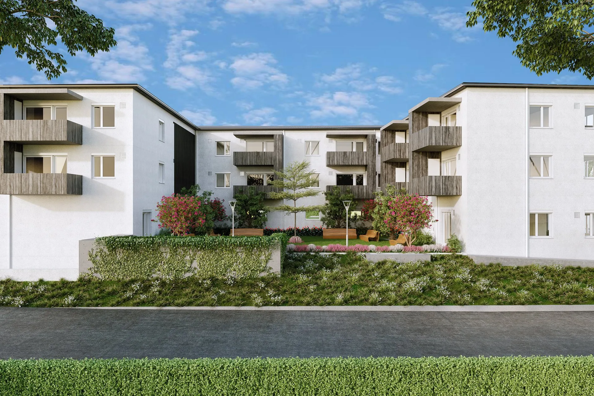
Every review submission earns or loses ground on legibility — can a reader who has never visited the site follow the building, and the ground it sits on, from the images alone? Project Twee Facility needed exactly that: a full elevation and a boundary condition, both resolved to review-board standard.
Institutional Exterior
- Exterior Visualization
- Landscape & Context
- Material Studies
- Boundary Resolution
- Full-Length Elevation
- Site-Boundary Detail
- Print & Web Ready
A full elevation, not a hero angle
Three storeys in white render and dark timber-slat cladding, continuous balcony bays reading consistently from one end of the building to the other, set behind a landscaped courtyard — lawn, flowering shrubs, a low retaining wall, benches and a lit path. Nothing in the frame could be a generalization: if a run of balconies is going to be measured against itself, every bay has to hold up in one continuous read.
Where the site actually ends
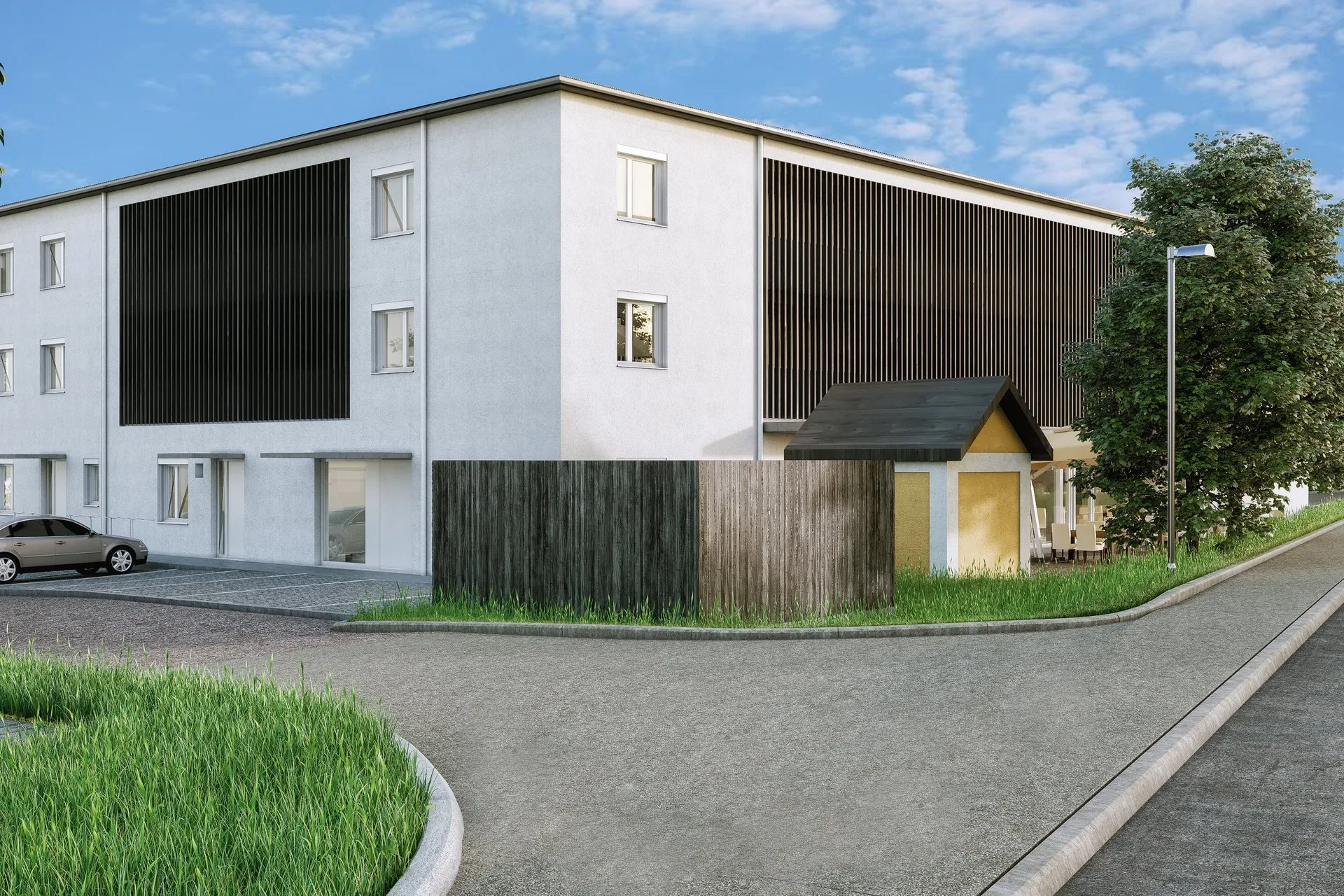
The harder job in this set was the less glamorous view: the property edge. A two-tone timber boundary fence, a small gable-roofed outbuilding, mature planting, and a car parked at the kerb doing the work of a scale reference. It's the view a review board reads hardest, because it's the one most submissions leave to a site plan instead of a render.
What a review-ready set has to carry
One continuous elevation
The whole run has to hold together as a single frame — not a partial crop that could be hiding a bay that doesn't match its neighbours. A board reading a submission wants the building, not a highlight reel of its best angle.
The boundary, not just the building
The harder job is usually the least glamorous view: where the site actually ends. A fence line, a small outbuilding, the planting at the edge — drawn with the same care as the facade, because that's where a reviewer's eye goes looking for what wasn't shown.
Materials that survive scrutiny
White render against dark timber-slat cladding only reads as two considered materials if the roughness, the shadow depth in the slats, and the reflectance of the render coat are all correct at once — get one wrong and the wall reads flat.
Scale nobody has to take on faith
A parked car, a bench, a lit path — ordinary things doing the job of a scale bar, so a reader can judge the balcony depth and the fence height by eye instead of by caption.
It's the format we use whenever a firm needs the whole building — and the ground it sits on — read correctly in one look.
- Full elevation, bay to bay
- Boundary drawn, not implied
- Materials that hold at review distance
- Scale you can judge by eye


