Transitional Master Bedroom Dark Panel — Case Study
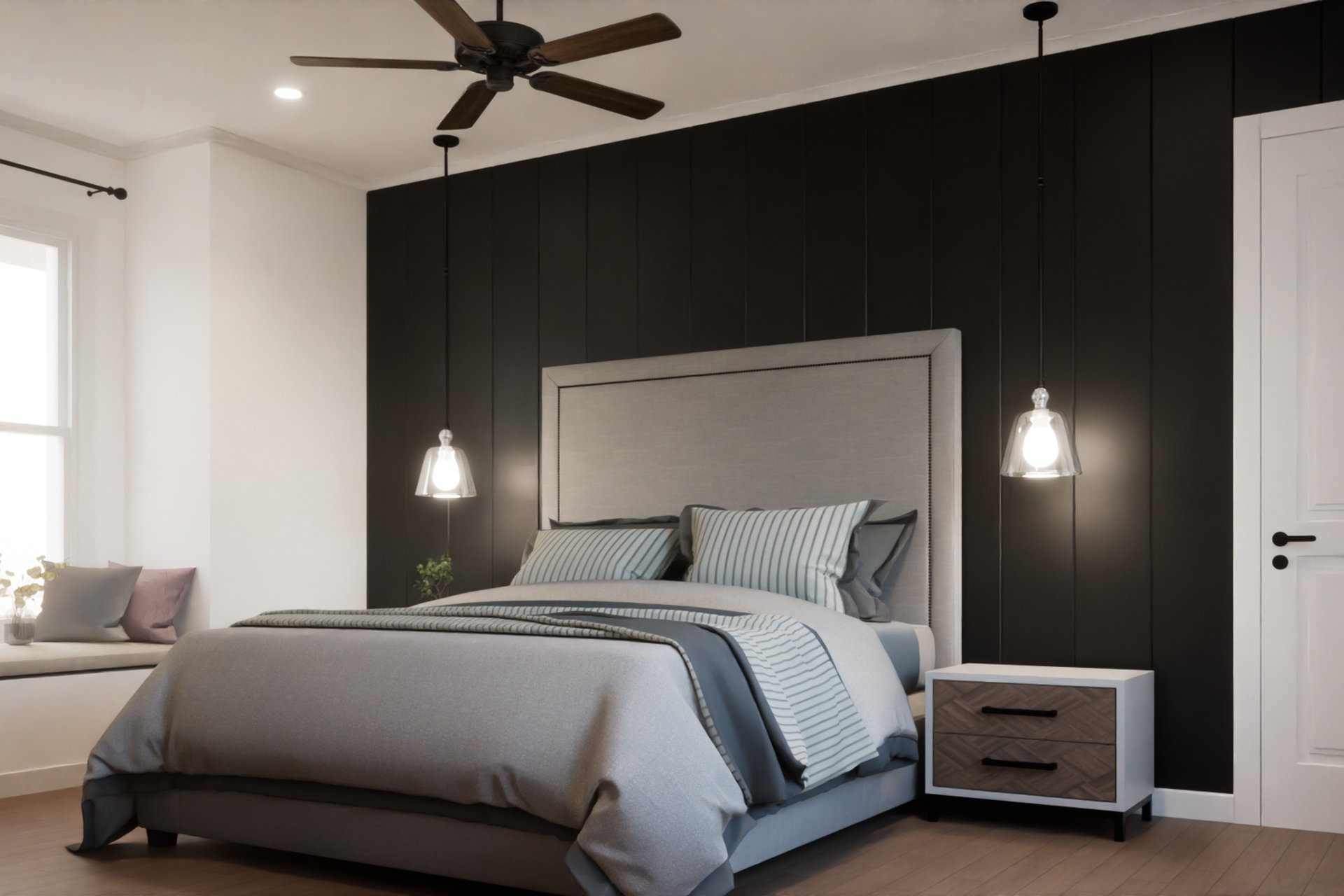
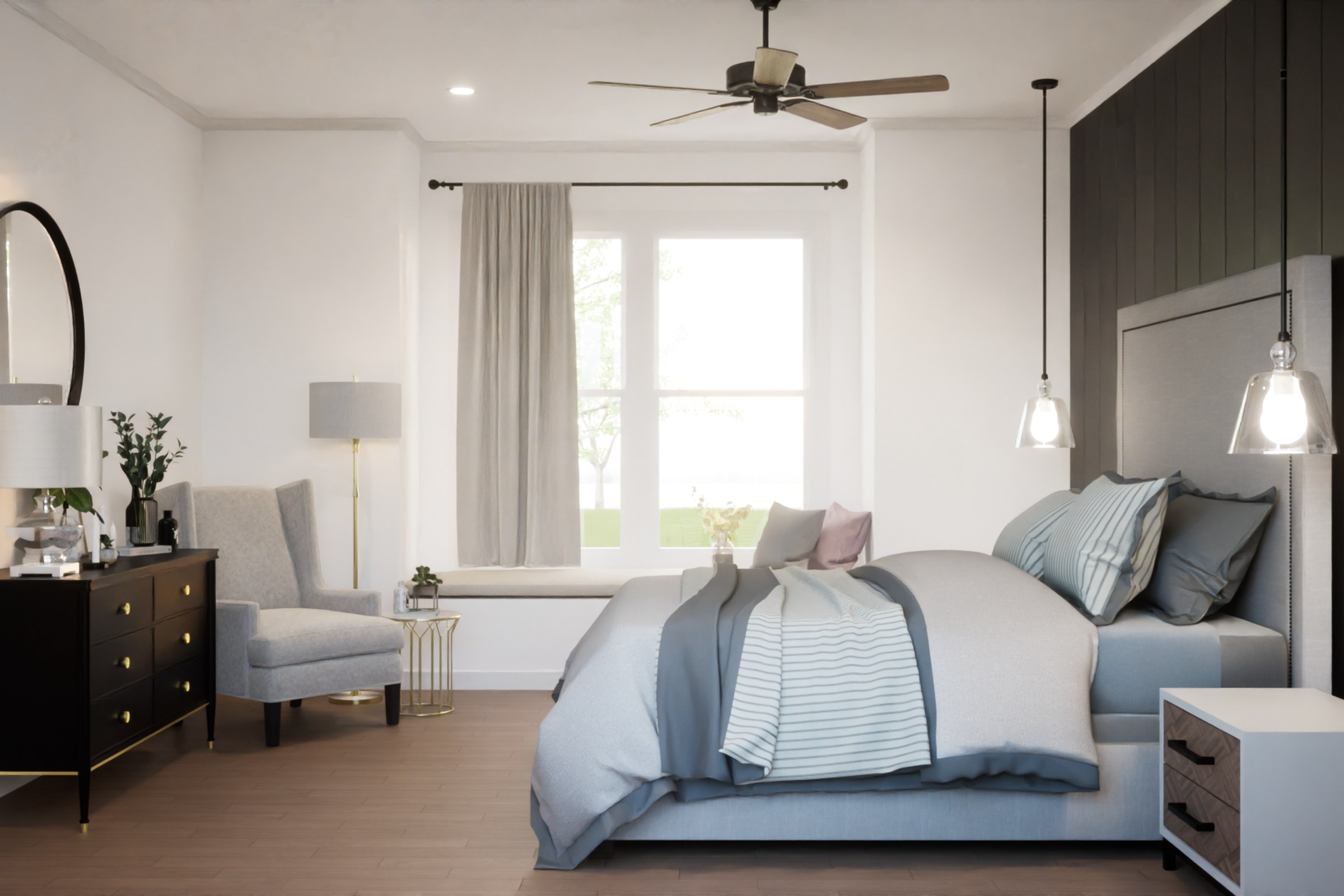
Transitional master bedroom with black paneled accent wall, gray upholstered bed, pendant lights, dark dresser, window seat, ceiling fan, and hardwood flooring.
Client
Kahn Architects
Industry
Residential Interiors
Objective
Transitional Bedroom Visualization
Deliverables
Photoreal residential living spaces renders, multiple viewpoints, marketing-ready output
Overview
A transitional master bedroom is one of the harder residential briefs to render well. The style sits between traditional and contemporary, which means it has to feel warm without leaning rustic, and refined without feeling cold. Get the balance wrong and the image reads as a furniture catalogue.
This 2023 commission for Kahn Architects in San Francisco asked for visualization of a master bedroom defined by a black paneled accent wall, a gray upholstered bed, pendants flanking the headboard, a dark dresser, a window seat, a ceiling fan, and hardwood flooring. The materials list is short. The tonal range is brutal.
The stakes were straightforward. The architect needed images that could carry both internal design review and the client-facing presentation deck. That meant the renders had to survive being projected on a wall, printed on a board, and scrolled past on a phone. The same frame, three reading distances.
What did the brief actually demand?
On paper, a single hero room. In practice, a controlled study in contrast management. The dark panelling absorbs light. The hardwood reflects it. The upholstered bed sits between them, and the entire composition lives or dies by how those three values speak to each other under one believable lighting condition.
The architect supplied the layout, finishes schedule, and intent. Our scope:
- Translate the panelled wall into a render-grade material with real depth
- Resolve the cohabitation of pendant light, ceiling fan, and accent wall
- Stage the window seat as a secondary focal point, not an afterthought
- Deliver imagery that holds up in both warm evening and cool daylight states
- Match upholstery and dresser tones to the architect’s spec, not approximate them
None of these are exotic asks. All of them are where transitional bedroom renders typically fail.
Where do most residential bedroom renders go wrong?
The honest answer is: in the panelling, the bedding, and the lighting hierarchy. These three failure modes recur across briefs we audit.
Panelling gets modelled as flat geometry with a bump map. Under any directional light, the reveals collapse and the wall reads as wallpaper. Real panelling has shadow lines you can measure. Skip the geometry, lose the presence.
Bedding is the second trap. A gray upholstered bed with hospital-tight linen looks like a showroom prop. The eye registers it as fake before it registers anything else in the frame. A bedroom render needs textile that has been slept in, or at least sat on.
Lighting hierarchy is the third. Pendants, a ceiling fan with potential downlight, ambient daylight from the window, and the absorption of a dark feature wall, all competing for the same exposure budget. Without a planned hierarchy, the image goes muddy.
A dark accent wall is not a material problem. It is an exposure problem, and it has to be solved before the first render goes out.
How we approached it
We ran the project across four phases. Each one closed before the next began, with the architect’s sign-off on intent before we committed render time.
1. Reference alignment and material study
We started with the finishes schedule and a closed conversation about what “transitional” meant for this specific room. Transitional is a vague word in catalogues. Here it meant: traditional panel proportions, contemporary tonal palette, no ornamental moulding.
We built a small material study, not a full render. Three panel finishes, two hardwood tones, two upholstery grays. Reviewed flat, against each other, at the actual contrast ratio they would face in the final frame. This caught one wood tone that would have read orange against the panelling under warm light.
2. Geometry and panel modelling
The accent wall was modelled with real reveals, not displacement. Stile and rail widths were specified by the architect, so the panel grid is dimensionally correct rather than artistic. Ambient occlusion along the panel edges does the work it is supposed to do, which is to give the wall depth without the need for raking light.
The ceiling fan was modelled, not kitbashed. A library asset with the wrong blade pitch would have undermined the period cues the panelling sets up. The pendants were placed to the architect’s centreline, not eyeballed.
3. Lighting and camera planning
Two lighting states were built: a daytime read using HDRI lighting through the window, and a low evening state where the pendants and ambient warm fixtures carry the room. Both were locked before any beauty render started.
View planning was deliberate. We worked three angles:
- A wide hero from the foot of the bed showing panelled wall, bed, and pendants
- A three-quarter from the window seat back toward the dresser
- A tight crop on the headboard wall as a material-led detail
The wide hero used a 35mm-equivalent lens choice to keep proportions honest. Wider would have flared the panel grid into a fish-eye read. Tighter would have lost the ceiling fan, which the architect wanted in frame as a deliberate transitional cue.
4. Materials, render, and final compositing
PBR materials were authored for the panelling, the dresser veneer, the upholstery weave, and the floor. The hardwood used a real plank-length variation; identical-length boards are one of the fastest ways to make a render look synthetic. Subtle ray-traced reflections in the floor carry light from the window into the darker side of the room.
The black wall was held back from full black. A wall that crushes to zero loses the panel detail and dies on print. We kept the darkest reveal a few values above pure black so the geometry survives a CMYK conversion.
Deliverables
| Type | Quantity | Notes |
|---|---|---|
| Hero stills | 3 | Wide, three-quarter, headboard detail |
| Lighting variants | 2 per angle | Daylight and evening |
| Material detail crops | Multiple | Panel, floor, upholstery |
| Revision rounds | 2 | Included in scope |
| Final delivery | TIFF + JPG | Print-ready and web-ready |
Turnaround on the package was inside the architect’s review window, with both lighting states delivered together so the team could compare side by side rather than sequentially.
What it delivered
The architect used the imagery in two contexts we know about. The wide hero went into the design presentation. The detail crops went into the material conversation, where they replaced physical samples for finishes that were not yet on site.
For the people commissioning this kind of work, that second use is the underrated one. A render that resolves a material conversation in one meeting saves a fortnight of sample shipping. The image stops being a marketing asset and starts being a working document.
Specific outcomes from the package:
- Two lighting states from one geometry build, no rework
- Panel wall held detail in both web and print output
- Material crops used in lieu of physical sample boards
- Three angles delivered inside the agreed review cycle
Key takeaways
-
Dark walls are an exposure problem before they are a material problem. Plan the histogram before you assign the texture, or you will rebuild the lighting twice.
-
Panel proportions cannot be faked with maps. If the architect specified stile and rail widths, model them. The geometry survives every output medium; a normal map does not.
-
Two lighting states from one build pays for itself. Daytime and evening on the same geometry gives the design team a comparative tool, not just two pretty pictures.
Working on a project that needs compelling visuals? Tell us about your project or explore our full portfolio.
Project Gallery