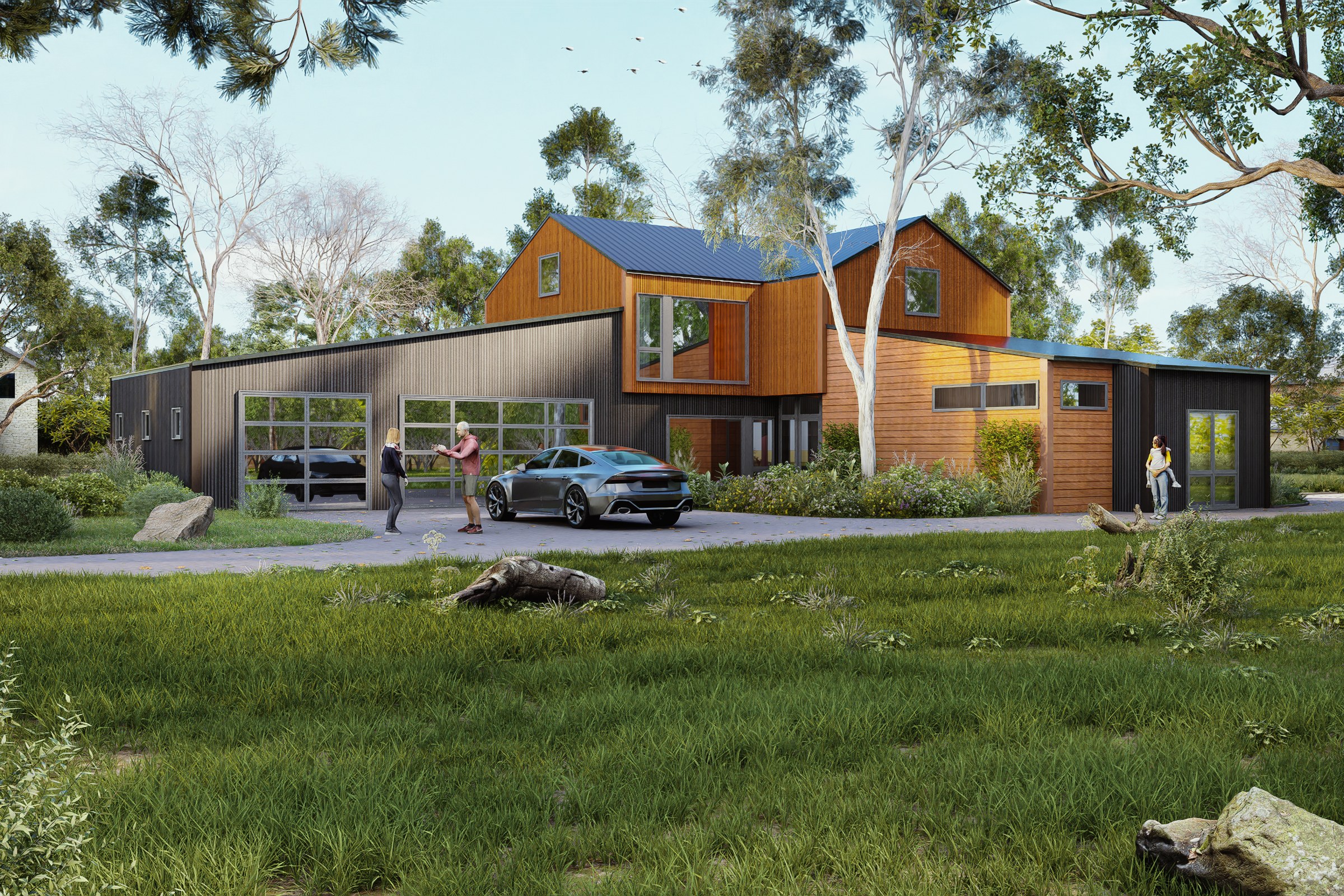
Barn Style Contemporary 118 — Case Study
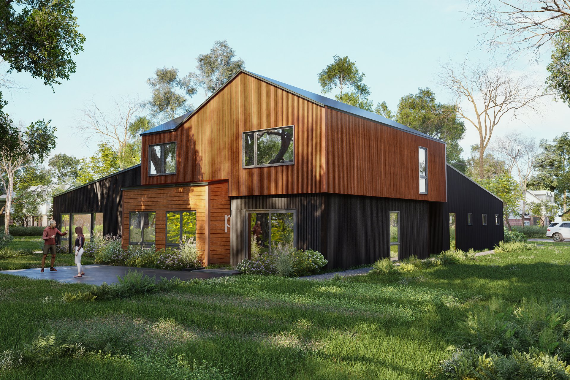
Primary front view of the barn-style contemporary home showing glass carport, timber and dark metal cladding, with people at the entrance.
Client
Henderson + Associates
Industry
Luxury Residential Architecture
Objective
Contemporary Single Family Visualization
Deliverables
Photoreal luxury residential exterior renders, multiple viewpoints, marketing-ready output
Overview
Barn Style Contemporary 118 is a primary front-view exterior visualization of a contemporary barn-form single family home in Seattle, produced for Henderson + Associates in 2025. The image carries the entire first impression of the residence. It must read at thumbnail and at 2-metre print without compromise.
The brief sat inside a familiar luxury residential constraint: a hybrid material palette of warm timber, dark metal cladding, and a glass carport that had to behave like architecture, not jewellery. Add figures at the entrance, and the frame becomes a habitation study, not a product shot.
That last point is what shaped most production decisions. A single hero exterior is asked to do publicity, planning support, and pre-sale work simultaneously. Each audience reads it differently, and the craft sits in resolving those readings inside one frame.
What did the brief actually demand?
The deliverable was a primary front view, but the workload behind it was wider. A barn-form silhouette is graphic and unforgiving. Any error in proportion, ridge alignment, or roof pitch reads instantly, because the form is so legible.
The material story compounded that. Timber wants warmth, dark metal wants depth, and the carport glass wants to disappear without flattening the volume behind it. Three competing optical behaviours, one frame.
Specific demands the design team flagged early:
- Carport glass had to read as transparent, not as a grey panel
- Timber grain needed direction, not just colour
- Metal cladding had to hold shadow without going muddy
- Figures needed to scale the entrance without dating the image
- The render had to survive both web crops and large-format print
Where do most luxury residential exterior briefs fail?
They fail at the intersection of material and light. A render that nails geometry but misreads how cedar reacts at low sun is technically correct and emotionally wrong. Architects spot this in seconds.
The second common failure is figure work. Stock entourage at the wrong scale, wrong era, or wrong wardrobe quietly cheapens an otherwise careful image. People at the entrance are the hardest element to get right, and the easiest to get visibly wrong.
A luxury exterior render is judged not on its geometry but on whether the materials behave the way an experienced eye expects them to behave.
The third failure is view planning. A front elevation rendered head-on is a drawing. A front view rendered with considered camera height, lens choice, and a small lateral offset becomes architecture.
The challenge
The barn-contemporary form is having a moment, which means the visual category is crowded and the bar for differentiation is high. Henderson + Associates needed an image that did not look like every other gabled timber-and-metal hero on the feed.
Three production tensions had to be resolved inside one frame:
- A graphic silhouette that flattens easily under wrong lighting
- A glass carport that risks reading as void, not as feature
- An entrance scene with figures, where staging slips into staged
We also had to leave the frame usable across mediums. A print-grade image and a feed-grade image are not the same image, and most pipelines quietly optimise for one at the expense of the other.
How we approached it
Production ran across roughly three weeks, structured so that each phase committed only what the next phase could verify. The shape below mirrors how we run most luxury residential exteriors of this complexity.
1. Source review and view lock
Before any modelling decision, the source set, drawings, elevations, reference photographs, and material specifications, was audited for consistency. Discrepancies between elevation and section were flagged and resolved with the architect, not assumed away.
The hero camera was locked early. Lens choice sat in a moderate range to avoid distortion at the gable, and camera height was placed at standing eye level to match how visitors will actually first see the house.
2. Material build and lighting study
Materials were built as PBR materials with measured roughness and reflectance values, not eyeballed shaders. Timber received directional grain and subtle weathering variation. Metal cladding carried a low-gloss finish tuned to hold shadow detail without crushing.
Lighting was tested across multiple time-of-day variants before committing to the hero condition. HDRI lighting anchored the ambient sky, with a directional sun pass set for late-afternoon Seattle latitude. Ambient occlusion was tuned conservatively so contact shadows read as architectural, not graphic.
3. Figures, glass, and final integration
The carport glass was the most delicate element. Ray-traced reflections were dialled to read transparency first and reflection second, so the structure behind the glass remained legible while the glass still felt material.
Figures at the entrance were placed for scale and narrative. Wardrobe was kept neutral and contemporary, posed in mid-action rather than staged tableau, so the image dates slowly. Final compositing balanced exposure across timber, metal, glass, and sky in separate render passes.
Results
The single hero front view shipped as the lead image for the project’s external communications. The deliverable package supported planning conversations, pre-sale collateral, and architectural portfolio use without recommissioning.
| Type | Quantity | Notes |
|---|---|---|
| Hero exterior still | 1 | Primary front view, print and web grade |
| Lighting variants | Multiple | Tested, single condition selected |
| Render passes | Multiple | Diffuse, reflection, AO, shadow, depth |
| Resolution outputs | 2 | Print master and web-optimised crop |
| Figure compositions | Multiple | Reviewed for scale and narrative fit |
What the image actually delivered for the team:
- A planning-grade asset that survives close inspection of materials
- A marketing-grade asset that holds at thumbnail in a feed
- A portfolio-grade asset that reads as architecture, not product
- A reusable lighting and material library for future views of the same house
For the architect, the practical value was confidence. The render matched the design intent closely enough that conversations with stakeholders moved past visualisation accuracy and into design substance.
Key takeaways
-
Materials carry the image. A barn-contemporary exterior lives or dies on whether timber, metal, and glass each behave the way a trained eye expects, under one consistent light.
-
View planning is design work. Lens, height, and offset decisions made before a single render starts determine whether the final frame reads as architecture or as elevation.
-
One hero, many uses. A correctly built primary view supports planning, pre-sales, and portfolio without re-rendering, which is where the actual return on a luxury residential exterior commission shows up.
Working on a project that needs compelling visuals? Tell us about your project or explore our full portfolio.
Project Gallery