Hans Rustic Retreat — Case Study
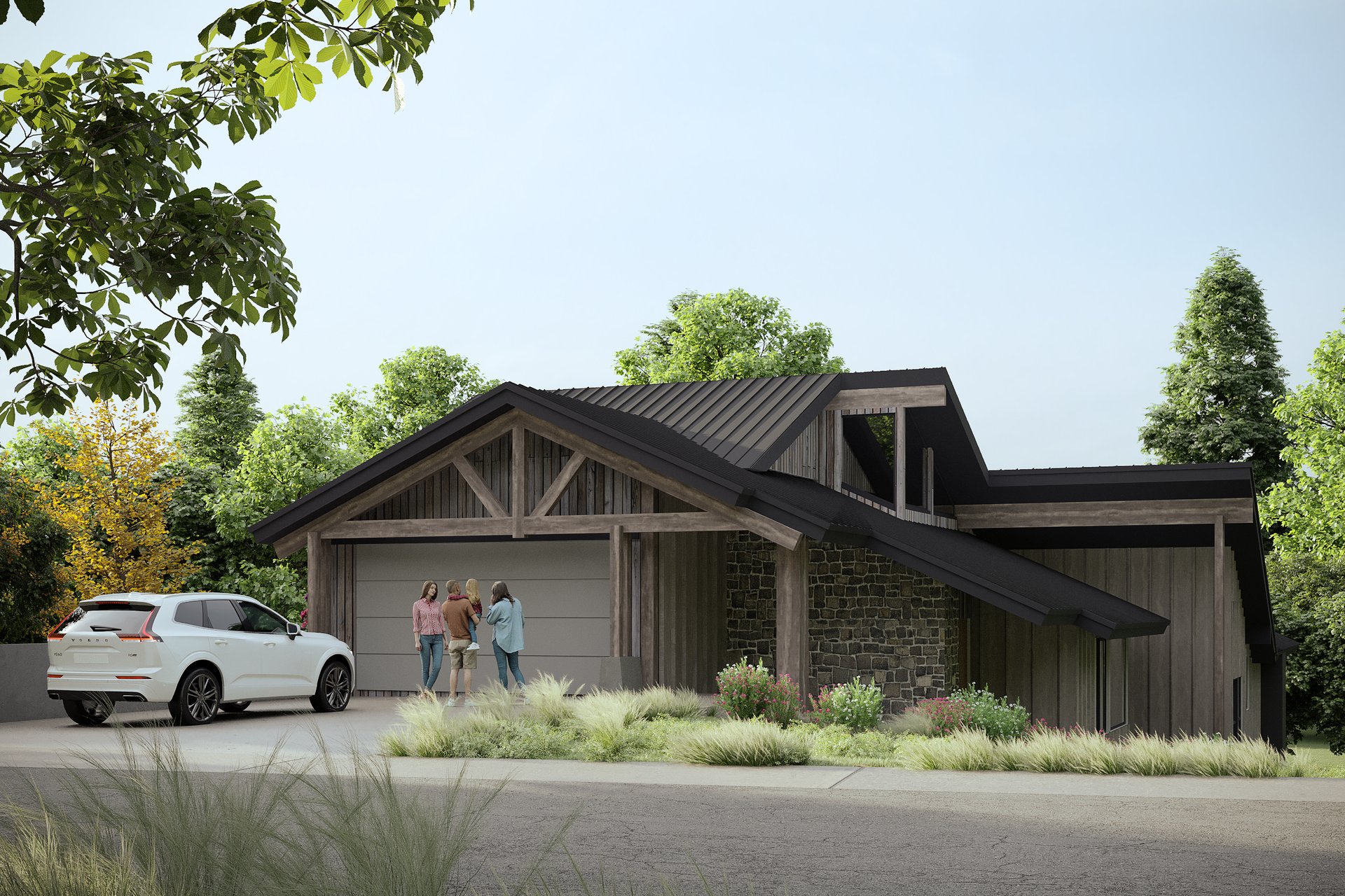
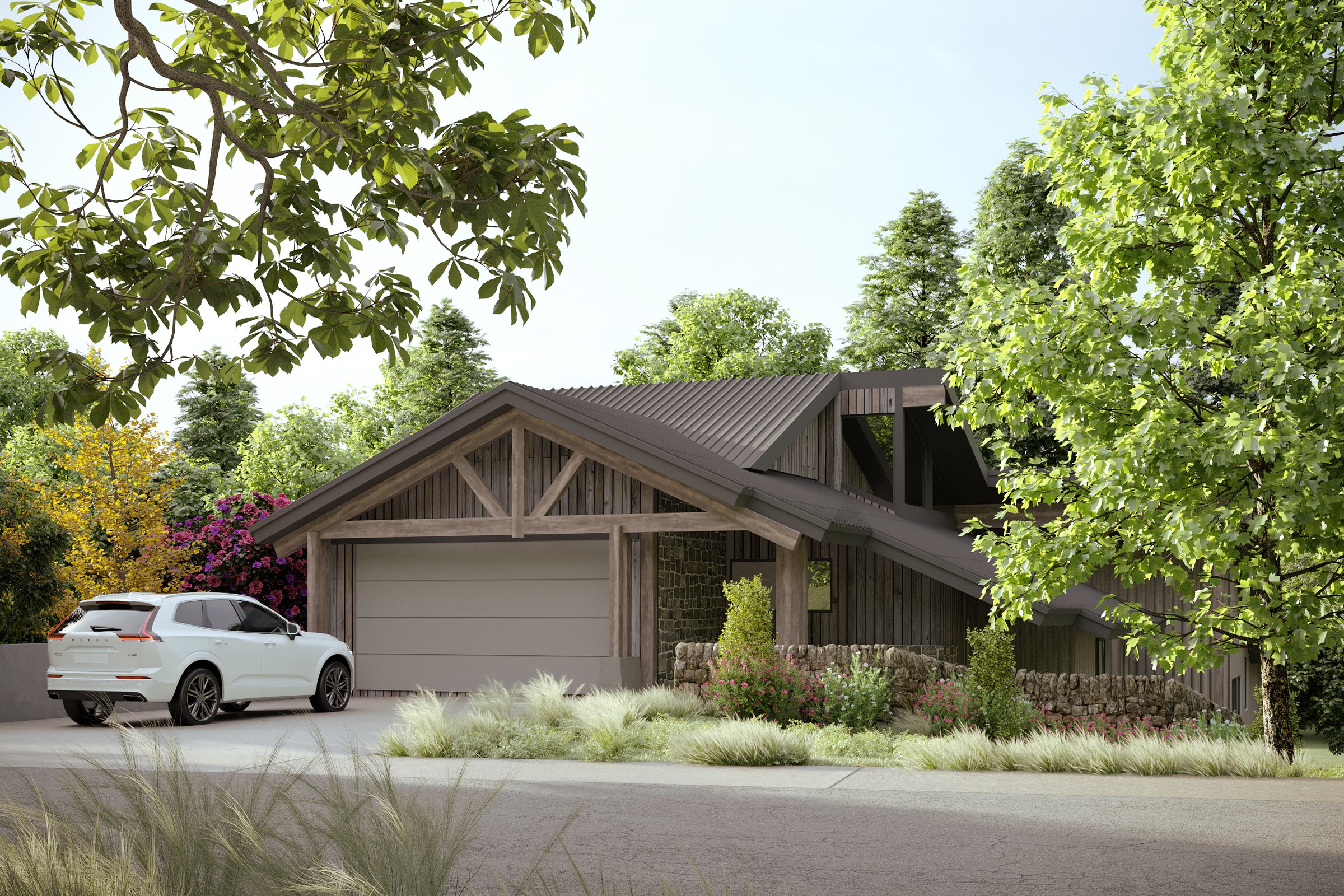
Rustic modern home with exposed timber trusses over garage, standing seam metal roof, dark wood siding, natural stone accents. White SUV in driveway. Dense green surroundings.
Client
Kahn Architects
Industry
Luxury Residential Architecture
Objective
Rustic Modern Custom Home Visualization
Deliverables
Photoreal luxury residential exterior renders, multiple viewpoints, marketing-ready output
Overview
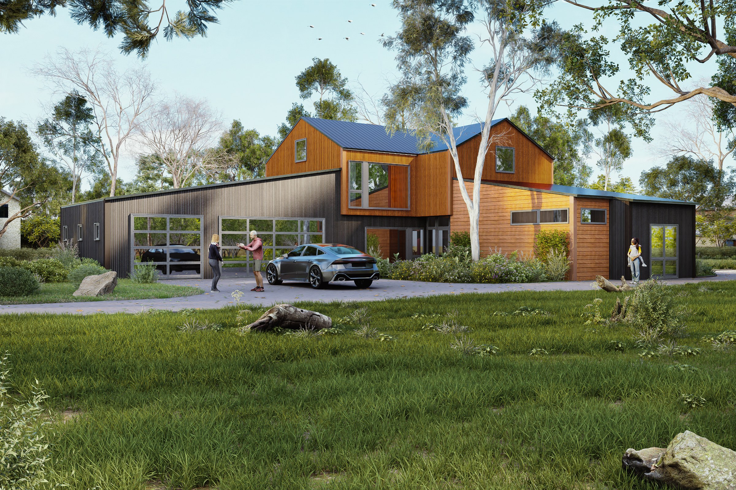
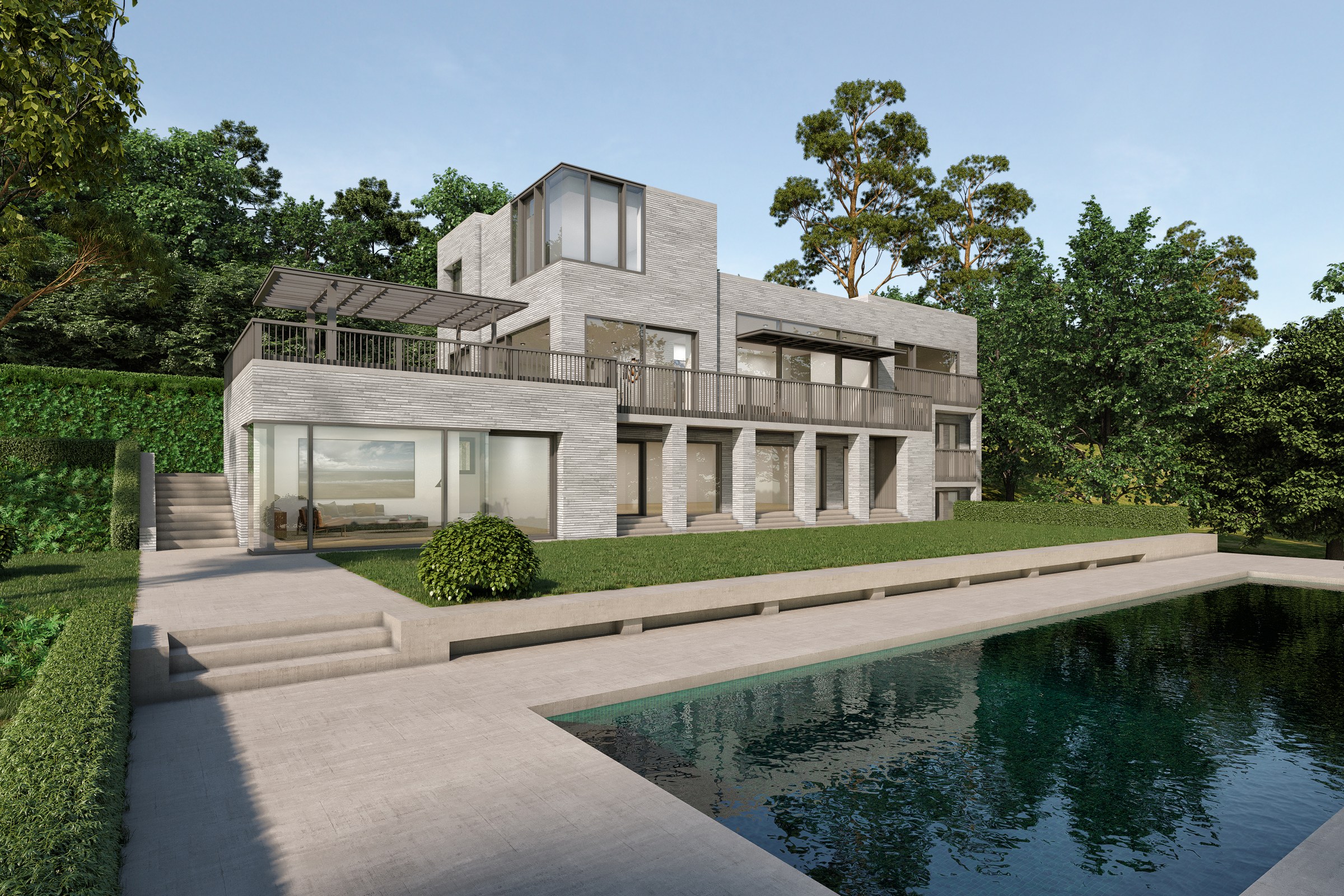
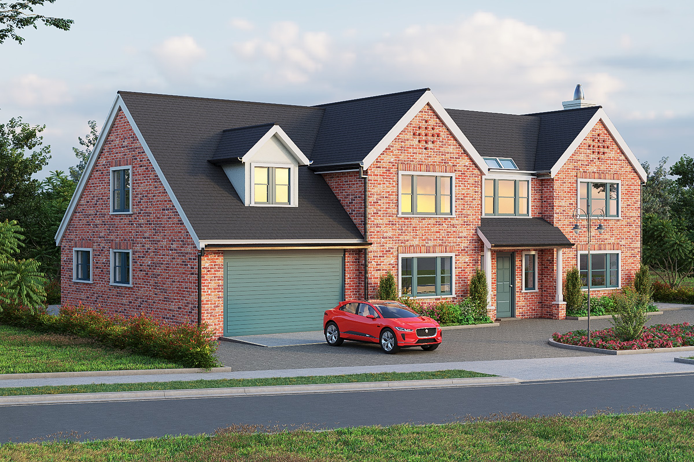
Hans Rustic Retreat is a custom single-family home visualized for Kahn Architects in Fort Worth, Texas, in 2023. The package covered a rustic modern exterior: a timber-trussed garage volume, standing seam metal roof, dark wood siding, and natural stone bases set into dense Texas tree cover.
The renders served pre-construction alignment between the architect and the home’s owners. They needed to settle material questions before shop drawings, and they needed images that read as a real place rather than a configuration of finishes. That second part is harder than it sounds.
This case study walks through the production decisions that shifted the output from a competent material catalogue to an image with atmosphere and inhabitation that reads as real. Most of the craft sits in choices invisible to a non-specialist eye but obvious in their absence.
What made this hard
Rustic modern is a deceptive style for visualization. The palette is narrow: stone, oiled wood, blackened metal, glass. Variation lives in PBR material roughness and the way late light grazes a board joint after weathering. Get the surfaces wrong and the whole image flattens into a brochure.
The Fort Worth siting added a second problem. Dense canopy means heavy bounced green pushing into every wood and stone surface, which fights the warm tones the architect wanted to read on camera. Holding the palette warm under that canopy is a grading problem before it is a lighting one.
The third problem was domestic. A vehicle in a residential render is a scale cue and a lighting trap. It is also a lifestyle prop the eye reads instantly. Done badly, the white SUV looks like a stock-library paste. Done well, it grounds the house. We treated it as a hero asset.
What did the brief actually demand?
The architect’s deliverable list was specific. View planning mattered more than image count. We worked backwards from how each render would be used. The chain ran from a planning pre-submission through homeowner review and into supplier approvals on millwork and metalwork.
The brief came down to four practical asks:
- A signature three-quarter front view showing the trussed garage gable
- A side elevation that resolved the wood-to-stone transition
- A dusk variant for emotional sign-off with the homeowners
- A neutral daytime frame for the supplier package
Each viewpoint had a different job. Lumping them under one lighting scheme would have weakened all four.
Our approach
1. Source review and reference build
Before any modelling, we audited the architect’s drawing set against site photographs and reference imagery for the chosen claddings. We pulled physical samples where useful, especially for the standing seam profile and the stone coursing pattern. Most rustic-modern failures start at this step rather than further downstream.
2. Modelling and material authoring
Geometry was built true to the drawing set. The timber trusses were modelled as discrete members rather than a stamped texture, since they sit in the focal third of the hero frame. Displacement mapping carried the stone. The wood siding used layered roughness maps to break repetition.
3. Lighting and HDRI selection
We tested HDRI lighting rigs for both the daytime and dusk frames separately. The dusk pass used a practical interior light spill against a low-angle sun. That is the only way to make standing seam read with character rather than as a flat sheet of metal.
Common lighting pitfalls on this category of project:
- Overdriven sunset oranges that blow out the wood tone
- Ambient occlusion crammed too dark, killing stone texture
- Sky HDRIs that fight the actual canopy colour temperature
- Vehicle paint reflecting sky tones the surrounding scene does not share
- Cold blue dusks that contradict North Texas evening light
Each was reviewed at greybox stage, not at final render.
4. Camera and lens decisions
Lens choice was deliberately conservative. A 35mm full-frame equivalent for the hero, a 50mm for the elevation study. Wide-angle distortion on a residential exterior reads as a real-estate listing, not architectural documentation. The architect wanted the latter. Camera height was set at standing eye line.
The difference between a forgettable render and a useful one is almost always restraint with camera height and lens length.
5. Render and post
Final frames went through multiple passes including beauty, ray-traced reflections, AO, and a separate vegetation matte for grading the canopy bounce out of the wood tones in post. Total turnaround across all viewpoints and variants was inside three working weeks from drawing receipt.
What it delivered
| Type | Quantity | Notes |
|---|---|---|
| Exterior hero stills | 2 | Three-quarter front, daytime and dusk |
| Supporting elevations | 2 | Side and rear, daytime |
| Time-of-day variants | Multiple | Dusk pass for homeowner review |
| Material study crops | Multiple | Wood, stone, standing seam close-ups |
The image set served two distinct conversations. Homeowner sign-off ran first, then supplier coordination on the metalwork and timber. The architect also retained the package for portfolio use. None of those audiences look at a render the same way. The frames were built so each could find what they needed.
For developers and marketing directors reading this, the multi-audience use is the unglamorous economic case for commissioning at this level. One render package that survives three rooms is cheaper than three packages that each survive one. The discipline is upstream, in view planning.
Key takeaways
- Rustic modern lives or dies on material authoring. Narrow palettes punish lazy roughness maps and reward layered, physically grounded surfacing.
- View planning beats image count. Four viewpoints chosen against named use cases outperform eight viewpoints chosen for coverage.
- The car is not set dressing. A scale and lifestyle prop in a residential frame deserves the same lighting discipline as the architecture.
Working on a project that needs compelling visuals? Tell us about your project or explore our full portfolio.
Project Gallery