English Brick Estate — Case Study
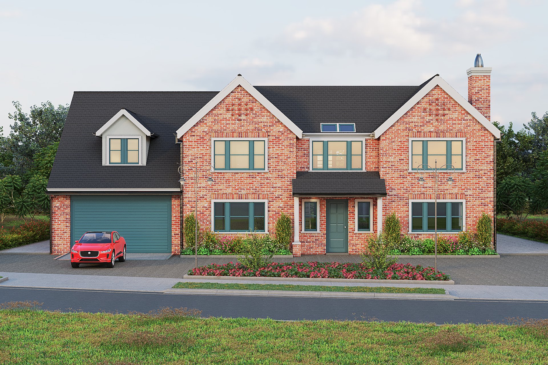
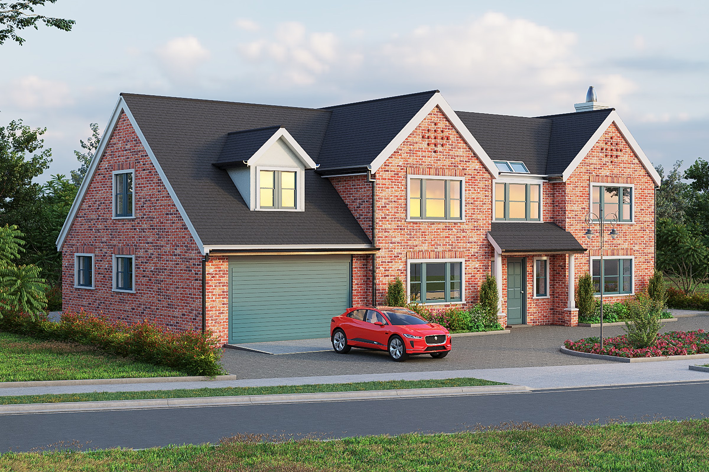
Large traditional English red brick home with dark slate roof, multiple gables, dormer windows, green garage door, paved driveway, red EV in drive
Client
Confidential
Industry
Luxury Residential Architecture
Objective
Traditional English Detached Visualization
Deliverables
Photoreal luxury residential exterior renders, multiple viewpoints, marketing-ready output
Overview
A traditional English red brick detached, dropped into the Orlando suburbs. That alone is a brief that pulls in two directions: the architecture wants overcast Cotswold light, the site wants Florida sun. The visualization had to honour the architecture without lying about where the house actually sits.
The 2022 commission asked for a luxury residential exterior package built around a single hero asset, the front three-quarter view showing the gabled massing, slate roof, dormer rhythm, and the paved driveway with a red EV parked beside the green garage door. Secondary angles supported the hero. Everything else was discipline.
The development team treated this as a positioning piece, not a planning render. That changed every decision downstream: material fidelity over technical orthography, narrative framing over context maps, and lighting that flattered the brickwork rather than proving solar compliance.
What made this hard
Traditional English brick is a material that punishes shortcuts. It is not one colour. It is fifteen colours of fired clay, varying mortar joints, weathering bands at sill height, and a coursing pattern that the eye reads even when it cannot name what it is reading. Tile a single texture across a façade and the result looks like a video game.
The slate roof carried the same risk. Displacement mapping was non-negotiable on the gable faces, flat normal maps would have killed the silhouette at the ridge line and the dormer cheeks. The dormers themselves were the geometric complexity peak: six visible faces on the hero angle, each with its own glazing reflection, each with cheek brickwork that had to course correctly into the main wall.
The site context added a further constraint:
- Florida latitude gives harsher sun angles than the architecture expects
- Native vegetation would betray the English idiom immediately
- Driveway paving had to read as English block paver, not American concrete
- The red EV had to sit as a scale device, not a focal point
- Sky had to feel temperate without going grey-British
What did the brief actually demand?
The development team needed visuals that would survive being printed at A1, projected at a sales preview, and compressed to a 1080-wide social tile. That is three different fidelity targets from one master render. It dictated render resolution, anti-aliasing budget, and how aggressively we could push ambient occlusion in the brick recesses.
The brief also wanted the hero to read instantly. A viewer scrolling a feed should know within half a second that this was a substantial English-traditional home, not a pastiche. That ruled out the standard architectural three-quarter at 35mm. We needed a longer lens choice to compress the gables and let the roofline do the talking.
A render package earns its fee in the seconds before the viewer decides whether to keep looking.
Our approach
1. Reference assembly and material library
Before any modelling decisions were locked, we built a closed reference set: Cotswold and Home Counties brickwork, Welsh slate variants, period-appropriate dormer detailing, English block paving. The point was not stylistic copying. The point was building a PBR materials library where every albedo, roughness, and height map was anchored in something that actually exists in the British vernacular.
2. Geometry pass and silhouette discipline
The model was built to hold up at the hero distance and on the closer secondary angles. Gable bargeboards, ridge tiles, dormer flashing, sill courses, and the chimney stack were all modelled rather than textured. Anything sitting on the silhouette against sky got geometry. Anything inside the silhouette could be a high-resolution texture with displacement.
3. Lighting and time-of-day study
We ran a time-of-day variants sweep before committing the hero. Three candidates were rendered at preview quality:
- Early morning, low east sun, long shadow across the driveway
- Late afternoon, warm raking light on the brick face
- Overcast soft, HDRI lighting dome only
The development team picked the late afternoon. It gave the brickwork its full colour range and let the slate sit dark without going black. The overcast version was kept as a secondary deliverable for marketing contexts where mood mattered more than warmth.
4. Camera and view planning
View planning drove the entire shoot. The hero was set at a longer focal length than a standard 35mm architectural view, which compressed the gables and gave the dormers visual weight. Camera height was placed at standing eye level rather than the often-defaulted 1.6m architectural average, because the driveway slope made the lower position read as more inhabitable.
5. Render and post
Final passes were rendered with ray-traced reflections on the glazing and the EV bodywork, full ambient occlusion, and a separate displacement pass on the brick and slate. Post was deliberately restrained. Colour grading pulled the brick toward its warm range and lifted the slate shadows just enough to keep roof detail readable in print.
Deliverables
| Type | Quantity | Notes |
|---|---|---|
| Hero exterior still | 1 | Three-quarter front, late afternoon, 6K master |
| Secondary exterior stills | 3 | Side, rear-garden, driveway approach |
| Time-of-day variants | 2 | Overcast and early morning of hero angle |
| Detail crops | Multiple | Dormer, entry, brick coursing close-ups |
| Print-ready masters | All angles | Full resolution, uncompressed, layered PSD |
Where do most luxury residential exterior briefs fail?
They fail at the material library. A studio that reuses the same red brick texture across every project will produce twenty competent renders that all look like the same render. The viewer cannot say why, but they sense it.
They also fail at restraint. The temptation on a luxury brief is to push everything: harder shadows, glossier reflections, denser planting, a sunset every time. The architecture stops being the subject and becomes a stage for the lighting.
Common failure points we see in competing packages:
- Single brick texture tiled across multiple façade planes
- Roof slate that flattens to a grey shape at distance
- Glazing that reflects an HDRI dome without scene context
- Vegetation that betrays the architectural idiom
- Hero camera defaulted to 35mm three-quarter without testing
Results
The package shipped on schedule. The hero became the development team’s primary positioning asset across print and digital. The time-of-day variants gave them a second life on social, where the overcast version performed differently to the warm hero, useful, because a single image fatigues quickly in a marketing rotation.
What the package delivered, in concrete terms:
- A hero asset that survived A1 print and 1080-wide compression
- Detail crops that doubled as material specification references
- Two lighting moods from one geometry build
- A reusable English-vernacular material library for future phases
For an architect, the value of this kind of package is leverage in early conversations. For a developer, it is pre-sales confidence before the first brick is laid. For a marketing director, it is a content well that does not run dry after the launch week.
Key takeaways
-
Material library is the project. On a traditional vernacular brief, the brick, slate, and paving textures are not finishing details, they are the entire credibility layer, and they must be built before the camera is set.
-
Lens choice carries the architecture. A longer focal length on a gabled English form compresses the rooflines into the silhouette the architecture is actually trying to make, where a wide angle scatters it.
-
One render, three fidelity targets. A package commissioned for positioning has to survive print, screen, and compression from a single master, which means resolution, AA, and post are decided at the brief stage, not the render stage.
Working on a project that needs compelling visuals? Tell us about your project or explore our full portfolio.
Project Gallery