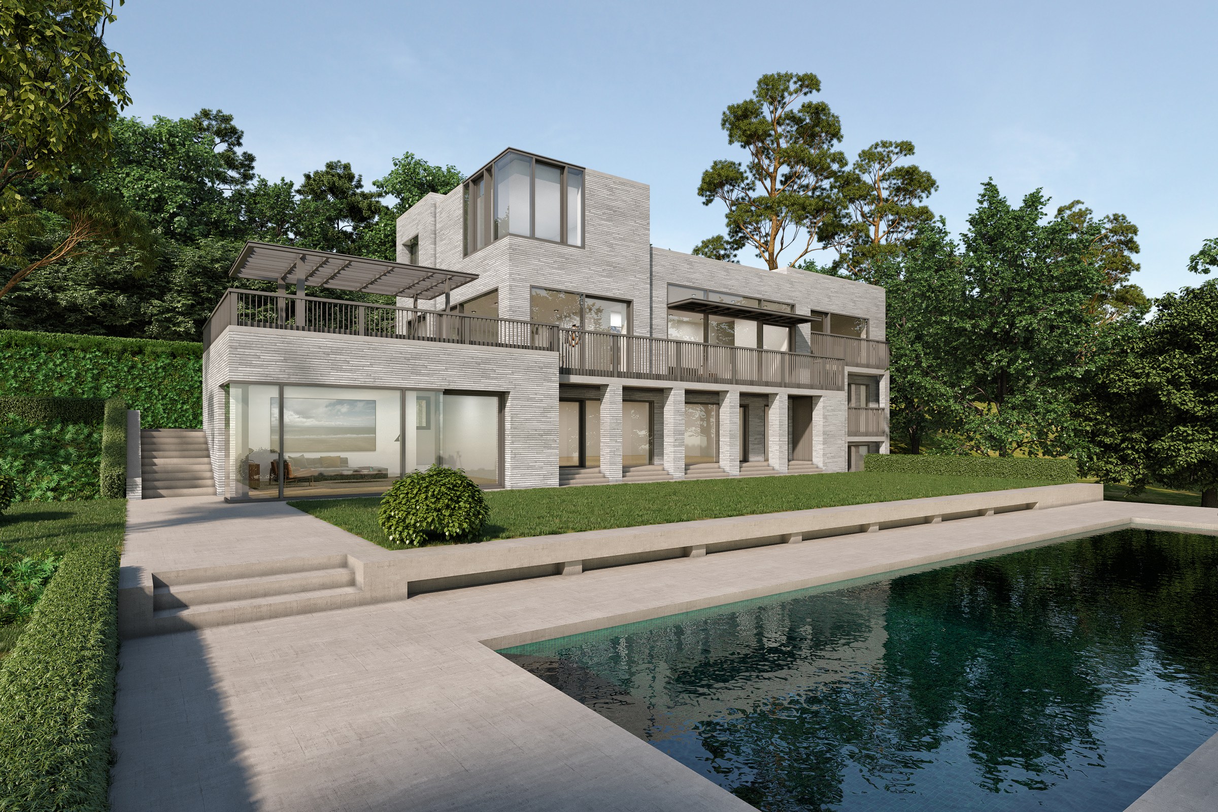
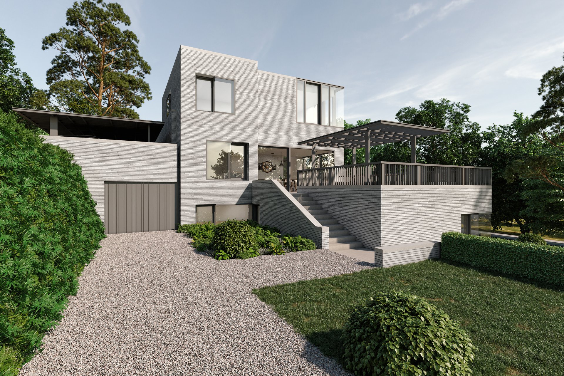
Contemporary Stone Villa — Residential Rendering Case Study
A stone-clad contemporary villa rendered with pool, pergola and gardens for design review. See the views. Renders from $199 per image.
Client
Confidential
Industry
Luxury Residential Architecture
Objective
Contemporary Detached Visualization
Deliverables
Photoreal luxury residential exterior renders, multiple viewpoints, marketing-ready output
Overview
Birmingham planning context is unforgiving for contemporary stone-clad work. The vernacular leans red brick and pitched slate, so a flat-roofed, two-story stone villa with a metal pergola balcony has to argue for itself visually before it can argue for itself technically. The visualization brief, in 2021, was effectively a planning and pre-sales tool dressed as a marketing asset.
The residence sits across two volumes with mixed flat and angled rooflines, a pool-facing elevation as the hero, and tightly hedged garden boundaries that needed to read as mature rather than freshly planted. Stone cladding had to feel quarried, not wallpapered. The pergola needed to be metal, not painted timber.
This case study walks through what the production actually looked like, what we refused to compromise on, and where the time went. Project category was luxury residential exterior. Client remains confidential.
What did the brief actually demand?
Three things, in this order: planning-grade fidelity to the architectural intent, pre-sales appeal for a buyer who values restraint, and a set of frames that would survive being cropped for hoarding and brochure layouts without rebuilding the scene.
The non-negotiables were specific:
- Stone cladding readable as a real material at hero distance
- Pool reflection physically plausible in late-afternoon light
- Pergola shadow patterns landing correctly on the balcony deck
- Hedge mass dense enough to suggest 8-10 year growth
- Two-story massing legible from a low approach angle
- Roof transitions, flat to angled, clean at the parapet line
A render package that nailed four of those six and fudged the other two would have failed the brief. Pre-sales reviewers fixate on exactly the details that fudging tries to hide.
Where do most luxury residential exterior briefs fail?
In the gap between competent and persuasive. A competent render gets the geometry right, applies plausible materials, and lights the scene without obvious errors. A persuasive render makes the building feel inevitable, like the architect’s intent was always going to land this way.
The usual failure modes:
- PBR materials at default roughness, killing stone character
- HDRI rotation chosen for sky drama instead of facade legibility
- Vegetation library assets reused at identical scales across the frame
- Pool water treated as a flat plane with a reflection map slapped on
- Ambient occlusion dialed too aggressively, bruising every corner
- Camera height defaulted to 1.6m without checking how the massing reads
Birmingham’s overcast bias makes this worse. A naive sun setup produces flat, grey-card lighting that strips the stone of depth. The brief required late-afternoon warmth without slipping into orange-saturated cliche.
The challenge
Three problems sat at the center of production.
First, the stone. Contemporary stone cladding lives or dies on displacement mapping rather than normal maps alone. Normals fake the surface; displacement actually deforms the geometry at the silhouette. At hero distance the difference between the two is the difference between a render that holds up under crop and one that flattens the moment a reviewer zooms in.
Second, the pool elevation. The pool is the primary sales surface. Water needed correct caustics on the pool floor, ray-traced reflections of the facade on the surface, and a believable interaction between the water and the stone coping. Cheating any one of those three breaks the other two.
Third, the gardens. Hedged boundaries at this scale are usually the tell that betrays a render as CG. Identical instances, identical scales, identical light response. The brief needed mature, settled vegetation, which meant scattered variation in species, height, and translucency.
Render fidelity is settled at the silhouette, not the surface. Get the edges right and the rest is forgivable.
The flat-to-angled roofline transition was a quieter problem. Parapet lines that are correct in the model often render incorrectly because of floating-point precision at the geometry intersection. We caught this on the first test pass and rebuilt the parapet as a single coplanar surface with a clean boolean cut.
How we approached it
Production ran across roughly six weeks, structured to front-load the decisions that downstream phases couldn’t undo cheaply.
1. Source file review and reference gathering
Before any modeling work, the design team’s CAD package was audited against a written shot list. Two viewpoints were flagged immediately as weak, the standard front-three-quarter and a top-down approach that flattened the massing. Both were dropped from the deliverable set in favor of a low pool-side hero and a raised side angle that read the two-story volumes correctly.
Reference gathering was specifically Midlands stone, not generic limestone libraries. A facade clad in Cotswold honey-tone reads completely differently from one clad in a cooler grey-buff Yorkshire stone, and the brief specified the latter.
2. Modeling and material build
The villa was rebuilt from CAD into the visualization environment with three priorities: clean topology at the rooflines, correct edge bevels on every visible stone course, and accurate window reveal depths. A reveal that’s 40mm too shallow flattens an entire elevation.
Material build sequence:
| Stage | Focus | Output |
|---|---|---|
| Base PBR | Albedo, roughness, normal | First-pass material |
| Displacement layer | Course-level depth variation | Silhouette-correct stone |
| Edge wear pass | Subtle chip and weather at corners | Aged, not new |
| Pool water shader | Caustics, refraction, surface ripple | Hero-ready water |
| Pergola metal | Brushed finish, controlled reflectivity | Non-mirror metal |
The pergola was a deliberate restraint exercise. Architectural metalwork at sales-render scale tempts the artist into over-reflective treatments that look like jewelry. We dialed the reflectivity down twice during review.
3. Lighting and time-of-day
Two time-of-day variants were rendered: a primary late-afternoon and a softer overcast secondary. Primary used a HDRI lighting dome with a sun position calculated for Birmingham latitude in early summer, roughly 17:30, when the pool elevation catches direct light without harsh contrast.
The overcast variant existed for planning use. Planning officers tend to distrust render packages where every frame is golden-hour. A grey-sky alternative anchors the package as honest documentation rather than pure marketing.
4. Scattering, vegetation, and final dressing
Hedge mass was built from three species mixed at varied scales, with a controlled randomization on rotation and a slight color drift across the boundary. Foreground planting used larger hero specimens with hand-placed positioning. Background planting was scattered procedurally then thinned by hand where it read as too uniform.
5. Rendering and post
Final frames were rendered at print resolution with separate passes for beauty, ambient occlusion, reflection, and depth. Compositing in post let us tune the late-afternoon warmth without a full re-render when the design team requested a slightly cooler grade on the second review.
Results
The deliverable package broke down as follows:
| Type | Quantity | Notes |
|---|---|---|
| Hero exterior stills | 4 | Pool elevation, side approach, garden, entry |
| Time-of-day variants | 2 per hero | Late-afternoon and overcast |
| Detail crops | Multiple | Stone, pergola, pool coping |
| Planning-grade frames | 2 | Neutral lighting, contextual |
What it actually delivered for the recipients:
- Planning submission imagery that read as documentation, not advocacy
- Pre-sales frames that survived crop to brochure and hoarding ratios
- Detail crops usable in interior-architecture press without re-rendering
- A consistent visual language across hero and contextual frames
Turnaround across the package was approximately six weeks from CAD handover to final delivery, with two formal review rounds and a small third round for grading adjustments.
Key takeaways
-
Silhouette beats surface. Displacement at the edge of stone cladding does more for perceived realism than any amount of texture detail on the flat.
-
Restraint reads as quality. Under-reflective metal, controlled hedge variation, and honest grey-sky variants signal craft more reliably than dramatic lighting.
-
Viewpoint selection is half the job. Cutting weak angles early protects the package from frames that competent execution can’t rescue.
Working on a project that needs compelling visuals? Tell us about your project or explore our full portfolio.
Project Gallery