NYC Residential Tower — Case Study
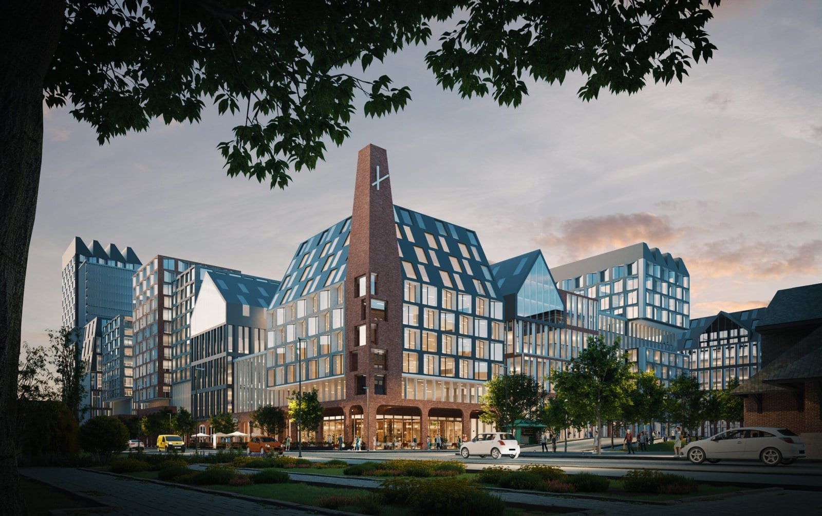
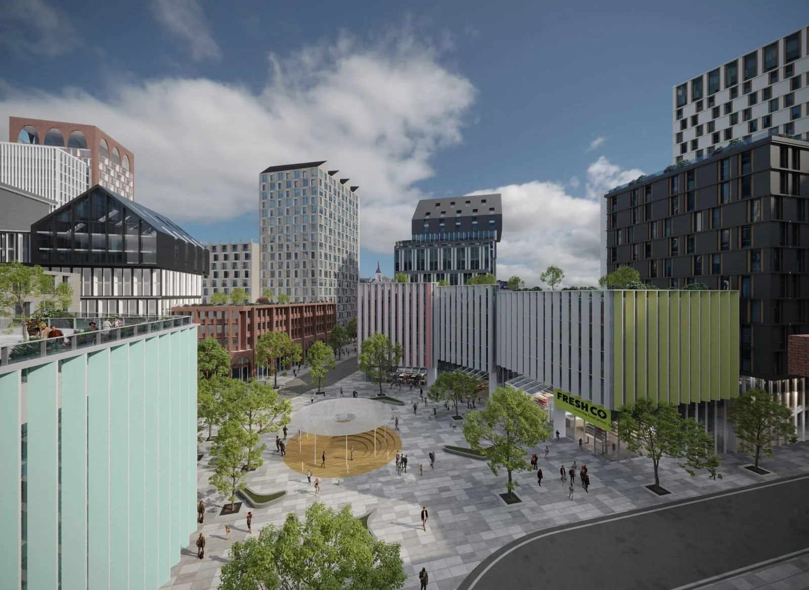
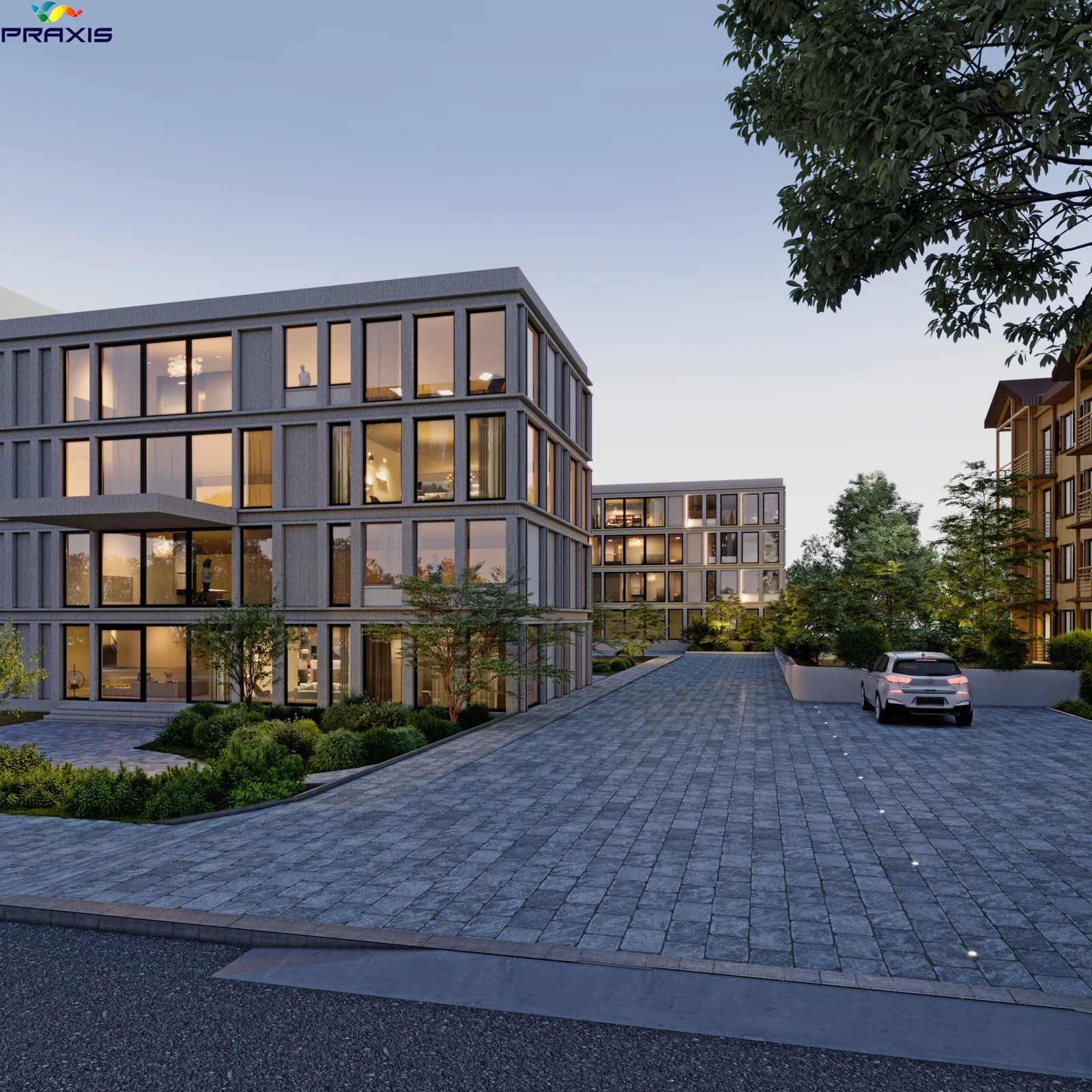
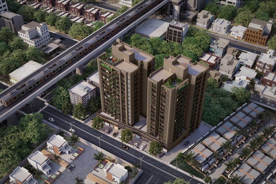
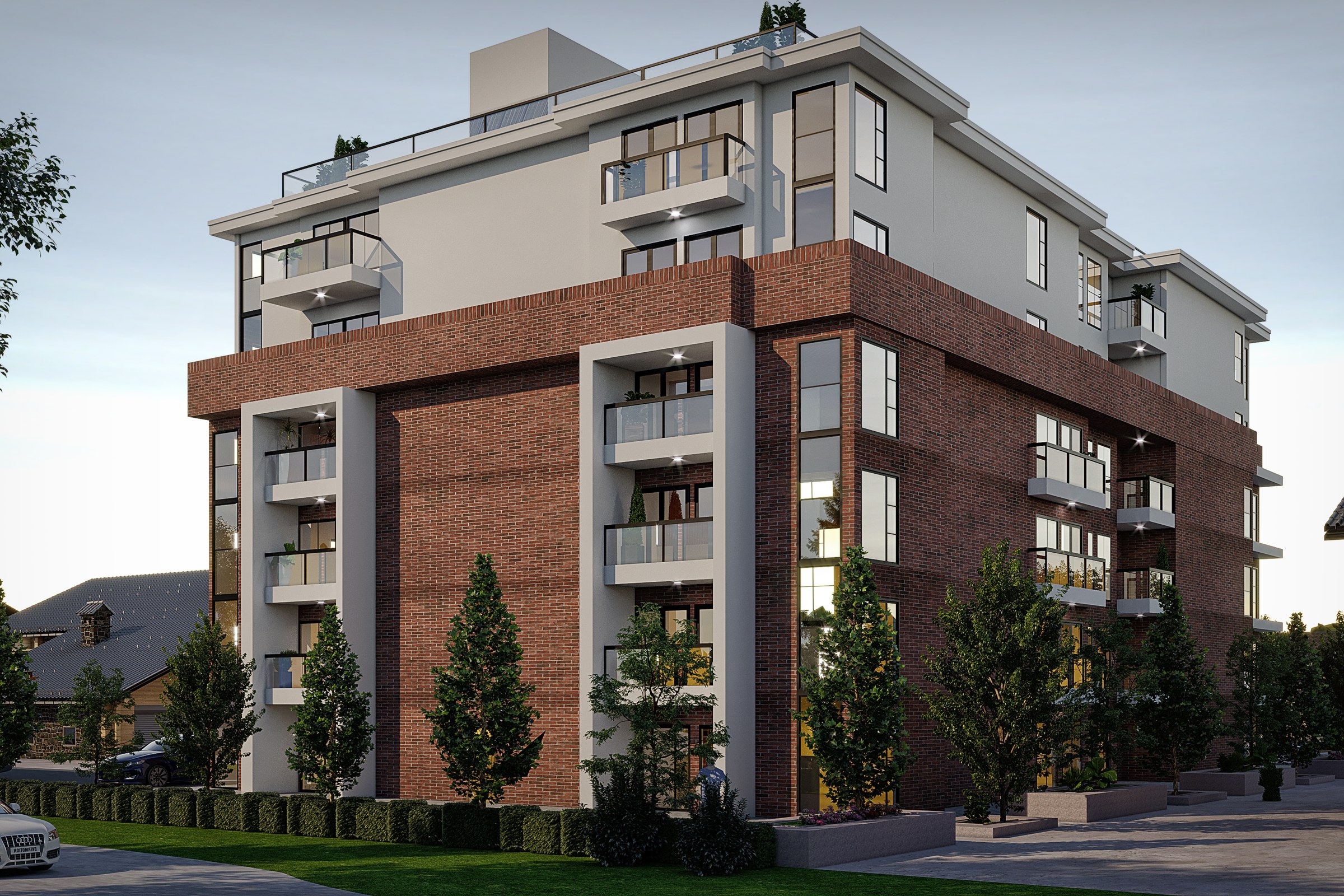
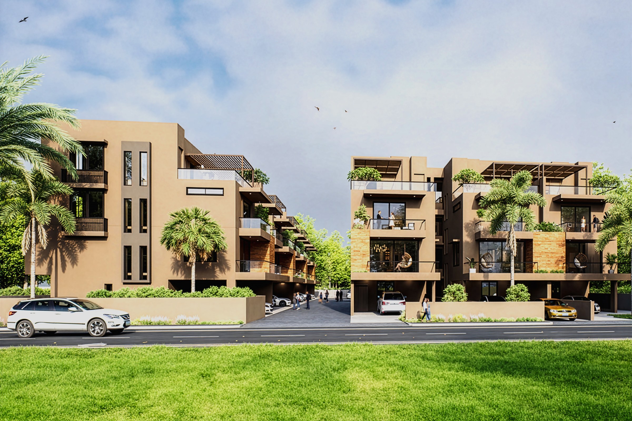
Exterior architectural visualization of a high-rise residential tower in New York City, capturing the urban context and design intent for pre-sales marketing.
Client
Confidential
Industry
Multi-family Residential Development
Objective
Architectural visualization for NYC Residential Tower
Deliverables
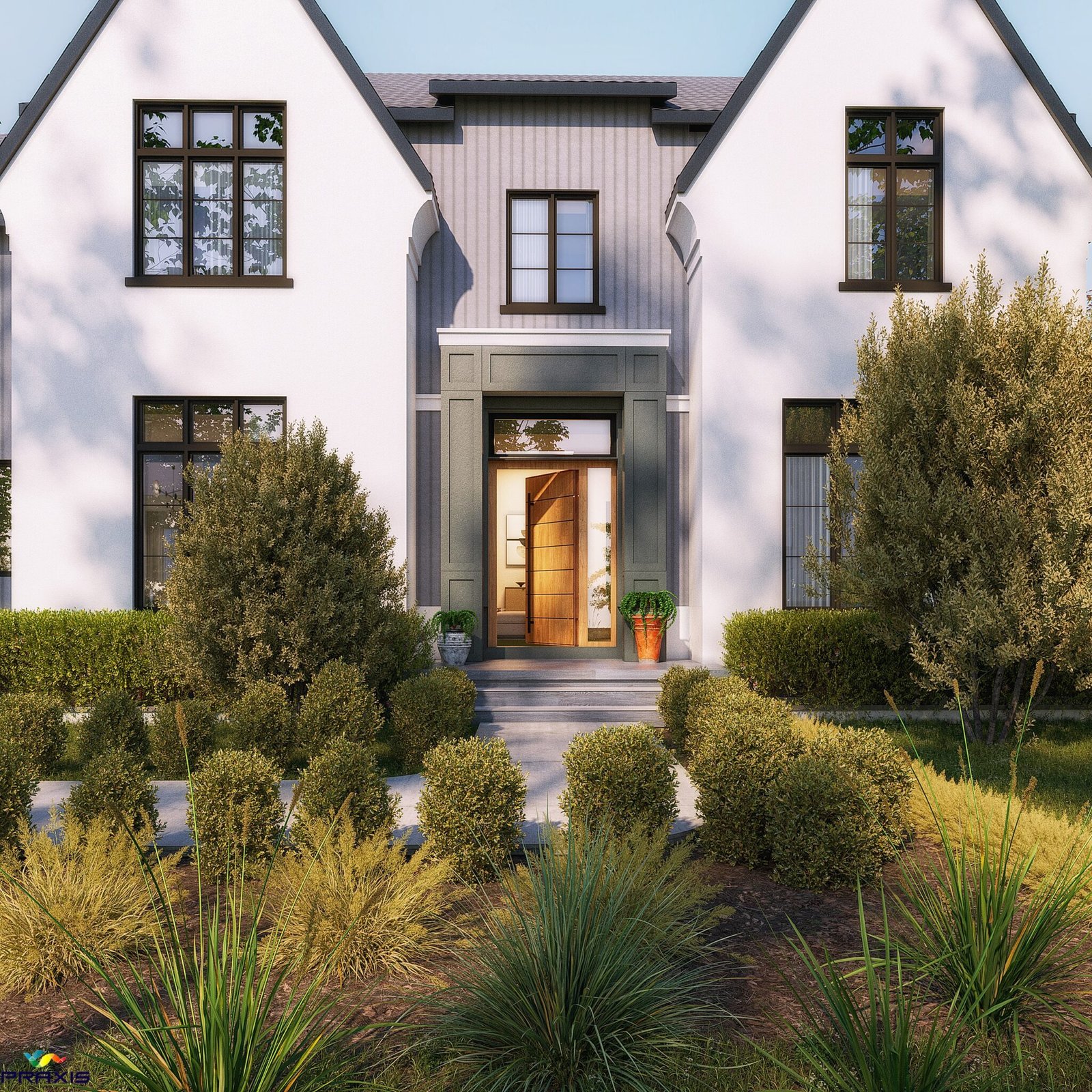
Photoreal multi family exterior renders, multiple viewpoints, marketing-ready output
Overview
A high-rise residential tower in New York City carries a particular kind of weight in visualization work. The image has to sell apartments that do not yet exist, to buyers who will pay seven figures, in a market where every competing tower has already shown its glossy hero shot. The render is doing real commercial labour.
This 2024 commission was an exterior package built for pre-sales marketing. The development team needed imagery that read as Manhattan first and as the tower second, because the urban context was the genuine product. A tower disconnected from its street, sky, and neighbours photographs as a model. A tower embedded in the city photographs as a home.
The brief came in confidential, as most pre-launch towers do. What follows is a documentation of the craft decisions, written without naming the project or its design team. The goal is to show how the package was built, not what it looks like.
What did the brief actually demand?
The deliverable was straightforward on paper. Exterior hero stills, multiple viewpoints, two times of day, ready for hoarding graphics and digital sales channels. The complexity sat underneath that simplicity.
A New York tower render fails in three predictable ways. It floats, because the surrounding buildings are wrong. It feels stage-lit, because the HDRI lighting is generic. Or it photographs as a 3D model, because the PBR materials are too clean for a city where everything has weathered.
The package had to clear all three failure modes simultaneously. Hero imagery would be reproduced at hoarding scale on the construction site, which meant the renders had to hold up at roughly 8K linear width without revealing texture stretching, banding in the sky, or the tell-tale CG sharpness that experienced buyers spot immediately.
What made this hard
New York is the hardest city in the world to photograph in CG. The reason is simple: every viewer has a reference image in their head. Light bouncing off the Hudson at 4 p.m. in October has a specific quality. Get it wrong and the image reads as fake before the viewer can articulate why.
The specific challenges on this project:
- Context modelling at scale, with neighbouring towers needing accurate massing
- Reflective glass facades that pick up the entire surrounding skyline
- Pedestrian-eye viewpoints that demand street-level grit, not aerial polish
- Two time-of-day variants that had to feel like the same building, same week
- Hoarding-scale output requirements without losing close-read detail
- A confidential review chain, meaning fewer rounds and tighter first-pass accuracy
The reflective facade was the hardest single problem. Glass on a tower of this scale becomes a mirror of its environment. If the surrounding city is wrong, the building tells on itself in every reflection.
How we approached it
The work split into four production phases. Each one resolved a specific risk before the next phase began. This sequencing matters because compositing fixes are expensive and view planning errors are catastrophic.
1. Source review and view planning
The architect supplied design files in the standard formats. Before any modelling started, we ran a view planning exercise against the proposed buyer journey. Where would the hoarding sit? Which views would land in print? Which were strictly digital?
This produced a shortlist of camera positions tied to specific commercial uses. Three pedestrian-level views at approachable focal lengths, mid-rise context views from neighbouring rooftops, and one elevated establishing shot. Lens choice was locked early, because changing focal length late forces a re-shoot of the entire surrounding context.
2. Context build and material library
The tower itself was modelled from architectural source. The surrounding blocks were built to a deliberately graded level of detail, with closer buildings carrying full geometry and distant ones simplified. This is where most studios overspend or underspend, and either is visible in the final image.
The neighbours decide whether your tower belongs on the block, which is why context modelling deserves more time than the hero geometry.
Materials were authored as full PBR materials with proper roughness and normal maps. The facade glass was tuned with measured reflectance values, not eyeballed. Brick on neighbouring buildings carried genuine weathering through displacement mapping, because clean brick reads as wrong in Manhattan.
3. Lighting and atmosphere
Two lighting setups were developed in parallel. A late-afternoon golden condition for the hero image, and a dusk-to-evening condition for the lifestyle frame. Both used HDRI lighting captured to match the building’s actual orientation and the sun path for the relevant season.
Ray-traced reflections carried the work in the facade. Ambient occlusion was used surgically at facade junctions and street level, never as a global crutch. Atmospheric haze was layered to give the building distance from the camera without dulling the foreground, which is the standard mistake on tall-building renders.
4. Composition, render, and post
Final renders went out at hoarding-ready resolution with separated passes for sky, glass reflections, ambient occlusion, and direct lighting. This pass structure gave the post team room to adjust without re-rendering.
Post work was deliberately restrained. People and street-level life were composited in carefully, with shadow direction matched to the render lighting. The team rejected the temptation to over-populate. A New York street with thirty people in frame reads as a stadium, not a residential block.
Deliverables
| Type | Quantity | Notes |
|---|---|---|
| Exterior hero stills | 4 | Pedestrian and elevated viewpoints, hoarding-ready |
| Time-of-day variants | 2 per view | Golden hour and dusk conditions |
| Context views | Multiple | Mid-rise establishing shots for digital channels |
| Print-scale masters | 4 | Approximately 8K linear width, layered files |
| Web-scale exports | Multiple | Compressed variants for sales portal use |
Results
The renders went into pre-sales marketing in 2024. From the production side, three outcomes were measurable.
- First-round approval on three of four hero views
- Hoarding output produced from the master files without re-rendering
- Reflection accuracy held up against on-site reference photography post-construction-start
The development team reused the master files across digital sales channels, brokerage decks, and physical hoarding without commissioning a second pass. That reuse is the real test of a visualization package. If the renders only work for one medium, the package was specified wrong.
Key takeaways
-
Context is the product. A tower render in New York is judged on the city around it, not the building itself, and the budget should reflect that.
-
View planning beats view fixing. Camera positions tied to specific commercial uses save more money in the production phase than any post-production technique can recover later.
-
Restraint in post separates the package. Over-populated streets, crushed shadows, and excessive bloom are the markers of a render trying too hard. The buyer wants to see the building, not the rendering effort.
Working on a project that needs compelling visuals? Tell us about your project or explore our full portfolio.
Project Gallery