Sam Final Apartment — Case Study
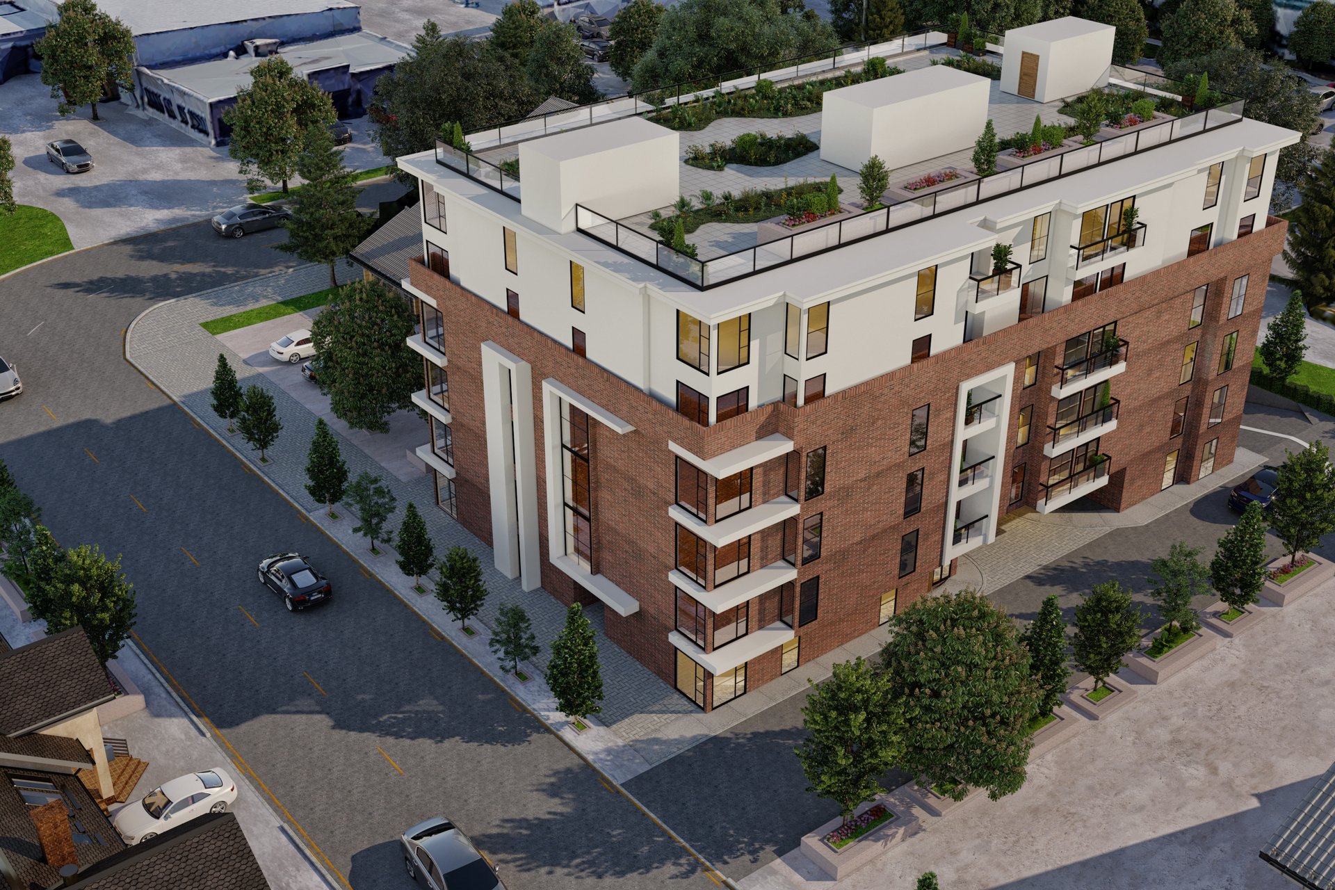
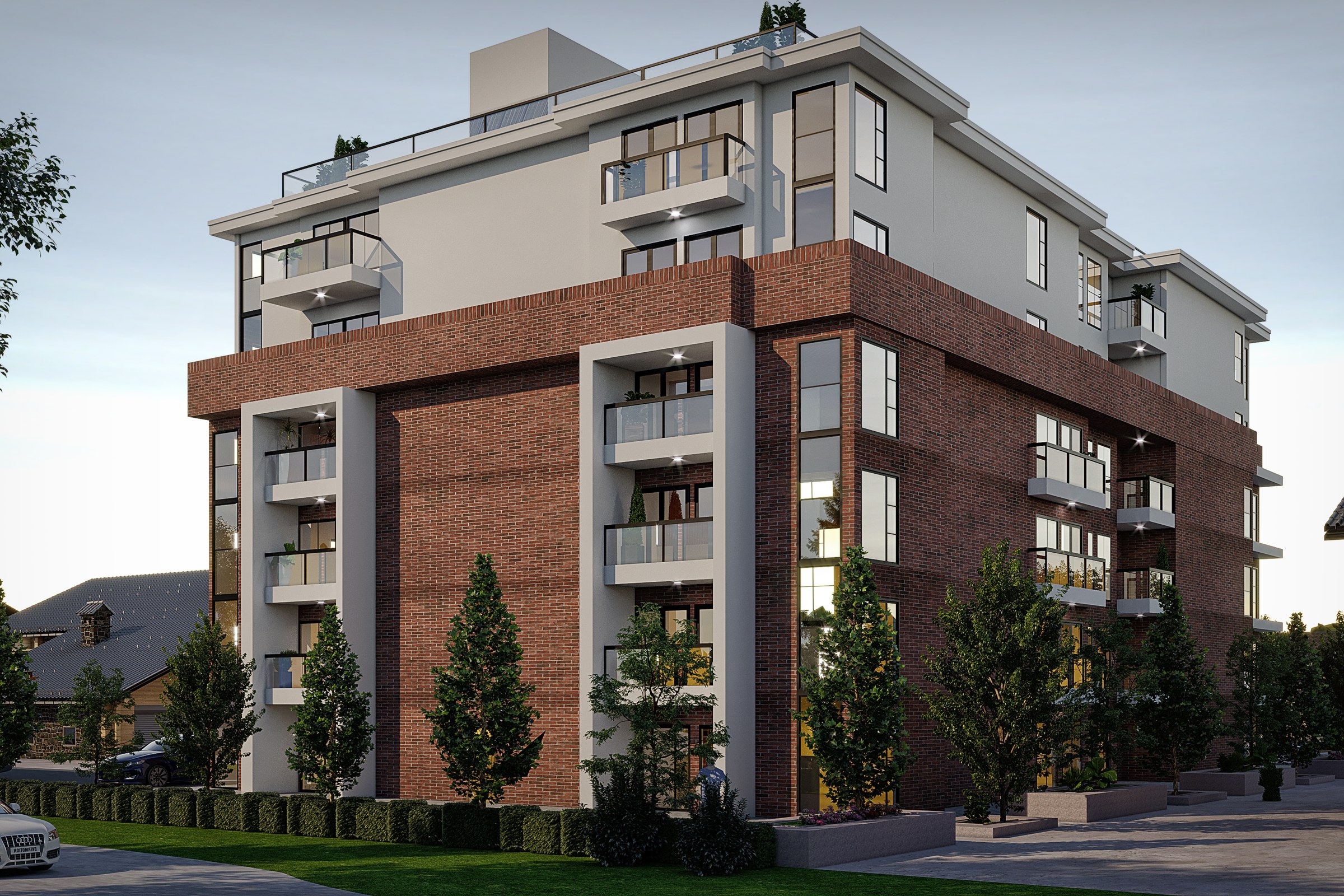
Dusk corner view of a five-story contemporary apartment building with red brick lower floors, white render penthouse level, glass balconies, and rooftop terrace.
Client
Atkins Architects
Industry
Multi-family Residential Development
Objective
Contemporary Apartment Building Visualization
Deliverables
Photoreal multi family exterior renders, multiple viewpoints, marketing-ready output
Overview
A five-story apartment building photographed at dusk is one of the most over-rendered subjects in the visualization industry. Every developer brief asks for the same thing: warm interior glow, twilight sky, glass that reads as glass. The genre has a baseline. Clearing it requires deliberate work.
This 2020 commission for Atkins Architects in Portland was a corner-view exterior of a contemporary multi-family building. Red brick at the lower floors, white render at the penthouse, glass balconies stacked vertically, a rooftop terrace cap. Standard contemporary vocabulary. The brief sat in a category where competent renders are cheap and memorable ones are not.
The output had to support entitlements review, marketing collateral, and the architect’s own portfolio. Three audiences, one image. That constraint shaped every craft decision that followed.
What did the brief actually demand?
The architect needed a hero exterior that would survive scrutiny from a planning board, look credible on a hoarding, and photograph well in a magazine spread. Each use case has a different tolerance for stylization.
Planning bodies want material accuracy and honest scale. Developers want emotional warmth that pre-sells units. Editors want composition that holds up at full bleed. The render had to register as architecture first and atmosphere second.
The deliverable list was modest in count, demanding in finish:
- One hero corner view, dusk, fully resolved
- Material studies for the brick-render junction
- A clean daylight variant for planning submission
- Reflection and glazing checks across all balcony glass
- Final files at print-ready resolution
Where do most multi-family exterior briefs fail?
The failure mode is predictable. The render reads as a building, but it does not read as this building. Brick courses get smoothed. Mortar reads flat. Glass balconies turn into mirrors with no subsurface depth. The penthouse render finish goes plastic under direct light.
The work of a good exterior render is to make a viewer believe the building is already standing, not to prove the software can simulate light.
Most teams default to a sky HDRI, a sun angle, and a turntable of camera positions. The image looks fine in thumbnails and falls apart at A2.
Three specific traps recur in this category:
- Brick texture tiling visible at mid-distance crops
- Balcony glass with no edge thickness, killing realism
- Time-of-day choice fighting the building’s primary facade orientation
- Rooftop terrace reading as a flat plane with no occupiable depth
The challenge
The corner viewpoint forced two facades into the frame at once. That meant the dusk light had to be honest on both sides, with one elevation in warm rim light and the other in cool ambient fill. A single sun angle does most of the work, but the secondary facade needed help.
The brick-to-render transition at the penthouse was the second pressure point. Two materials with very different reflectance and surface roughness meeting on a single plane is where amateur work gives itself away.
Glass balconies stacked across five floors created a third issue: every pane needed ray-traced reflections that were specific to its height and angle. Copy-pasted reflection maps would have read as wallpaper.
How we approached it
The production was sequenced so that lighting and material decisions were locked before any final-resolution rendering began. Reworking at the end of an exterior pipeline is expensive. Reworking in the test-render phase is the job.
1. View planning and camera lock
We spent the first two days on viewpoint selection alone. The corner angle was set early, but the lens choice took iteration. A wider lens flattered the massing and lost the brick detail. A longer lens compressed the facades and made the penthouse feel grafted on.
We settled on a moderate wide that held the corner geometry honestly, then locked the camera. Every subsequent decision referenced that single frame.
2. Material build and surface authoring
The brick was authored as a PBR material with displacement, not a flat normal map. Mortar recesses cast real shadows under low-angle light, which is what makes the lower floors hold up at the dusk hour. Generic brick libraries were rejected at this stage.
The white render at the penthouse needed a subtle tooled finish, not a smooth wall. We added micro-roughness variation so the surface caught the warm horizon light without going to a chalk-white blowout.
Balcony glass was given real edge thickness, a slight green tint in section, and per-pane reflection sampling.
3. Lighting and atmosphere
Dusk lighting was built in three layers: a primary sun at a low western angle, an HDRI lighting dome for sky color and ambient fill, and supplementary practicals for the interior glow visible through the windows. The interior lights were placed per unit, not as a global emissive.
Ambient occlusion was used surgically, not as a blanket pass. Heavy AO on a dusk render reads as dirt.
4. Post and final delivery
Compositing handled the dynamic range that no single render pass can hold. The sky was graded separately from the facades. Specular highlights on the glass were lifted in post to read against the dimming ambient. Lens artifacts were kept minimal.
| Type | Quantity | Notes |
|---|---|---|
| Hero exterior stills | 1 | Dusk corner view, print resolution |
| Time-of-day variants | 2 | Daylight for planning, dusk for marketing |
| Material study close-ups | Multiple | Brick, render, glass junctions |
| Composition test renders | 4-5 | View selection phase |
| Final delivery formats | 3 | Print TIFF, web JPG, layered PSD |
What it delivered
The architect received a hero image that worked across the three intended use cases without separate edits for each. The daylight variant carried the planning submission. The dusk hero carried the marketing rollout. The PSD allowed the in-house team to recolor the sky for seasonal campaigns without re-rendering.
Turnaround from briefing to first lighting test was inside a week. Final delivery followed two iteration rounds with the design team.
The render package gave the architect:
- A planning-grade material-honest daylight image
- A pre-sales-grade dusk hero with interior warmth
- Layered files the in-house team could repurpose
- Material close-ups for the project monograph
Key takeaways
-
View planning is half the render. A locked camera before lighting starts saves more time than any render-engine optimization.
-
Material authoring beats library material selection. On a building this exposed, generic brick and generic render finishes are visible from across the room.
-
One image must serve three audiences. Planning, pre-sales, and editorial each have different tolerances. Build the file so a single hero can flex across all three without rework.
Working on a multi-family exterior that needs compelling visuals? Tell us about your project or explore our full portfolio.
Project Gallery