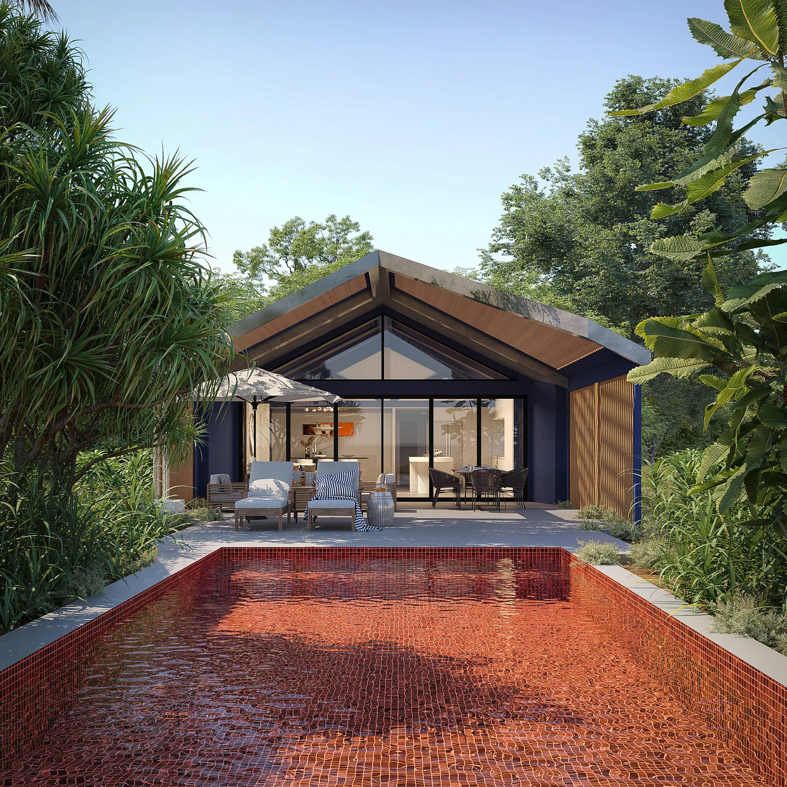
Luxury Villa Exterior Rendering — Case Study
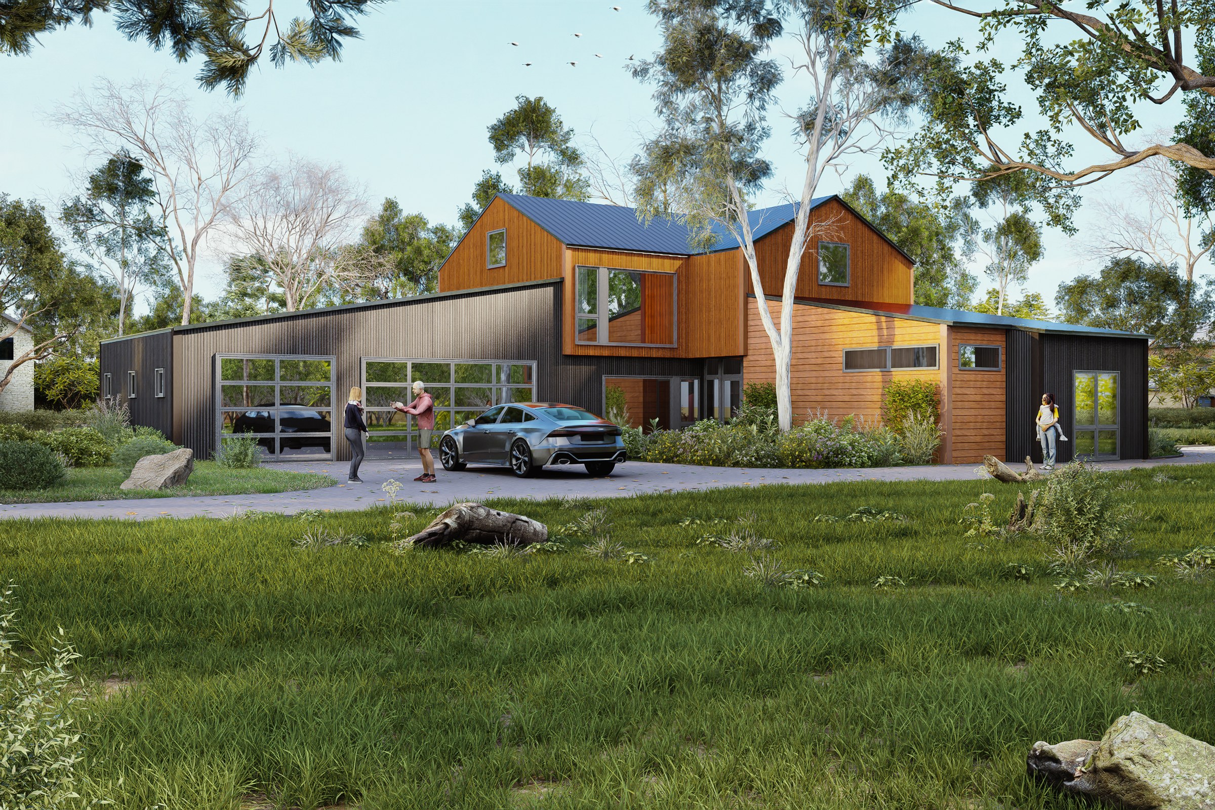
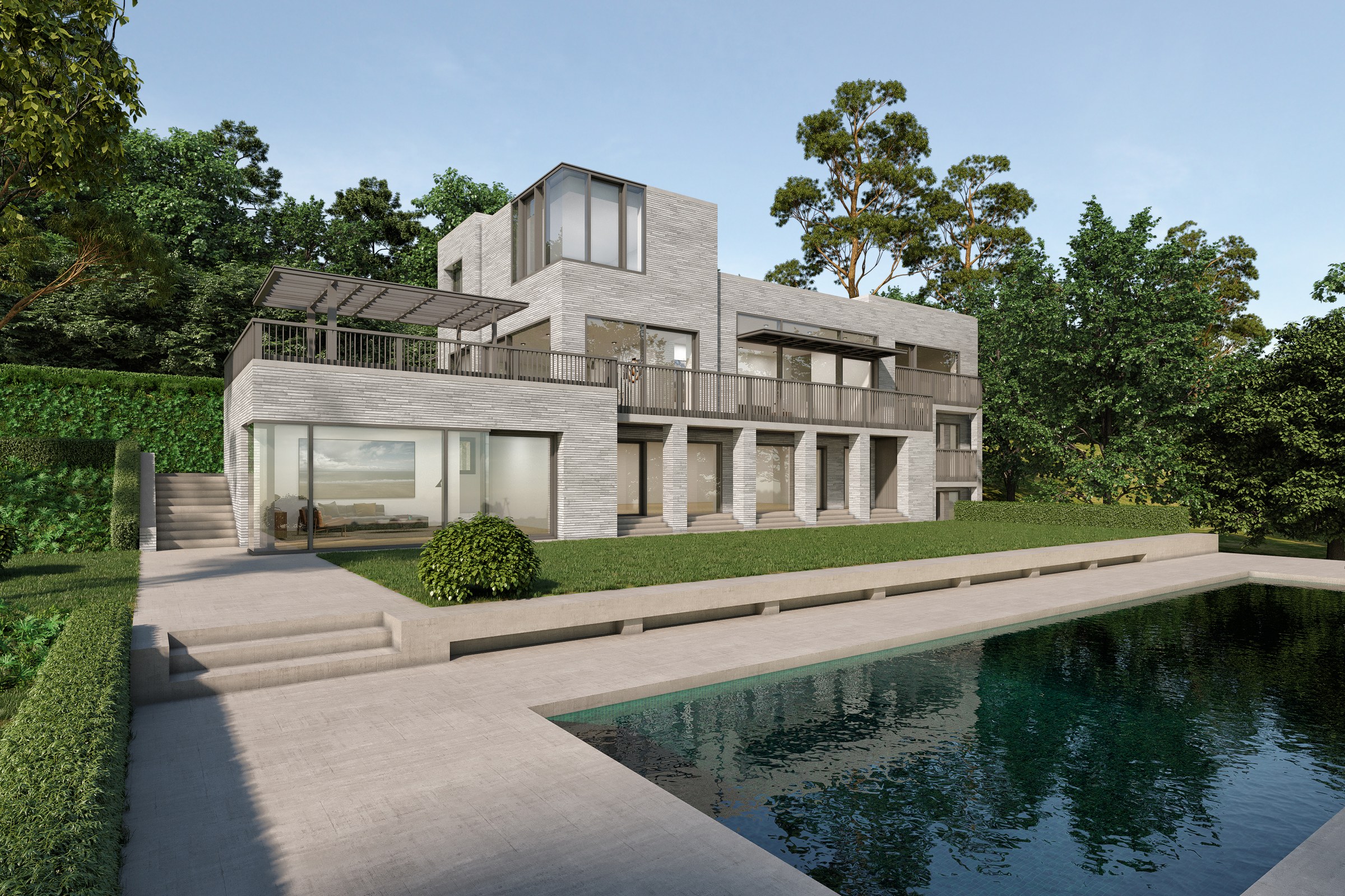
Photoreal exterior visualization of a contemporary luxury villa, showcasing dusk lighting, landscaping, and materiality for pre-sales marketing.
Client
Confidential
Industry
Luxury Residential Architecture
Objective
Architectural visualization for Luxury Villa Exterior Rendering
Deliverables
Photoreal luxury residential exterior renders, multiple viewpoints, marketing-ready output
Overview
The brief was simple on paper: produce a set of photoreal exterior images of a contemporary luxury villa for pre-sales marketing. The project closed in 2024 under a confidentiality arrangement, so identifying details stay with the development team. The visuals had to carry the weight of a sales conversation before any site visit was possible.
Luxury residential exteriors are deceptively hard. The architecture is usually restrained, which means there are no busy facades to hide behind. Material honesty, lighting discipline, and landscape integration do most of the work. A weak render in this category looks generic; a strong one feels like a photograph someone almost took.
This piece walks through the production decisions that shaped the final set, the constraints we imposed on ourselves, and why those choices matter for anyone using the images downstream. It is not a tutorial. It is a record of how we kept a quiet building from looking flat.
What did the brief actually demand?
The development team needed marketing-grade stills suitable for a pre-launch campaign: print collateral, hoarding graphics, web hero imagery, and broker decks. That breadth of use is the real spec, not the image count.
Each output had to survive scaling from a 1080-pixel social tile up to a printed billboard. That means resolution, but it also means compositional clarity at every crop. A render that reads at A3 and falls apart at B0 is not finished.
The constraints we worked within:
- Pre-construction project, no on-site reference photography possible
- Confidential brief, no public marketing material to align with
- Dusk and early-evening lighting as the primary mood
- Landscaping had to feel mature, not freshly planted
- Material palette restricted to the architect’s specified samples
Where do most luxury residential exterior briefs fail?
Most underwhelming exterior renders in this category fail at one of three points, and all three are decisions made before a single render button is pressed.
The first is view planning. Hero angles get chosen for drama instead of for what the building is actually doing. A villa designed around horizontal lines does not benefit from a low three-quarter shot that flattens its proportions. We spent the first phase walking the model in viewport, not framing camera shots.
The second is lighting. Dusk is overused in this category because it forgives weak texturing, but it is not free. A poorly handled dusk render reads as orange soup. Real dusk has a specific cool-warm balance, a directional sun that has just dipped, and a sky that still carries information.
The third is landscape. Stock vegetation libraries are easy to spot. Grass that looks like a video game gives away the entire image, no matter how well-modelled the architecture is.
A photoreal exterior is only as convincing as its weakest material; the eye finds the lie and trusts nothing else in the frame.
What made this hard
Three project-specific conditions made this harder than a typical luxury exterior package.
No site photography existed. The plot context had to be inferred from survey drawings and topography data alone. That meant constructing a credible environmental backdrop from scratch, including neighbouring tree lines, ground material variation, and middle-distance terrain falloff.
The architecture leaned on subtle material transitions, including stone, timber, and large glazed openings with deep reveals. Reveals are unforgiving. They expose any failure in ambient occlusion, shadow softness, or glass behaviour the moment light angles shift.
Dusk was specified as the dominant mood, but the development team also wanted a daylight variant for daytime broker presentations. Two lighting conditions on the same architecture is not double the work; it is more, because each condition needs its own material tuning and landscape read.
How we approached it
The work broke into four discrete phases. None of them are exotic. The discipline is in not skipping any of them.
1. Source file review and rebuild
The architectural model arrived in a working format, not a render-ready one. We rebuilt the geometry hierarchy, corrected normals on imported elements, and replaced placeholder materials with PBR materials mapped to the architect’s specified samples. This is unglamorous work and it sets a ceiling on everything that follows.
2. View selection
We presented six candidate camera positions before locking the final shortlist. Selection criteria:
- Each angle has to read the building’s primary architectural move
- No two angles repeat the same massing relationship
- At least one angle has to work as a vertical crop for hoarding
- Foreground, midground, and background must each carry information
- Lens choice stays in the 28-50mm equivalent range to avoid distortion
3. Lighting and atmosphere
Lighting was built in two passes. A daylight pass used HDRI lighting with a corrected sun position based on the site’s actual latitude and the time of year the development team wanted evoked. The dusk pass replaced the HDRI with a custom sky shader and added warm practical lighting from interior fixtures, which is what sells a dusk image more than the sky does.
We rendered with full ray-traced reflections on glass and water elements, and used displacement mapping on stone surfaces that would appear in close foreground. Bump maps would have been cheaper and would have looked it.
4. Landscape and post
Vegetation was assembled from a curated mix of high-detail scatter assets, with manual placement for any plant within 15 metres of camera. Ground textures were hand-painted in patches to break up tiling. Post-production was kept minimal: colour grading, subtle atmospheric haze, and lens-correct chromatic aberration at the frame edges only.
Deliverables
| Type | Quantity | Notes |
|---|---|---|
| Hero exterior stills (dusk) | 4 | 6K resolution, print-ready |
| Daylight variants | 2 | Same camera positions as hero set |
| Detail close-ups | 3 | Material and entry-sequence focus |
| Vertical crops | 2 | Derived from hero set, hoarding-ready |
| Working draft revisions | Multiple | Across two review rounds |
Turnaround ran across roughly six weeks from locked source files to final delivery, with two structured review rounds between the studio and the design team.
What it delivered
The image set went into the development team’s pre-sales marketing track and was used across hoarding graphics, broker presentation decks, and web launch material. We do not publish sales numbers, and would not even if we had them, but the practical outcomes the team reported back:
- Single image set served print, web, and broker contexts without re-rendering
- Dusk variant became the campaign’s lead image across all formats
- Daylight variant carried the daytime broker walkthroughs
- No re-shoots requested after final delivery
- Hoarding crops held up at full installed scale on site
For the architect involved, the visuals doubled as a planning and stakeholder communication tool, which is the secondary use case most exterior packages quietly end up serving.
Key takeaways
-
Restraint is harder than spectacle. Quiet architecture demands stronger fundamentals because there is nowhere for a weak material or sloppy shadow to hide.
-
Lighting variants are not duplicates. A dusk and daylight pair of the same scene need separate material tuning, separate landscape reads, and separate compositional logic.
-
The image set is a system. Hero, detail, and vertical crops have to behave as one family across every downstream use, from a phone screen to a printed billboard.
Working on a project that needs compelling visuals? Tell us about your project or explore our full portfolio.
Project Gallery