Project 79 Contemporary Mixed Addition — Case Study
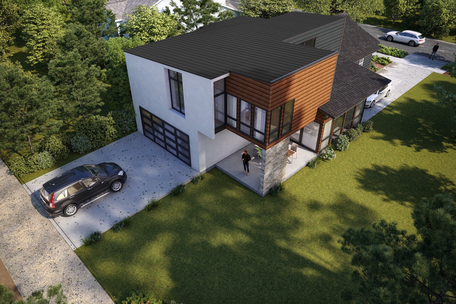
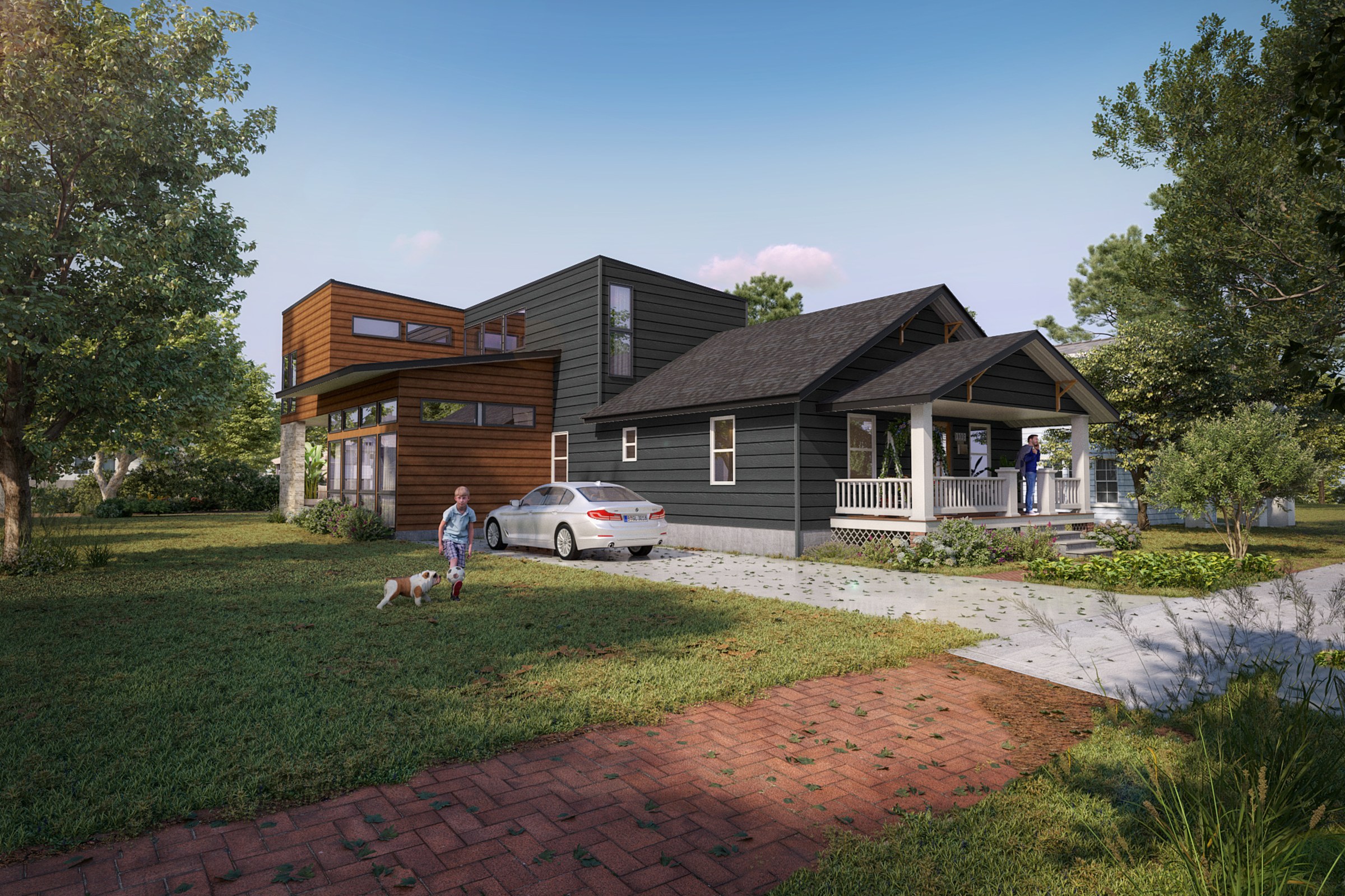
Corner view showing a modern cedar-and-metal clad addition to a dark-sided craftsman bungalow with brick path and lush green yard.
Client
Mies Architects
Industry
Luxury Residential Architecture
Objective
Contemporary Single Family Visualization
Deliverables
Photoreal luxury residential exterior renders, multiple viewpoints, marketing-ready output
Overview
A contemporary addition to a craftsman bungalow is one of the harder briefs in luxury residential exterior visualization. The new volume has to read as confidently modern without making the original house look like a mistake. The original has to retain its character without making the addition look apologetic.
Project 79 sat exactly on that line. Mies Architects had designed a cedar-and-metal clad addition grafted onto a dark-sided craftsman in Jacksonville, Florida. The corner view was the hero. It needed to show both volumes in a single frame, settled into a mature yard with a brick path, without flattening either.
The studio’s job was to turn that drawing into a corner view that worked for planning conversations, pre-sales material, and the architect’s portfolio. One frame, three audiences, no compromises.
Where do most contemporary-addition briefs fail?
Most renders of additions fail in the same place. The new volume looks pasted on. Materials read as a sample board rather than a wall. The lighting flatters one half of the house and abandons the other.
The failure is rarely modeling. It’s almost always view planning and material authoring. A camera placed for the addition makes the original house look ignored. A camera that shows both equally often picks a height or focal length that no human would actually use.
- Camera too high, the yard collapses and the bungalow loses scale
- Camera too low, the metal cladding catches sky and goes blown out
- Wide lens, the corner geometry distorts and the eaves bend
- Long lens, the two volumes flatten into one undifferentiated plane
- Symmetrical framing, the addition reads as a transplant, not a graft
For a corner shot showing two material languages, the camera does as much design work as the lighting.
What made this hard
The brief carried three structural tensions that had to be resolved before a single render passed final.
First, the material contrast. Cedar reads warm and low-frequency. The metal cladding reads cool and high-frequency. The dark siding on the original bungalow is closer in value to the metal than to the cedar. Without careful handling, the cedar floats and the other two volumes merge into a single dark mass.
Second, the Jacksonville site context. Lush green yard, mature planting, Florida light. That light is harder than most northern-exposure work, high contrast, fast falloff, deep shadows under eaves. Rendering it with a generic sun setup produces a render that could be anywhere.
Third, the corner-view requirement itself. One frame had to do the work of three. Architects wanted accuracy. The development team wanted warmth. Marketing wanted a hero shot for hoarding and the project page.
The corner view is the only frame where an addition either resolves with the original house or doesn’t, and no amount of detail elsewhere fixes a corner that reads wrong.
How we approached it
The production sequence was deliberate. Each phase resolved one of the tensions above before moving on, so by the time we were rendering, the difficult decisions had already been made.
1. Source file review and view planning
We started with the architect’s drawings, sections, and any reference photography of the existing bungalow. Before any modeling, we placed test cameras at five viewpoints around the corner. Eye-level human standpoints only. No drone heights, no impossible angles.
The chosen camera sat roughly where a person on the opposite sidewalk would actually stand. Lens choice was a moderate wide, enough to hold both volumes without bending the eaves. The brick path was placed inside the lower third to lead the eye from the original house toward the new addition.
2. Material authoring with PBR fidelity
Cedar, metal, and dark siding were each built as full PBR materials, albedo, roughness, normal, and where needed, displacement. The cedar got grain variation across boards so it didn’t read as wallpaper. The metal cladding got real specular falloff and subtle directional brushing so it caught light without going chrome.
- Cedar: per-board color variation, grain normal, light displacement
- Metal cladding: anisotropic roughness, real edge highlights
- Dark siding: matte rather than satin, to separate from the metal
- Brick path: weathered edges, joint variation, no repeating tile
3. Lighting and time-of-day study
We rendered three lighting variants before locking the final. Mid-morning, late afternoon, and an overcast neutral. HDRI lighting drove the sky and ambient. A directional sun gave the cast shadows.
Late afternoon won. It put warm light on the cedar, pushed the metal cladding into a clean cool reflection, and carried the dark siding without crushing it. The yard read green rather than yellow. Ambient occlusion under the eaves and porch held the craftsman detail that a flatter time of day would have lost.
4. Render passes and post
The final frame came out of the engine in separate passes, beauty, reflection, AO, shadow, foliage, and a couple of utility passes for sky and z-depth. Ray-traced reflections on the metal were rendered clean rather than denoised aggressively, since the reflection is part of how the cladding reads as cladding.
Post was light. Color balance, micro-contrast on the cedar, a subtle vignette to weight the corner. No filters. No HDR look. The grade had to survive being printed at hoarding scale and being viewed on a phone.
Deliverables
| Type | Quantity | Notes |
|---|---|---|
| Hero corner exterior still | 1 | Final approved frame at print resolution |
| Time-of-day variants | 2 | Mid-morning and late afternoon, same camera |
| Material study crops | Multiple | Tight crops on cedar, metal, brick junctions |
| Marketing-ready exports | 3 | Web, hoarding, and print aspect ratios |
| Working files | Project archive | Scene retained for future view additions |
Results
The corner view did the three jobs it had to do. The addition reads as designed alongside the original bungalow rather than competing with it. The cedar holds its warmth. The metal reads as metal. The dark siding sits between them without disappearing.
For the architect, the frame works as portfolio. It shows the design decision, the contrast graft, clearly enough that a reader understands the project from one image. For the development team, the same frame carries warmth and lifestyle context, which is what pre-sales material needs.
- One hero frame approved without revision rounds beyond standard review
- Two time-of-day variants delivered for marketing flexibility
- Print-resolution outputs sized for hoarding and large-format use
- Material crops usable independently in spec sheets and brochures
The brick path and yard, which on a lesser brief would have been afterthoughts, ended up doing real work. They give the eye somewhere to land before reading the architecture, and they ground the addition in a site rather than a void.
Key takeaways
-
View planning is the design decision. On a corner shot of a contemporary addition, the camera placement decides whether the project reads as resolved or as transplanted, before lighting or materials matter.
-
Material contrast needs authoring, not assignment. Cedar, metal, and dark siding only sit together when each one is built as a real PBR surface with proper roughness, variation, and reflection behavior.
-
One frame, three audiences is achievable but deliberate. Architects, developers, and marketers want different things from the same image, and the lighting study is where those needs get reconciled rather than compromised.
Working on a project that needs compelling visuals? Tell us about your project or explore our full portfolio.
Project Gallery