Nicholas Mcdougall Residence — Case Study
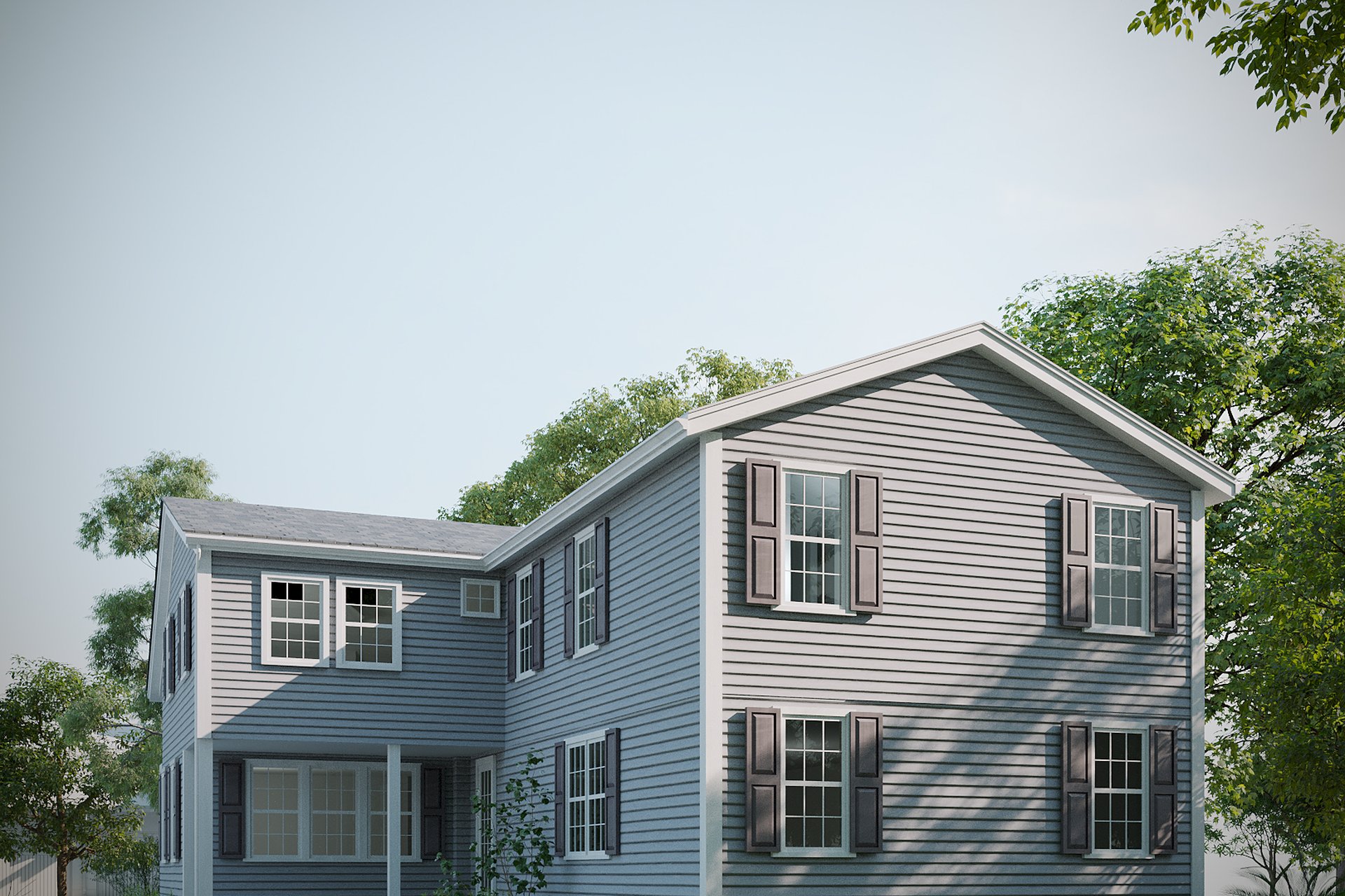
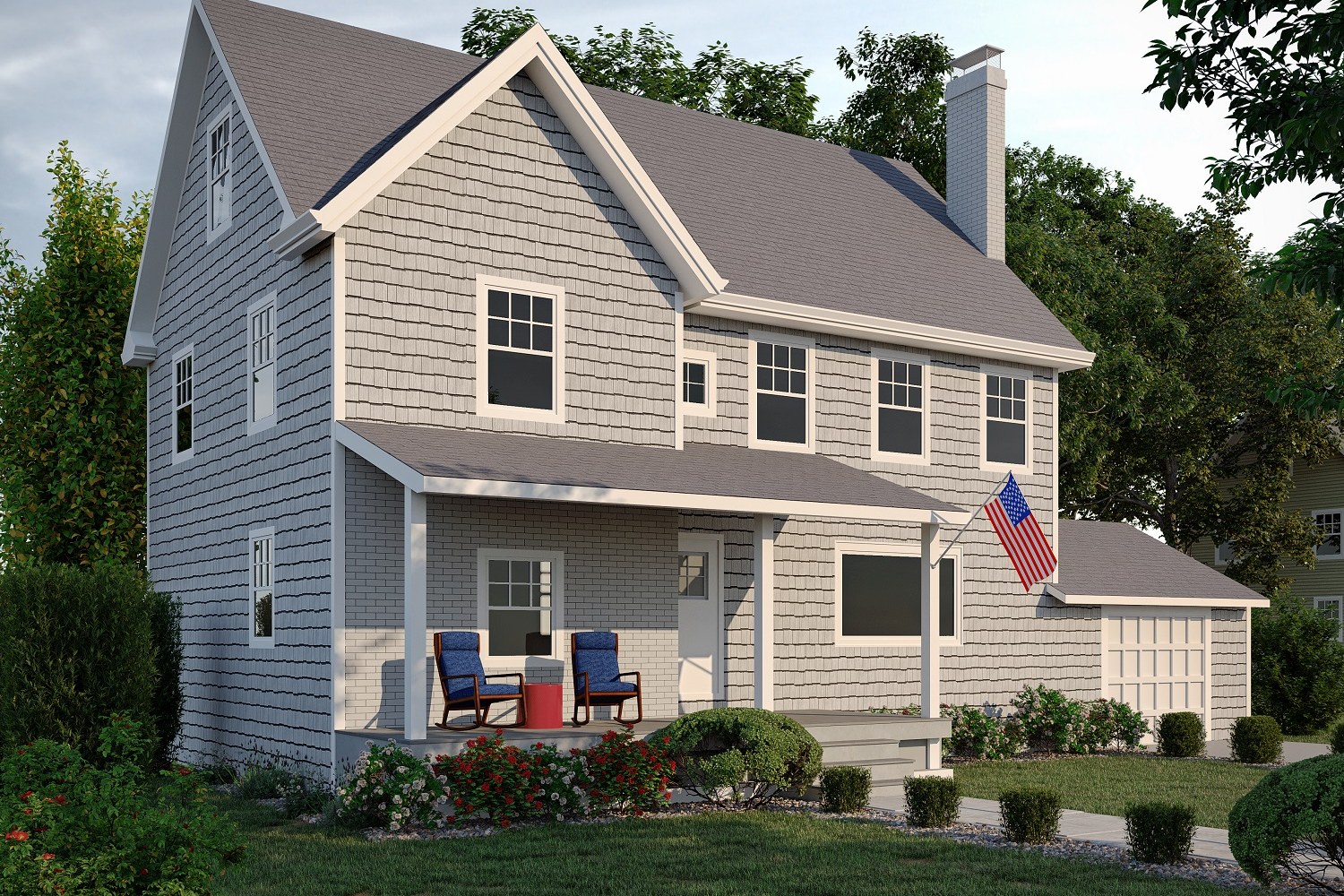
Front-corner view of New England shingle-style home with American flag, cedar shingle siding in gray, steep gable, front porch with Adirondack chairs. Detached garage at right.
Client
Atkins + Partners
Industry
Luxury Residential Architecture
Objective
Colonial Colonial Visualization
Deliverables
Photoreal luxury residential exterior renders, multiple viewpoints, marketing-ready output
Overview
The Nicholas Mcdougall Residence sits in the architectural vocabulary that Halifax knows by heart: shingle-style, gabled, porch-fronted, set back from the lot line with a detached garage holding the corner. It is a typology that locals can read at a glance. That familiarity is precisely what makes it hard to render well.
Atkins + Partners came to us in 2023 with a front-corner view brief and a small constellation of design intentions that had to be legible without explanation. Cedar in weathered gray. Steep gable. Adirondack chairs on the porch. An American flag. Each element is a cliché until it isn’t, and the difference is craft.
This case study walks through the production decisions that separated a competent render from one that earned the residence its first review-board approval and seeded the marketing package that followed.
Where do most luxury residential exterior briefs fail?
They fail at the surface of the cedar.
Shingle-style homes live or die on PBR materials that read as wood, not as a tiled texture. Most studios deliver a uniform gray plane with a normal map and call it shingles. Up close, the eye knows. Reviewers know. The architect knows on the third revision when the porch column meets the wall and the shadow line is wrong.
The second failure point is light. Halifax is not California. The site sits at 44 degrees north, which means a sun that grazes rather than punches, and shadows that elongate even at midday. A rendering lit for Phoenix will look false here regardless of how clean the geometry is.
The third is staging. An Adirondack chair placed by someone who has never sat in one reads as furniture-store inventory. So does a flag hung without slack.
What made this hard
Three constraints shaped the production from the first call:
- Typology fatigue. Reviewers see twenty shingle-style proposals a year.
- Coastal lighting authenticity. Maritime atmosphere reads differently from inland light.
- Two-volume composition. House plus detached garage in one frame without crowding.
- Material legibility. Weathered cedar must read as cedar, not as gray paint.
- Period-appropriate styling. Adirondacks and flag without descending into pastiche.
- Front-corner geometry. A three-quarter view exposes more facade than any single elevation.
Each of these is solvable in isolation. Together they require sequencing.
Our approach
We ran the project across roughly six weeks, structured into discrete production phases. Each phase had a sign-off gate before the next began. This is not novel, but the discipline matters: a lighting decision made on stale geometry compounds.
1. Source file review and reference gathering
The design team sent CAD elevations, a site plan, and a folder of reference photographs of comparable Maritime homes. We added our own reference: weathered cedar at three to seven year aging stages, since the brief specified gray rather than fresh ochre. View planning began here, not later.
We locked the front-corner camera at a 35mm equivalent lens choice, eye-level, with the garage held in supporting position at frame right. Wider would have flattened the gable. Tighter would have lost the porch.
2. Geometry and material build
The shingle wall was modelled with offset rows and individual board variation rather than a planar tile. Displacement mapping carried the corner returns and the gable trim where the silhouette reads against sky. Flat-mapped shingles betray themselves at the gable edge every time.
Cedar was authored as four material variants. Sun-bleached upper courses, slightly greener north-face shingles, the weathered porch ceiling, and the trim. The architect specified a single gray. The render needed four to make that single gray believable.
3. Lighting and atmosphere
We built the scene with HDRI lighting captured for Maritime overcast conditions, then layered a directional sun for the hero variant. Two time-of-day variants were rendered: late-morning clear and a softer afternoon overcast for the hoarding graphic.
Ambient occlusion was tuned conservatively. Shingle-style homes have deep porch recesses that AO can over-darken into caves. Subtle is the right register here.
4. Staging and review rounds
Adirondack chairs were placed at conversational angle, not parallel to the porch rail. The flag was modelled with cloth simulation and held at partial furl, which is what flags actually do in still air. Two revision rounds with the design team adjusted shrub massing and resolved a roof-pitch read on the dormer.
Deliverables
| Type | Quantity | Notes |
|---|---|---|
| Hero exterior still | 1 | Front-corner view, late-morning clear |
| Lighting variant | 1 | Afternoon overcast for hoarding use |
| Detail crops | 3 | Porch, gable, garage approach |
| Material study renders | 2 | Cedar weathering reference |
| Print-resolution master | 1 | 6000 px long edge for board submission |
| Working files | Full | Archived for future revision rounds |
The hero image was delivered at submission resolution and again as a web-optimised crop. The detail crops gave the marketing team material to work with without recommissioning.
Results
The visualization package supported a successful planning review on first submission. The development team used the hero image and one detail crop in their pre-sales material. The afternoon overcast variant became the hoarding graphic on site.
A few things mattered to the outcome:
- First-pass review approval with no requested visualization revisions
- Two distinct atmospheres delivered from one geometry build
- Reusable asset library for future Maritime shingle-style commissions
- Print and web masters sized for both review board and marketing channels
A render of a familiar typology has to do something the photographs of the typology cannot, or it has no reason to exist.
That principle drove every decision. The reference photographs of New England shingle-style homes are extensive and excellent. To matter, the render had to show this house in this light at this moment, not a generic example of the category.
Key takeaways
-
Familiar typologies demand more craft, not less. Reviewers’ fluency raises the bar; weak materials or generic light get caught immediately.
-
Light is regional. A Halifax brief rendered with inland or southern light will read as wrong even to viewers who cannot articulate why.
-
Two variants from one build is the right unit of delivery. Late-morning clear plus afternoon overcast covered the planning submission and the hoarding graphic without doubling cost.
Working on a project that needs compelling visuals? Tell us about your project or explore our full portfolio.
Project Gallery