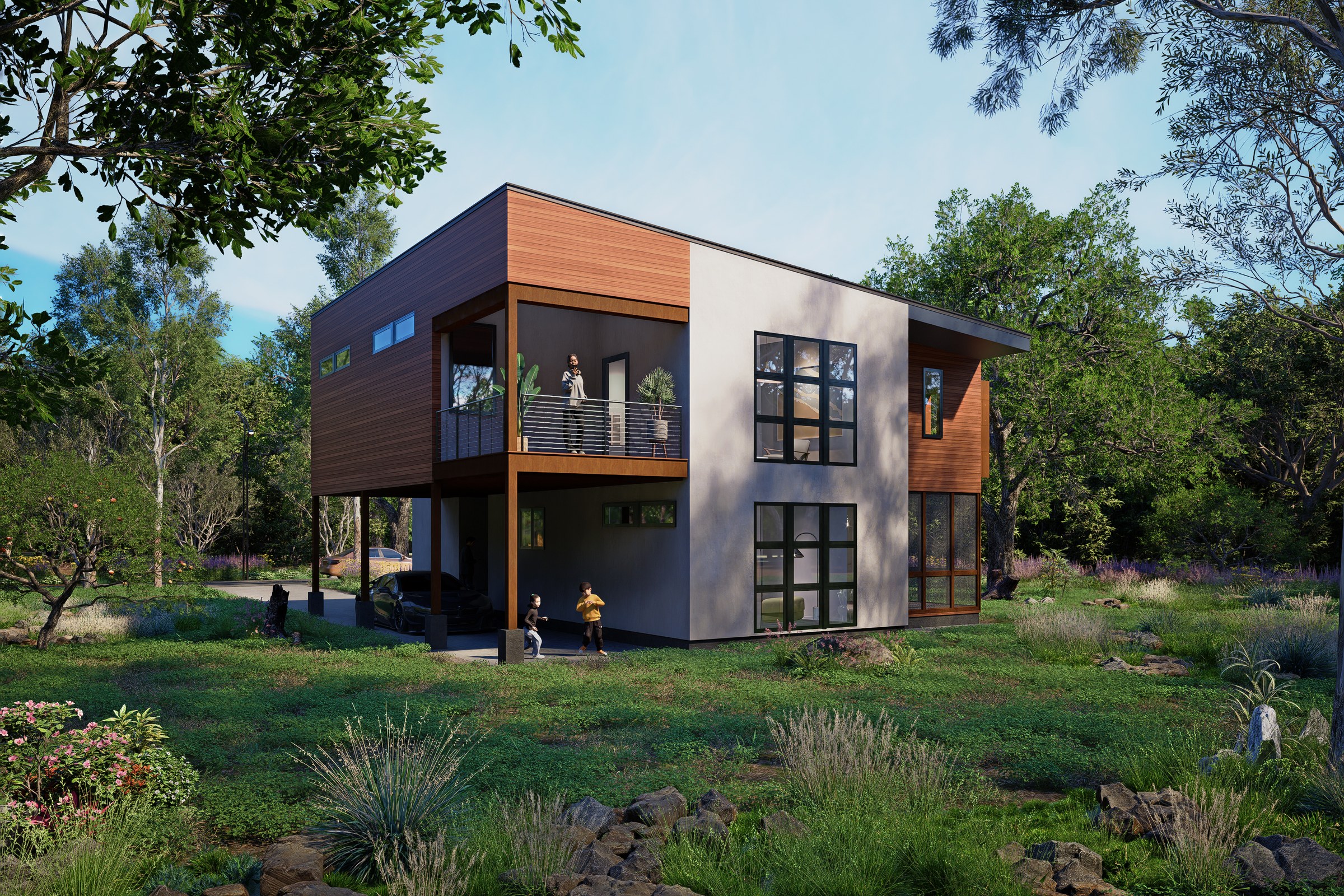
Modern Box House 107 — Case Study
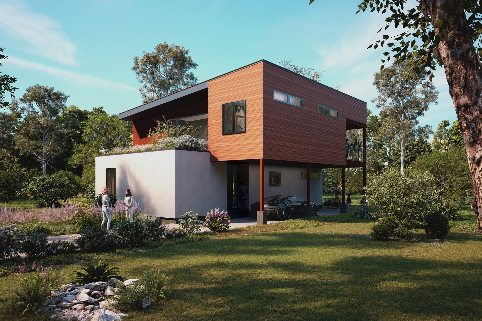
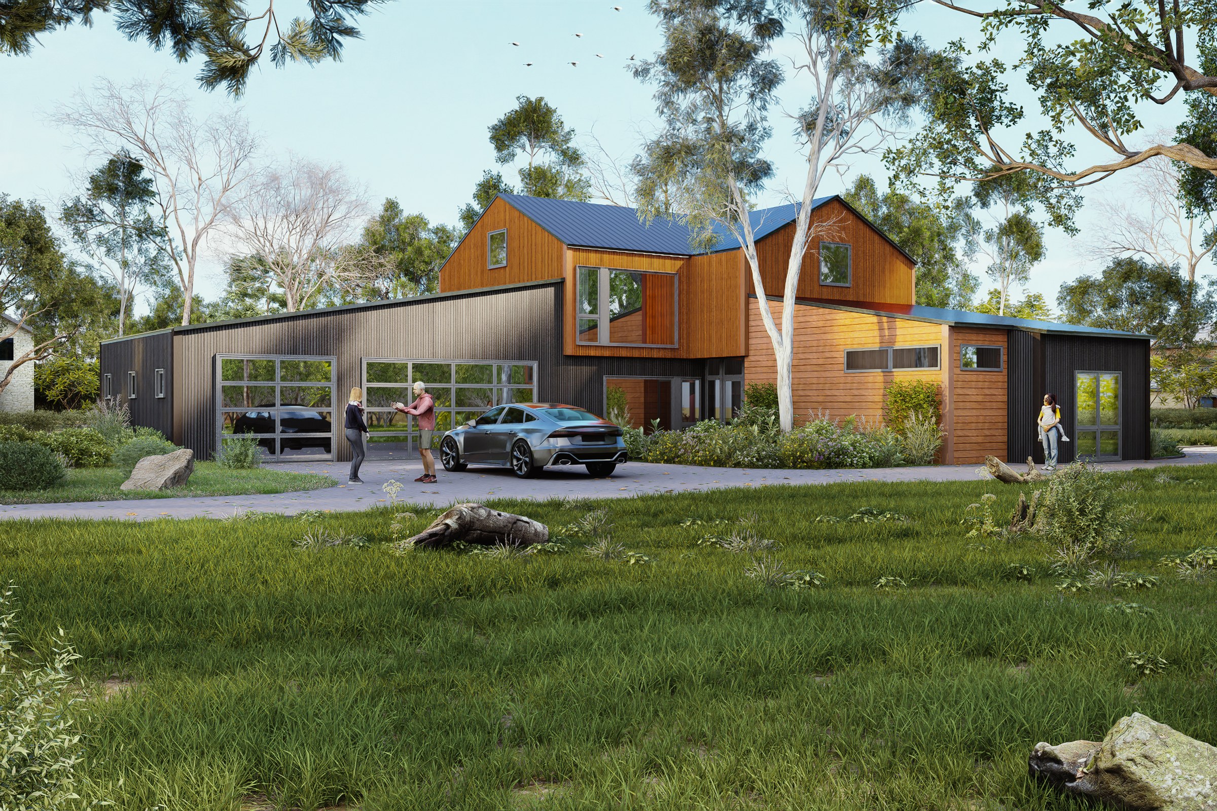
Two-story modern cubic residence with warm cedar wood cladding and grey concrete walls, flat roof, and large glass windows in a wooded setting.
Client
Foster Design Group
Industry
Luxury Residential Architecture
Objective
Modern Single Family Visualization
Deliverables
Photoreal luxury residential exterior renders, multiple viewpoints, marketing-ready output
Overview
Modern Box House 107 is a two-story cubic residence set into a wooded plot outside Munich. The architecture is restrained: cedar cladding warming a grey concrete shell, a flat roof, glass openings sized to frame trees rather than views of neighbours. Foster Design Group commissioned the visualization package in 2025 to communicate that restraint to non-architectural audiences.
That brief sounds simple. It is not. A cubic volume in a forest is the hardest exterior typology in luxury residential because there is nowhere for a weak render to hide. No swooping cantilever to dramatize, no skyline to borrow gravitas from. The materials carry the building, and the PBR materials have to be exactly right.
This case study walks through the production decisions that mattered. Lighting choices, viewpoint logic, material calibration, and the quiet trade-offs that distinguish a render package an architect can present at a planning meeting from one they have to apologize for.
What made this hard
Three constraints defined the work before a single camera was placed.
- Cedar reads as orange under the wrong colour temperature
- Concrete reads as flat grey without correct ambient occlusion
- Forest sites kill renders when the foliage looks like a stock asset library
- Flat roofs hide the building’s silhouette from most natural viewpoints
- Glass at this scale shows everything wrong with interior lighting balance
- German planning culture expects sober, accurate imagery, not theatrical hero shots
Any one of those issues is solvable. The combination is what makes a forested cubic house difficult. Each decision constrains the next. Push the warmth in the cedar and the concrete goes muddy. Lift the concrete and the cedar bleaches.
Where do most luxury residential exterior briefs fail?
They fail at the seam between architectural intent and image-making instinct.
Visualization studios trained on commercial work tend to overdress. They add sunset gradients, lifestyle props on the terrace, a wine glass on a table. For a Foster Design Group project of this character, that approach would have read as dishonest. The architecture is quiet. The renders had to be quiet too.
The other failure mode is the opposite: technically clean images with no atmosphere, the kind of output that gets a project approved but never sells a unit or wins a magazine feature. The job was to find the narrow band between those two failures.
The discipline in luxury residential exterior work is knowing what to leave out, not what to add.
Our approach
We ran the project across four production phases over roughly six weeks. Each phase had a defined deliverable and a single point of architectural review with the design team before the next phase opened.
1. Source file review and viewpoint planning
We started with the Foster Design Group CAD set and a site survey. Before any modelling, we walked the site digitally and locked view planning to four primary camera positions. Two long approaches through the trees, one corner hero, and one tight elevation showing the cedar-to-concrete junction.
Each viewpoint had a written rationale. The corner hero was for planning submission. The elevation tight-shot was for material approval conversations. The two approach shots were for marketing use.
2. Material calibration
This is where most of the project lived. Cedar is not a single material. It is a colour family that shifts under sun, shade, and reflected light from concrete. We built three cedar variants and locked the final choice against physical reference samples the architect approved.
- Cedar base albedo calibrated against three reference samples
- Concrete with subtle displacement mapping to read formwork lines
- Glass with measured ray-traced reflections, not screen-space approximations
- Forest foliage built from scanned trees native to Bavarian woodland
- Ground cover varied across viewpoints to avoid repeating texture patterns
3. Lighting and time-of-day
We tested four HDRI lighting environments before settling on an overcast morning as the primary condition and a low late-afternoon sun as the secondary. Overcast was the honest choice for Munich. It is what the building actually looks like on most days.
The late-afternoon variant gave the marketing team something warmer for hoarding and brochure use without crossing into the sunset cliché. We delivered both as separate time-of-day variants rather than retouching one into the other.
4. Final passes and review
Each final image went through three render passes: a beauty pass, an ambient occlusion pass, and a separate reflection pass. Compositing happened in post, which let us tune the cedar warmth independently of the sky temperature without re-rendering. Foster Design Group reviewed at 70 percent and 95 percent stages.
Deliverables
| Type | Quantity | Notes |
|---|---|---|
| Exterior stills (hero) | 4 | 6000px wide, print-ready |
| Time-of-day variants | 2 | Overcast morning and late afternoon |
| Detail crops | 6 | Cedar-concrete junctions, glass reveals |
| Site context shots | 2 | Long approach views through woodland |
| Aspect ratio variants | Multiple | 16:9, 3:2, and square crops for social |
What it delivered
The work was used in three distinct contexts, which is the real test of a render package. Planning presentation, sales material, and architectural press submissions all draw on the same files but ask different things of them.
- Planning submission imagery accepted without revision
- Pre-sales hoarding graphics produced from the same masters
- Press-ready stills with no additional retouching required
- Material approval conversations resolved in a single review cycle
- Forest context shots reused for the architect’s monograph submission
The 6000-pixel masters meant the marketing team could crop aggressively for Instagram without losing fidelity. The separate render passes meant late-stage tweaks did not require re-rendering. That matters when a planning officer asks for a small change forty-eight hours before submission.
The lens choice on the corner hero shot was a 35mm equivalent rather than the wider 24mm most studios default to. A 24mm would have exaggerated the cube. The 35mm let the architecture sit at its real proportions, which is what the design team wanted.
Key takeaways
-
Restraint is the brief, not the limitation. Quiet architecture demands quiet visualization, and the discipline is resisting the urge to dramatize what does not need drama.
-
Material calibration is the project. On a cubic house with two dominant materials, getting cedar and concrete to coexist truthfully is more than half the work, and it is where studios without physical reference workflows fall short.
-
Render packages serve three audiences. Planning, sales, and press all pull from the same files but weight them differently, so deliverables have to be planned for that downstream flexibility from day one.
Working on a project that needs compelling visuals? Tell us about your project or explore our full portfolio.
Project Gallery