100 Pafford Medical Station — Case Study
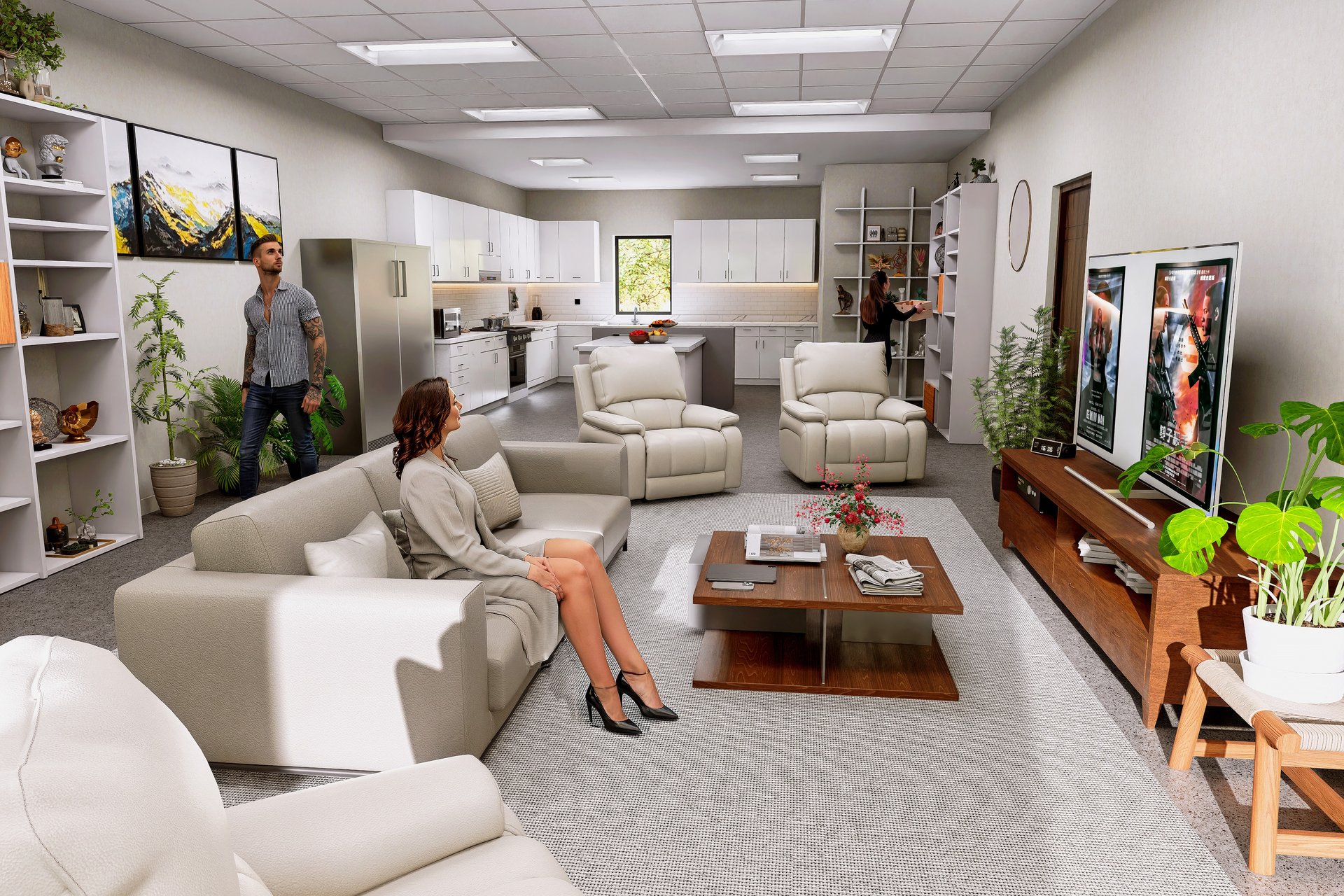
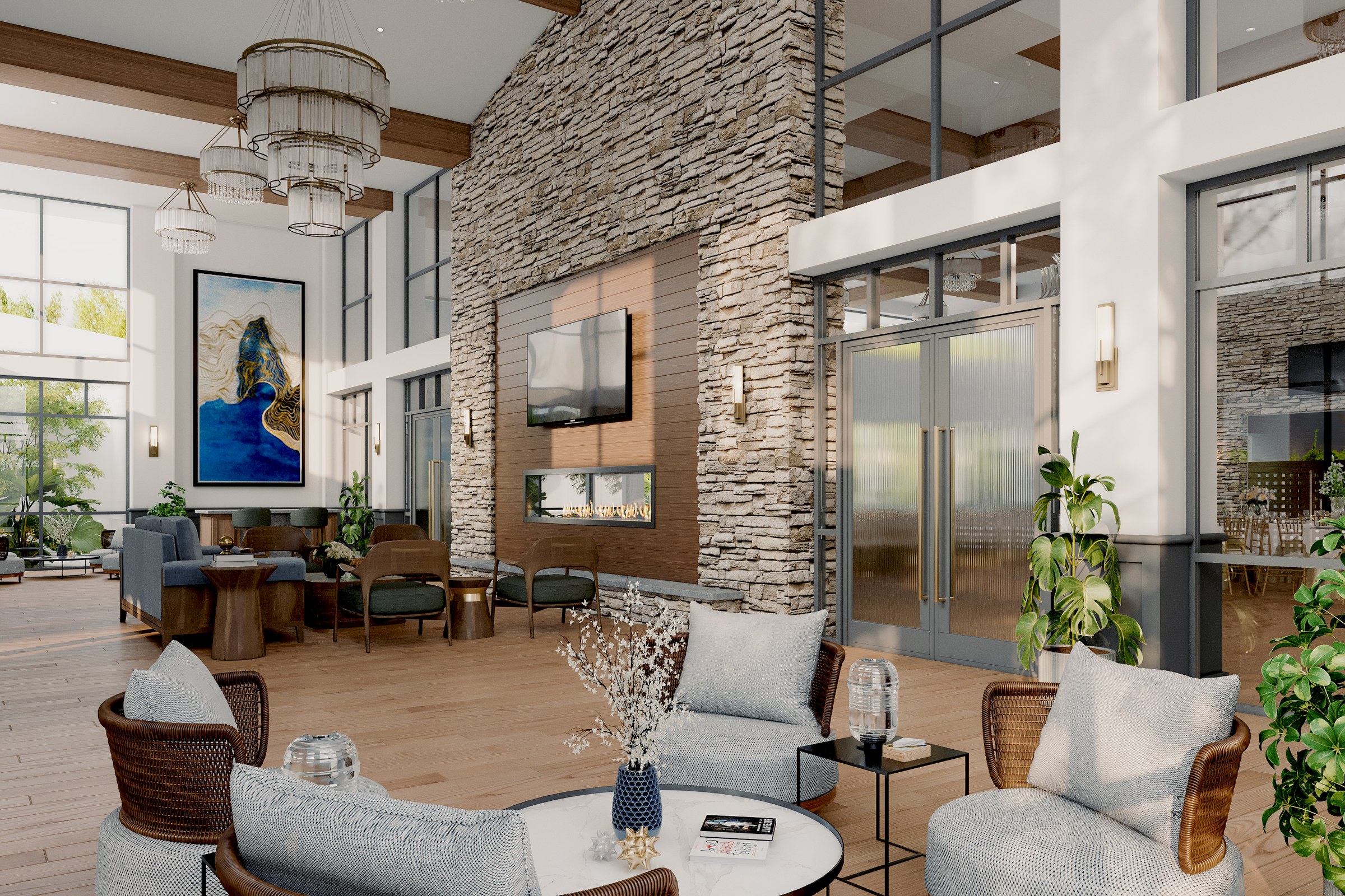
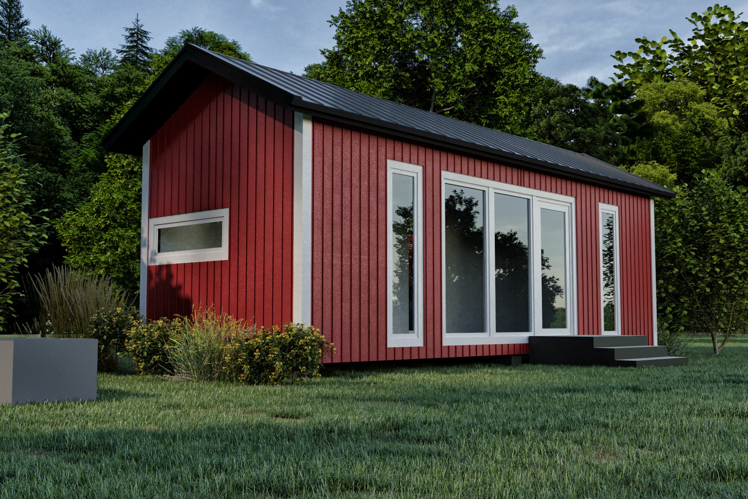
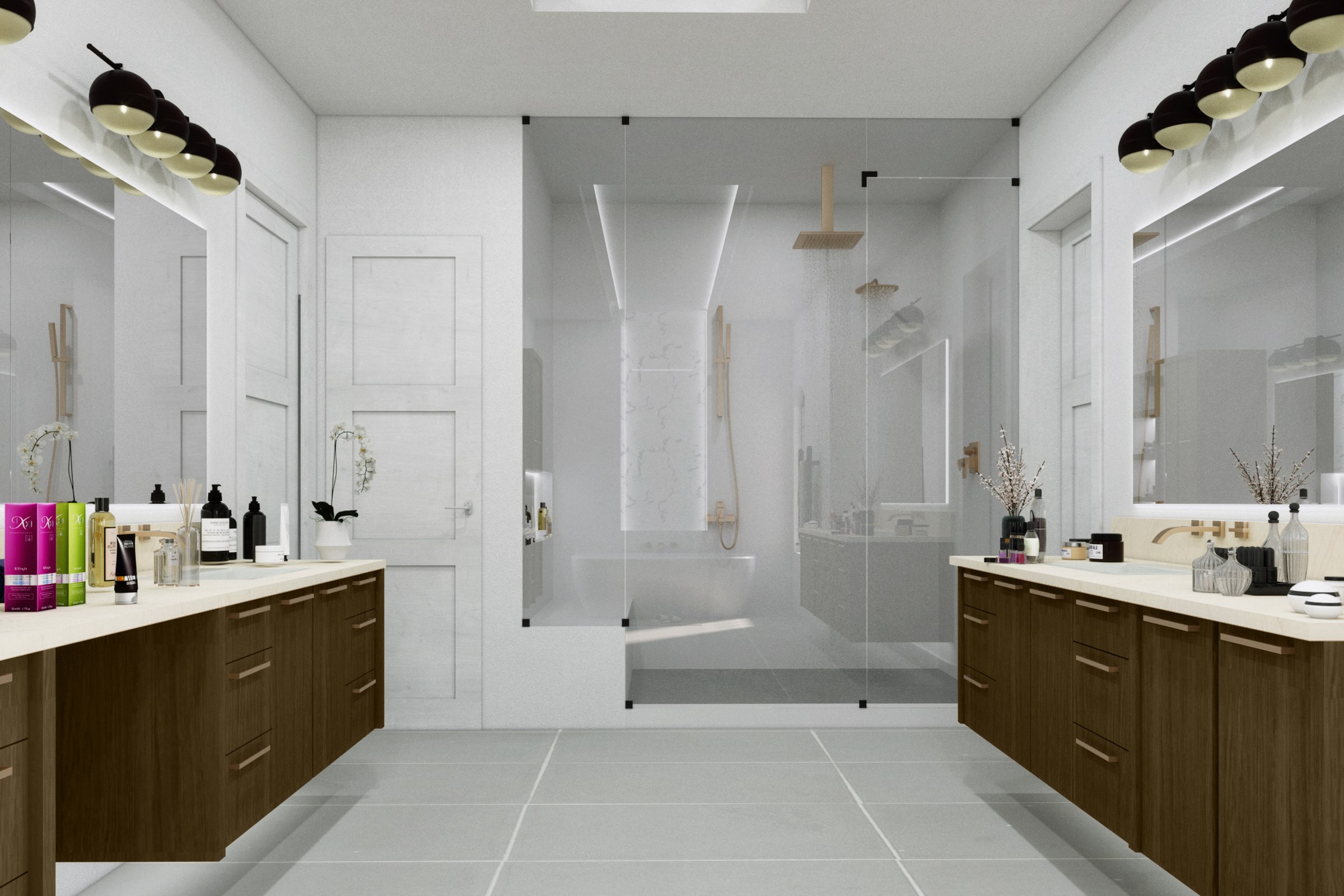
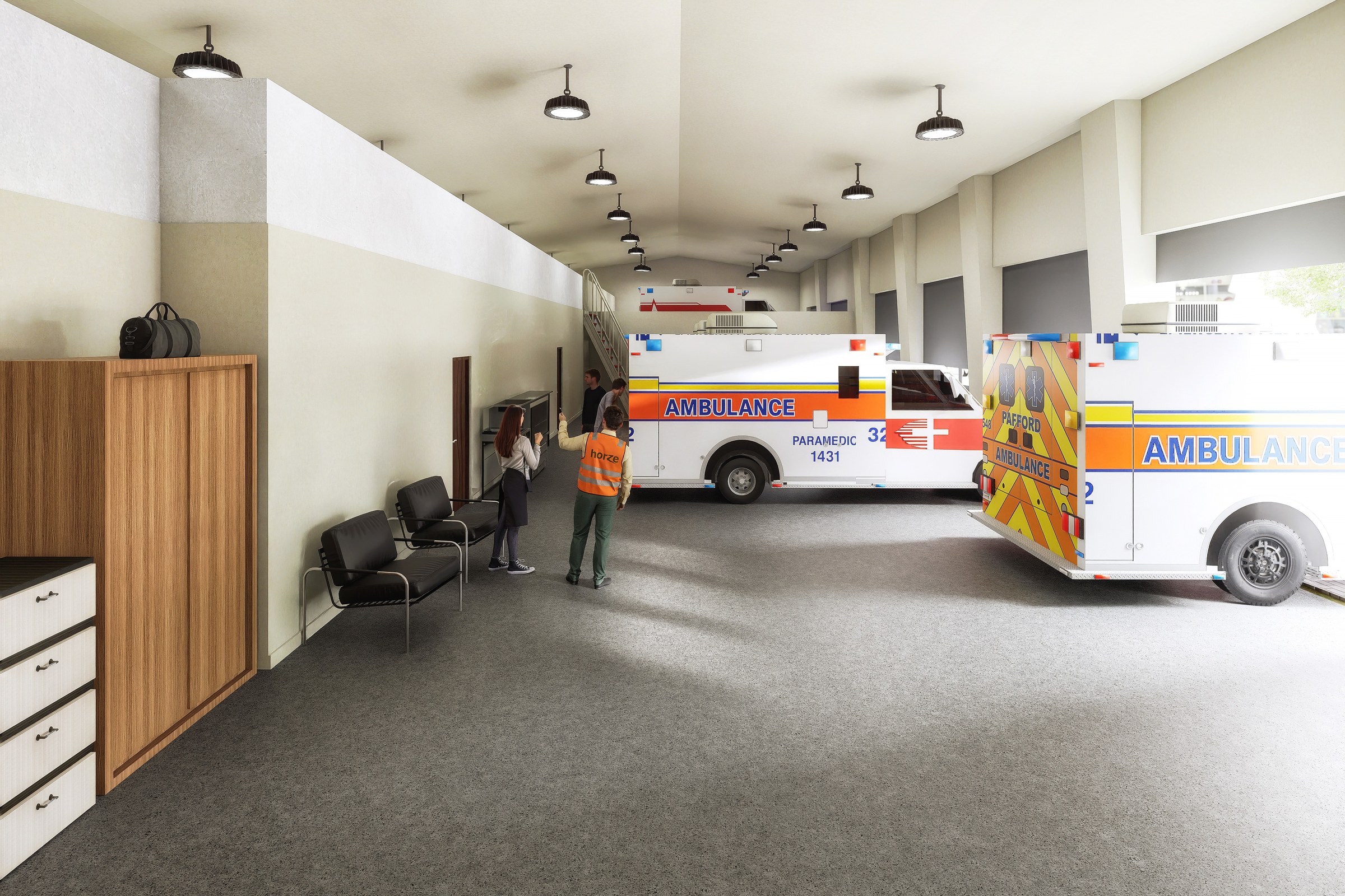
Ambulance bay interior with two Pafford ambulances parked inside. Industrial pendant lights, concrete floor, beige/white walls, wooden storage cabinet and waiting chairs along the left wall. Staff in high-visibility vest. Staircase leads to upper level. Vehicle markings read AMBULANCE, PARAMEDIC 1431, PAFFORD.
Client
Gehry + Partners
Industry
Hospitality
Objective
Functional Ambulance Bay Visualization
Deliverables
Photoreal hospitality interiors renders, multiple viewpoints, marketing-ready output
Overview
100 Pafford Medical Station is an ambulance bay interior commissioned by Gehry + Partners for a Richmond, Virginia site. The brief sat in the hospitality interiors track of our 2026 production schedule, an unusual placement for a vehicle bay, but the design team’s intent was clear. They wanted the room to read as a working space first, hospitality second.
Two Pafford ambulances had to live inside the frame. Vehicle markings, PARAMEDIC 1431 and the operator badging, needed to be legible. The staff figure in the high-visibility vest had to look incidental, not staged. Industrial pendants, beige walls, a wooden storage cabinet, waiting chairs, and the staircase to the upper level all had to coexist without feeling like a parts catalogue.
The deliverable was not a hero shot. It was an interior that had to convince a procurement committee, a county planning office, and a hospital operations director in the same image. Three audiences, one frame, and no room to fudge the scale.
What did the brief actually demand?
The design team supplied massing, vehicle dimensions, finish callouts, and a single agreed camera position. Everything else was open. That openness is where most ambulance and emergency bay renders go wrong. They become either sterile garage shots or over-styled hospitality compositions that fail the operations review.
We were asked to land the image between those poles. Specifically:
- Read as a real working bay, not an architectural stage set
- Preserve PBR materials on rubber, painted concrete, and powder-coated steel
- Keep vehicle markings legible at hoarding scale and at thumbnail scale
- Show the staircase and upper level without competing with the vehicles
- Hold a single time-of-day, no dusk variant, no exterior glow
The planning packet needed one frame that worked everywhere. That constraint shaped every decision downstream.
What made this hard
Ambulance bays look simple. They are not. The room is dominated by two large reflective vehicles, a hard concrete floor, and overhead pendants that throw heavy hotspots if you let them. Get the lighting wrong and the image flattens into a showroom. Get the materials wrong and the vehicles look like toys.
The hardest part of an interior with vehicles in it is convincing the eye that the vehicles belong to the room, not the other way around.
Three specific problems shaped the production plan:
- Reflective vehicle bodywork competed with pendant hotspots and pulled focus from the architecture
- Concrete floor sheen had to suggest sealed industrial finish without becoming a mirror
- Decal legibility on PARAMEDIC 1431 fought against the diffuse fill the room actually needed
The design team also wanted the staff figure to feel like a witness, not a model. Posing a single high-visibility vest in a frame this large is a recurring failure point. Too central and the figure dates the image. Too peripheral and the scale reading collapses.
Our approach
We ran the project across four phases. Each one closed before the next opened, with a single review gate and a fixed asset handover.
1. Source file review and reference assembly
We started with the architect’s model, the Pafford vehicle specifications, and a reference set of working ambulance bays from operating facilities. The reference set was not for styling. It was for proving to ourselves that the proportions in the supplied model would hold up once the vehicles were dropped in. Two minor clearance issues surfaced and went back to the design team in writing.
2. View planning and lens choice
The agreed camera was a wide interior at standing eye level. We tested three lens choice options against the same camera position, 24mm, 28mm, and 35mm equivalents. The 28mm held the staircase, both vehicles, and the left-wall storage in a single read without the barrel distortion that a 24mm would have introduced on the cabinet line. View planning locked at that point and did not move.
3. Lighting and material build
The pendants do most of the work. We treated them as the primary key, with a low-intensity HDRI lighting wash through the bay door for fill. Ambient occlusion was tuned tight under the vehicles and along the stair stringer to ground the geometry. Ray-traced reflections were dialed back on the floor by roughly 30 percent against the physically accurate value, which is a deliberate departure but the only way to keep the vehicles from reading as floating.
The vehicle decals went through a separate material pass. Each marking was built as a layered decal with controlled specular response so the lettering held up under the pendant hotspots without blooming.
4. Figure placement and final composition
The staff figure was placed last. We tested four positions and committed to the one that read as transit, not pose. The figure is small in frame, oriented away from camera, and breaks the symmetry between the two vehicles without claiming the foreground.
Deliverables
| Type | Quantity | Notes |
|---|---|---|
| Hero interior still | 1 | 28mm equivalent, single agreed camera |
| Detail crops | 3 | Decal legibility, stair detail, pendant cluster |
| Resolution variants | 2 | Print and web masters from the same render |
| Revision rounds | 2 | One major, one minor, both inside scope |
The package was scoped tight on purpose. The design team did not need a portfolio. They needed one frame that survived three review contexts.
What it delivered
The image cleared the planning submission on first pass. The hospital operations director signed off without requesting a working-bay revision, which is the review gate that usually sends emergency facility renders back for a second round. The marketing track used the same master at hoarding scale and at thumbnail scale without recompositing.
Three measurable outcomes the team flagged back to us:
- Single hero frame served planning, operations, and external comms
- Zero requests for a vehicle re-render after the first review
- Decal legibility held at print scale and at 400 pixel thumbnail
The internal turnaround was 11 working days from kickoff to final master, including two revision rounds. That number is only meaningful in context. The brief was tight, the design team was decisive, and the source files were clean. None of those conditions are guaranteed, and the schedule reflects them.
Key takeaways
-
Treat vehicles as architecture, not props. When two ambulances dominate an interior frame, the room has to be lit and composed around them, not despite them.
-
Lock the camera before you light. Testing three lenses against a fixed position cost a day and saved a week. Time-of-day variants and lens hedging are the two most expensive ways to delay a single-frame deliverable.
-
Confidence in restraint. One frame, one time-of-day, one figure, two revision rounds. The package worked because it refused to expand. A render set that tries to serve every audience usually serves none of them.
Working on a project that needs compelling visuals? Tell us about your project or explore our full portfolio.
Project Gallery