Veterans Memorial Park — Case Study
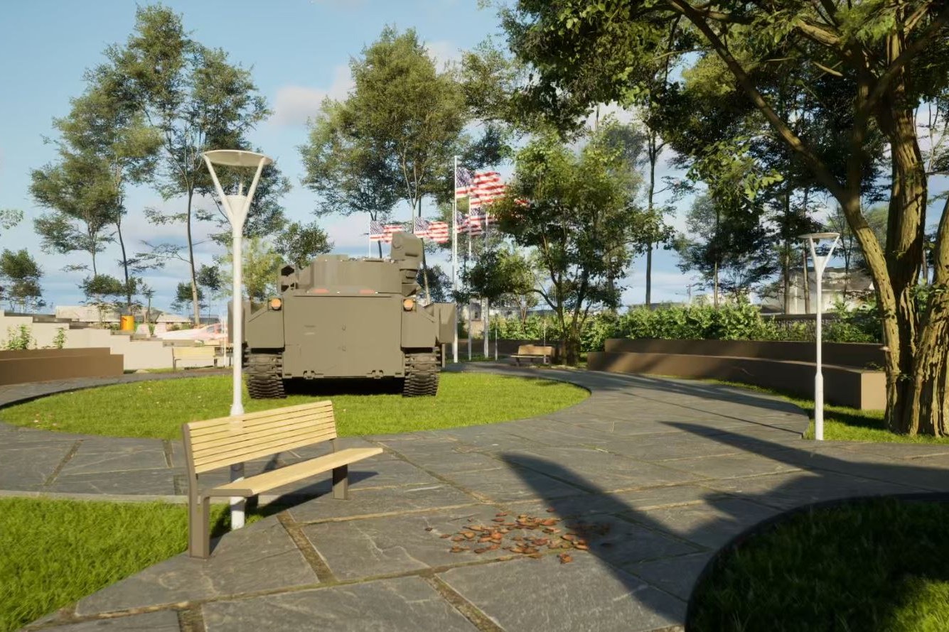
3D rendering of a veterans memorial park featuring a military armored personnel carrier (APC/tank) displayed on a circular grass island. American flags fly on poles in the background. Modern Y-shaped street lamps, wooden park benches, and flagstone pathways with circular layout surround the display. Mature trees and a residential neighborhood are visible beyond a perimeter wall. Civic memorial atmosphere with strong patriotic elements.
Client
Confidential
Industry
Landscape Outdoor
Objective
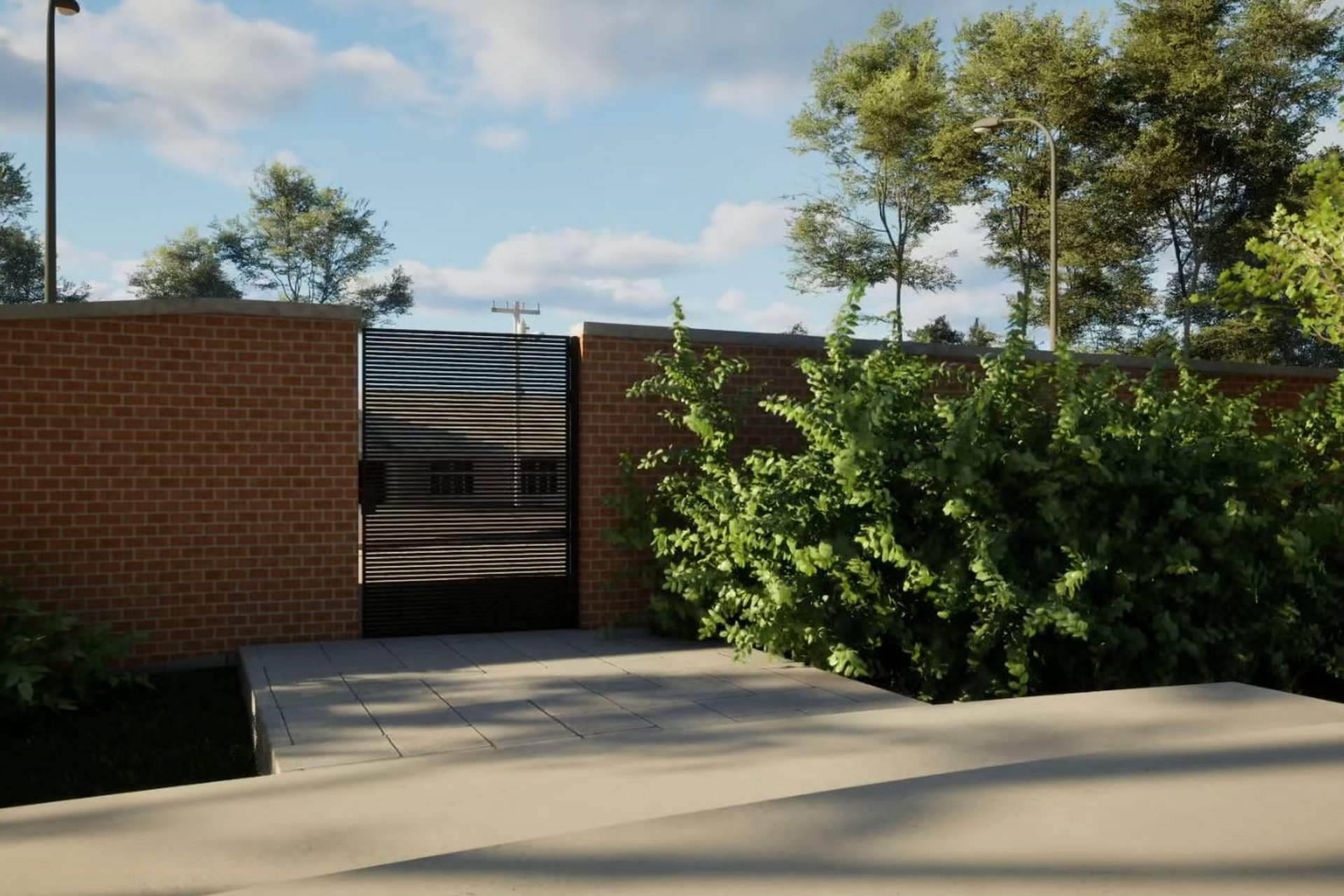
Contemporary Civic Perimeter Wall Gate Visualization
Deliverables
Photoreal landscape outdoor renders, multiple viewpoints, marketing-ready output
Overview
A memorial park is a strange brief for a visualization studio. The deliverable is not a building. The hero object is a decommissioned armored personnel carrier on a grass island, surrounded by flagpoles, benches, and a flagstone path that loops back on itself. Most of the work happens at ground level, in the spaces between objects.
This Dallas project came to us as a contemporary civic perimeter scheme. The design team needed images that read as dignified civic ground, not military display, and not theme park. That distinction lives in lighting choices, material restraint, and where the camera sits relative to the carrier’s silhouette.
The reader brief: an architect or municipal stakeholder evaluating the scheme should understand the place in three seconds. The render has to communicate scale, sightlines, and tone before anyone reads a caption. That is the bar.
What did the brief actually demand?
The design team handed over CAD plans, a perimeter wall elevation, and reference photographs of the APC. From that, we had to build a credible civic landscape that sat naturally inside an existing residential neighborhood in Dallas.
Three things had to be true in every frame:
- The memorial reads as the focal point without dominating the street
- The perimeter wall feels protective, not defensive or fortress-like
- Surrounding houses and mature trees integrate without competing for attention
That last point is where most landscape outdoor briefs quietly collapse. Context is treated as background filler. Here, the neighborhood was the reason the park exists.
Where do most veterans memorial visualizations fail?
They over-saturate. Flag red, grass green, sky blue, all dialed up because patriotism is mistaken for visual loudness. The result reads as a postcard, not a place.
They also flatten the carrier. An APC is a complex object with riveted plates, weathered steel, mounted optics, and tread detail. Shortcut it with a low-poly placeholder and the entire frame loses anchor weight. The eye knows when the hero object is fake.
A memorial render fails the moment the visitor in the frame feels staged rather than present.
The other failure mode is lighting that flatters the architecture but ignores the ritual function of the space. A memorial is used at dawn ceremonies, midday visits, and dusk reflection. One golden-hour image does not tell that story.
The challenge
Four constraints shaped production:
- The APC required photoreal asset accuracy, including weathering and surface decals
- Perimeter wall masonry had to read as contemporary civic, not decorative
- Flagpole physics, fabric weight, and wind direction had to stay consistent across views
- Residential context beyond the wall needed to feel real but never compete
The grass island geometry was deceptively hard. A circular berm with a heavy object on top reads wrong if the ground plane lacks displacement mapping and proper shadow contact. We rebuilt it three times before the carrier sat correctly.
Flag rendering was the other quiet difficulty. American flags on tall poles, lit from multiple angles, with subsurface scattering through the fabric. Get this wrong and the render loses credibility at the exact place patriotic viewers will look first.
How we approached it
1. Source review and asset audit
Before any modeling, we audited what was usable from the design team’s package. CAD plans were clean. The APC reference photographs were inconsistent in lighting and angle. We flagged the carrier as a custom build rather than a library asset, which moved roughly two days into the upfront schedule.
We also walked Dallas residential typology references to ensure the houses beyond the wall matched the neighborhood’s actual architectural vocabulary. Generic suburban stand-ins would have undermined the entire frame.
2. View planning and camera strategy
View planning is where a forgettable render package and a useful one diverge. We blocked five candidate camera positions against the site plan, then narrowed to the angles that did distinct narrative work:
- A wide establishing shot showing the perimeter wall and gate relationship
- A mid-range hero view of the APC on the grass island
- A pedestrian-eye view along the flagstone path
- A dusk variant emphasizing the Y-shaped lamp standards
Each angle answers a different question a stakeholder will ask. Lens choice stayed conservative, between 35mm and 50mm equivalents, to avoid distortion that makes civic spaces feel theatrical.
3. Materials and lighting build
We used PBR materials throughout, with custom texture work for the perimeter wall stone, the APC’s weathered finish, and the flagstone path. The wall material went through four iterations before it stopped reading as either too rustic or too corporate.
Lighting was HDRI-based with a midday Dallas sky as primary, supplemented by directional sun. Ambient occlusion was tuned conservatively. Heavy AO on a memorial reads as gloomy. We wanted reverence, not weight.
4. Context integration
The mature trees, residential rooflines, and street lamps beyond the perimeter were modeled as full geometry, not billboard cards. This matters at dusk, when ray-traced reflections on the lamp posts and gate hardware pick up the warm sky. Cardboard context breaks immediately.
Deliverables
| Type | Quantity | Notes |
|---|---|---|
| Exterior stills, daytime | 4 | Hero, wide, pedestrian, gate detail |
| Exterior stills, dusk variant | 2 | Lamp standards lit, sky transition |
| Perimeter wall context view | 1 | Showing residential integration |
| Revision rounds | 3 | Standard for civic visualization briefs |
Image resolution was delivered at print-ready dimensions to support hoarding graphics, board presentations, and any municipal review submissions the design team needed.
Results
The package gave the design team a tool for three distinct conversations:
- Municipal review: the wide establishing shot and perimeter context view
- Donor and community presentations: the hero APC view and dusk variants
- Construction coordination: the pedestrian-eye path view, which clarified flagstone layout intent
Turnaround ran across roughly three weeks from approved brief to final delivery, including the three revision rounds. Most adjustments were lighting weight on the carrier and time-of-day variants for the dusk frame, not structural rework. That ratio tells you the upfront view planning held.
The dusk image became the lead asset for the team’s stakeholder presentations. That was not the obvious pick at briefing. It became obvious once the lamp standards, flag fabric, and residential silhouettes were all working in the same frame.
Key takeaways
-
Hero asset accuracy is non-negotiable. When the focal point is a real, photographed object like an APC, viewers will catch any shortcut, and the entire frame loses authority.
-
Context is the brief, not the background. A memorial inside a residential neighborhood is a relationship, not a foreground. Modeling the houses, trees, and streetscape as real geometry is what makes the place believable.
-
Plan camera angles before you build materials. Five blocked viewpoints filtered down to seven final images. The filtering happens at the storyboard stage, not in post, and that discipline is what kept revision rounds to three.
Working on a memorial, civic, or landscape visualization project? Tell us about your project or explore our full portfolio.
Project Gallery