Bk Scandinavian Tiny Cabin — Case Study
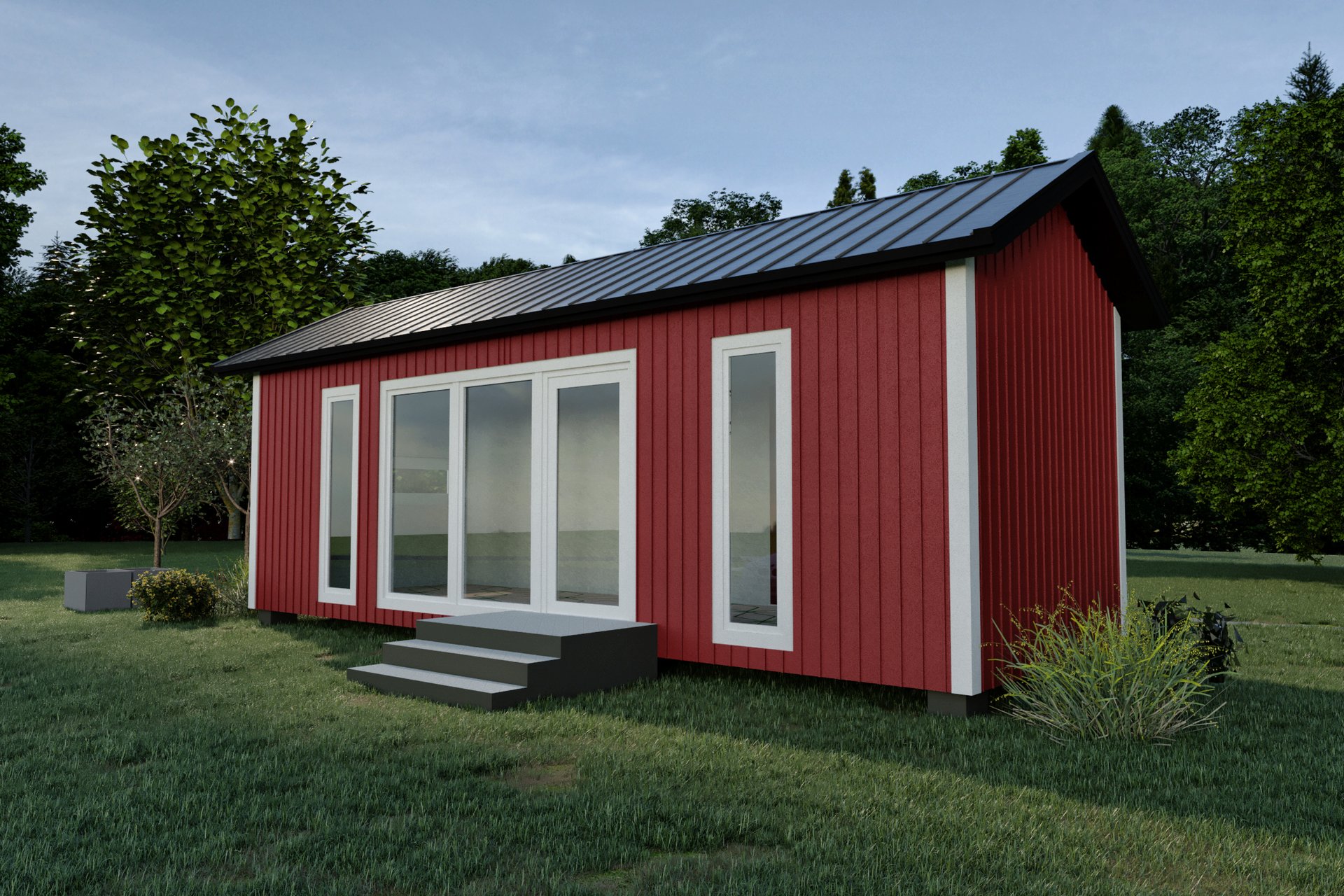
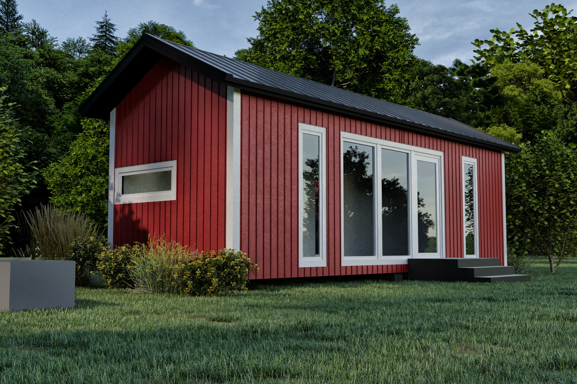
3D render of a compact red-painted tiny cabin with pitched roof, large white-framed glass patio doors on the front facade, small horizontal window on the side wall, set on a manicured green lawn with shrubs and mature trees in the background. Concrete planter visible at lower left.
Client
Confidential
Industry
Container House
Objective
Scandinavian Modern Container House Visualization
Deliverables
Photoreal container house renders, multiple viewpoints, marketing-ready output
Overview
A red-painted tiny cabin on a Malibu lawn sounds like a simple brief. It isn’t. The smaller the building, the less the image can hide behind volume, complexity, or hero geometry. Every joint, every shadow line, every blade of grass has to carry weight, because there’s nothing else competing for the eye.
The Bk Scandinavian Tiny Cabin was visualized in 2025 for a confidential development team exploring a compact, exportable container-format dwelling. The format is deceptively demanding: archetypal Scandinavian colour, pitched roof, white-framed glazing, a manicured Californian setting. Visually familiar territory, which means the reader’s tolerance for error is near zero.
Our brief was a single hero exterior plus supporting variants. The output had to function for design review, pre-sales material, and planning-adjacent collateral, all from one tightly composed scene. This is a record of how that image was built and the decisions that mattered.
What did the brief actually demand?
The development team supplied geometry, a material direction, and a site reference. What they did not supply, and what most clients cannot supply, was a resolved answer to the harder question: what does this cabin need to feel like to a buyer, a planner, and a marketer simultaneously?
That gap is where visualization work earns its fee. We translated the brief into three operating constraints:
- Honest scale. A tiny cabin must read as small without looking like a toy.
- Material truth. Painted timber siding must read as paint on timber, not plastic.
- Climate legibility. Malibu light is specific. Generic noon HDRI would betray the location.
Every later decision traces back to one of those three.
Where do most container house renders fail?
Container and tiny-format housing visualizations fail in predictable ways. We have reviewed enough of them, ours and others’, to name the pattern.
The first failure is lens choice. A 24mm wide-angle distorts a 20-square-metre footprint into something that looks twice its size. Buyers feel cheated when they walk the actual unit. The second failure is over-stylized lawns and shrubs that read as a 3D asset library rather than a place. The third is a sky that doesn’t match the latitude.
A tiny cabin render lives or dies on the believability of the ground plane and the hour of the day, not on the building itself.
The fourth failure is reflections. White-framed glazing on a red facade is a reflection trap. Mismanaged, the patio doors turn into black mirrors that flatten the entire front elevation.
The challenge
Three technical problems dominated the shot.
Colour control on the red. Saturated red siding is one of the harder pigments to render without it shifting toward orange in warm light or pink in cool light. Calibration runs were needed against physical Falu-style paint references before the first beauty pass.
Glass behaviour. The patio doors occupy roughly a third of the front facade. They had to show interior depth without revealing an unresolved interior, and they had to reflect the lawn and trees without becoming the dominant visual event.
Setting integrity. Mature trees, shrubs, a concrete planter, a manicured lawn. Each element is a cliché on its own. Together, badly handled, they collapse into stock-photo territory. The site needed to feel maintained but not staged.
Turnaround was 6 working days from locked geometry to final delivery, which constrained how many lighting iterations were viable.
How we approached it
The project ran in four discrete phases. None of them were skippable.
1. Source file review and scale audit
Before any lighting work, we re-walked the supplied geometry against the stated footprint. Tiny-format projects often arrive with door handles, window mullions, and roof overhangs at slightly inflated scale, a habit carried over from larger residential models. We corrected mullion thickness and verified door height against human reference before the camera was placed.
2. View planning and lens lock
We tested 4 candidate viewpoints. The selected angle is a slight three-quarter view that shows the front facade, the side window, and enough of the gable to communicate the pitched roof in one read. Lens was locked at a focal length that preserved honest proportions. View planning at this stage is non-negotiable, because every later decision is downstream of it.
Camera height was set just below standing eye level. Tiny buildings photographed from above look like models. Photographed from slightly below, they gain presence.
3. Lighting, materials, and the red problem
We built the lighting around a late-afternoon HDRI keyed to a Malibu latitude, with a primary sun angle that raked across the front facade rather than hitting it square. Raking light gave the painted siding texture and revealed the subtle plank shadow lines that prove the material is timber.
PBR materials were tuned in this order:
- Red painted timber: roughness map first, then base colour
- White window frames: low-gloss enamel, not plastic
- Glass: ray-traced reflections with a controlled interior fall-off
- Lawn: scattered grass with displacement mapping rather than a flat texture
- Concrete planter: micro-variation to avoid the “fresh-out-of-the-mould” look
Ambient occlusion was kept restrained. Tiny buildings benefit from clean shadow corners, not the heavy contact darkening that flatters larger massing.
4. Compositing and final pass
Render passes were composited to allow independent control of sky exposure, glazing reflection strength, and foliage saturation. The concrete planter at the lower left was treated as a foreground anchor, slightly desaturated to push the eye toward the cabin. Final grading pulled the reds toward a Falu-paint reference rather than a screen-pure red.
Deliverables
| Type | Quantity | Notes |
|---|---|---|
| Hero exterior still | 1 | Three-quarter view, late-afternoon light |
| Time-of-day variants | 2 | Midday and golden-hour passes for marketing flexibility |
| Detail crops | 3 | Facade, glazing, side-window vignette |
| Web-optimized exports | Multiple | sRGB, sized for hoarding and digital use |
| Print-ready master | 1 | 300 DPI, CMYK soft-proof reviewed |
Results
The single hero image had to do work across three distinct downstream uses. It did.
- Design review: scale and material decisions readable in one frame
- Pre-sales: glazing and setting communicate lifestyle without overselling
- Marketing: composition holds at hoarding scale and at thumbnail scale
The time-of-day variants extended the asset’s shelf life. A golden-hour pass for social, a cleaner midday pass for spec sheets. One geometry build, multiple campaign uses, no re-modelling required.
Internally, the project reinforced a working principle we apply to every container-format job: spend more time on the lawn than feels reasonable. The building is the product. The ground plane is what makes the building believable.
Key takeaways
-
Small buildings need bigger lighting decisions. Reduced volume means reduced margin for lighting error, so latitude-accurate HDRI and raking sun angles do disproportionate work.
-
Material truth beats material complexity. A correctly tuned painted-timber surface with honest roughness outperforms an elaborate shader stack every time on this category of project.
-
Plan the view before you light the scene. Lens choice and camera height set the ceiling on every other decision, and tiny-format projects punish wide-angle shortcuts.
Working on a project that needs compelling visuals? Tell us about your project or explore our full portfolio.
Project Gallery