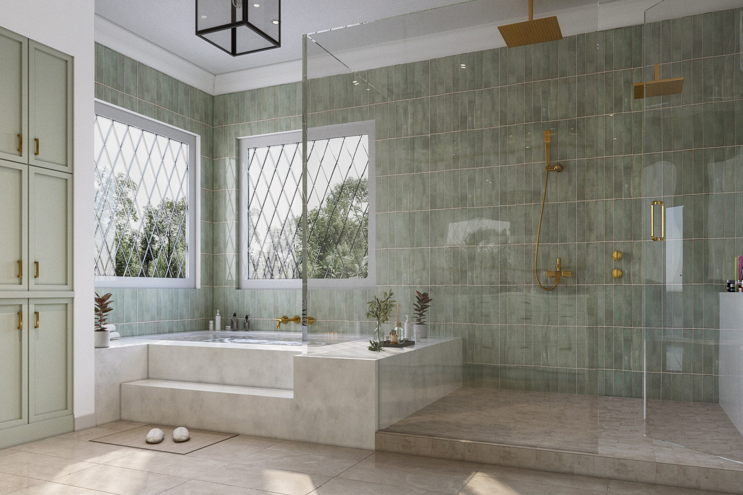
Opt1 Green Tile Master Bath — Case Study
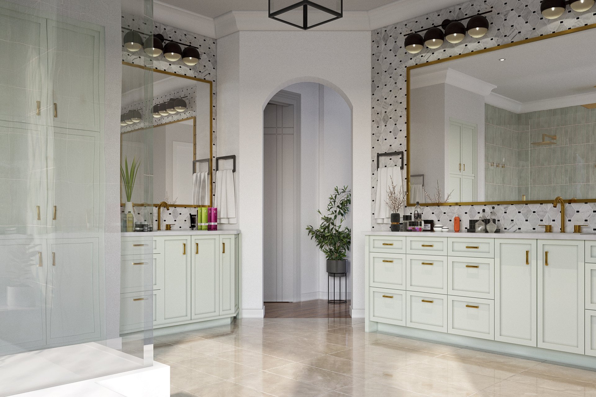
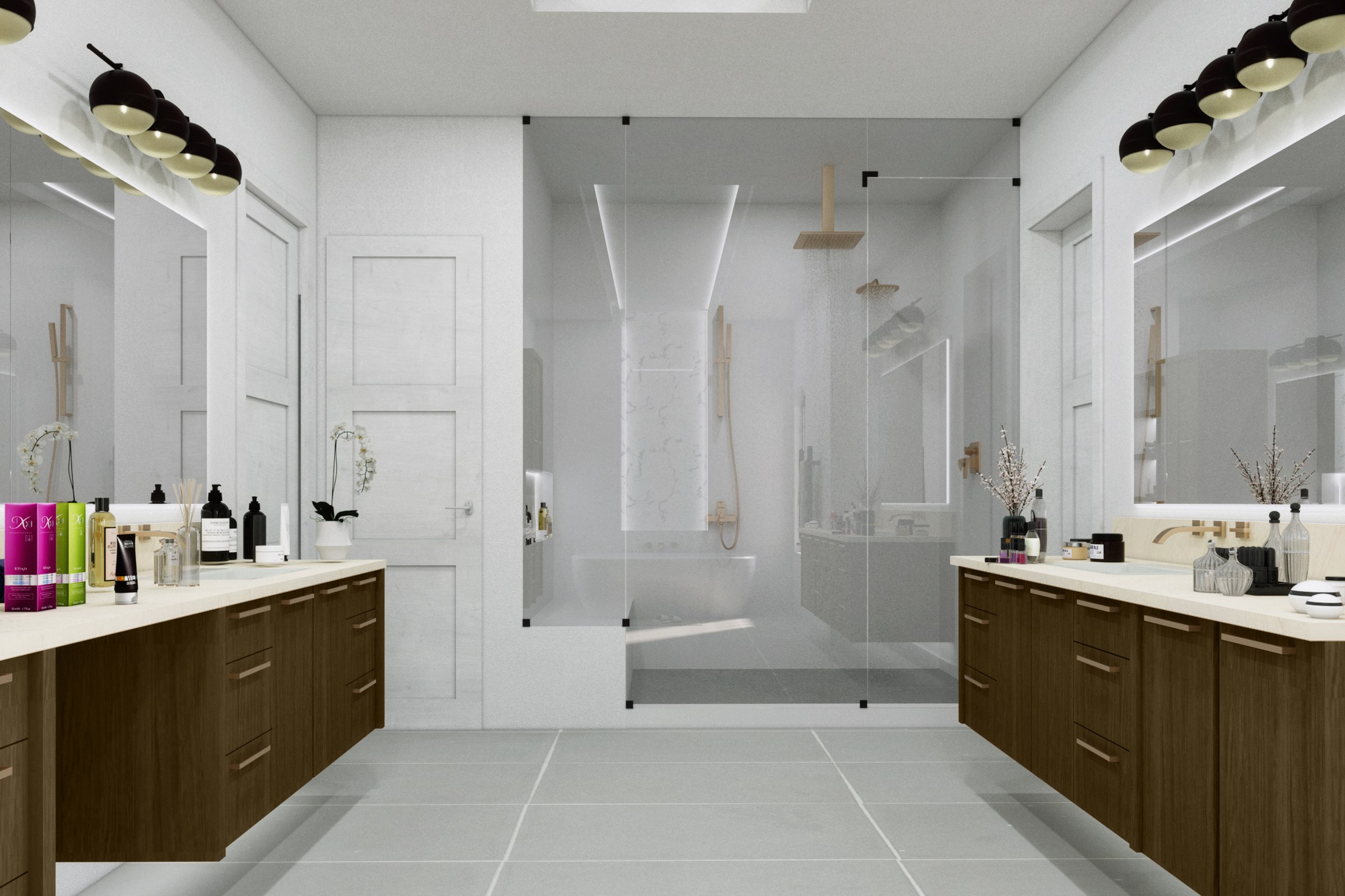
Elegant master bathroom with sage-green vertical tile in the shower and tub zone, a built-in soaking tub with marble surround, brass rain showerhead and fixtures, diamond-patterned window grilles, and soft green shaker-style cabinetry.
Client
Gehry Design Group
Industry
Residential Interiors — Kitchen & Bath
Objective
Transitional Master Bath Visualization
Deliverables
Photoreal kitchen bath renders, multiple viewpoints, marketing-ready output
Overview
A master bath is a small room asked to do a lot of work. It needs to read as private, considered, and expensive in a single frame, often shot from a doorway because the floor plan refuses to give the camera any other position. The brief for Opt1 Green Tile Master Bath, produced for Gehry Design Group’s Atlanta project in 2025, sat exactly inside that constraint.
The space is transitional in the working sense of the word: traditional shaker cabinetry and a marble tub surround held together by sage-green vertical tile and brass fixtures. None of those elements are forgiving. Brass picks up every nearby colour. Marble veining will betray a low-effort material setup. Sage tile shifts hue under the slightest white-balance drift.
The goal of the visualization was not decoration. It was a decision-grade image set the design team could put in front of a homeowner and use to lock specifications before procurement. That changes what “good” means.
What did the brief actually demand?
The deliverable language was simple. The underlying ask was harder. The design team needed images that would survive being scrutinised at full screen, on a phone, and printed at A3 in a client meeting on the same afternoon.
Three things had to be true at once:
- The sage-green vertical tile had to read as a single deliberate colour, not a noisy gradient
- The marble surround on the soaking tub needed real depth, not a flat photo-texture
- The brass fixtures had to feel warm without tipping into yellow under the room’s mixed lighting
A miss on any of those would force a respec. A respec at this stage is what burns budget on a residential build.
Where do most kitchen bath briefs fail?
In our experience, bath visualization fails for a predictable set of reasons, and they are rarely about render engine choice. They are about the inputs and the early decisions.
- Camera placed wherever the room allows, not where the design reads best
- Tile modelled as flat planes instead of actual ceramic with edges and grout depth
- Brass treated as a single metal shader across rain head, spout, and handles
- Marble used as a tiled bitmap with visible repeats on the tub surround
- Lighting set to “bright and even” so nothing has shape
Each of those is individually small. Together they produce the competent-but-forgettable render package every developer has seen and quietly stopped trusting.
A bathroom render is judged on three surfaces, tile, stone, and metal, and if any one of them is wrong, the whole frame is wrong.
The challenge
The hardest constraint on this project was not geometry. It was the interaction of materials in a room measured in feet, not metres.
Sage tile reflects into the marble. Marble reflects into the brass. Brass reflects the tile back at a warmer temperature. In a real bathroom, the eye filters this. In a render, the camera does not, and the result either reads as muddy or as oversaturated. Getting that loop to settle is most of the work.
The diamond-patterned window grilles added a second problem. They cast a directional, patterned shadow across the tub zone at certain times of day. That shadow is a feature of the design, not an artefact, and it had to land on the marble cleanly without breaking up the surround’s veining.
The shaker cabinetry sat in the calmer half of the room and needed to hold its own visual weight without competing with the tile wall. A flat green paint job in CG looks plastic. The cabinetry had to read as wood under paint.
How we approached it
The production was structured in four sequential phases. Each phase had a single output that fed the next. Nothing went to render until the upstream decisions were locked.
1. Source review and view planning
Before any modelling work, we reviewed the floor plan, elevations, and the design team’s reference imagery against the room’s actual proportions. View planning for a master bath usually yields two strong viewpoints and one supporting angle. We selected camera positions that placed the tile wall, tub surround, and vanity in the same frame where possible, and treated the secondary views as detail shots rather than full-room repeats.
2. Material development
Each of the three critical surfaces was built and tested in isolation before being placed in the room.
- Tile: ceramic shader with PBR materials, real grout depth, subtle per-tile colour variation
- Marble: hand-placed veining on the tub surround, no visible bitmap repeat
- Brass: a single base metal with three roughness variants for rain head, spout, and handles
This separation matters because a problem found in a full-room render is expensive to chase. A problem found in a material test is a fifteen-minute fix.
3. Lighting
The room was lit with a single physically-based daylight setup as the primary, plus warm interior fills tuned to read against the brass. We ran two time-of-day variants internally before committing to the final morning light. HDRI lighting through the diamond grilles produced the patterned shadow cleanly without needing a separate gobo pass.
4. Render and finishing
Final frames were produced with full ray-traced reflections and ambient occlusion at print resolution. Post was deliberately light: white-balance hold, mild contrast, no heavy grade. The sage tile’s hue was the reference colour and the rest of the frame was balanced to it, not the other way around.
What it delivered
The output gave the design team a usable, decision-grade asset set rather than a single hero image.
| Type | Quantity | Notes |
|---|---|---|
| Hero interior stills | 2 | Tub zone and full-room composition |
| Detail views | 2 | Vanity and shower fixture close-ups |
| Time-of-day variants | 2 | Morning and softer afternoon |
| Resolution | Print-ready | Suitable for client review and A3 print |
The variants matter more than the count. A homeowner reviewing finishes does not want one perfect image. They want to see the room hold up under different light, from different angles, with the same materials reading consistently across all of them.
For the design team, that consistency is the deliverable. It is what lets them sign off the tile, the stone, and the brass in one meeting instead of three.
Key takeaways
-
Materials are the project, not the geometry. In a bath this size, tile, marble, and metal are doing the storytelling, and they have to be built and tested before the room is lit.
-
View planning saves more time than render optimisation. Two well-chosen camera positions produce a stronger asset set than five mediocre ones, and the cost of changing a viewpoint after lighting is locked is significant.
-
Decision-grade beats hero-grade. Renders that help a design team close out specifications are worth more to the project than renders that look spectacular but leave material questions open.
Working on a project that needs compelling visuals? Tell us about your project or explore our full portfolio.
Project Gallery