96 Dual Vanity Master Bath — Case Study
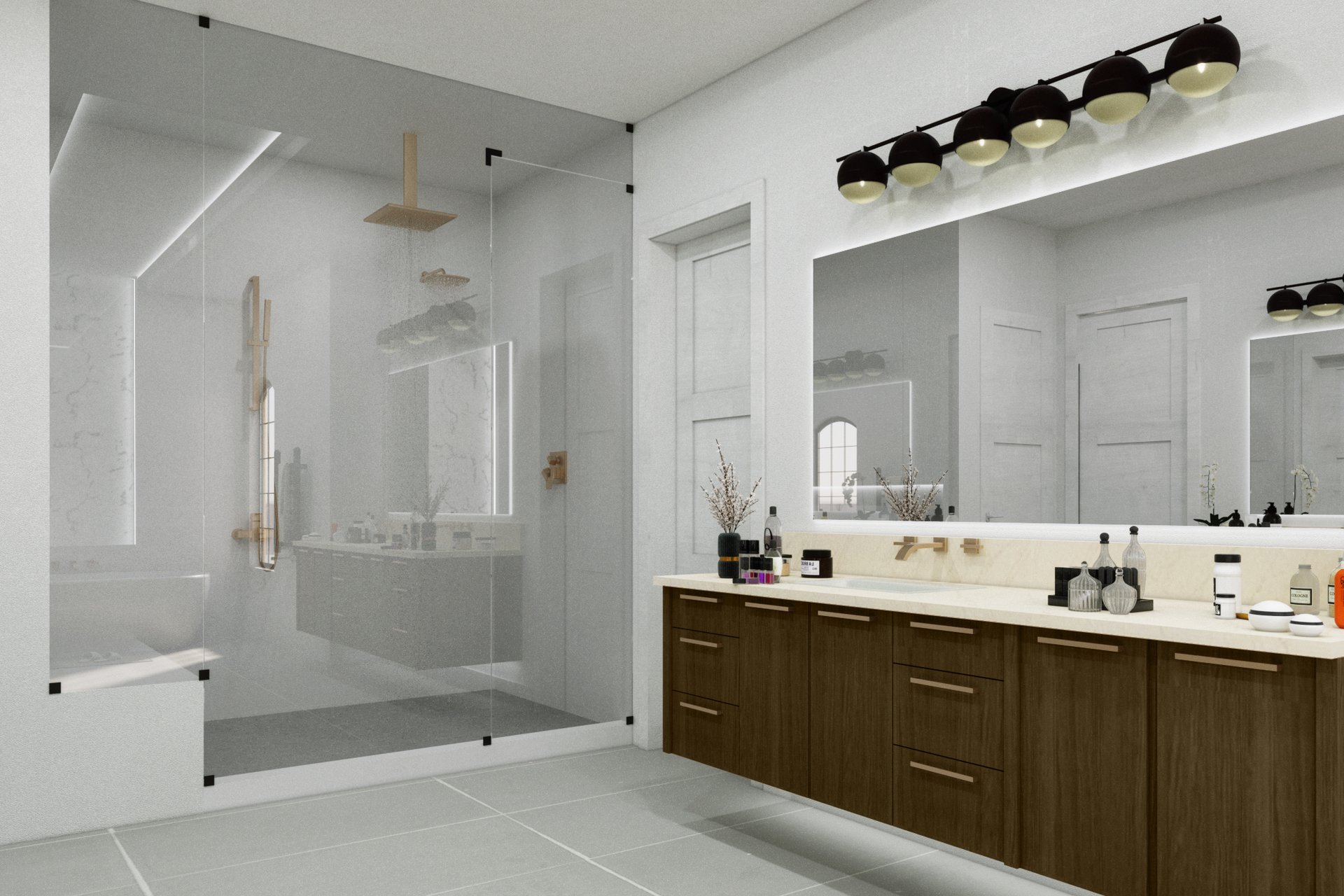
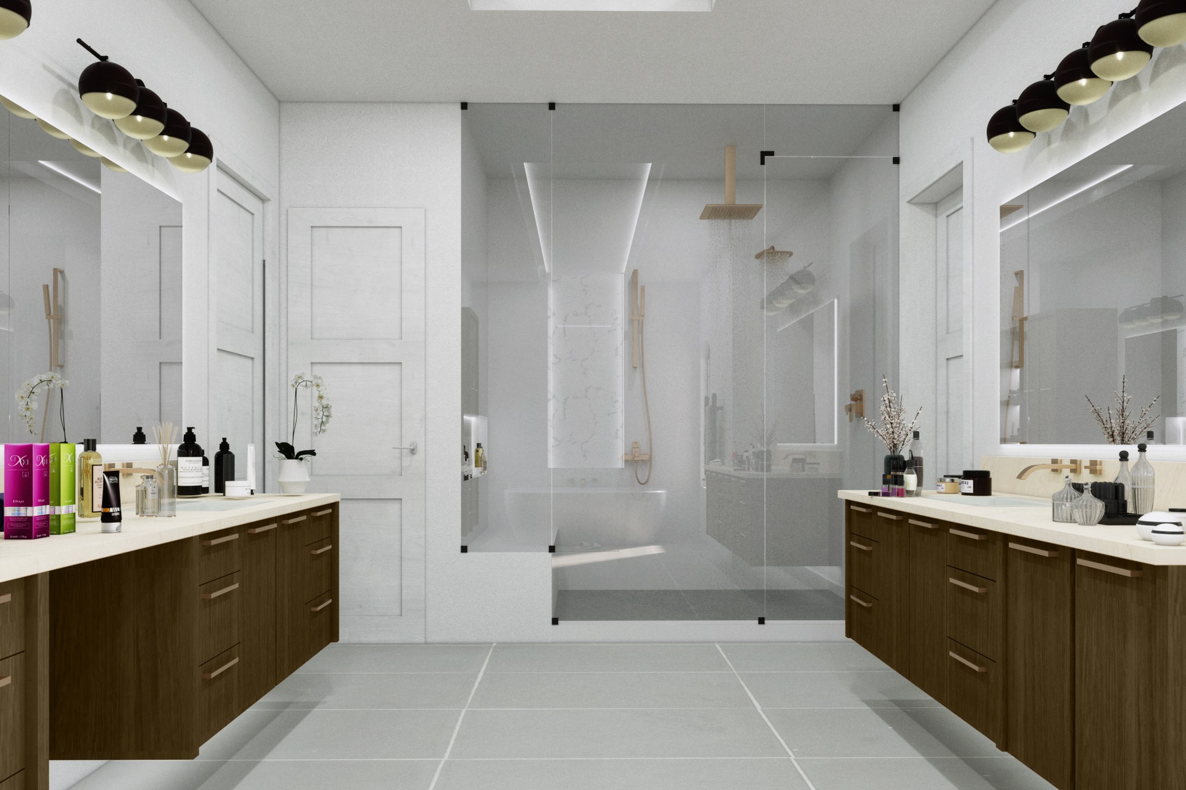
Symmetrical master bathroom with dual walnut wood vanities topped with quartz counters, large illuminated mirrors, black globe vanity lights, and a spacious glass-enclosed shower with gold rain showerhead at center.
Client
Foster Architects
Industry
Residential Interiors — Kitchen & Bath
Objective
Transitional Master Bath Visualization
Deliverables
Photoreal kitchen bath renders, multiple viewpoints, marketing-ready output
Overview
A symmetrical master bathroom looks simple in plan. It is rarely simple to render. Every reflective surface duplicates a mistake, every vanity light multiplies a noise problem, and the moment a viewer’s eye lands on the centre line, any drift in alignment becomes the only thing they can see.
This brief from Foster Architects in Denver covered a transitional master bath built around twin walnut vanities, quartz counters, oversized illuminated mirrors, black globe sconces, and a glass-enclosed shower with a gold rain head sitting on the room’s primary axis. The project was small in square footage and dense in finish detail.
The output had to read as a calm, marketable interior at first glance, while holding up under the scrutiny of an architect checking proportions and a developer’s marketing team pulling crops for a sales sheet. That dual job, atmospheric appeal plus technical credibility, set the bar for the work.
What did the brief actually demand?
A transitional master bath is a genre with very low tolerance for sloppy material work. The style relies on restrained contrast: warm wood, cool stone, matt black, polished gold. If any one of those finishes drifts off, the room reads as builder-grade rather than considered.
The architect’s reference set was specific about three things:
- Walnut grain had to feel furniture-grade, not laminate
- Quartz veining needed depth without going theatrical
- Globe sconces had to glow, not blow out
That last point matters more than it sounds. Vanity lighting is the single most common failure mode in bathroom CGI. Globes that bloom too hard kill the surrounding material read; globes that are too dim look like switched-off props.
Symmetry is not a styling choice in this room, it is the brief, every render decision had to defend the centre line.
What made this hard
The geometry forced the camera into a small number of honest viewpoints. With dual vanities mirrored across an axis and a centred shower, there are only so many positions where the room reads correctly. Off-axis hero shots flatter many interiors. They flatten this one.
Three production constraints shaped the entire pipeline:
- A reflective gold rain head sitting dead-centre in most framings
- Large mirrors above each vanity capturing the opposite wall
- A glass shower enclosure refracting both vanities at oblique angles
Each of those is a render-time cost and a debugging surface. A mistake in the mirror is a mistake in the room. A noisy reflection in the gold fixture telegraphs cheapness. The shower glass had to carry ray-traced reflections without smearing the tile pattern behind it.
There was also a softer problem. Transitional interiors live or die on light temperature. Push warm and the walnut goes orange, the quartz goes yellow, the gold goes brassy. Push cool and the whole room turns into a showroom. The target was the narrow band where all four finishes sit honestly together.
How we approached it
1. Source file audit and view planning
We started by interrogating the architectural model rather than rendering it. Wall thicknesses, vanity heights, mirror returns, and the shower curb were all checked against the design intent before a single material was assigned. View planning came next, locking three primary camera positions that respected the room’s symmetry instead of fighting it.
We rejected several tempting oblique angles early. They produced prettier thumbnails and dishonest geometry. The architect needed images that matched what the contractor would build.
2. Material build and lighting study
Walnut, quartz, matt black, polished gold, glass, and large-format tile all had to coexist. Each was built as a layered PBR material with measured roughness values, not eyeballed sliders. The walnut carried a real grain map with subtle displacement mapping at the drawer fronts so raking light caught the joinery the way it would in the finished room.
Lighting was assembled in three layers:
- A neutral HDRI lighting base for ambient fill
- Practical IES profiles for the globe sconces and shower downlight
- A controlled key wash to lift the back wall without flattening the mirrors
We ran a short lighting study before committing to final passes. Two warmth variants and two intensity variants, judged side by side, before locking the look.
3. Camera, render, and post
Lens choice stayed conservative. A 24mm equivalent on the wide hero, 35mm on the secondary angles, no aggressive tilts. Bathrooms suffer from wide-angle abuse more than any other interior type. Vanities stretch, mirrors warp, and the room loses the calm the design was trying to sell.
Final beauty passes were rendered with full global illumination and dedicated ambient occlusion AOVs for compositing control. Reflection, refraction, and shadow passes were split out so the post stage could adjust the gold fixture and shower glass independently without re-rendering the room.
Deliverables
| Type | Quantity | Notes |
|---|---|---|
| Hero interior stills | 3 | Symmetrical centre-line, plus two flanking angles |
| Detail crops | Multiple | Vanity, sconce, shower fixture close-ups |
| Lighting variants | 2 | Warm evening and neutral daylight |
| Material study frames | 2 | Walnut and quartz close studies for spec review |
The split between hero frames and detail crops mattered for how the images would be used downstream. Hero frames carry the room. Detail crops carry the spec. Marketing teams need both, and they need them at print resolution from day one, not upscaled later.
Results
The image set went through one round of architect review and one round of minor finish adjustments before sign-off. The most useful feedback was about the gold rain head’s reflection intensity, which we tuned in post without touching the 3D scene. That is the value of splitting passes properly upstream.
What the package delivered:
- A defensible centre-line hero that survives close inspection
- Detail frames usable in spec sheets and finish boards
- Lighting variants that let the design team test mood without a re-render
- Print-ready files at sizes suitable for hoarding and brochure use
For a development team, the practical outcome is that the same asset set covers planning submissions, investor decks, and pre-sales material without commissioning three separate jobs. For an architect, it means the visuals match the drawings, which is the only thing that actually protects the design through construction.
Key takeaways
-
Symmetry forces honesty. A mirrored room punishes shortcuts, so the only defence is correct geometry, calibrated materials, and disciplined camera work from the first viewpoint study onward.
-
Reflection budget is a real budget. Gold, glass, mirror, and quartz in one room means every render decision has a knock-on cost, and splitting AOVs for post is non-negotiable on this kind of brief.
-
Lighting variants beat lighting guesses. Two committed variants, judged side by side, produce a better final image than ten ad-hoc tweaks chasing a feeling the team has not yet agreed on.
Working on a project that needs compelling visuals? Tell us about your project or explore our full portfolio.
Project Gallery