Commercial Office Visualization — Case Study
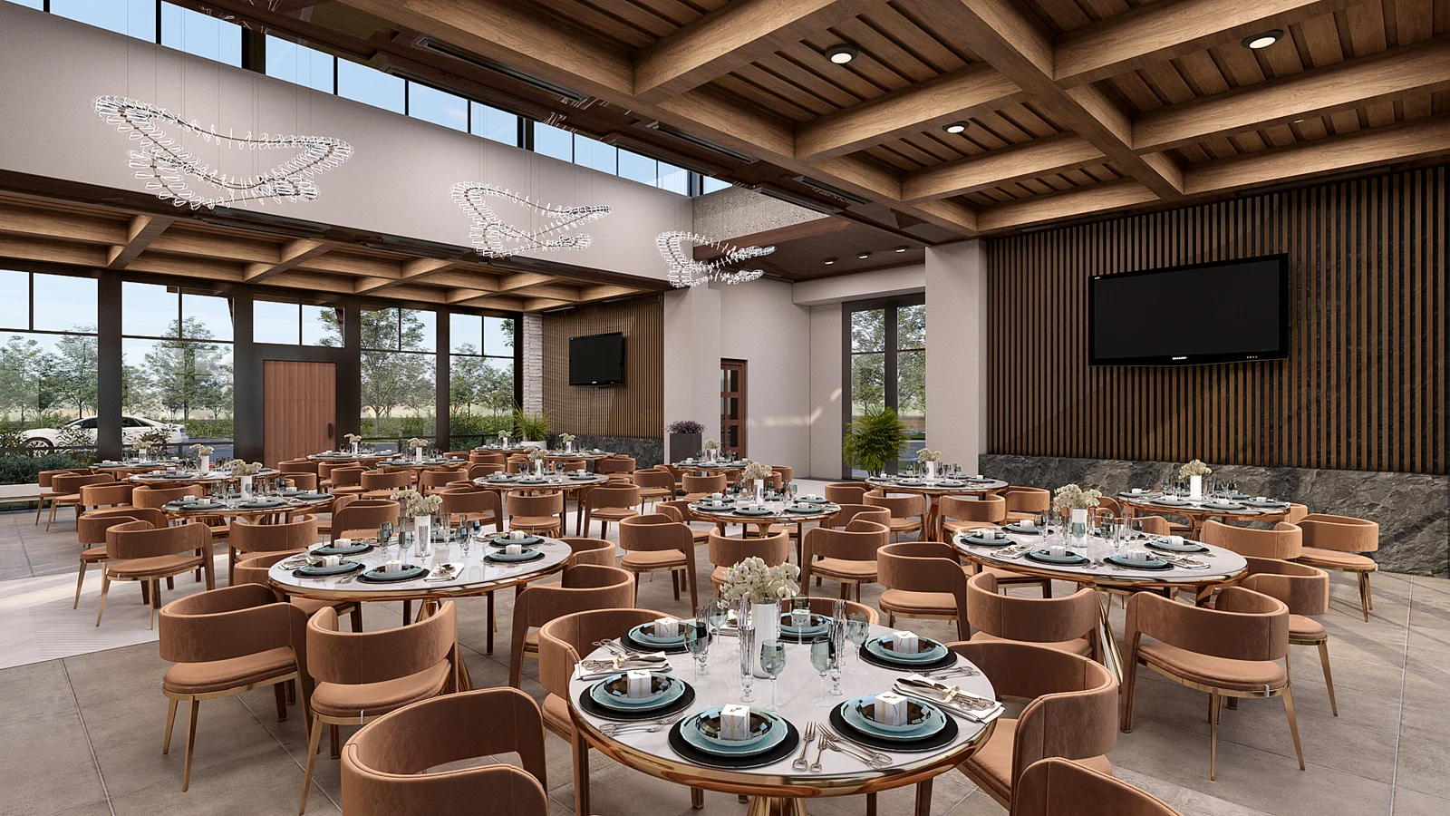
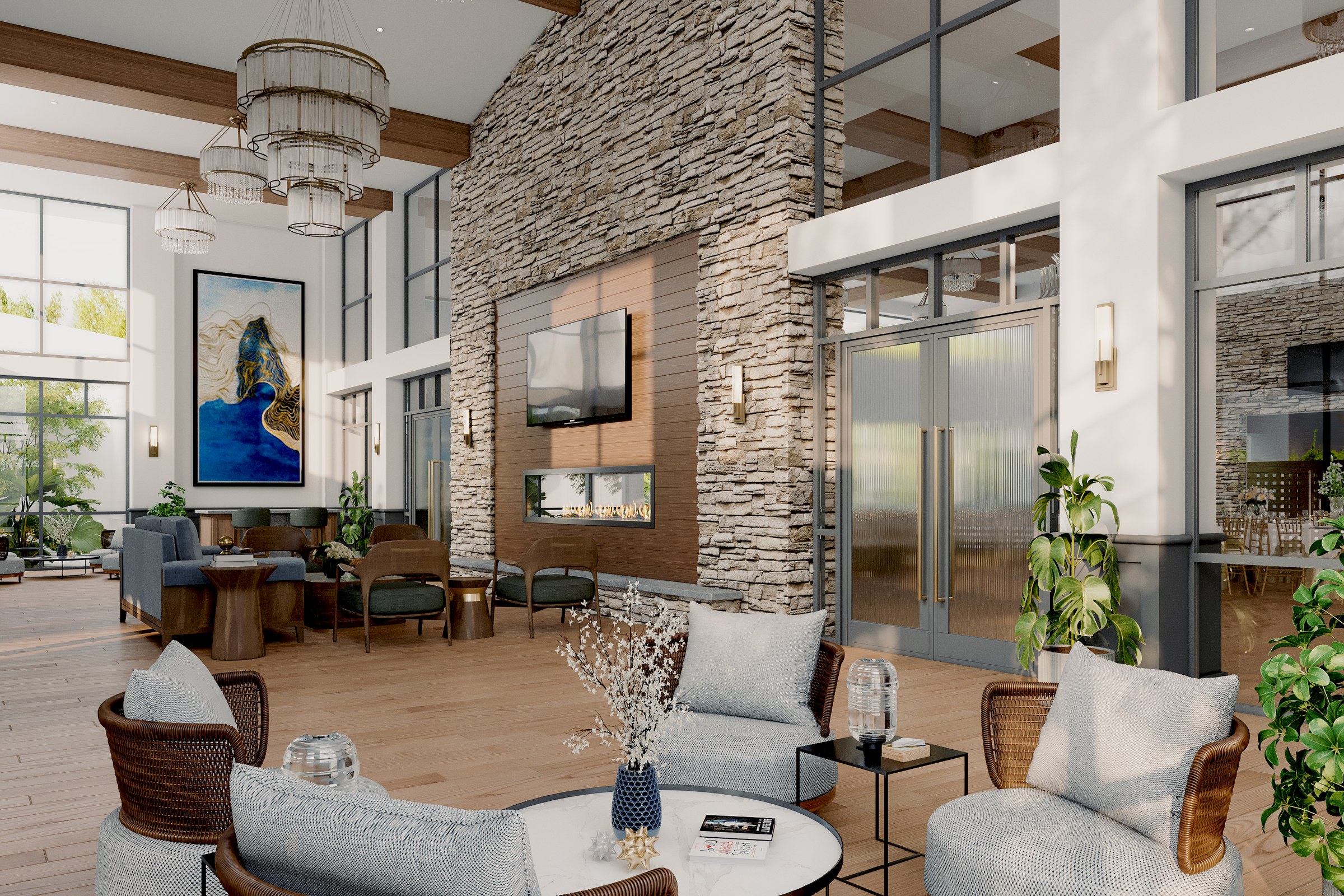
Photorealistic interior rendering of a premium commercial workspace, designed to attract tenants and secure leasing commitments before fit-out.
Client
Confidential
Industry
Commercial Interiors
Objective
Architectural visualization for Commercial Office Visualization
Deliverables
Photoreal commercial interiors renders, multiple viewpoints, marketing-ready output
Overview
A premium commercial workspace on paper is a leasing argument waiting to be made. The development team commissioned this photorealistic interior visualization in 2024 to win that argument before a single partition went up. The brief was practical: produce imagery convincing enough to anchor tenant negotiations and pre-leasing campaigns months ahead of fit-out completion.
Commercial interiors at this tier do not forgive shortcuts. Prospective tenants comparing floor plates are reading material quality, daylight behaviour, and ceiling logic in the same glance. A render that flattens those signals reads as marketing fluff and gets dismissed. One that holds up under scrutiny becomes evidence.
The project category is straightforward, but the production demands were not. The output had to function as leasing collateral, investor presentation material, and a reference set the design team could trust against the eventual built reality. Three audiences, one image package.
What did the brief actually demand?
The development team needed images that performed three jobs without compromise. They had to read as photography from twenty feet away on a hoarding, hold detail when zoomed on a tablet during a tenant walkthrough, and not embarrass anyone when the actual space was photographed eighteen months later.
That third requirement is the quiet one. Many render packages are designed to flatter. This one was designed to predict.
The deliverable scope covered:
- Hero workspace views for the leasing brochure
- Reception and arrival sequence imagery
- Collaboration and meeting zone variants
- Circulation and amenity floor stills
- A small set of detail crops for material call-outs
What made this hard
Commercial interiors compress the hardest problems in archviz into a small footprint. You are working with artificial and natural light at the same time, surfaces that are mostly engineered (glass, veneer, fabric, polished stone), and an audience that has sat in a hundred similar rooms. The threshold for “looks fake” is low.
Three specific challenges drove the production schedule:
- Mixed lighting balance. Daylight from the perimeter against warm interior fixtures, without either washing out
- Reflective surface discipline. Glass partitions, polished floors, and screens that needed credible ray-traced reflections, not painted-on shine
- Material restraint. Premium reads through subtlety; over-textured veneers and aggressive displacement mapping cheapen the result instantly
The fastest way to lose a commercial interior is to over-light it; restraint reads as quality, theatre reads as render.
There was also the question of furniture. Generic asset-library furniture in a premium workspace is the visual equivalent of a stock photo. The team needed loadouts that matched the design intent without clearly being placeholders.
How we approached it
The project ran across roughly six weeks from source file handoff to final delivery, with two structured review rounds. The phases below were sequential, not parallel; each one’s output was the input for the next.
1. Source file review and briefing
We started with the design team’s drawings, finish schedules, and reference imagery. The first pass was a coverage audit. Which views actually sell the floor plate? Which corners are dead? Which sightlines reveal the ceiling strategy and which hide it?
This is view planning, and it is the cheapest stage to fix mistakes. A bad camera position discovered at render time costs days. Discovered at the briefing stage, it costs an email.
2. Modelling and material build
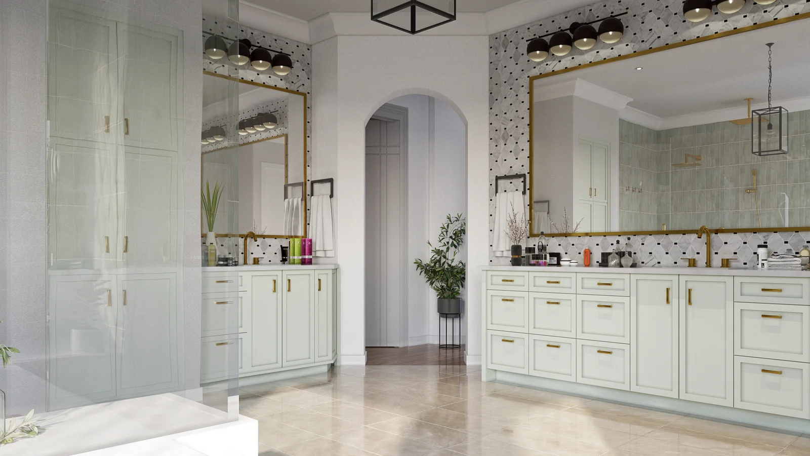
The architectural shell was modelled to the drawing set. Furniture was specified against the design team’s intent rather than dropped from libraries. Every visible material was built as a proper PBR material with measured roughness, reflectance, and where relevant, weave or grain.
We pushed back on two finishes during this phase. Both were resolved with the design team rather than papered over in post.
3. Lighting and atmosphere
Lighting was built in two passes. Daylight came from a calibrated HDRI lighting setup matched to the building’s actual orientation and a plausible mid-morning sun position. Interior fixtures were placed and powered against the reflected ceiling plan, not eyeballed.
We rendered time-of-day variants for the hero views. A single noon render flattens depth; an early-morning or late-afternoon variant reveals how the space actually behaves across a working day.
4. Camera, composition and lens
Lens choice was deliberately conservative. Wide-angle distortion is the tell of cheap interior renders. We worked between 24mm and 35mm equivalents for most views, with two-point perspective held vertical. Ambient occlusion was tuned restrained, not cranked for drama.
5. Post-production and delivery
Post was minimal by design. Colour balance, light bloom, and selective contrast on hero frames. No painted-in people who do not match the lighting, no sky replacements that fight the interior temperature.
Deliverables
| Type | Quantity | Notes |
|---|---|---|
| Hero interior stills | 6 | Workspace, reception, collaboration zones |
| Secondary interior stills | Multiple | Circulation, amenity, support spaces |
| Detail crops | Multiple | Material and finish call-outs |
| Time-of-day variants | 2 per hero view | Morning and late-afternoon passes |
| Resolution outputs | Print + web | 6K masters, downscaled web sets |
Results
The image set went into leasing material and tenant presentations within the agreed window. The development team reported that prospective tenants engaged with the imagery as factual representation rather than aspirational marketing, which is the response this kind of work is built for.
Practical outcomes the team could point to:
- Leasing collateral produced before fit-out completion
- A consistent visual language across brochure, hoarding, and digital
- Reference frames the design team could check the built space against
- No reshoot or revision cycle once construction imagery arrived
The pre-leasing window is where commercial visualization either earns its fee or wastes everyone’s time. In this case the imagery did the job it was commissioned to do.
Key takeaways
-
Restraint outperforms theatre. Premium commercial spaces read as premium when the lighting and materials behave honestly, not when they are pushed into hero-render territory.
-
View planning is the highest-leverage decision. A correctly chosen camera at briefing stage saves days of remodelling and renders that the building cannot actually support.
-
The render must survive the photograph. Visualization that predicts the built reality builds long-term trust with developers, design teams, and the tenants who will eventually walk the space.
Working on a project that needs compelling visuals? Tell us about your project or explore our full portfolio.
Project Gallery