Rustic Event Venue — Case Study
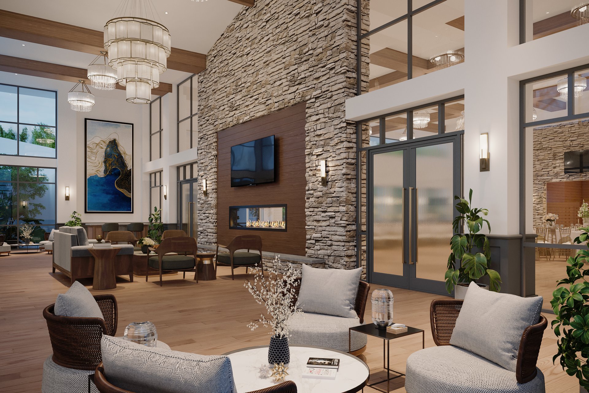
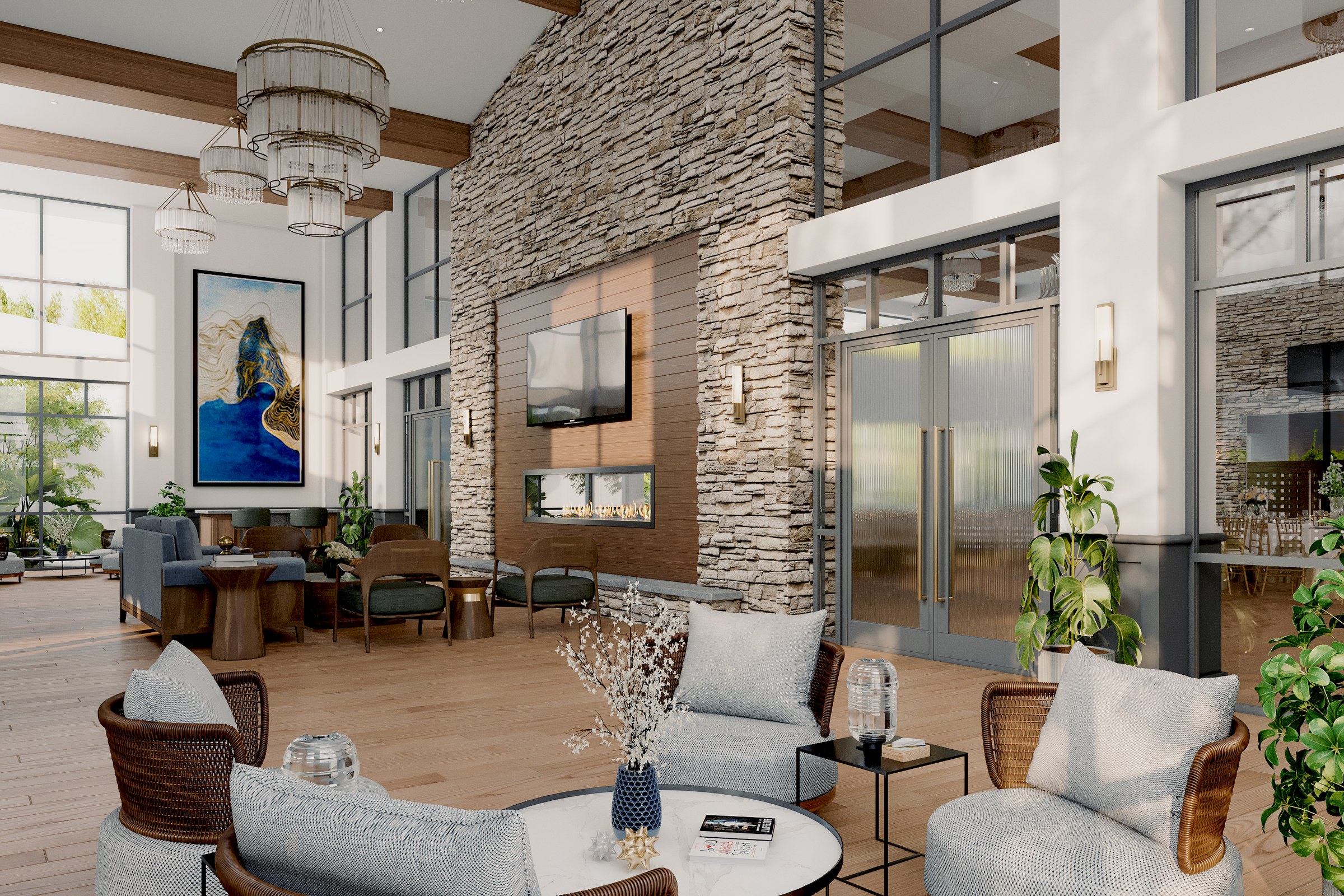
Grand lobby with stacked stone fireplace feature wall, double-height windows, crystal tiered chandeliers, rattan and upholstered seating, wood beam ceiling. Transitional rustic-luxury style. Fireplace with wood and TV.
Client
Atkins Architects
Industry
Hospitality
Objective
Rustic Elegant Banquet Hall Visualization
Deliverables
Photoreal hospitality interiors renders, multiple viewpoints, marketing-ready output
Overview
A banquet hall lives or dies on a feeling. Walk into the wrong one and you notice the carpet seams, the conduit on the ceiling, the spacing between chairs. Walk into the right one and you stop noticing anything at all, which is the entire point. The Rustic Event Venue project, built for Atkins Architects in Boise, Idaho, in 2023, set out to render that second feeling before a single board was cut.
The brief was a transitional rustic-luxury banquet hall. Stacked stone fireplace as the room’s gravitational center. Double-height glazing, wood beam ceiling, tiered crystal chandeliers, rattan and upholstered seating in conversation clusters around a wood-and-TV fireplace feature wall. Materials that pull in two directions at once.
That tension is the whole job. Rustic stone wants to absorb light. Crystal wants to throw it. Get the balance wrong and you produce either a barn with chandeliers or a hotel lobby pretending to be a barn. The visuals had to read as one coherent room, photographed, not assembled.
Where do most hospitality interiors briefs fail?
Most hospitality renders fail at the material handshake. A designer specs reclaimed timber, polished stone, brushed brass, and crystal in the same room because that contrast is the design idea. The render then flattens all four into a single plastic sheen, and the design idea evaporates.
The second failure is lighting hierarchy. A banquet hall has at least four light sources working at once: daylight through tall glazing, fireplace flame, chandelier sparkle, and recessed warm-white fill. Treat them as one ambient bath and the room reads dead. Stage them properly and the room reads occupied.
- Stone surfaces flatten without proper displacement mapping
- Crystal chandeliers bloom into white blobs without controlled exposure
- Fabric upholstery looks plastic without subsurface response
- Wood beams lose grain at distance without high-resolution PBR materials
- Glazing reflections double the room’s apparent depth when handled correctly
What made this hard
The fireplace wall did most of the heavy lifting in the design and most of the heavy lifting in the visualization. Stacked stone is the hardest hero material to render honestly. Each stone face has its own tilt, its own porosity, its own micro-shadow. Tile a single texture across the wall and the eye catches the repeat in under a second.
We treated the fireplace wall as its own asset rather than a surfaced plane. That meant geometry-level variation, tuned ambient occlusion in the joint lines, and reflectance values that softened where soot would realistically settle. The TV inset above the firebox added a second problem: a black rectangle that wants to read as a hole punched in the composition.
A second hard problem was the chandelier-to-window relationship. Crystal tiers in front of double-height glazing means every faceted drop is backlit and front-lit at once. Without ray-traced reflections and a controlled refraction budget, the chandeliers either disappear into the daylight or scatter the frame with fireflies.
The job was not to render a banquet hall. It was to render the moment a guest stops looking at the room and starts looking at the people in it.
How we approached it
The project ran across roughly six weeks from kickoff to final delivery, structured as four discrete phases. Each phase had its own sign-off so the design team could course-correct early rather than at the render stage, where changes get expensive.
1. Source file review and view planning
We started with the architect’s CAD package and walked the floor plan in low-detail block geometry before any materials were assigned. View planning is where most of the budget gets won or lost. Three viewpoints, well chosen, beat eight viewpoints chosen reflexively from the four corners.
We locked four hero angles:
- Long axis from entry, fireplace as terminus
- Three-quarter view showing chandelier tier against the glazing
- Seating cluster at fireplace, intimate scale
- Mezzanine-level wide shot capturing the beam ceiling
2. Material development and lighting block-in
Every hero material was authored as a full PBR set rather than pulled from a library. Stacked stone, oak beams, rattan weave, upholstery linen, and the crystal drops each got individual attention. Lens choice was set early: a 35mm equivalent for hero shots, 50mm for the intimate seating cluster, to avoid the warped wide-angle look that signals “render” instantly.
Lighting block-in used a single HDRI lighting dome for sky contribution, three artificial sources for the chandelier tiers, and a fireplace emissive plane warmed and animated subtly to suggest live flame. We rendered low-resolution lighting tests at this stage to confirm the hierarchy before any final-quality passes.
3. Iteration and review
We delivered low-resolution preview renders at 50 percent quality for the design team to mark up. Two rounds of revisions were budgeted, one used. Comments centered on chandelier scale and stone color temperature, both adjustable without rebuilding the scene.
4. Final render and post-production
Final renders were delivered at print resolution with separate render passes for compositing flexibility. Time-of-day variants were produced for the long-axis hero shot: late afternoon and evening, the two states most relevant for a venue’s pre-sales material. Post-production stayed light. Color grading, subtle bloom on the chandeliers, and a controlled glazing glow.
What it delivered
| Type | Quantity | Notes |
|---|---|---|
| Hero interior stills | 4 | Print-resolution, 35mm and 50mm |
| Time-of-day variants | 2 | Late afternoon, evening |
| Detail shots | 3 | Fireplace, chandelier, seating cluster |
| Material sample boards | Multiple | Stone, oak, rattan, crystal close-ups |
The deliverables were sized for three downstream uses the design team had named upfront: planning and design review, pre-sales collateral for the operator, and hoarding graphics for the construction phase. Each use case has different resolution and crop demands. Producing for all three at once costs marginally more than producing for one and saves a re-engagement later.
For the design team specifically, the renders functioned as a material handshake test. Seeing the stone, crystal, and oak in one frame at one time of day surfaced two material adjustments that would have been caught only on site, after installation. That is the quiet value of pre-construction visualization. It makes mistakes cheap.
Key takeaways
-
The hero asset deserves hero treatment. A stacked stone fireplace wall is not a surfaced plane. Treat it as geometry, vary it, and let the joint lines do the lighting work for you.
-
View planning is the budget decision. Four well-chosen viewpoints carry a banquet hall further than eight reflexive ones. Decide where the camera stands before you decide what it sees.
-
Lighting hierarchy beats lighting quantity. Daylight, fireplace, chandelier, and fill are four roles, not four switches. Stage them and the room reads as occupied rather than illuminated.
Working on a hospitality project that needs compelling visuals? Tell us about your project or explore our full portfolio.
Project Gallery