
The pair that moves a board
Every firm has a before/after slide by now. Most of them don’t do anything — because most of them are two nice renders, not a record of what actually changed and why.
A before/after is supposed to be evidence: this was the concern, this is how it was answered. What most submittals actually contain is two attractive images with no visible connection between them — no markup, no locked camera, no way for a reader to confirm anything actually changed on purpose. A board can tell the difference in about four seconds, and so, usually, can the client who’s deciding whether to brief you at all.
So here are two real pairs from work that went through actual review — not staged, not idealized, not the same design photographed twice for effect — and the four things both of them do that a merely-decorative before/after doesn’t.
Four things, none of them optional
- 01
One camera, locked
Same viewpoint, same lens, same sky, from the first frame to the last. The moment the angle shifts, a board is comparing two different pictures, not one design across time — and every objection becomes arguable again.
- 02
The mark, not just the fix
A clean “after” with no visible “before” is a claim. A redline, a hand-annotated corner, an actual client markup sitting next to the resolved version — that’s a record. It shows the concern was heard in the room, not invented afterward to justify a nicer render.
- 03
One shift, not a reinvention
If everything changed, nothing was answered — a board reads a full redesign as evasion. The pairs that land address the ONE thing that was actually raised: a massing line, a roof pitch, a setback. Everything else holds still on purpose.
- 04
In order, not side by side
Concern, then markup, then resolution — shown as a sequence a reader can walk, not two thumbnails dropped next to each other for comparison. The order is the argument.
Drag to compare
Both from projects that went through genuine stakeholder review to a signed-off final. Client names are Confidential; the pairs are exactly as delivered.
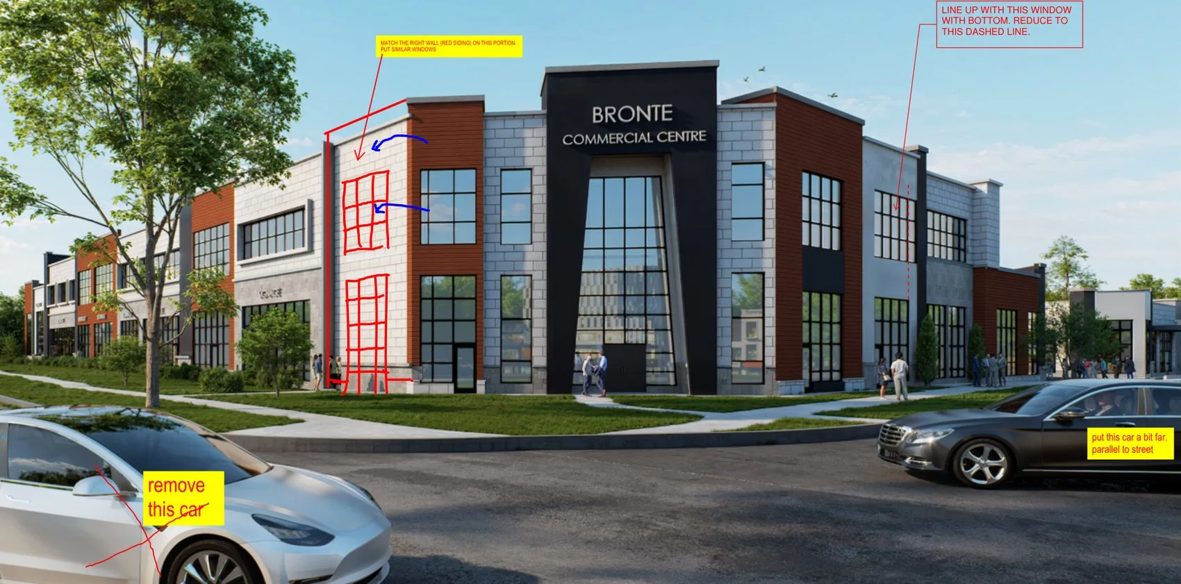
Bronte Commercial Centre
The client’s own redline on the left — window layout, a wall material, a car to remove — the resolved final on the right. Same camera, same corner, only the marked items moved.
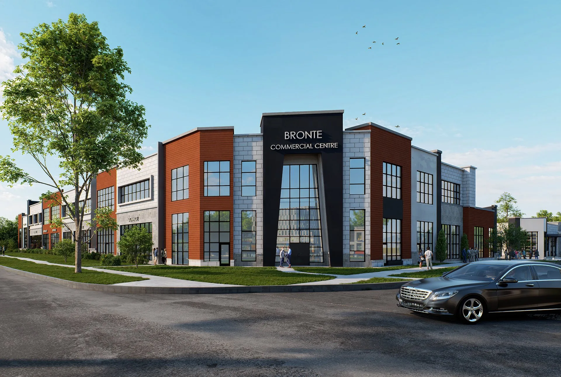
This is the actual client markup, not a reconstruction — the earlier scheme it grew out of is on the case study. See the full case study →
Barks & Board Flex Building
An aerial pair from the same review: the massing raised as a concern, and the revision that answered it — nothing else in the frame moved.
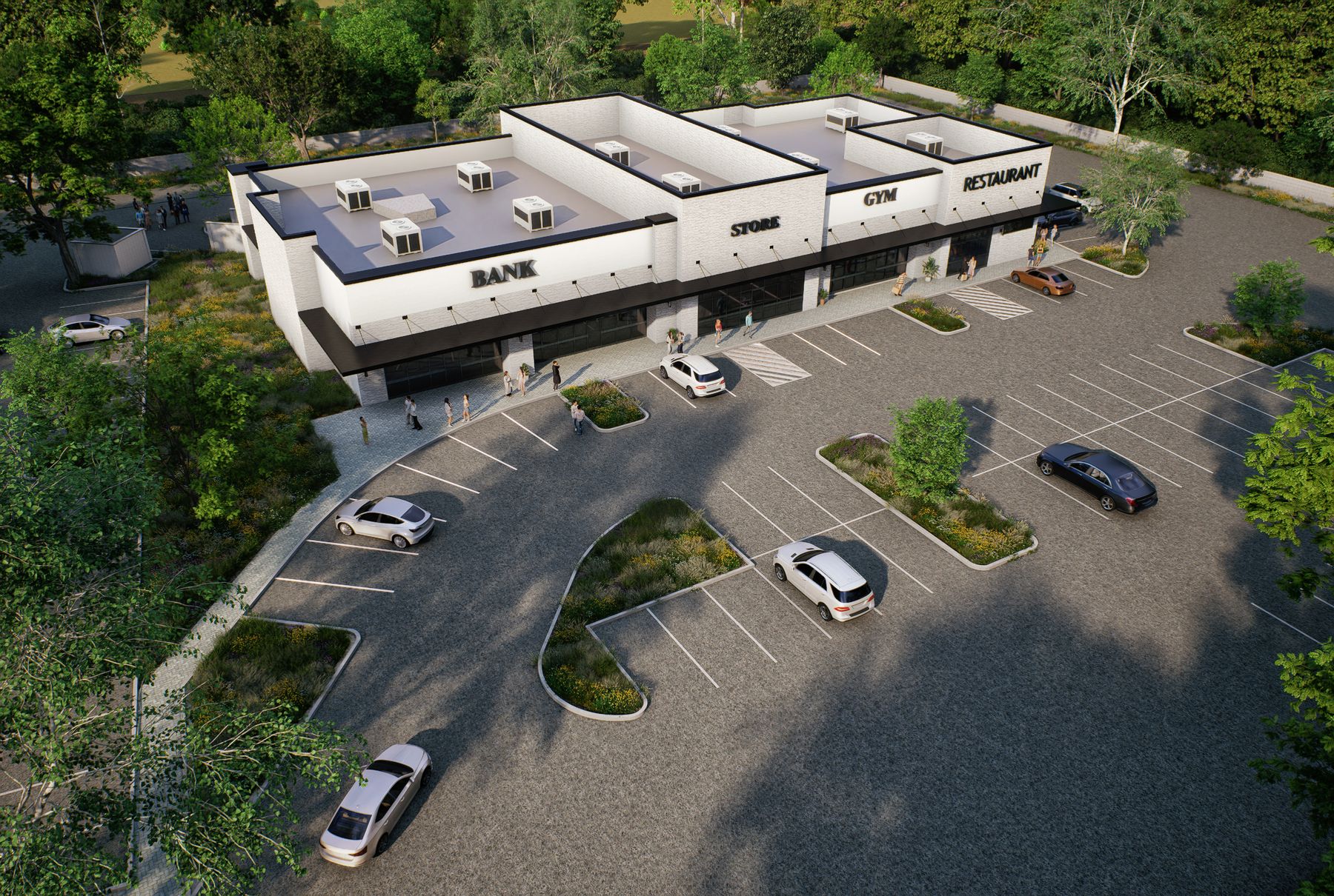
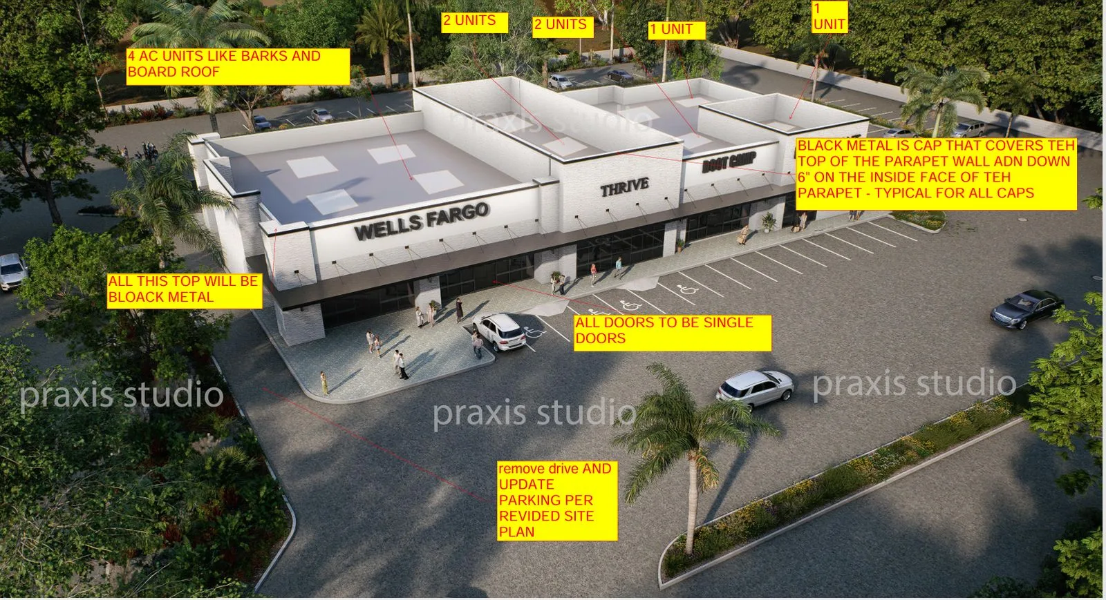
Full workflow — the presentation package that carried this pair through review to approval — is on the case study. See the full case study →
The design didn’t survive review because the render was pretty. It survived because the change on the page matched the concern in the room.


