Red Stucco Mixed Use — Case Study
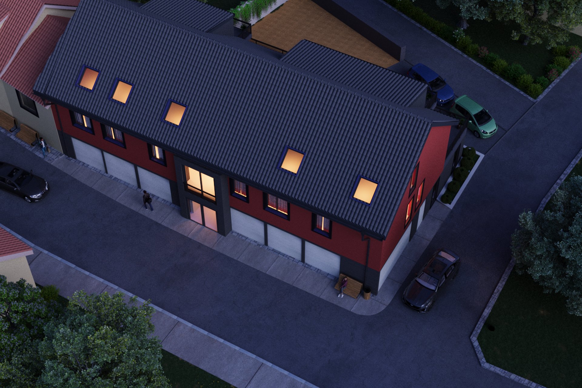
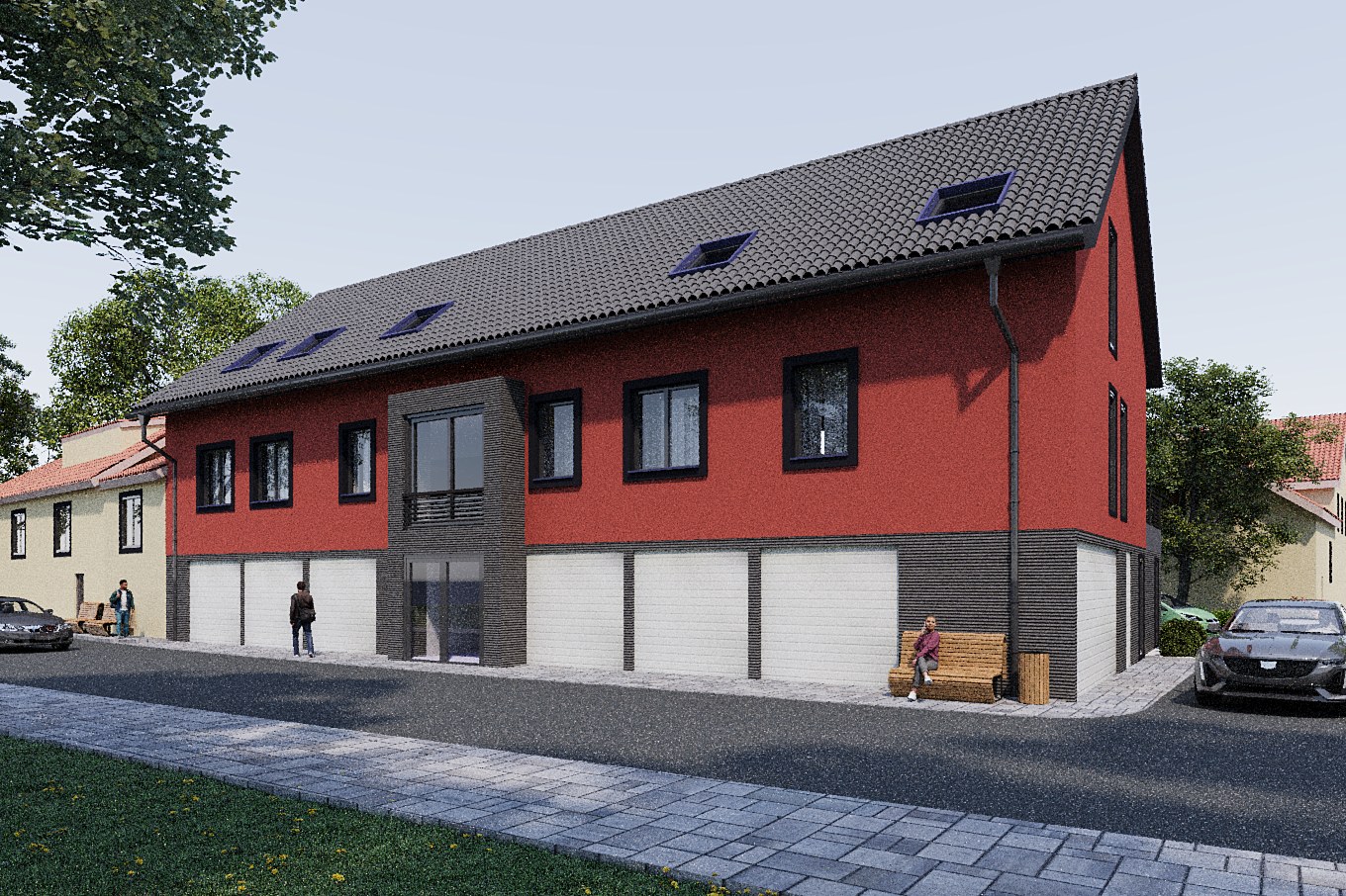
Red stucco and dark brick two-story building with peaked roof, garage bays at ground level, and street-side context.
Client
Mies Design Group
Industry
Retail / Mixed-use
Objective
Contemporary Mixed Use Building Visualization
Deliverables
Photoreal retail mixed use exterior renders, multiple viewpoints, marketing-ready output
Overview
Red Stucco Mixed Use is a two-story contemporary mixed use building combining red stucco walls with dark brick, finished by a peaked roof. Ground-floor garage bays open directly to the street, with active urban context wrapping the volume on multiple sides. The visualization brief came from Mies Design Group in Amsterdam, completed in 2023.
The project sits in dense Dutch urban fabric, which set the tone for the entire visualization package. Mixed use in this kind of context is rarely about the building alone. It is about how the volume reads from the sidewalk, how the garage bays feel at pedestrian distance, and whether the materiality survives the overcast weather that defines most of the year.
The output had to function for a Dutch design audience that knows brick intimately. Hiding behind soft lighting or stylized angles would not have worked. The team needed renders that could sit next to built-reference photography from the same neighbourhood and still hold their ground.
What did the brief actually demand?
A retail mixed use exterior in Amsterdam carries specific reading conventions. Red stucco against dark brick is a deliberate, slightly contrarian palette in a city dominated by yellow brick and tall narrow fenestration. The visualization had to honour that intent without dramatizing it.
Three asks shaped the package:
- Materiality that reads correctly under overcast skies
- Garage bay geometry shown without retail clutter overwhelming the building
- Street-context views capable of carrying a tenant pitch
The geometry itself was straightforward. The harder work lived in material accuracy, lens choice, and the specific decisions about when to show the building empty versus inhabited.
The challenge
Red stucco is a specific material problem. It absorbs light differently than the brick sitting beside it. Get the PBR materials wrong and the stucco reads as plastic, the brick reads as stickered, and the whole facade collapses into a plausible but unconvincing image.
Four constraints shaped every viewpoint decision:
- Dutch overcast is the default lighting condition; full sun is the exception
- Pedestrian-scale views matter more than aerial hero shots in this fabric
- Garage bays at ground level need to feel inviting, not industrial
- The peaked roof had to read as contemporary, not American suburban
That last constraint was less obvious than the others. The peaked roof in a Dutch street context sits inside a tradition. Render it too sharply and you lose the local register. Render it too softly and you sacrifice the contemporary edge the design is reaching for. Threading that gap was the central craft problem of the package.
Red stucco fails the moment it stops absorbing light the way real stucco does, and that single material decision determines whether the entire elevation is believable.
Our approach
The work moved through four phases. None of them is unusual on its own. The sequencing and the time spent inside each phase is what separated this output from the kind of competent-but-forgettable render package an architect cannot quite defend in front of a planning panel.
1. Source review and reference walks
Before any 3D work began, the team gathered Amsterdam street references in matching weather and light conditions. Buildings combining red stucco with dark brick were studied for how the two materials weather at different rates and how mortar joints read at typical pedestrian distance. This took roughly four working days, and it is the phase most studios skip.
2. View planning before modelling
View planning was committed before the model reached production density. Six viewpoints were locked early in the schedule:
- Two pedestrian eye-line approaches
- One elevated three-quarter
- One tight garage-bay study
- One wide street-context establishing shot
- One rear approach
Locking views early meant the modelling effort concentrated on what the camera would actually see. Detail budget went to the visible facade, the bay frames, the immediate street furniture, and the neighbour buildings sitting inside the camera frustum.
3. Material and lighting calibration
A single calibration view was rendered and iterated until the red stucco, dark brick, bay metal, and roof tile all read correctly together under one HDRI lighting setup. That calibration view became the reference for every subsequent render in the package.
Per hero view, the lighting and reflection logic followed three rules:
- Time-of-day variants at overcast midday and low-angle late afternoon
- Ray-traced reflections used selectively on glazing and wet-tarmac variants
- Ambient occlusion tuned per material, not globally, since stucco and brick need different shadow softness at the joint scale
4. Context, people, and post
People density was kept low. Two to four figures per view, none mid-stride near the camera. Vehicles in the street-context shots were chosen for the right country and the right decade, which sounds obvious and is repeatedly missed. Final colour grading kept the red stucco from reading as orange or pink under the slight blue cast of overcast Dutch daylight.
What it delivered
The package shipped on schedule in 2023. Final deliverables broke down as follows:
| Type | Quantity | Notes |
|---|---|---|
| Exterior stills | 6 hero views | Pedestrian, elevated, and street-context angles |
| Time-of-day variants | 2 per hero | Overcast midday and late afternoon |
| Garage bay study | 1 close view | Ground-level approach detail |
| Material calibration sheet | 1 | Reference for any future package extension |
The renders performed across the three downstream uses they were built to support:
- Planning submission, where the overcast variants read as honest documentation
- Pre-sales material, where the late-afternoon variants carried the emotional weight
- Hoarding and signage graphics, where the wide context views cropped without losing the building
A practical note worth recording. Because views were locked before modelling, scope creep on additional angles was contained throughout production. The team did not have to rebuild the model to support an unplanned hero shot, which is the most common reason render budgets actually overrun in this category.
Key takeaways
-
Material accuracy beats lighting drama. A correctly read red stucco under overcast light sells the building harder than a sunset hero with the materials slightly off-key.
-
Lock views before modelling. Six committed viewpoints save more production time than any rendering optimisation, and they prevent the late-stage scope creep that wrecks render schedules in mixed use exteriors.
-
Match the local visual vocabulary. A Dutch street is not an American street, and the people, vehicles, weather, and joint scale in frame have to carry that without being announced.
Working on a project that needs compelling visuals? Tell us about your project or explore our full portfolio.
Project Gallery