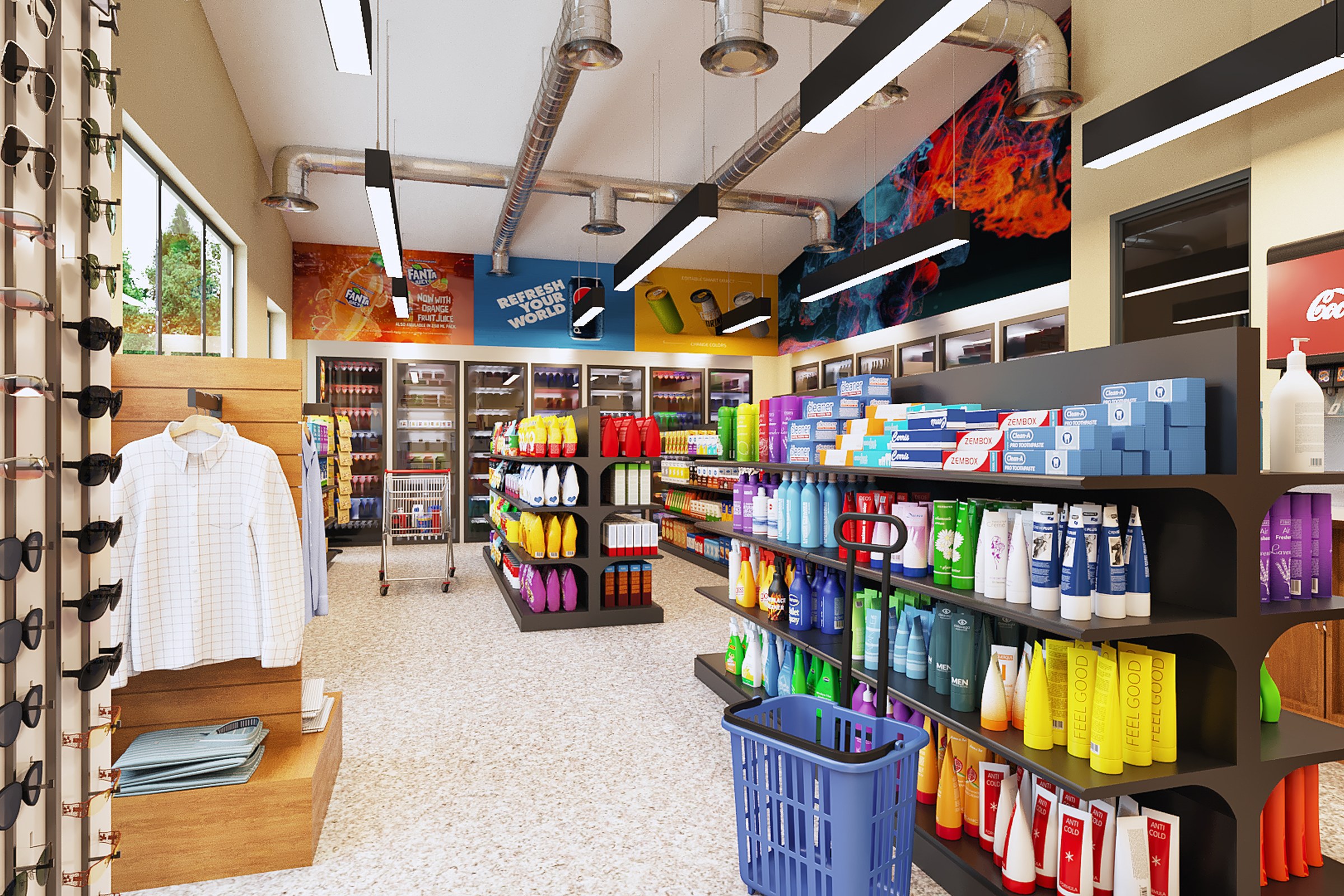
Modern Convenience Store
Modern Commercial Convenience Store / Mini Mart Visualization
Same convenience store from another angle. Shows sunglasses display rack, clothing on hangers, beverage coolers with Fanta/Coca-Cola branding, health and beauty products on dark metal shelving, exposed HVAC ductwork, skylight, colorful abstract art on ceiling panels, shopping basket on floor.
Project Overview
When we took on Modern Convenience Store, the showroom designer in San Francisco, CA had a specific problem: their design was strong, but nobody outside the studio could see it yet. They needed 4 renders that would change that.
Same convenience store from another angle.
The Challenge
The project site has strong character — mature trees, sloping terrain, established neighbours. Ignoring that context would have produced renders that felt disconnected from reality. We had to model the environment as carefully as the building itself.
Each viewpoint served a different audience. The hero shot needed marketing punch. The detail views needed technical precision. The aerial needed context. Making all of them feel cohesive while serving different purposes was the real puzzle.
Lighting was the quiet challenge here. The showroom designer wanted Daytime (Interior Lit), Daytime (Skylights And Windows Visible) conditions, and getting those to look natural — not staged, not oversaturated — is where a lot of archviz falls flat.
Our Approach
Feedback cycles were structured. We presented renders in context — placed into the marketing layout or presentation deck — so the showroom designer could evaluate them as their audience would see them, not as isolated files on a white background.
The rendering pipeline was set up to handle 4 outputs efficiently. Shared lighting rigs, consistent material libraries, and a standardised colour pipeline meant every image maintained the same visual standard.
The modelling phase was methodical. We built the geometry from the architectural plans, cross-referencing elevations and sections to catch anything that might read differently in three dimensions than it does on paper.
Post-production was restrained. We adjusted contrast, corrected any colour casts, and added subtle atmospheric effects — but the goal was always to enhance what was already there, not to paper over problems in the base render.
Camera positions were planned, not improvised. We mapped out wide-angle from entrance, aisle perspective from right side, three-quarter angle from right, frontal wide-angle angles based on the project’s strongest design moments, then refined framing through a series of grey-shaded test renders before committing to final production.
The Result
We delivered the complete package of 4 renders within the agreed 2-3 weeks window. The showroom designer confirmed the images are now central to their sales and approval materials.
Thinking about visualization for your next project? Reach out — we respond within 24 hours. Or keep exploring.