Barks and Board Pet Resort
Contemporary Playful Cat Boarding Room Visualization
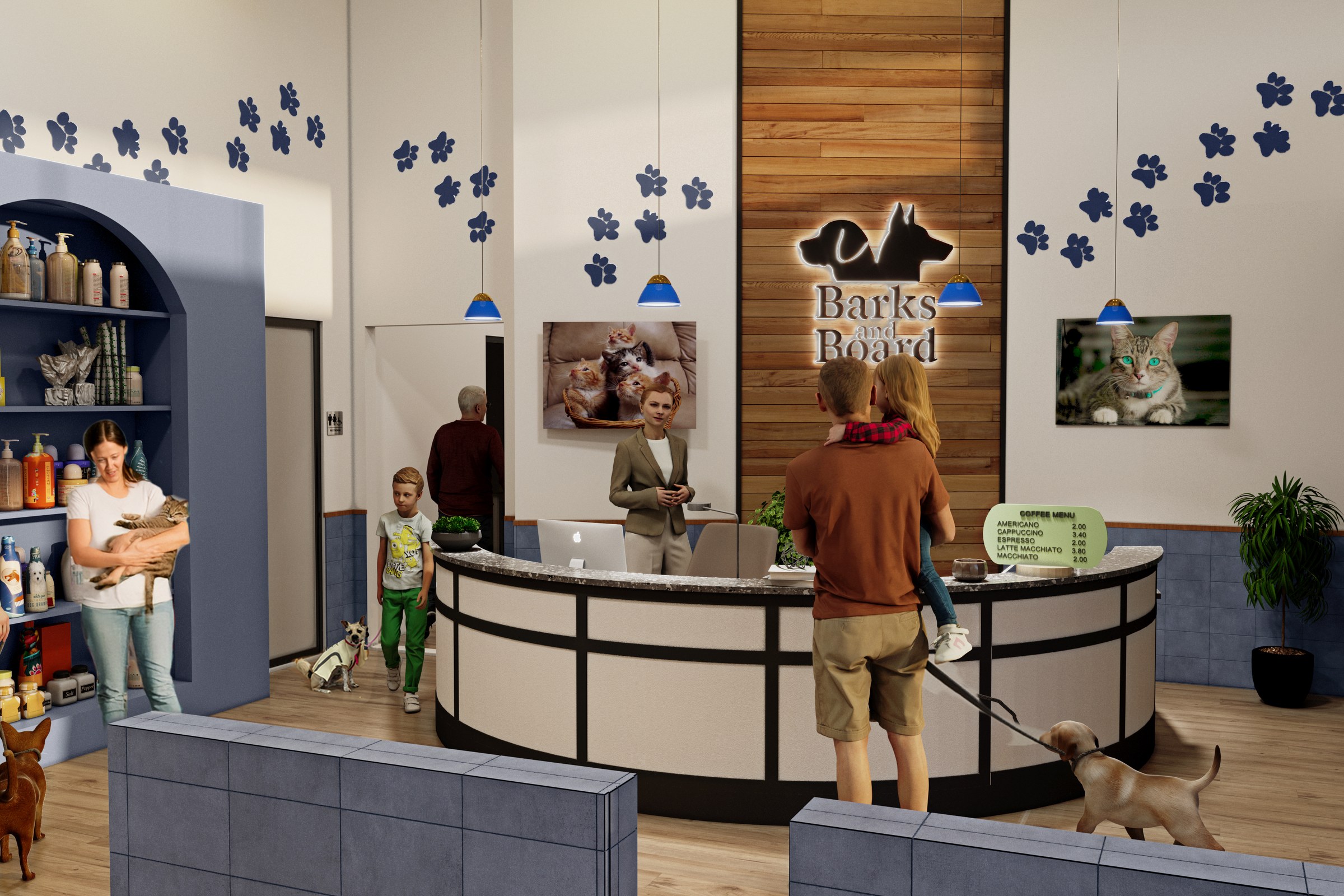
Reception lobby of Barks and Board pet facility. Navy blue/dark blue color scheme with paw print decals on walls, arched product shelving, curved reception counter, illuminated logo on wood feature wall, coffee menu board visible. Blue pendant lights. People with dogs and cats.
Project Overview
When we took on Barks and Board Pet Resort, the retail brand in Asheville, NC had a specific problem: their design was strong, but nobody outside the studio could see it yet. They needed 7 renders that would change that.
Reception lobby of Barks and Board pet facility.
The Challenge
Lighting was the quiet challenge here. The retail brand wanted Daytime (Clerestory Natural Light), Daytime (Interior Lit), Daytime (Overhead Natural Light) conditions, and getting those to look natural — not staged, not oversaturated — is where a lot of archviz falls flat.
The design language was distinctive — a mix of forms and materials that doesn’t photograph itself. Translating that into a render that feels lived-in rather than clinical took several rounds of material and lighting refinement.
The project site has strong character — mature trees, sloping terrain, established neighbours. Ignoring that context would have produced renders that felt disconnected from reality. We had to model the environment as carefully as the building itself.
Our Approach
We shared work-in-progress renders with the retail brand at two key milestones: after initial composition lock and after material refinement. Both rounds stayed tight — targeted feedback, fast turnarounds.
Landscape and entourage came last but mattered enormously. Trees, people, vehicles, sky — these contextual elements are what make a render feel like a photograph instead of a diagram.
Material selection was hands-on. We sourced textures from manufacturer libraries and matched them against the specification documents. Where specs were ambiguous, we sent samples to the retail brand for sign-off before rendering.
We ran the first round of test renders at reduced resolution to get quick feedback on composition, materials, and overall mood. This let us catch issues early when changes were cheap, not late when they weren’t.
We leaned on physically-based rendering throughout. Every material — glass, stone, metal, timber — was defined by real-world optical properties. That’s what makes the difference between a render that looks ‘nice’ and one that looks true.
The Result
Production closed within 3-4 weeks. The hero image is now the signature visual for Barks and Board Pet Resort, and the supporting gallery views have been deployed across the retail brand’s marketing channels.
Got a project that needs this kind of visual clarity? Get in touch or see more examples.