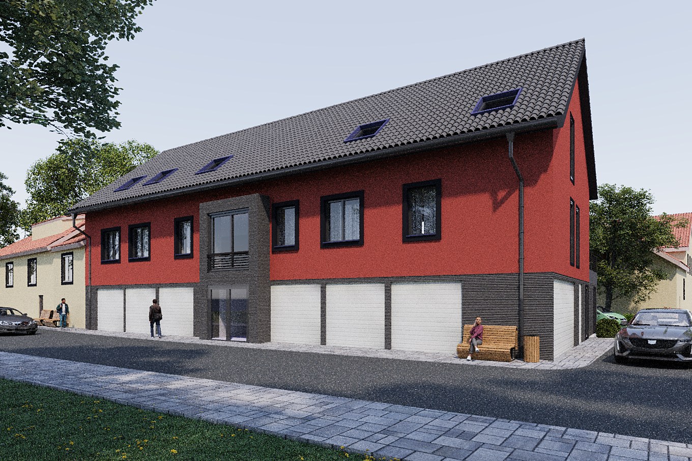
Red Stucco Mixed Use
Contemporary Mixed Use Building Visualization
Red stucco and dark brick two-story building with peaked roof, garage bays at ground level, and street-side context.
Project Overview
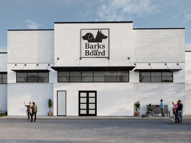
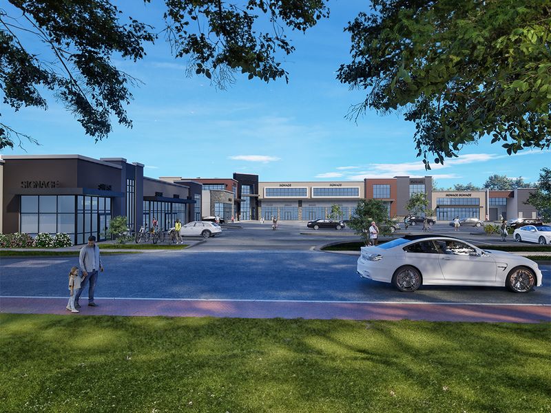
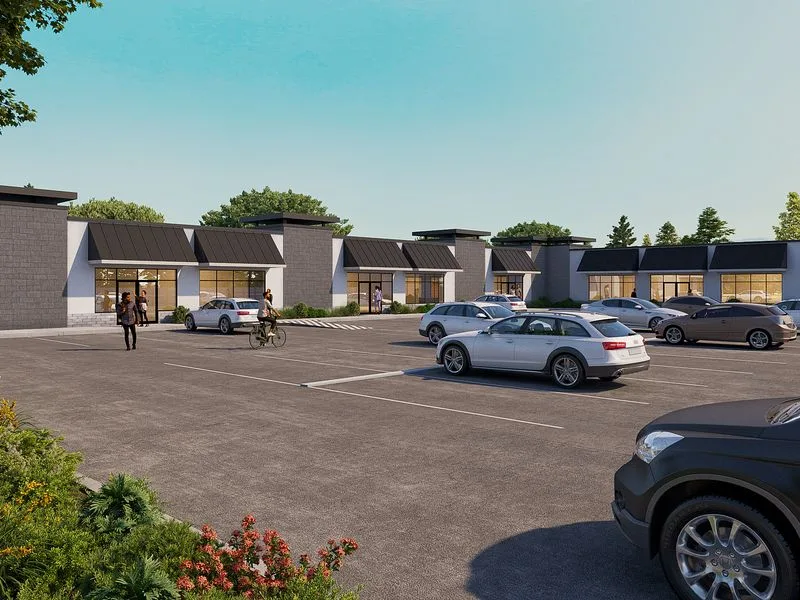
Red Stucco Mixed Use wasn’t just another rendering job — it was a visual campaign. The shopping center developer needed 4 views that could work across presentations, print materials, and digital marketing simultaneously.
Red stucco and dark brick two-story building with peaked roof, garage bays at ground level, and street-side context.
The Challenge
The biggest hurdle was fidelity at scale. With 4 compositions to produce, we couldn’t afford to let quality drift between the first render and the last. Every image needed to feel like it came from the same visual universe.
The design language was distinctive — a mix of forms and materials that doesn’t photograph itself. Translating that into a render that feels lived-in rather than clinical took several rounds of material and lighting refinement.
Getting the materials right was non-negotiable. The shopping center developer had specific finishes in mind, and anything that read as ‘generic CG’ would undermine the credibility of the entire package.
Our Approach
We shared work-in-progress renders with the shopping center developer at two key milestones: after initial composition lock and after material refinement. Both rounds stayed tight — targeted feedback, fast turnarounds.
Material selection was hands-on. We sourced textures from manufacturer libraries and matched them against the specification documents. Where specs were ambiguous, we sent samples to the shopping center developer for sign-off before rendering.
Post-production was restrained. We adjusted contrast, corrected any colour casts, and added subtle atmospheric effects — but the goal was always to enhance what was already there, not to paper over problems in the base render.
Camera positions were planned, not improvised. We mapped out corner-view, birds-eye angles based on the project’s strongest design moments, then refined framing through a series of grey-shaded test renders before committing to final production.
Feedback cycles were structured. We presented renders in context — placed into the marketing layout or presentation deck — so the shopping center developer could evaluate them as their audience would see them, not as isolated files on a white background.
The Result
The full set of 4 renders was delivered within 2-3 weeks. Hero images went out first for early marketing, with the complete gallery following shortly after for the project website and brochure.
Got a project that needs this kind of visual clarity? Get in touch or see more examples.