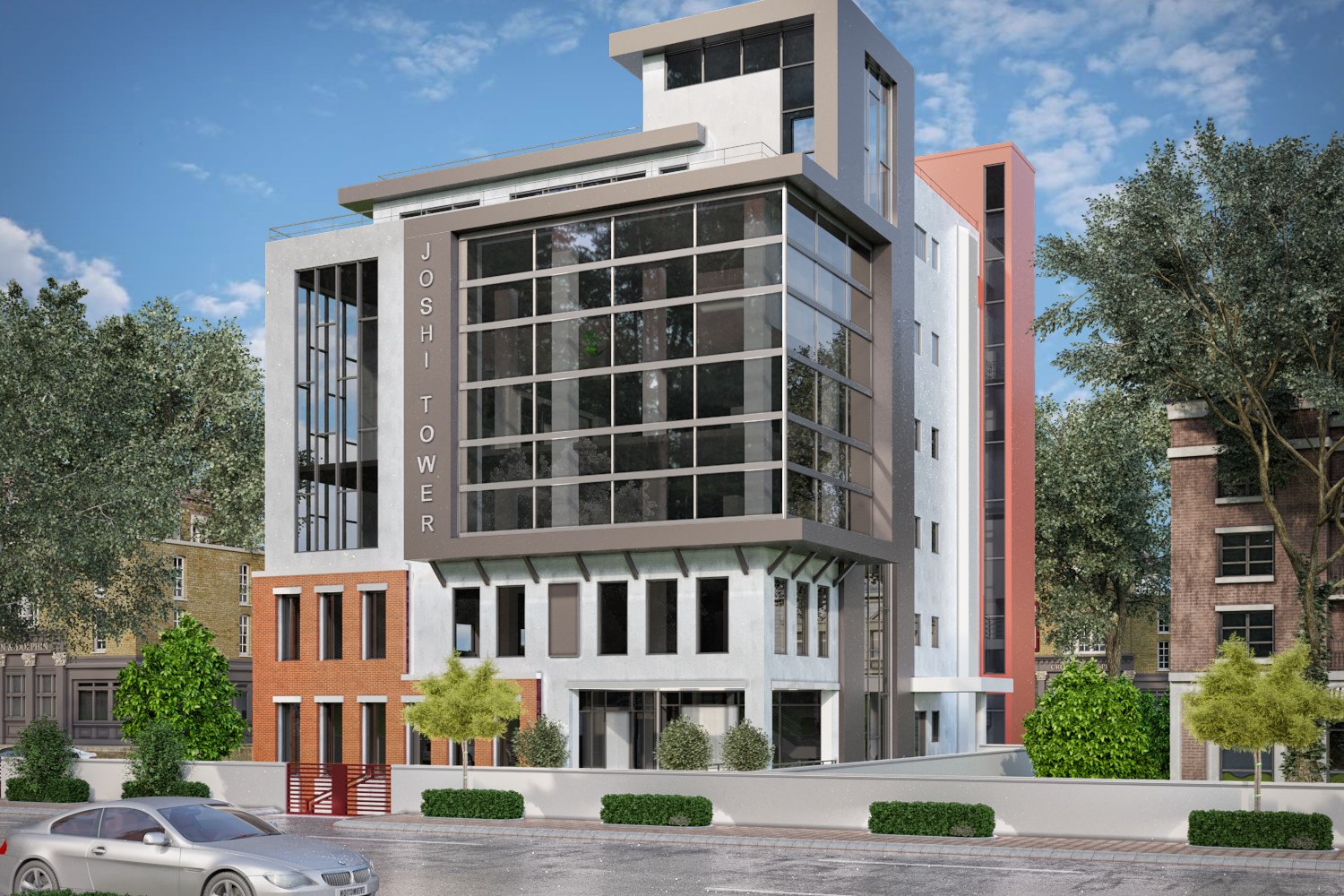
Joshi Tower
Modern Mixed Use Building Visualization
Multi-story modern glass and concrete mixed-use tower with brick base, cantilevered upper floors, vertical JOSHI TOWER signage, and street-level retail.
Project Overview
In early 2021, Foster Design Group reached out from Seattle with a tight ask: they needed a single hero image of a mixed-use tower for a zoning presentation in three weeks. The building — a glass and concrete structure with a brick retail base and cantilevered upper floors — had to look convincing enough for the planning committee, but also appeal to prospective retail tenants who would see it in a leasing brochure.
Ketan, one of our senior artists, took the lead. The challenge was immediately obvious from the drawings: the cantilevered upper floors created deep overhangs that would cast heavy shadows on the retail storefronts below. If we lit the scene for the tower, the street level would go dark. If we lit for retail, the upper floors would wash out.
Ketan spent the first two days just on camera placement. The client wanted a street-level perspective — the kind of shot where you feel like you are standing across the road, looking up slightly. That meant every proportional error in the model would be magnified. The vertical ‘JOSHI TOWER’ signage on the facade had to read clearly without dominating the frame.
The brick base was another puzzle. Foster Design Group had specified a specific running bond pattern with a warm, aged tone — not the clean, factory-fresh brick you see in most renders. Priya, who handles most of our material work, built a custom V-Ray displacement map using reference photos the client sent of a building in Pioneer Square they admired. That map alone took a day to get right, but it gave the base a weight and texture that made the whole image feel grounded.
We delivered on day ten. The client used it at their zoning hearing and later told us it was the image that convinced two retail tenants to sign letters of intent before construction started.
Technical Approach
The main technical difficulty was balancing natural light across a tall facade with deep cantilevers. Ketan used a V-Ray Sun + Sky setup with an HDRI backplate shot in overcast Seattle conditions. To recover light on the retail storefronts, he placed V-Ray mesh lights inside the shop windows, simulating interior retail lighting that would spill outward naturally. The glass panels on the upper floors required a careful balance of reflection and transparency — too reflective and the building looks like a mirror; too transparent and you lose the sense of solidity. We settled on a multi-layer V-Ray material with a Fresnel falloff that shifts based on viewing angle, which is how real glass behaves.
The Result
Foster Design Group used the image in their zoning presentation, retail leasing package, and project website. Two retail tenants signed letters of intent based partly on the visualization. The project moved to construction in late 2021, and the client came back to us for interior renderings of the retail spaces the following year.
Tips for Commercial Architects
-
Provide street-level reference photos. If you admire how a nearby building’s materials look in real life, send us those photos. It saves revision rounds and gets the tone right faster than written descriptions alone.
-
Think about what the image needs to do. A zoning board cares about massing, setbacks, and neighborhood fit. A retail tenant cares about storefront visibility and foot traffic feel. One render can serve both, but only if we know both audiences upfront.
-
Do not underestimate signage placement. Vertical signage on a tower changes how the eye moves across the image. Share signage specs early so we can integrate them into the composition rather than paste them on at the end.
Have a project like this? Let’s talk — or explore more work.