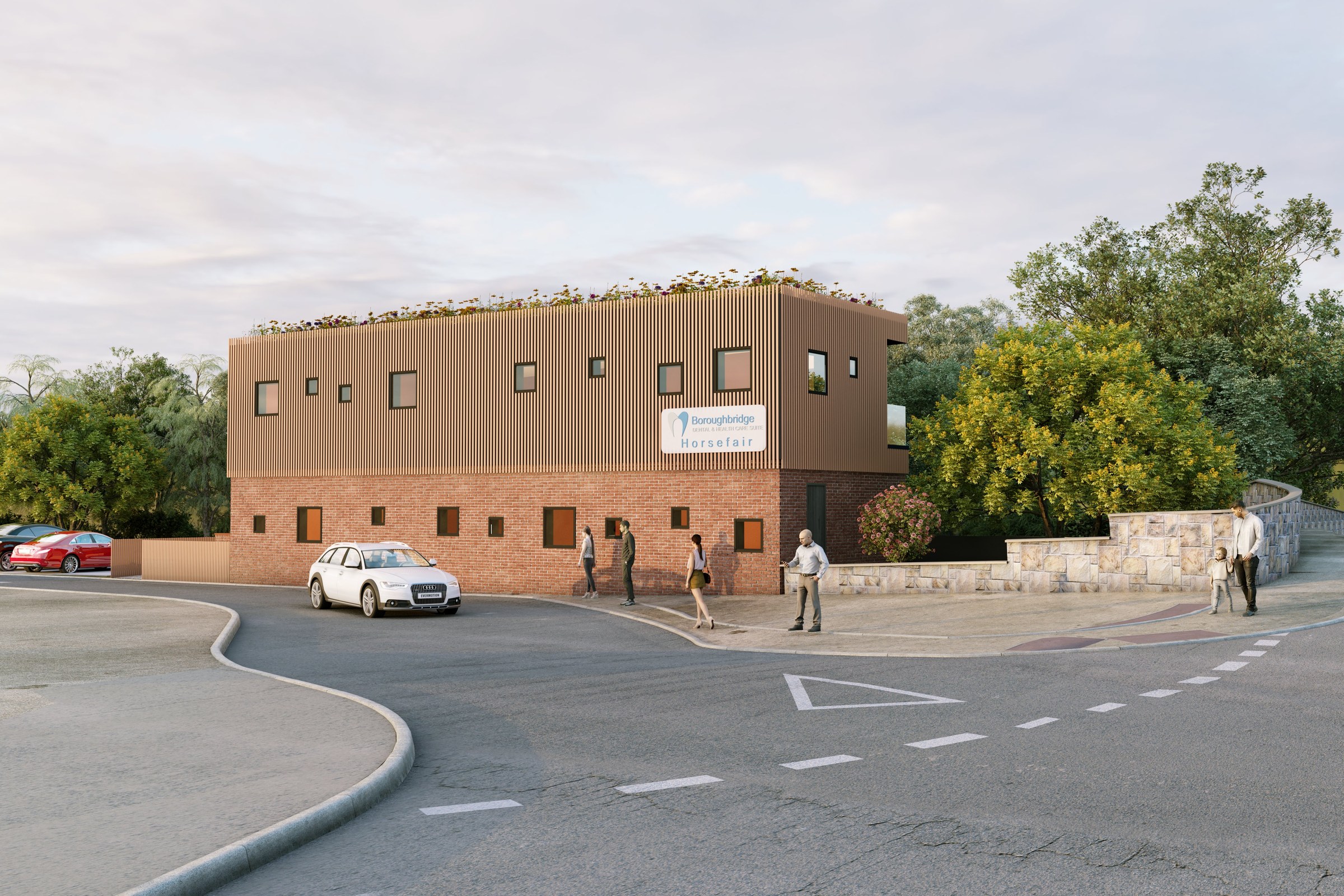
Brick Mixed Use Clinic
Contemporary Mixed Use Building Visualization
Two-story brick and brown metal-clad mixed-use building with green roof, parking lot, and pedestrian activity at street corner.
Project Overview
This project came in from Wright + Partners, a Nashville developer working on a corner-lot mixed-use building that would house a medical clinic on the upper floor and retail on the ground level. The brief was straightforward: one exterior corner view, overcast lighting, show the building in context with pedestrians and parked cars. Delivery in ten days.
What made it interesting was the material palette. The architect had specified a two-tone exterior — warm brick on the lower half transitioning to brown metal cladding on the upper story, topped with a green roof section. On paper, that sounds simple. In practice, getting brick and metal to sit together without one overpowering the other is a careful balancing act.
Amit, a mid-level artist on our team, took the project. He had been working with us for about two years at the time and was starting to handle client-facing work on his own. This was one of his first solo projects from start to delivery. Neha, our senior artist, reviewed his work at two checkpoints but did not take over — the goal was for Amit to learn the full workflow.
The green roof was the detail that took the most iteration. The client wanted it to look established — not freshly planted, but not overgrown either. Amit built a scatter of sedum plants using ForestPack in 3ds Max, adjusting the density and color variation until it looked like a roof garden about two years into its life. A small thing, but it is the kind of detail that separates a render that feels real from one that feels assembled.
The pedestrians were placed to suggest a lunch-hour pace — a couple walking toward the entrance, someone on a phone near the parking lot. We avoid the mistake of making street scenes look like a catalog shoot. People in renders should look like they have somewhere to be.
Technical Approach
The overcast lighting setup used a V-Ray dome light with an HDRI captured in similar flat-light conditions. The challenge with overcast scenes is avoiding a dull, lifeless result — everything can look the same value without careful attention to material contrast. Amit boosted the brick roughness slightly to catch micro-shadows and added subtle variation to the metal cladding panels so they would not read as a single flat surface. The parking lot asphalt used a rain-dampened shader to add depth to the ground plane without making it look like it was actively raining. Corona scatter handled the landscaping elements around the building perimeter.
The Result
Wright + Partners used the rendering for their investor presentation and local permitting application. The image helped secure tenant commitments for the ground-floor retail space before the building broke ground. Amit went on to handle three more projects for the same client over the following months — a good sign that the quality held up.
Tips for Developers
-
Corner views tell the most story. If your building sits on a corner lot, a corner-angle rendering shows two facades, the streetscape, and the building entry all at once. It is the most information-dense angle you can choose.
-
Specify the age of your landscaping. Telling us the green roof should look ‘established’ versus ‘newly planted’ changes every scatter parameter. The more specific you are about how the space should feel in time, the more believable the result.
-
Include real context early. If there is a bus stop across the street or a particular neighboring building, send us a photo. Context details like these make the rendering feel site-specific rather than generic.
Have a project like this? Let’s talk — or explore more work.