Retro Diner
Retro Diner Visualization
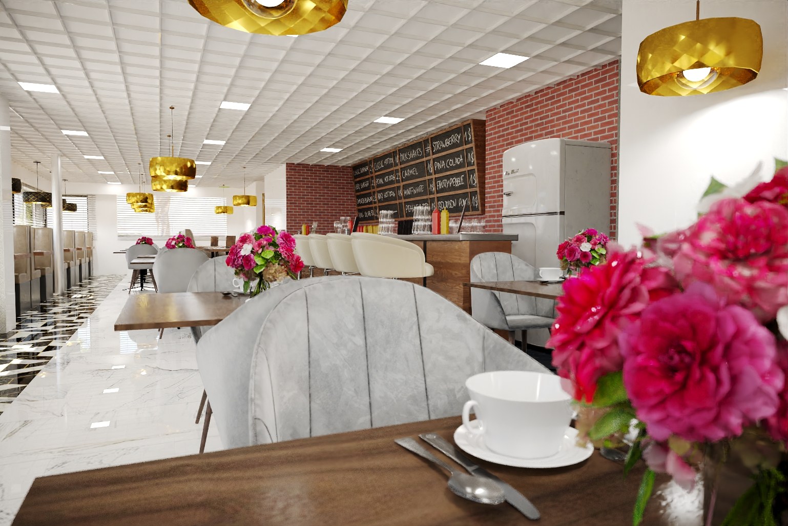
3D rendering of a retro diner interior featuring a chalkboard menu, gold pendant lights, grey velvet chairs, and a marble-patterned floor.
Project Overview
We approached Retro Diner knowing the event venue developer had a tight window and high expectations. 4 interior views needed to cover eye-level perspectives — and each one had to stand on its own.
Upscale diner/restaurant interior with chalkboard menu on brick wall, gold pendant lights, grey velvet chairs, marble-patterned floor, pink flowers on tables.
The Challenge
Getting the materials right was non-negotiable. The event venue developer had specific finishes in mind, and anything that read as ‘generic CG’ would undermine the credibility of the entire package.
The project site has strong character — mature trees, sloping terrain, established neighbours. Ignoring that context would have produced renders that felt disconnected from reality. We had to model the environment as carefully as the building itself.
Balancing aesthetics with accuracy is always the tension in this work. The event venue developer wanted images that looked aspirational — but the architects needed every proportion, setback, and material call to be precisely as drawn.
Our Approach
Camera positions were planned, not improvised. We mapped out eye-level angles based on the project’s strongest design moments, then refined framing through a series of grey-shaded test renders before committing to final production.
We ran the first round of test renders at reduced resolution to get quick feedback on composition, materials, and overall mood. This let us catch issues early when changes were cheap, not late when they weren’t.
Lighting development ran parallel to the modelling. We tested multiple Daylight, Neutral/Artificial setups early — before the geometry was even finished — so we could lock in the mood and atmosphere without burning production time later.
We started where we always start: with the drawings. Every wall thickness, every material notation, every site boundary got translated into the 3D model before we touched a single texture or light.
The modelling phase was methodical. We built the geometry from the architectural plans, cross-referencing elevations and sections to catch anything that might read differently in three dimensions than it does on paper.
The Result
The full set of 4 renders was delivered within 2-3 weeks. Hero images went out first for early marketing, with the complete gallery following shortly after for the project website and brochure.
Working on something similar? Let’s talk about your project — or browse more of our work.