What Separates a Usable Aerial Render from a Vanity Image?
A single aerial image must do three jobs at once: communicate design intent to stakeholders, anchor all marketing collateral, and survive monthly client presentations without losing credibility. The 
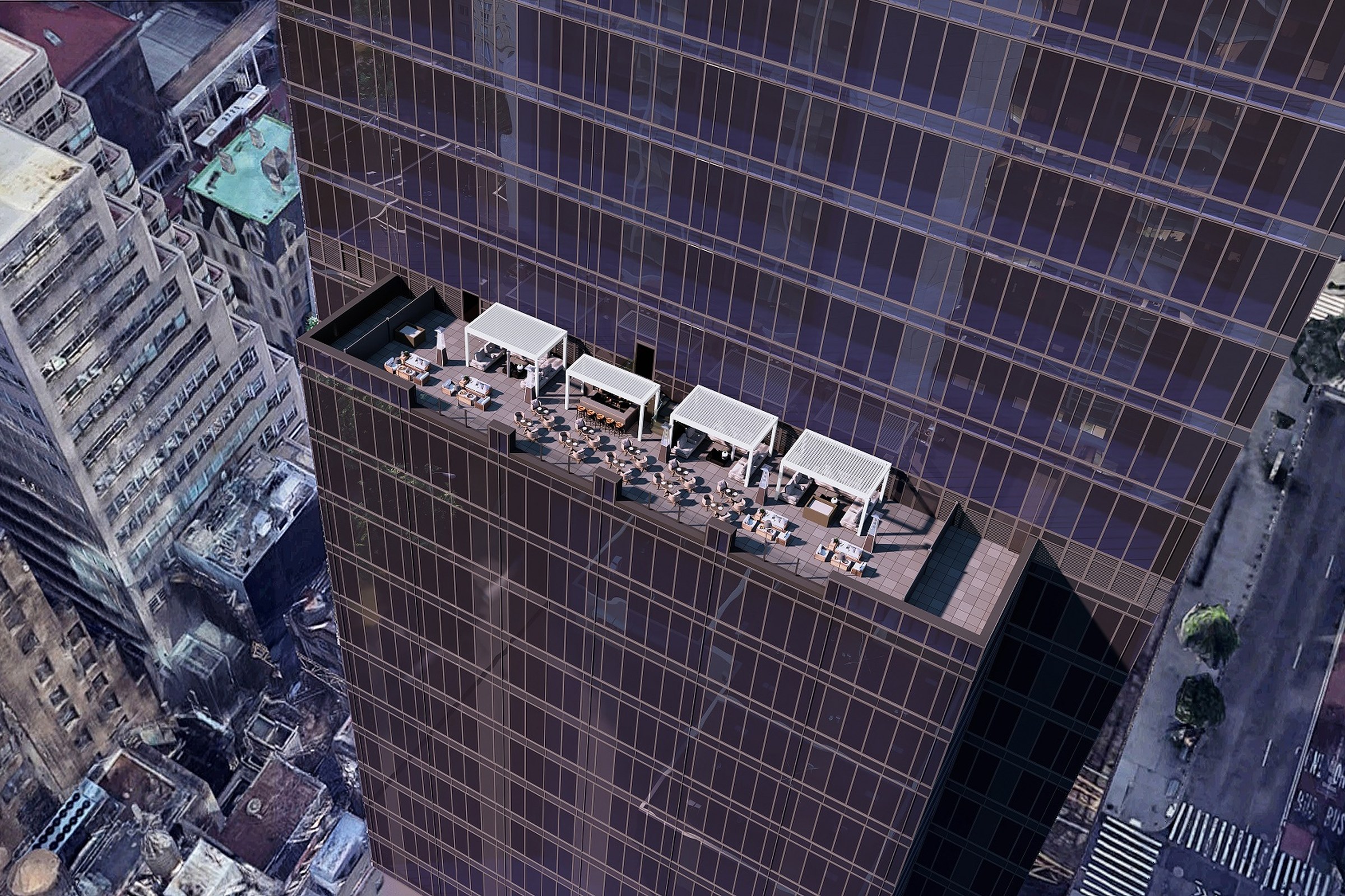
Manhattan Rooftop Terrace
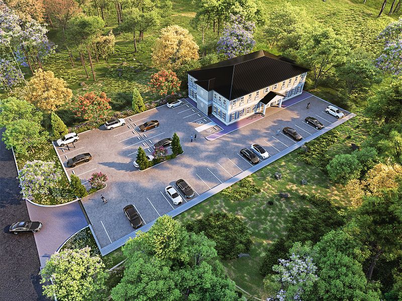
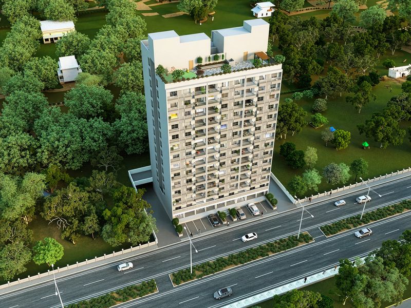
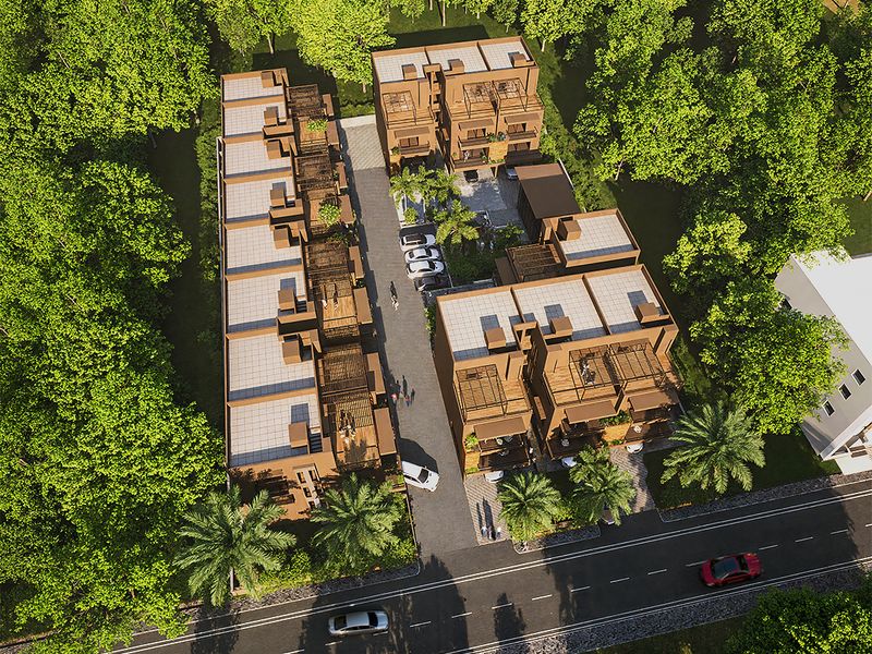
 was exactly this kind of load-bearing visual. One image. No fallback angles. 1-2 week delivery window.
The brief arrived specific and non-negotiable: 2400 × 1600 pixels, daylight variant only, JPEG format. Show the rooftop as birds-eye view: 4,000 square feet of terraced amenity space, white cabana structures, lounge clusters, dining setup, all set atop a dark glass curtain-wall high-rise with Lower Manhattan's dense street grid visible far below.
Viewpoint as Commitment, Not Default
Birds-eye perspective destroys experiential truth. Occupants never see their own terrace from directly above. Architects and developers see it constantly. This shift from human eye to planning eye trades emotional seduction for spatial clarity, a trade that usually matters more in project communication than people realize.
The surrounding Manhattan context needed photogrammetric accuracy in street patterns, building footprints, scale relationships, and urban density perception. Too generic and the render reads as stock illustration, not genuine proposal. Too obsessive with detail and the rooftop amenity gets buried in surrounding noise. The space between those extremes is where real craft lives.
Scene Composition Within Pixel Constraints
2400 × 1600 is not premium resolution in any absolute sense. It's the minimum threshold where cabana structures, individual lounge pieces, and dining table groupings read distinctly when a viewer's eye lands on them, yet stays renderable within real project timelines and budgets.
Composition at this scale demands discipline. Blurred edges suggest incompleteness. Soft materials read as placeholder models. Every pixel carries signal, which means zero cosmetic flourish.
---
Why Rooftop Context Often Outweighs Subject Detail
The rooftop sits 50+ stories above street level. That altitude context either anchors credibility or undermines it entirely. The scope question was fundamental: how much surrounding urban fabric is necessary without competing for visual focus?
The answer emerged through systematic decision-making:
- Adjacent buildings rendered in mid-to-dark tones to frame the rooftop without visual competition
- Street grid showing genuine Manhattan block proportions and typical New York scale
- Sufficient altitude visualization to convey height without vertiginous distortion
- HDRI lighting locked to a single north-facing sun position (no alternative dusk or magic-hour variants)
- Zero street-level detail rendered (ambient detail from this altitude reads as false perception)
The rule that emerged: viewers should orient to geography in five seconds, then spend three minutes understanding spatial adjacency, functional layout, and design intent.
Material Precision Under Client Scrutiny
Clients zoom into different areas during monthly reviews. White cabanas needed subsurface definition to read as tensioned fabric rather than plastic or unmarked geometry. Lounge pieces required material variation across wood joints, metal framework, and cushion surfaces. PBR material setup had to survive magnified inspection without revealing modeling shortcuts.
The single locked daylight lighting scenario meant one complete design story. No fallback "here's how it appears at sunset" option. That restriction forced earlier, cleaner decisions at every stage.
---
Aerial masterplans succeed when spatial relationships become instantly obvious. If viewers need explanation or a guided tour, the render failed at its core job.
---
Delivery as Strategic Constraint
The 1-2 week timeline wasn't arbitrary scheduling imposed by the client. It was a constraint deliberately chosen because the client understood that unlimited production time often produces unclear outputs. Constraints breed decision clarity and commitment.
This pace eliminated iterative rendering passes, material refinement studies, and "let's try this variant" exploration. Every major choice, view planning, sun position, material palette, context scope, lighting warmth, had to land correctly on the first execution pass. No safety net. No revision strategy.
Why Restrained Design Survives Market Rotation
The JPEG output has been in active market rotation for 18 months: investor presentations, architectural pitches, broker materials, web presence. It hasn't lost credibility or become dated. Most aerial renders age poorly because they chase drama: dramatic lighting, trendy furniture detailing, stylized or exaggerated contexts all feel artificial and forced within 12-18 months.
This render survives through restraint. Strong underlying geometry. Accurate spatial proportions. Functional clarity. It reads as a serious proposal, not as illustration or fantasy imagery.
Core Trade-offs When Scoping Aerial Masterplans
When briefing an aerial render project, these decisions determine the final output quality:
- Single locked image vs. multiple viewing angles (single = sharper focus)
- Photogrammetric mapping of context vs. simplified generic surroundings (photogrammetric = credibility)
- Accurate solar geometry vs. stylized dramatic lighting (accurate = survival)
- Fully landscaped site vs. clean architectural focus (clean = readability)
---
The Craft Beneath the Render
Aerial masterplans aren't about photorealism. They're about clarity under constraint. The Manhattan project succeeds because every decision, from viewpoint to pixel density to lighting setup, served one goal: make spatial relationships instantaneously readable.
This clarity comes from saying no more than from saying yes. Context that competes gets omitted. Details that don't serve function get simplified. Every rendering pass answers one question: does this make the rooftop amenity more legible or less?
Most visualization briefs start backwards. They begin with "make it look beautiful" or "show off the location." This brief started with "make it work." That difference compounds through every technical choice.
---
Aerial masterplans demand a different mindset than hero shots. Let's discuss how site scale and viewpoint strategy apply to your next project brief.