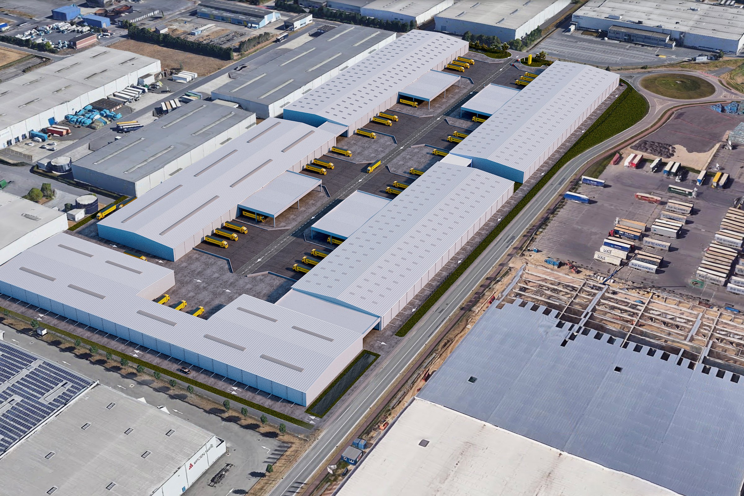
What Makes an Aerial Masterplan Worth Looking at?
Most aerial renders are competent. They show buildings, roads, parking. The eye knows what it's looking at. But competent isn't enough when the image needs to persuade boards, secure investment, or guide permitting. A working aerial masterplan does something harder: it makes abstract site performance visible.
The difference lives in specificity. Not detail for its own sake, but detail that reads the site's actual logic. White-roofed warehouses signal warehouse program. Yellow loading docks indicate dock placement, loading rhythm, and truck access patterns. These choices aren't arbitrary.
Parking configurations tell stories about scale, employee density, and traffic flow. A roundabout isn't decoration; it's a concrete answer to a circulation question viewers don't anticipate. Every visible element proves something about site viability.
The best aerial renders aren't the most detailed. They're the ones where every visible element serves the brief.
The Brief Beneath the Brief
Urban planning firms don't commission aerials to see their site from a helicopter. They commission aerials to settle arguments. Is the roundabout in the right place? Do loading docks face the right direction? The render becomes visual proof.
This reframes production. Accuracy of placement matters. Material color matters. Shadow direction matters. These aren't aesthetic choices; they're factual claims about site performance.
Resolution and Scale Legibility
At 2400 x 1600 pixels, this single image goes to print. It anchors digital listings. It won't pixelate under scrutiny. But pixel count alone doesn't equal legibility. Viewers need to read parking rows, dock orientations, and road markings from altitude without zooming three times.
This demands specific render geometry. Too wide an angle flattens relationships. Too narrow an angle cuts context. The view angle itself is a technical decision most briefs never articulate clearly.
---
Why View Selection Makes or Breaks a Masterplan Render
The angle you choose is not neutral. It controls what viewers understand about the site before reading a single label.
Directly overhead shows maximum parking legibility but hides building typology. 45 degrees shows form and volume but compresses parking counts. A 30-degree oblique balances readability with context. Each privileges different information.
Vancouver industrial sites sit on varied topography. Aspect matters. If your roundabout sits in depression, the wrong angle buries it. If building facades face a specific cardinal direction, you need that orientation in frame. The brief specified "alternate aerial angle," meaning the primary view wasn't solving something. One angle had to work.
The Math of View Planning
- Shadow direction reveals seasonal sunlight and dock operation viability
- Building height ratios show zoning compliance and visual hierarchy
- Road geometry confirms traffic engineering feasibility
- Parking module repetition signals standardized layout efficiency
- Material transitions delineate program zones clearly
Where Brief Drift Costs Time
- Client requests "more dramatic" lighting when they need clarity
- Stakeholder asks for "more context" and angle shifts five degrees
- Resolution expectations misaligned with print versus screen deployment
- Lack of agreement on what the image must actually prove
---
Why Daylight Simplifies Nothing
"Daylight only" looks like a constraint. It's a demand for absolute clarity. No mood lighting masks bad proportions. No neon distracts. This is the site as seen during a site walk.
Ambient occlusion, PBR material accuracy, and HDRI lighting setups matter more in daylight than any stylized variant. Wrong asphalt color reads as a site problem. Parking stripes at wrong opacity confuse the viewer about space counts. Building shadow density reveals whether facades actually bound the space.
A 1-2 week turnaround for a single aerial is fast. It's achievable because constraints stay tight: one angle, one time, one resolution, one format. No variants. Variants kill schedules.
---
How Developers and Planners Actually Use These Images
An architectural render lives in documents. It gets printed at 8.5 by 11. It gets embedded in slides at 1024 pixels wide. It gets printed at 2 feet by 3 feet for board presentations. The image that works at all four scales never made choices for vanity.
For developers, this image answers: Can my lenders see the parking? For planners, it answers: Does circulation flow? For board members with two minutes, it answers: Is this credible?
The specific metrics matter:
- Parking rows must be countable at a glance
- Loading dock count must be verifiable from the image alone
- Perimeter road geometry must match site survey data
- Building floor plate ratios must read correct at 400 feet up
- Material color accuracy prevents false site interpretation
These aren't niceties. They're the difference between an image that closes deals and one that raises questions.
---
Why This Renders Differently Than Architectural Close-Ups
An elevation render of a single facade is forgiving. A facade is a facade. Proportion and material go a long way. An aerial masterplan can't hide. The eye compares it immediately to Google Earth, to surveys, to stakeholder intuition. It has to be right.
This is why masterplan renders live in a different craft category than architectural portraiture. The audience skews technical. The scrutiny is forensic. The image must work as both communication and proof of concept.
---
Aerial masterplans get underestimated because they look simple. They rarely are.