Garden Apartment Complex
Traditional Residential Community Visualization
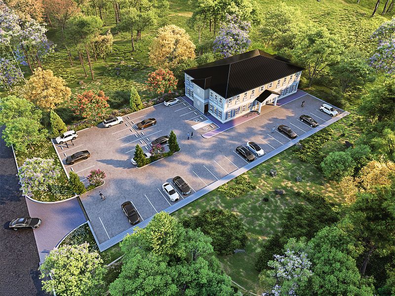
Aerial render of a two-story garden apartment complex with hip roofs, large parking lot, landscaped medians, and surrounding trees.
Project Overview
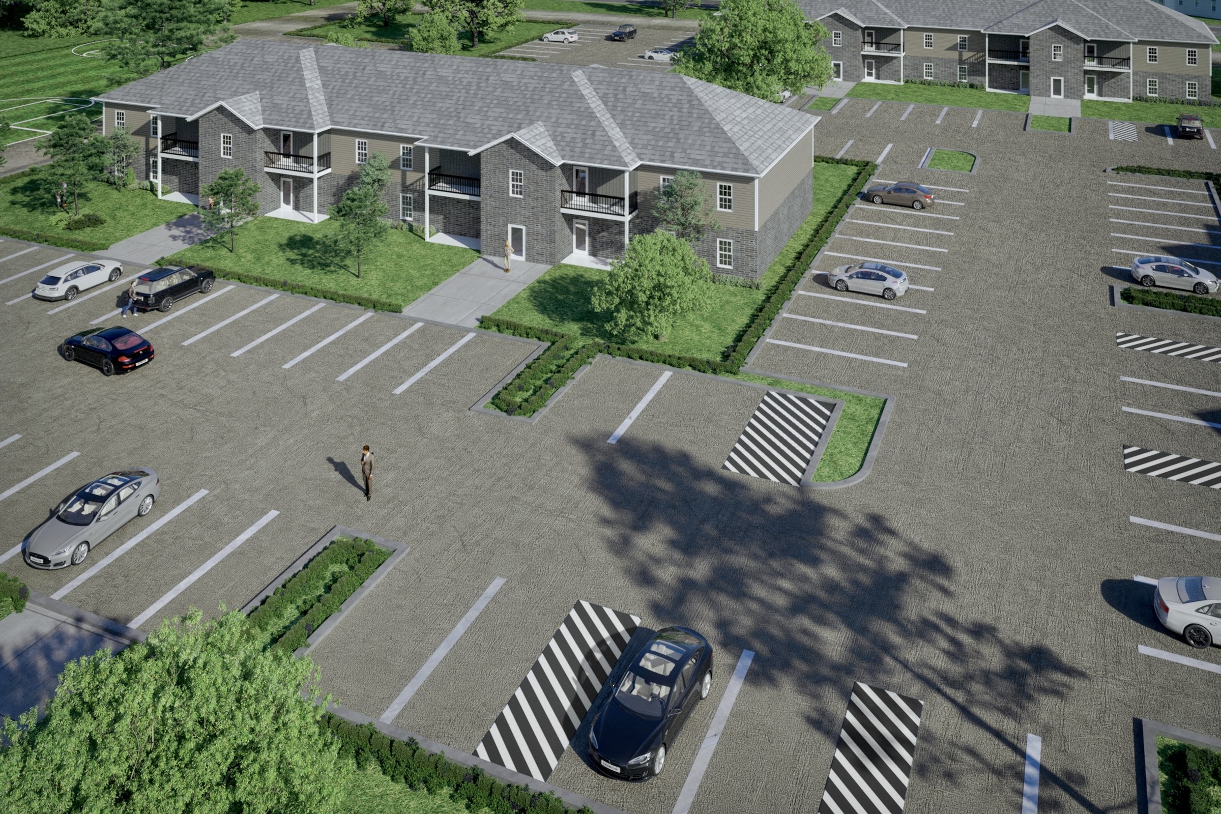
We picked up Garden Apartment Complex as a focused engagement: one hero image for a master plan project in Los Angeles, CA. Short timeline, high bar for quality.
Aerial render of a two-story garden apartment complex with hip roofs, large parking lot, landscaped medians, and surrounding trees.
The Result
We delivered the finished image within 1-2 weeks. It’s since been used across the project’s marketing materials, from digital listings to printed collateral.
If this is the kind of quality you’re after, start a conversation with us. Or explore the full portfolio.