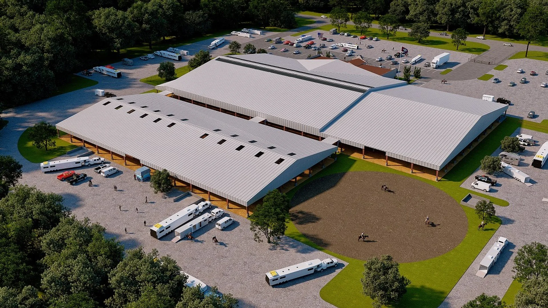
Equestrian Arena Facility
Rural Recreational Facility Visualization
Aerial drone render of a large covered equestrian arena with white metal roofing and exposed timber post-and-beam structure, circular riding ring with horses and riders, surrounding horse trailers and RVs in the parking area, with dense green tree canopy and open fields beyond.
For the “Equestrian Arena Facility” project, our client sought a striking aerial visualization that would capture the grandeur of their large covered equestrian arena. With a focus on attracting potential investors and securing planning approvals, they needed an image that showcased not only the architectural features but also the vibrant activity of the facility. The goal was to create a compelling representation that highlighted the arena’s functionality and aesthetic appeal.
Our approach to this rendering was to emphasize the dynamic nature of the equestrian environment. We meticulously crafted a scene that included a circular riding ring filled with horses and riders, surrounded by horse trailers and RVs in the parking area. By incorporating a dense green tree canopy and expansive open fields in the background, we created a sense of place that resonated with the equestrian lifestyle. This unique perspective, captured from an aerial viewpoint, allowed us to present the facility in a way that was both informative and visually captivating.
To achieve the photorealistic quality our clients expect, we utilized advanced software such as 3ds Max and V-Ray, which enabled us to render intricate details and realistic lighting. We paid special attention to the materials, using a combination of white metal for the roofing and exposed timber for the post-and-beam structure, ensuring that the textures were lifelike and engaging. The lighting was carefully calibrated to mimic natural sunlight, casting soft shadows that enhanced the overall depth of the scene.
The final result was a stunning aerial render that not only met but exceeded our client’s expectations. This visualization played a crucial role in their marketing strategy, helping them secure planning approvals and effectively pitch to investors. By showcasing the facility in such a compelling manner, we contributed to the project’s success and reinforced our commitment to delivering exceptional architectural visualizations.
Project Overview
Aerial drone render of a large covered equestrian arena with white metal roofing and exposed timber post-and-beam structure, circular riding ring with horses and riders, surrounding horse trailers and RVs in the parking area, with dense green tree canopy and open fields beyond.