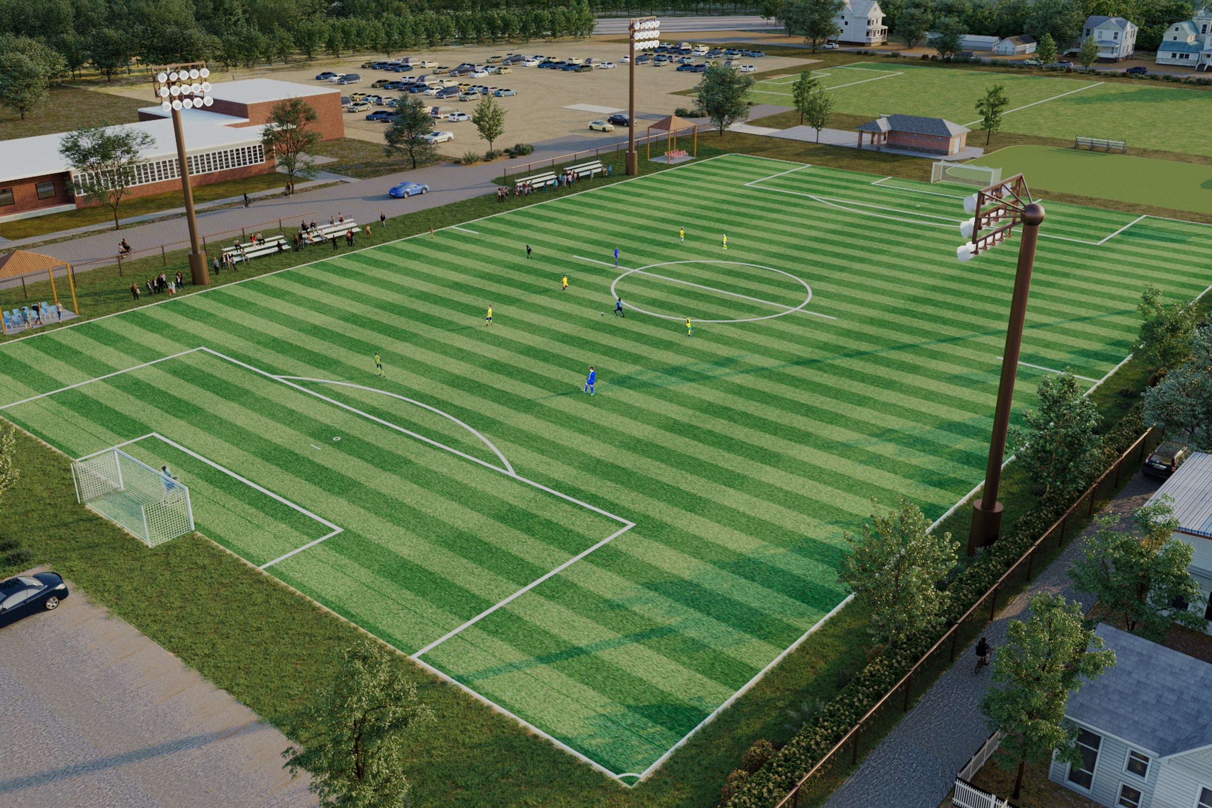
Community Soccer Field
Modern Site Plan Visualization
Aerial render of a full-size soccer field with floodlights, adjacent sports fields, parking area, and surrounding residential neighborhood.
For the “Community Soccer Field” project, our client sought a captivating aerial render that would showcase a full-size soccer field complete with floodlights, adjacent sports fields, and a well-planned parking area, all nestled within a vibrant residential neighborhood. The goal was to create a visual that not only highlighted the functional aspects of the facility but also conveyed its potential to enhance community engagement and promote a healthy lifestyle.
Our approach to this rendering was driven by a commitment to realism and detail. We meticulously crafted the scene to reflect the dynamic energy of a community sports hub. By incorporating elements such as surrounding greenery, active sports fields, and the residential backdrop, we aimed to create a narrative that resonated with both local stakeholders and potential investors. Our team utilized advanced techniques to ensure that the lighting mimicked the natural glow of sunset, casting warm hues across the field while the floodlights illuminated the area, creating a welcoming atmosphere.
In terms of technical execution, we employed industry-leading software such as Autodesk 3ds Max and V-Ray for rendering, which allowed us to achieve stunning photorealistic visuals. The materials used were carefully selected to reflect real-world textures, from the grass on the soccer field to the asphalt of the parking area. We also paid close attention to the placement of shadows and reflections, enhancing the overall depth and realism of the scene.
The final render not only met but exceeded our client’s expectations, serving as a powerful tool in their marketing strategy. It played a crucial role in securing planning approval and effectively communicated the project’s vision during investor pitches. By showcasing the community soccer field in such an engaging manner, we helped our client illustrate the positive impact this facility would have on the neighborhood, ultimately fostering community spirit and promoting an active lifestyle.
Project Overview
Not every project needs a dozen views. Community Soccer Field called for one carefully considered image — the kind that stops a client mid-scroll and gets a meeting scheduled.
Aerial render of a full-size soccer field with floodlights, adjacent sports fields, parking area, and surrounding residential neighborhood.
The Result
The final output landed within 1-2 weeks. Clean, high-resolution, ready for print and screen. It’s been the visual backbone of this project’s public-facing materials.
Got a project that needs this kind of visual clarity? Get in touch or see more examples.