Community Library
Modern Site Plan Visualization
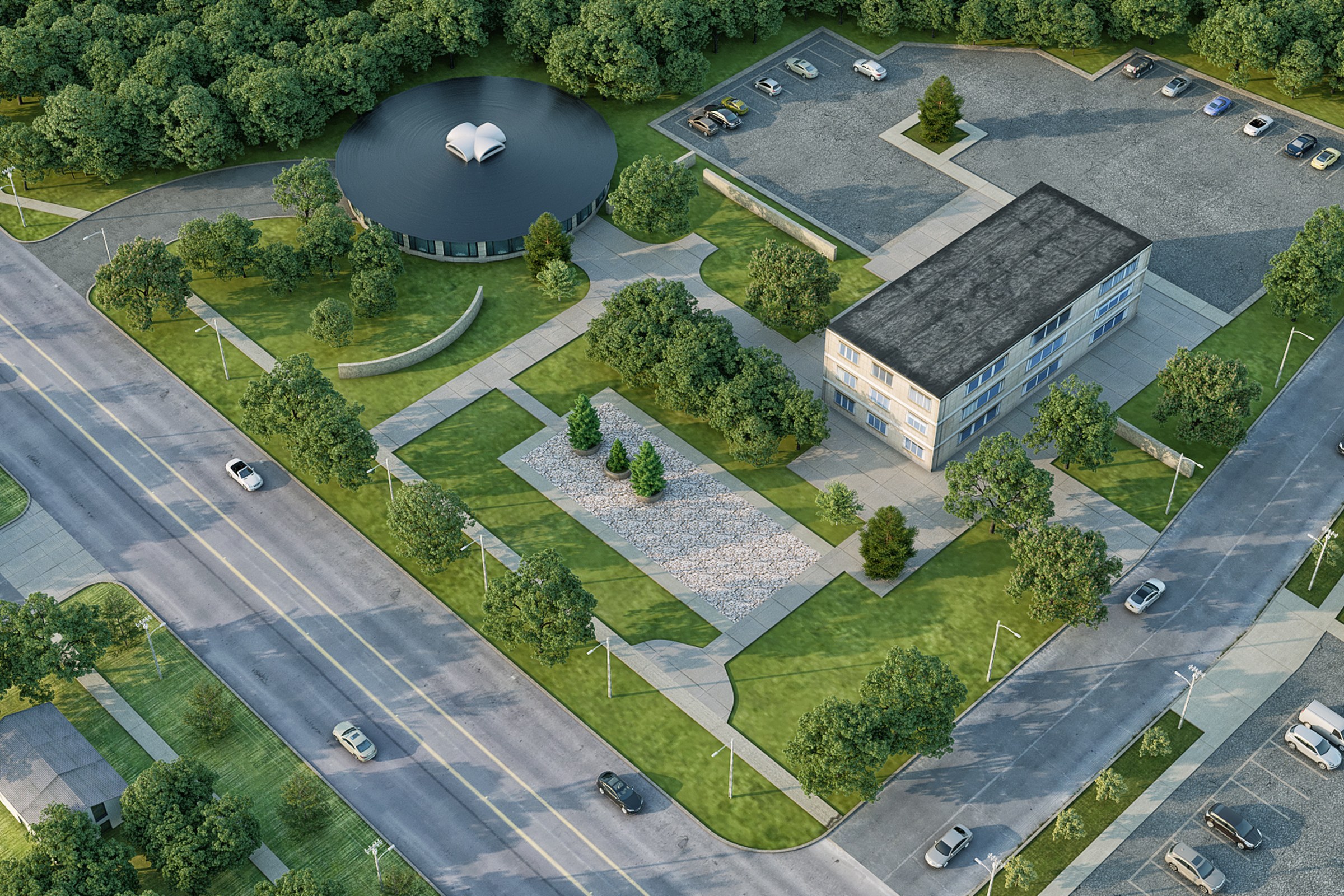
Aerial render of a modern library complex with a dark-roofed two-story building, circular water feature or amphitheater, landscaped courtyard, parking area, and surrounding trees.
For the “Community Library” project, our client sought a striking aerial render to showcase a modern library complex that would serve as a focal point for the community. They needed an image that captured the essence of the design, highlighting the dark-roofed two-story building, the inviting circular water feature, and the beautifully landscaped courtyard. The goal was to create a visual narrative that would not only aid in planning approvals but also inspire local stakeholders and potential investors.
Our approach was centered around creating a photorealistic representation that emphasized the library’s architectural features while integrating seamlessly with its natural surroundings. We carefully considered the layout and perspective to ensure that the circular water feature and amphitheater were focal points, inviting viewers to imagine themselves in the space. By incorporating lush greenery and surrounding trees, we aimed to evoke a sense of tranquility and community engagement.
In terms of technical execution, we utilized advanced rendering software, including V-Ray and 3ds Max, to achieve high-quality visuals. We paid meticulous attention to lighting, opting for a warm, natural daylight setting that enhanced the textures of the materials used, such as the sleek façade of the building and the reflective surface of the water feature. Our team also focused on realistic shadow play, which added depth and dimension to the overall composition.
The final render proved to be a game-changer for our client. It not only facilitated a smooth planning approval process but also served as a powerful marketing tool during investor pitches. The visual impact of our work helped convey the library’s potential as a vibrant community hub, ultimately leading to increased interest and support from stakeholders. We take pride in how our rendering contributed to bringing this visionary project to life.
Project Overview
A master plan project in Greenville, SC, Community Library came to us at the stage where the design was locked and the client needed one image — the definitive view — for their launch materials.
Aerial render of a modern library complex with a dark-roofed two-story building, circular water feature or amphitheater, landscaped courtyard, parking area, and surrounding trees.
The Result
The final output landed within 1-2 weeks. Clean, high-resolution, ready for print and screen. It’s been the visual backbone of this project’s public-facing materials.
Got a project that needs this kind of visual clarity? Get in touch or see more examples.