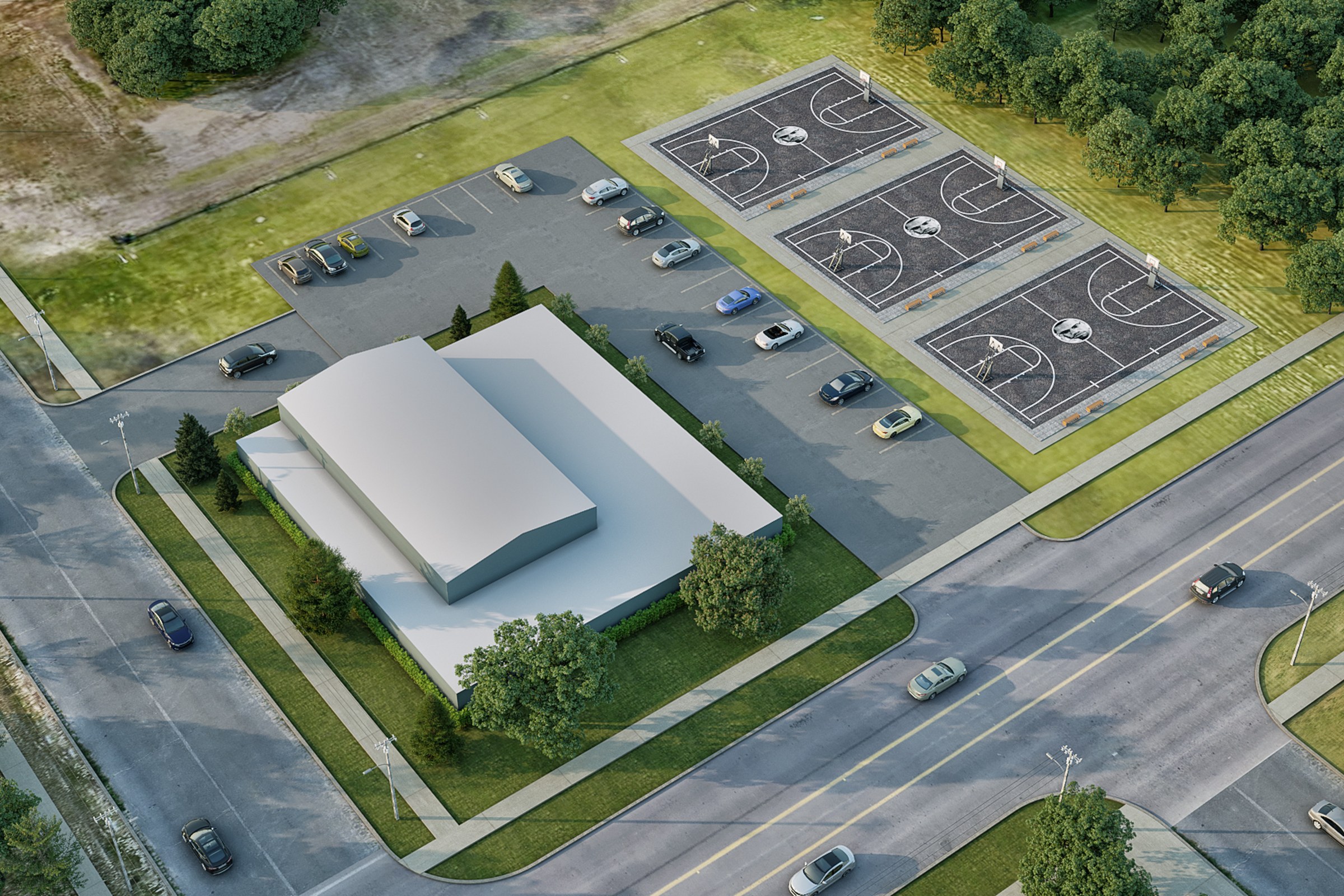
What Aerial Renders Actually Hide
Aerial masterplans appear simple: step back, point the camera down, light it naturally. But simplicity masks a fundamental constraint. You lose granular control over architectural detail, fenestration, material logic, spatial drama. In exchange, you inherit total responsibility for context, landscape, and how the project sits in the world.
Most aerial briefs fail because the client believes they're ordering a map. They're not. A map is neutral. A render makes an argument.
The scale penalty
Zooming out eliminates detail. A 2400 x 1600 px image cannot resolve fenestration at 200 meters altitude. The gymnasium's clerestory becomes generic texture. Parking layout must communicate instantly, or it reads blank. Every element on site becomes a vote for visual hierarchy.
What gets rendered at full detail? What recedes? These are design decisions with permanent consequences.
The landmark problem
Ground-level renders live in familiar perceptual space. Eye level is intuitive. Aerial renders strip that away entirely. Camera height, rotation angle, and lateral offset become your entire communication system. Get this calibration wrong and Jacksonville reads like anywhere. Get it right and the site feels inevitable.
Why Context Wins Over Craft
The gymnasium is pristine. The roofline geometry is clean. The material palette is tasteful. None of that architectural rigor matters if the surrounding park reads as afterthought, or if the parking footprint suggests the designer ran out of land halfway through planning.
Developers work inside constraint. They don't think in architectural gestures. They think in numbers: zoning limits, adjacency rules, municipal expectations, tenant mix requirements. A render ignoring these is invisible inside the pitch room. A render making constraints visible and resolved becomes the reference document for a year of sales conversations.
Developers need to see the answer to these questions:
- Will zoning approve these setbacks?
- Does parking cover projected occupancy?
- Does the adjacency match the tenant plan?
- Can circulation handle peak-hour loading?
- Will finished landscape support maintenance?
Landscape as proof
The courts. The green space. The sight lines between parking and entry. These aren't decoration. They're evidence that someone actually planned the edges, not simply positioned a building in white space.
The developer's geometry
Parking, loading, circulation, setbacks. These are the parts that get built. A render that makes these elements legible instead of apologetic becomes the deal-closing tool.
A single aerial image clearly resolving site logistics is worth more than a full presentation of detailed architectural shots that leaves stakeholders guessing about how the pieces fit.
What Separates a Usable Render From a Vanity Piece?
The difference lives in design decisions most people never articulate explicitly. A great aerial render answers specific questions the developer will face in permitting, finance, and sales. A vanity piece just looks stylistically accomplished.
Technical choices transform into philosophical choices at aerial scale:
- HDRI lighting: Neutral daylight, not dramatization. Developers see normal-condition visibility.
- Ambient occlusion: Essential at distance. Shadows are your primary depth cue.
- Camera height and angle: Matches decision-maker vantage: site plan, financial model, municipal presentation.
- Polygon geometry: Simplified vegetation. Detail reads as noise at this scale.
- PBR material consistency: Concrete, asphalt, grass, roof each need accurate reflectance.
The constant temptation in aerial work is to over-render the building and let the surrounding site go soft or generic. Resist this impulse. The building gets one week of visual attention. The site has to survive twelve months of financial and operational questions.
Why One Image Closed What Slide Decks Couldn't
The Brookside render shipped as a single JPEG, 2400 x 1600 px. One viewpoint. One lighting pass. Deliberately constrained at delivery.
This constraint was the deliverable's hidden strength. Developers don't have time to parse multiple camera angles. Marketing departments don't want to choose between competing variants. Architects need a fixed visual reference so that internal team conversations don't splinter into ten different interpretations of the same site geometry.
Single-image discipline
The 1-2 week project timeline meant no secondary render passes, no "what if we rotated it 15 degrees left" exploration. The view-planning decision had to be correct on the first iteration, because there was no project budget for revision cycles.
Distribution and adoption
One locked image moved into pitch decks, municipal submissions, website headers, investor reports. The same render. No version confusion. No stakeholders arguing which variation was approved. It became the canonical image for the project across every channel.
What Matters When Everything Else Is Invisible
What actually makes this render work never appears in the final JPEG file. The site survey data that informed parking geometry. The municipal zoning map that justified the setbacks. The landscape plan that the render had to match without explicitly illustrating.
Developers commission visualization for a single reason: to make decisions visible before construction begins. Every pixel choice in an aerial render is answering a question someone will face later, whether they recognize it or not.
The hidden inputs became the visible decisions:
- Does parking match the unit count?
- Are courts positioned for maintenance vehicle access?
- Does green space proportion match the building volume?
- Can circulation paths handle peak-hour loading?
- Is the loading zone visible from operations?
The actual work isn't in the software or rendering engines. It's in asking what's genuinely being decided, and building an image that refuses to let anyone look away from the answer.
---
Seeing other single-image deliverables reshape how teams communicate across disciplines.