Airport Master Plan
Modern Master Plan Visualization
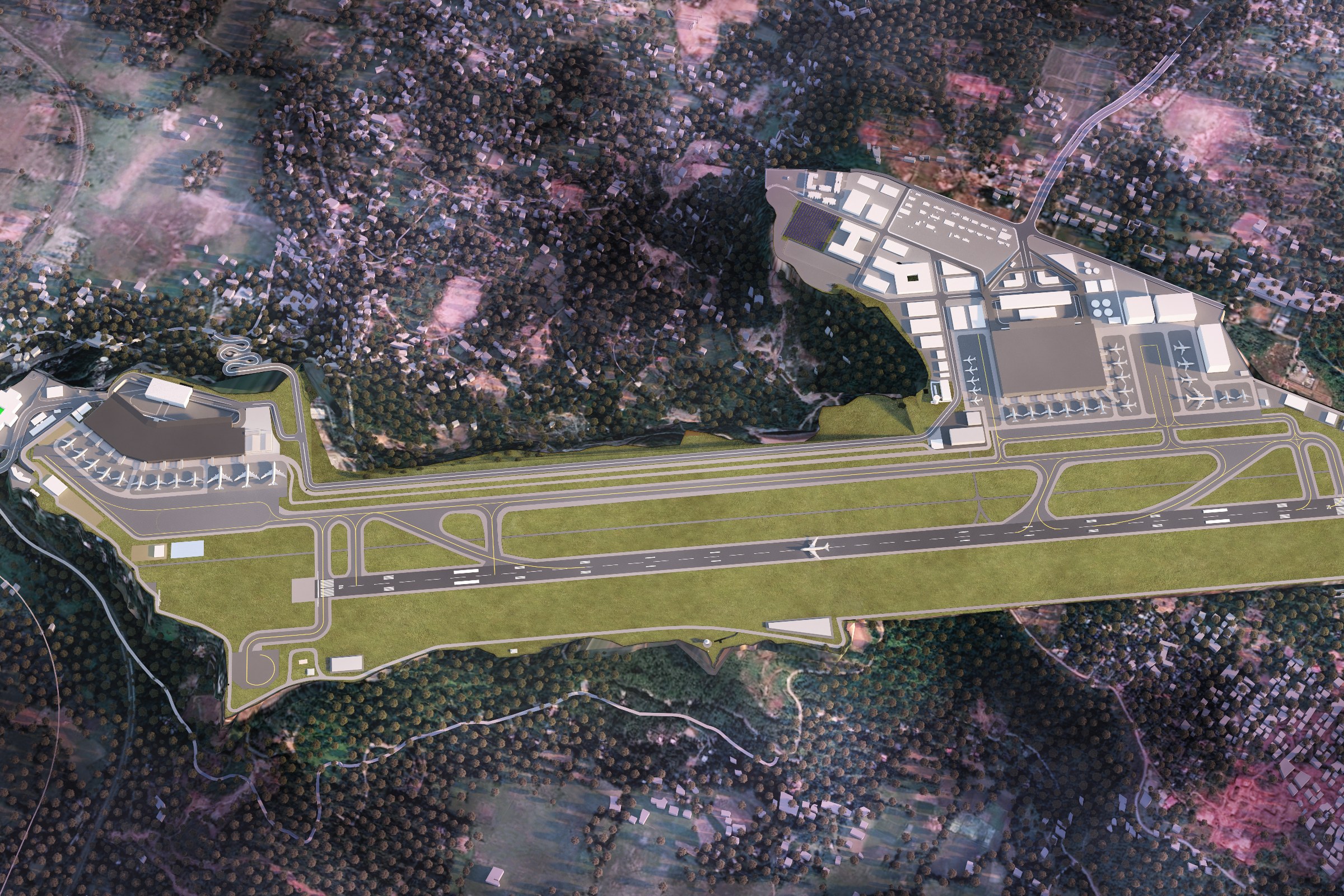
Top-down master plan view of an airport complex with a runway, taxiways, terminal buildings, and surrounding forested terrain.
Project Overview
Airport Master Plan was a quick-turn engagement. The master plan developer had a design they were proud of and needed it visualized — no extras, just one precise, photorealistic render.
Top-down master plan view of an airport complex with a runway, taxiways, terminal buildings, and surrounding forested terrain.
The Result
The image shipped on schedule and has been the go-to visual for this project ever since — presentations, planning submissions, social media, the lot.
Got a project that needs this kind of visual clarity? Get in touch or see more examples.