
The whole portfolio was never what you wanted
A link asks you to scroll and decide what’s relevant. One word in a reply does that matching for you — and gets back exactly one image built for your own typology.
“Here’s our portfolio” is a reasonable-sounding offer that quietly asks a lot: open the link, scroll past whatever isn’t yours, guess which of sixteen categories is close enough, and decide for yourself whether any of it actually says something about your project. Most people who’ve already opened an email and clicked through once don’t do that second round of work — not because they’re not interested, but because nothing in the ask told them it would be worth it.
So here’s the smaller version of that offer: tell us your typology, we send back one render — the one built for it, not the whole set. Below is what that single image actually has to prove for four different typologies, using four real ones.
One typology, one render, one thing it has to hold
Not a shared checklist across all four — each typology is judged on a different thing, and the render only proves the ask if it gets that specific thing right.
Hospitality
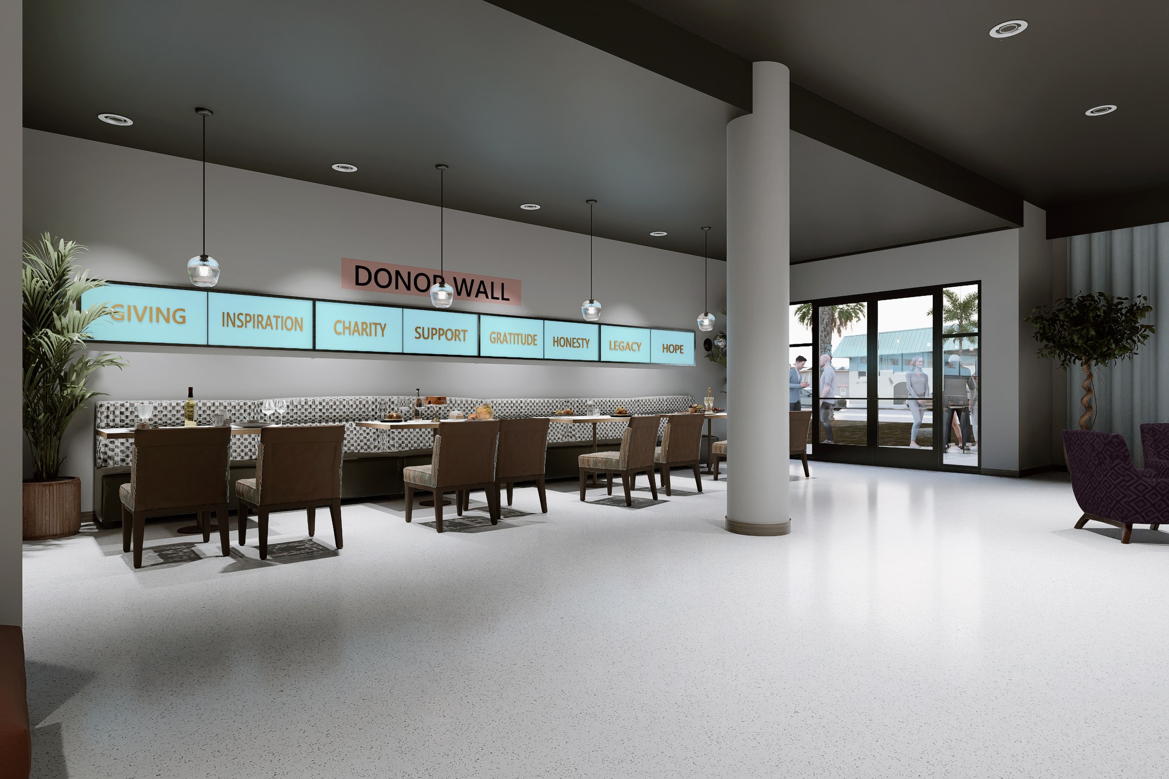
The render has to prove a route, not just a room.
A hospitality interior is judged on how a stranger moves through it on the first visit — where the eye lands from the door, how the seating reads at a glance as public or private, whether the materials still feel considered under the low, uneven light a real venue actually runs. A pretty finish photographs fine and tells you nothing about any of that. What tells you something is whether the render still makes sense as a place you could walk into.
Residential
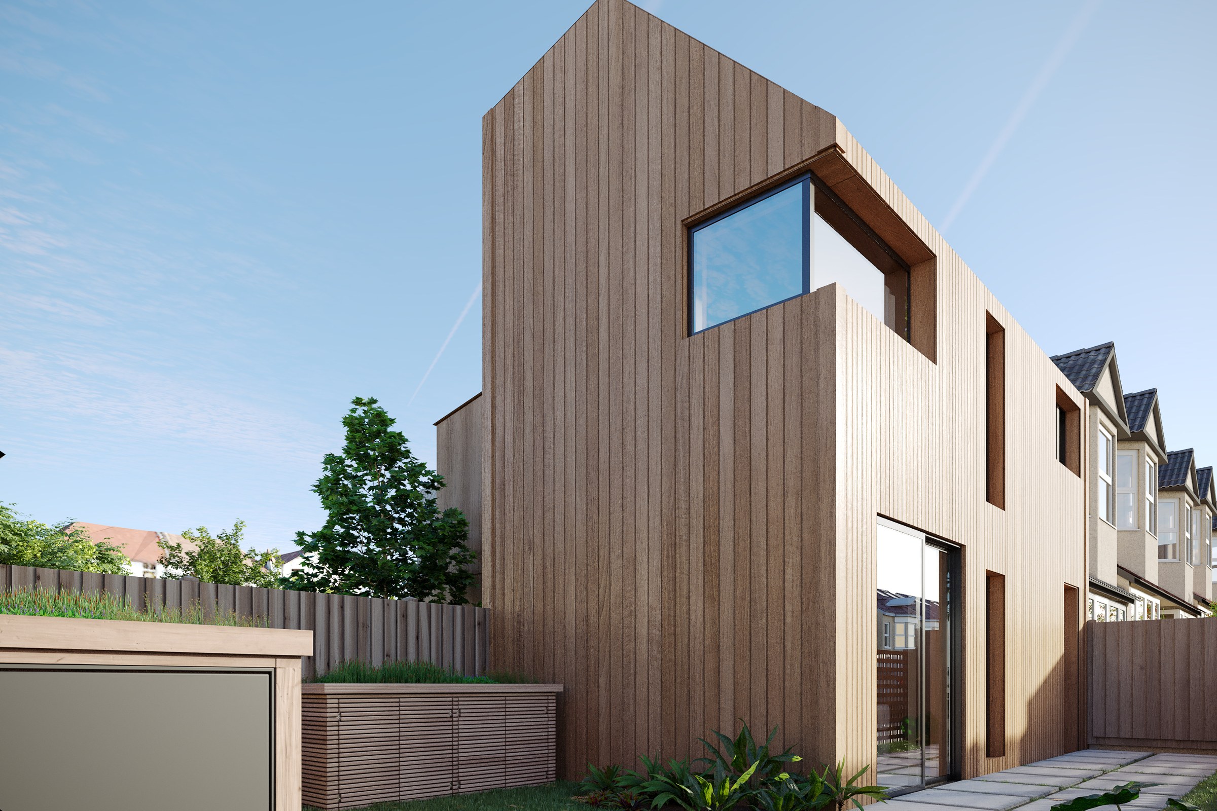
The render has to survive without a single dramatic light.
Most residential work isn’t a hero shot at golden hour — it’s a clean daylight elevation a client scrolls past on a phone. What holds up under that flat, ordinary light is the massing: the roof pitch against the cladding rhythm, the window proportions against the volume they sit in, the quiet decisions a design actually rests on once the mood lighting is taken away.
Healthcare
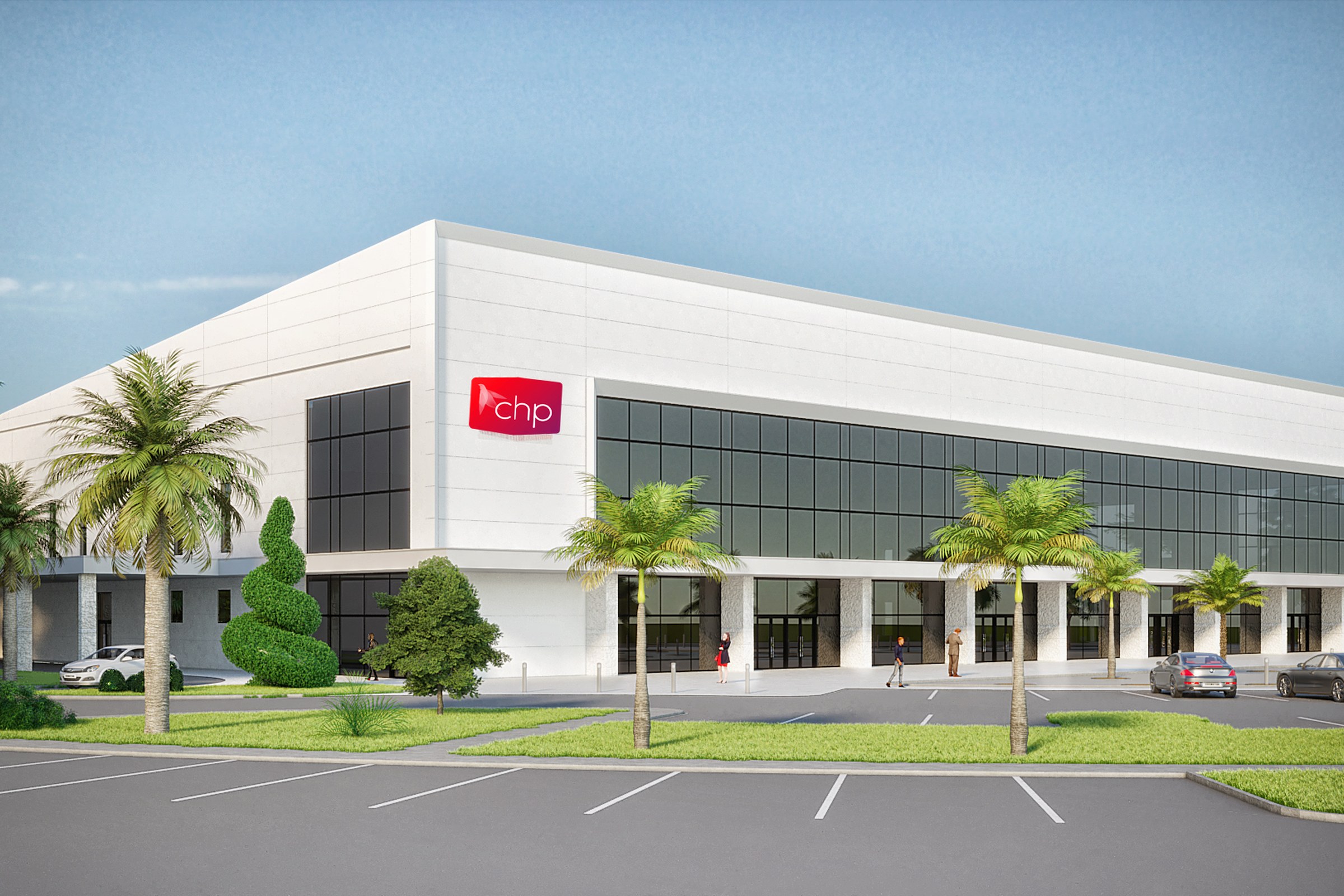
The render has to read as calm before it reads as impressive.
Clinical and medical-tenant buildings carry a different pressure than a showpiece commercial front: the arrival sequence, the signage, the sightlines have to feel legible and unhurried to someone who is probably not having a good day. A render for this typology earns its keep by staying restrained — clear circulation, honest materials, nothing that reads as trying too hard — not by being the loudest image in the set.
Mixed / multi-family
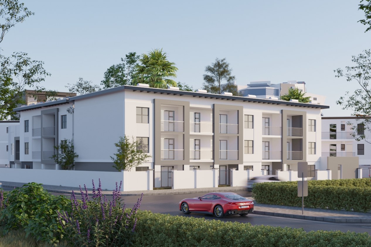
The render has to hold a rhythm, not just a single facade.
Multi-family and mixed-use schemes are read as a repeat — the same bay, balcony or unit run across a full elevation — so a single soft corner or a rhythm that quietly drifts is far more visible than it would be on a one-off building. What a render for this typology has to prove is that the pattern holds cleanly from one end of the block to the other, at the scale a planning board or a leasing office will actually view it.
The match is the whole ask
A portfolio link is proof we’ve done work. It isn’t proof we understand yours. The only thing that actually answers that question is the studio doing the matching — typology in, one relevant image out — instead of leaving it to you.
Which is the honest reason this page ends with four words instead of a gallery: the smallest possible ask is also the only one that proves we were listening to what you build, not just showing you what we’ve built.
A portfolio proves a studio has worked. One relevant render proves it was listening.


