
The materials pass: catching the clash before you see it
A marble sample, a fabric swatch, a metal finish card — each one is correct alone. Whether they agree in the room is a different question, and it only gets asked if someone asks it on purpose.
Here is an odd fact about how an interior actually gets specified: almost nothing in the room is chosen next to anything else. A stone is picked from a sample the size of a hand, a metal from a finish card, a timber from a plank on a shelf — each decision made in isolation, each one defensible on its own. The first time those materials are ever actually together, at scale, under one light, from the angle a person will really stand at, is inside the render. Which means a render is not just a picture of a decision — it is the first honest test of a set of decisions that were never tested against each other before. That is what a dedicated materials pass is for, and why it runs before anything reaches a client, not after.
What the pass is actually looking for
Not whether any one material is right. Whether it still agrees with its neighbours once they share a room.
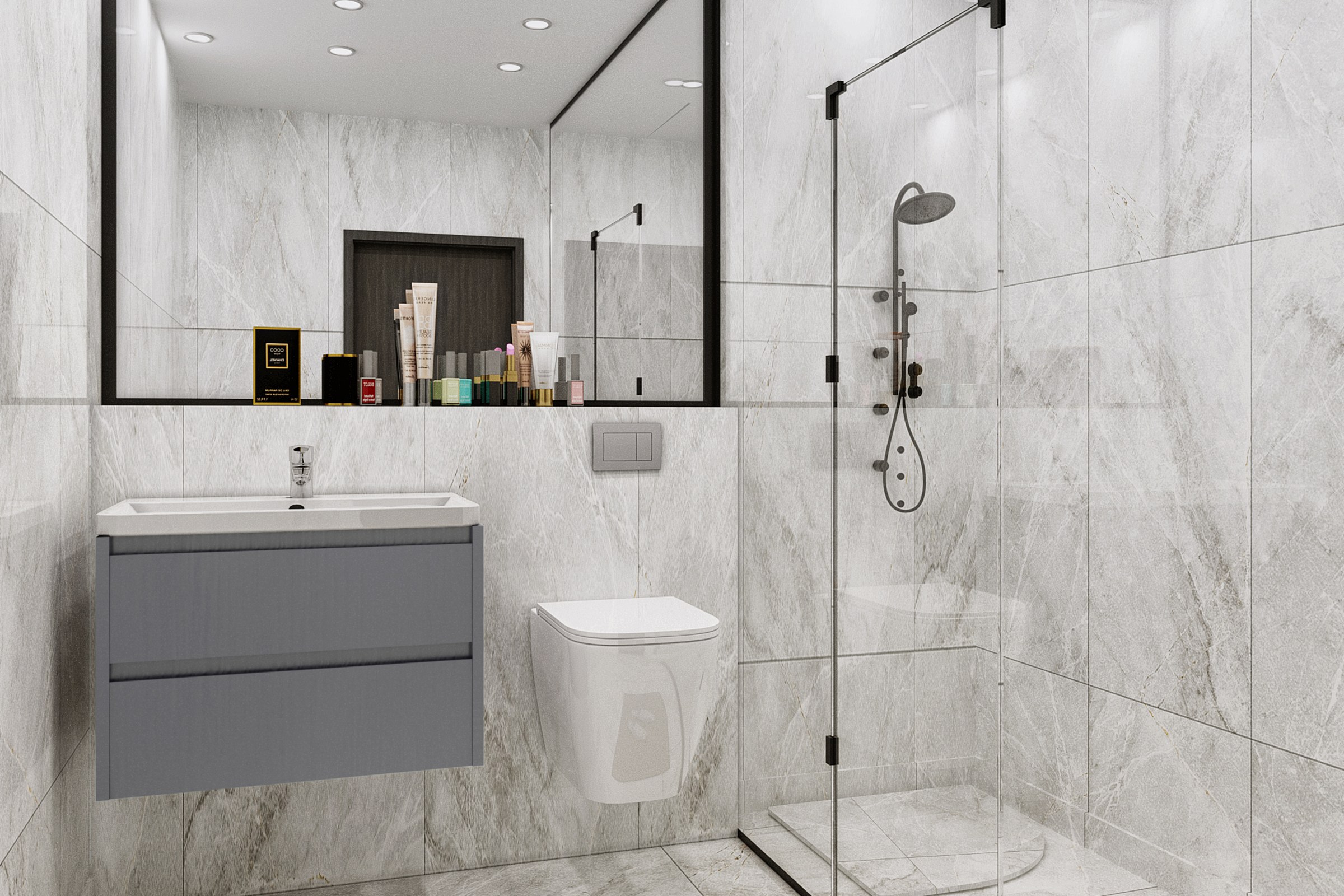
Stone that keeps its promise
Veining and tone have to agree from the vanity to the shower wall.
A slab is chosen from a sample the size of a hand. In the room it has to run continuously across a mirror wall, a vanity run and a shower enclosure without the veining jumping scale or the white going warm in one panel and cool in the next. That continuity is invisible when it holds — nobody compliments consistent stone — and glaring the one time it doesn’t. The pass exists to look for the seam before anyone else does.
Metals that belong to one family
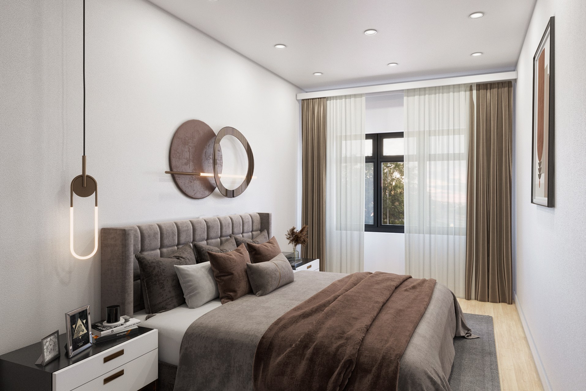
Fixture finish, hardware and light fittings are a set, even when they’re from different suppliers.
A pendant, a set of drawer pulls and a tap are almost never specified by the same person on the same day, and each looks correct alone on its own finish card. Put a warm brass alongside a cooler antique bronze in the same sightline and the room reads as unresolved even if no one in it could say why. The check is simple to state and easy to miss under deadline: every metal visible in one frame has to read as a deliberate family, not a coincidence of separate decisions.
A palette that survives more than one wall
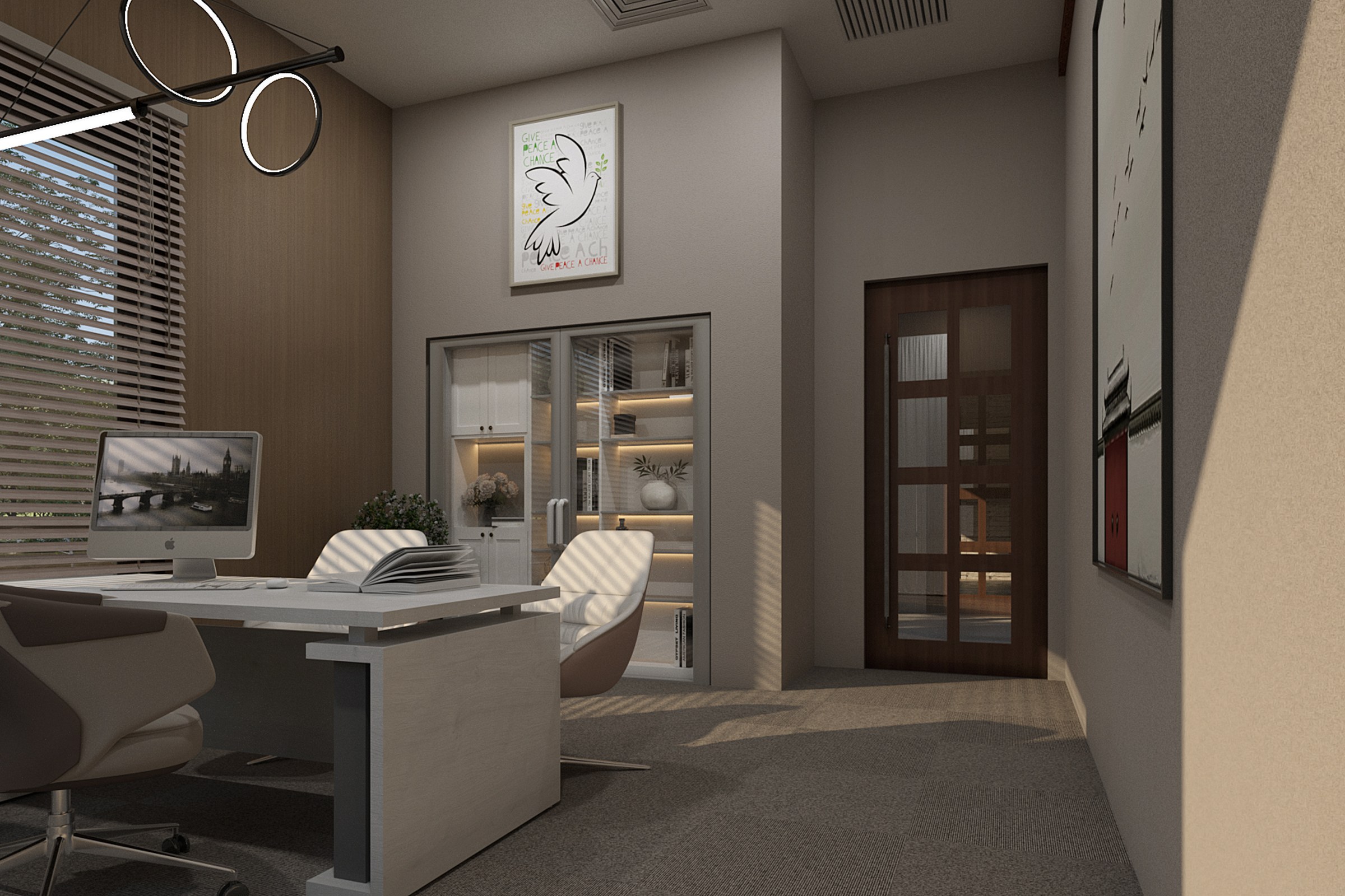
Timber tone, wall colour and joinery have to hold together turning a corner.
A material palette is usually approved as a board: swatches side by side, flattering, static. A room is not a board — it is walls at right angles under one light source, and a warm oak that reads beautifully next to a cream sample can go orange against a cooler grey the moment they share a corner. The pass walks the corner on purpose, because a palette that only works flat on a board is not yet a palette that works in the room.
The room, not the object
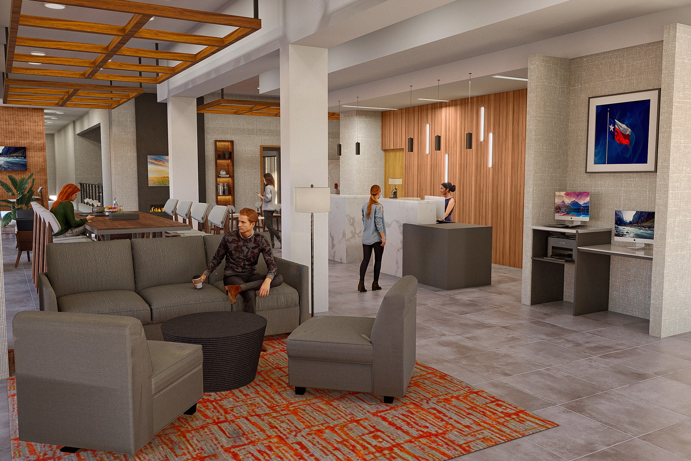
Step back to where a client actually stands, not where the model looks its best.
Every object in a room can be individually correct — the right stone, the right metal, the right timber — and still add up to a space that feels slightly off, because no single view was ever taken from where a person actually stands and takes in the whole room at once. The last check is the least technical one: stop looking at materials and look at the room, from the doorway, the way a client will the first time they see it.
Four questions, asked on purpose
None of them are about whether a material looks good by itself. All of them are about whether it still looks right next to what it now has to share a room with.
- Stone Does the vein or tone hold across every panel it touches?
- Metal Do the fixtures in one sightline read as one family?
- Palette Does it still work turning the corner, not just flat on a board?
- The room Seen whole, from the doorway — not just object by object?
A finish sample never lies. It just never tells you what happens next to another one.


