
The comment that got misread
Almost every review note that comes back "wrong" was never mis-heard. It was ambiguous, and somebody without your context answered its cheapest reading instead of the one you meant.
Every one of the four sentences on this page is completely ordinary. That is exactly the problem.
A review comment is written fast, usually from memory, often mid-meeting — "make it pop," "move it left," "it's too dark." Sentences like that carry a feeling with total clarity and a target with none at all. The person who wrote it knows precisely what they mean, because the missing half is sitting in their head, next to the render. Nobody downstream has access to that half. So a vendor without design-intent context does the only thing they reasonably can: they pick the reading that is fastest to try, ship it back, and wait to find out whether they guessed right.
The comment wasn't wrong. The guess was — and a guess is what fills a gap nobody named.
Below are four of the comment-types that go wrong this way most often, each shown against a real render that genuinely displays the ambiguity in question. For each: what was said, what a context-free reading hears, what was almost certainly meant, and the one question that would have closed the gap before anyone touched a file.
The same four words go wrong the same way, every time
Read the strip under each plate left to right — what landed, what a fast guess hears in it, and what the sentence almost certainly meant.
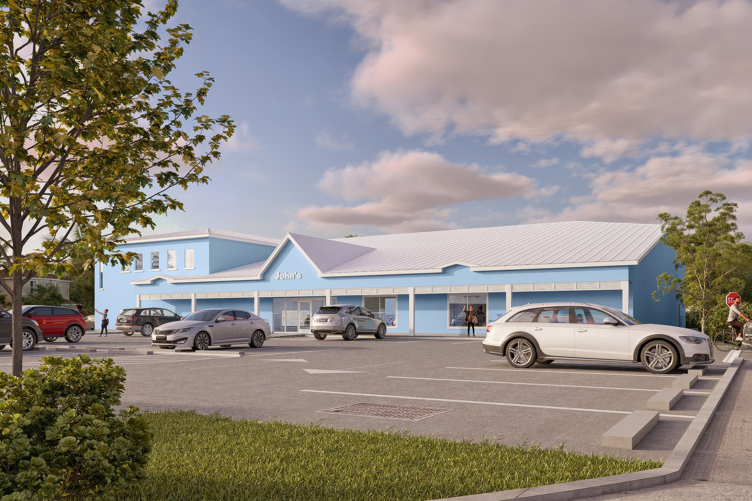
“Can you make it pop a bit more?”
Turn up saturation and contrast in post. Punch the sky, punch the walls, ship a louder version of the same frame.
Usually one of three completely different things: more tonal separation between the building and its background, a livelier hour of light, or a tighter crop that puts less empty foreground between the viewer and the entrance.
“Pop compared to what — the building against the sky, the light, or how much of the frame it fills?”
“Pop” has no target
It is the single most common word in a revision thread and it names a feeling, not an axis. A vendor without context reaches for the one lever that always visibly does something — saturation — because it is safe to guess and cheap to try. Half the time that guess is wrong, and the round gets spent proving it, on a note that was never really about colour at all.
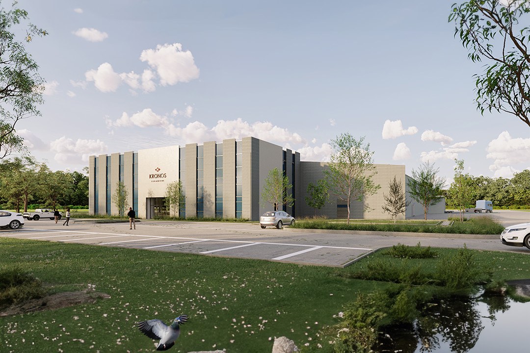
“Move it left a bit.”
Shift the building — or the camera — left in the frame. Nudge the composition and re-render.
One of at least three different lefts: left on the screen, left as drawn on the site plan, or "give the entrance more room to breathe in the frame" — which is a crop request wearing a direction.
“Left on your plan, or left on the screen you're looking at?”
Left is not a coordinate everyone shares
A plan reads north-up; a render reads camera-forward. The two "lefts" agree by chance about as often as they disagree, and a vendor who guesses wrong doesn't produce a bad render — they produce a correct answer to a question nobody asked, which reads exactly like being ignored.
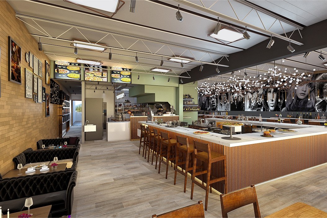
“It's too dark.”
Raise overall exposure. Brighten the whole frame until the shadows lift.
Almost never the whole frame — usually one under-lit zone the eye keeps landing on, or a request for a different hour and mood entirely, not a technical fix to the one that was rendered.
“Too dark everywhere, or too dark in one spot your eye keeps going back to?”
A mood and an exposure fault look identical in a screenshot
This room is meant to feel low-lit and clubby — that is the brief, not a mistake. "Too dark" can mean the mood is wrong for the room, or it can mean one booth genuinely reads as a black hole nobody would sit in. Brightening the whole image fixes the second problem by quietly deleting the first.

“It doesn't sit right.”
Something about the massing or the roofline is wrong. Reopen the model.
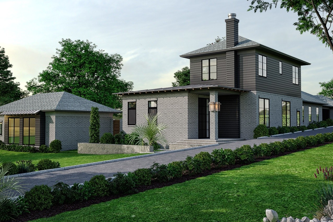
Frequently a context complaint, not a design one — the grading around the house, the density or age of the planting, or how hard the building reads against its neighbours, none of which touch the building itself.
“Is it the house, or what's around the house?”
A building can be right and still not sit right
The home in this frame has not changed since the site plan was approved — the ground it sits on has. Immature planting, a driveway that reads too new, a lot that looks too cleared: all of it lands as "the design feels off," and none of it is a reason to touch a single wall.
Three questions that catch almost every ambiguous note
None of them take longer to ask than the comment itself took to write.
- 01
The axis
Which one thing is this actually about — colour, light, geometry, or framing?
Most vague notes are precise about a feeling and silent about the lever. Naming the axis out loud turns a mood into a task.
- 02
The reference
Left/right, bigger/smaller, closer/further — compared to what, and from where?
Plan-left and screen-left are both correct answers to different questions. So are "closer to the camera" and "closer to the site line."
- 03
The scope
Everywhere in the frame, or one spot your eye keeps returning to?
A global fix for a local problem erases everything around the one thing that was actually wrong.
A vendor who guesses wrong doesn't produce a bad render. They produce a correct answer to a question nobody asked — and that reads exactly like being ignored.


