
Sized for the Job on Your Desk
A portfolio naturally leads with its biggest render. That's rarely the useful one to judge us by.
Every studio's portfolio front page runs on the same instinct: lead with the tower, the resort, the estate on eleven acres. It's the correct instinct for marketing — big renders photograph well and travel further. It is also the wrong sample to look at if the job on your desk is a single-storey addition or a three-unit infill building, because none of what made that hero image impressive is the thing you actually need proof of.
What you need proof of is smaller and harder to see in a hero shot: does the studio treat an ordinary brief with the same discipline it brings to the flagship one, or does the care visibly thin out once the fee does.
The scale of the building isn't the scale of the attention
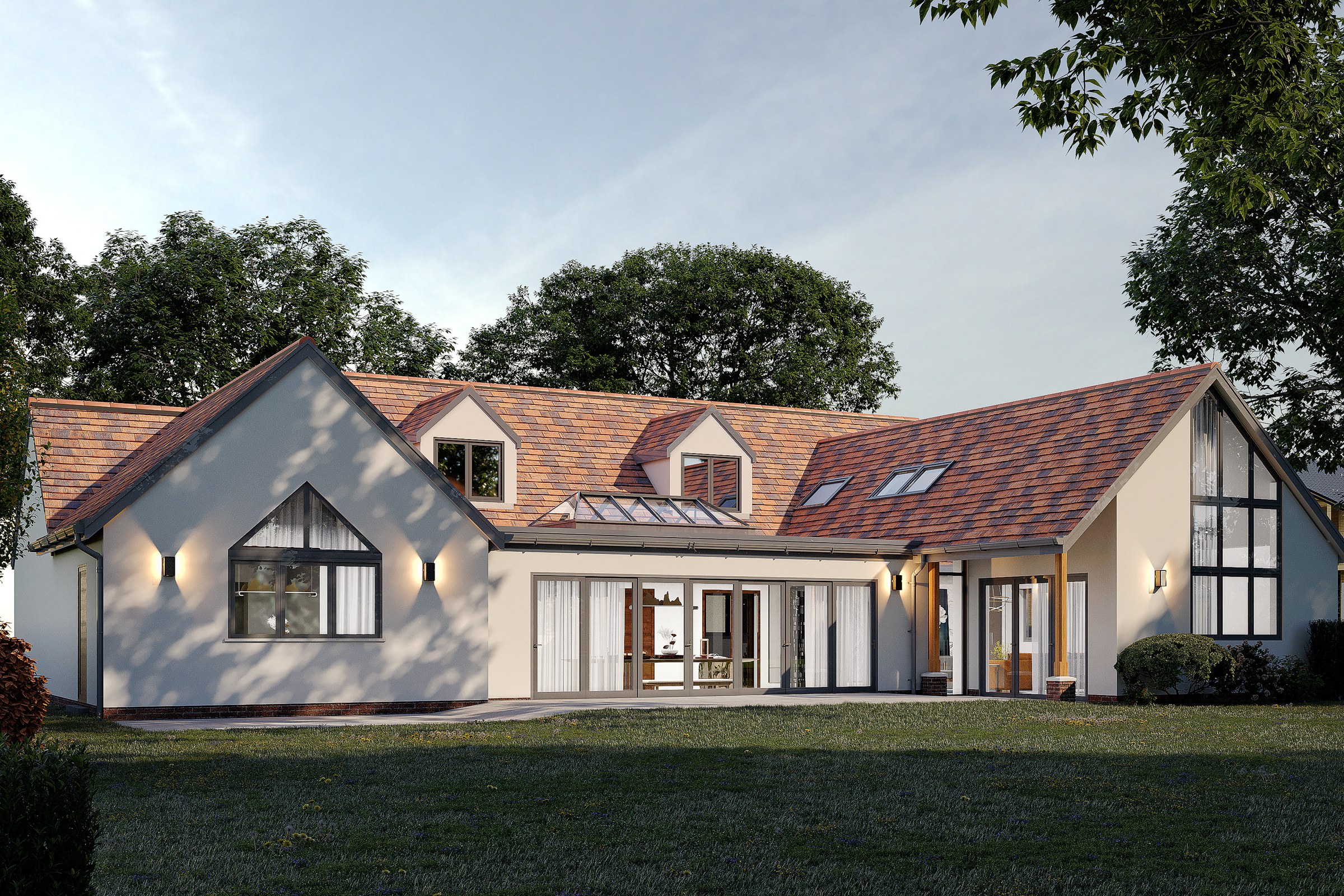
Here is a rear-garden view of a single-storey house with a glazed garden-room addition — the kind of extension brief a small residential practice runs every month, not once a career. Nothing about it is dramatized: no invented client, no manufactured backstory. It's an ordinary render of an ordinary addition, at dusk, with the interior lit so the new glazing reads against the old roofline.
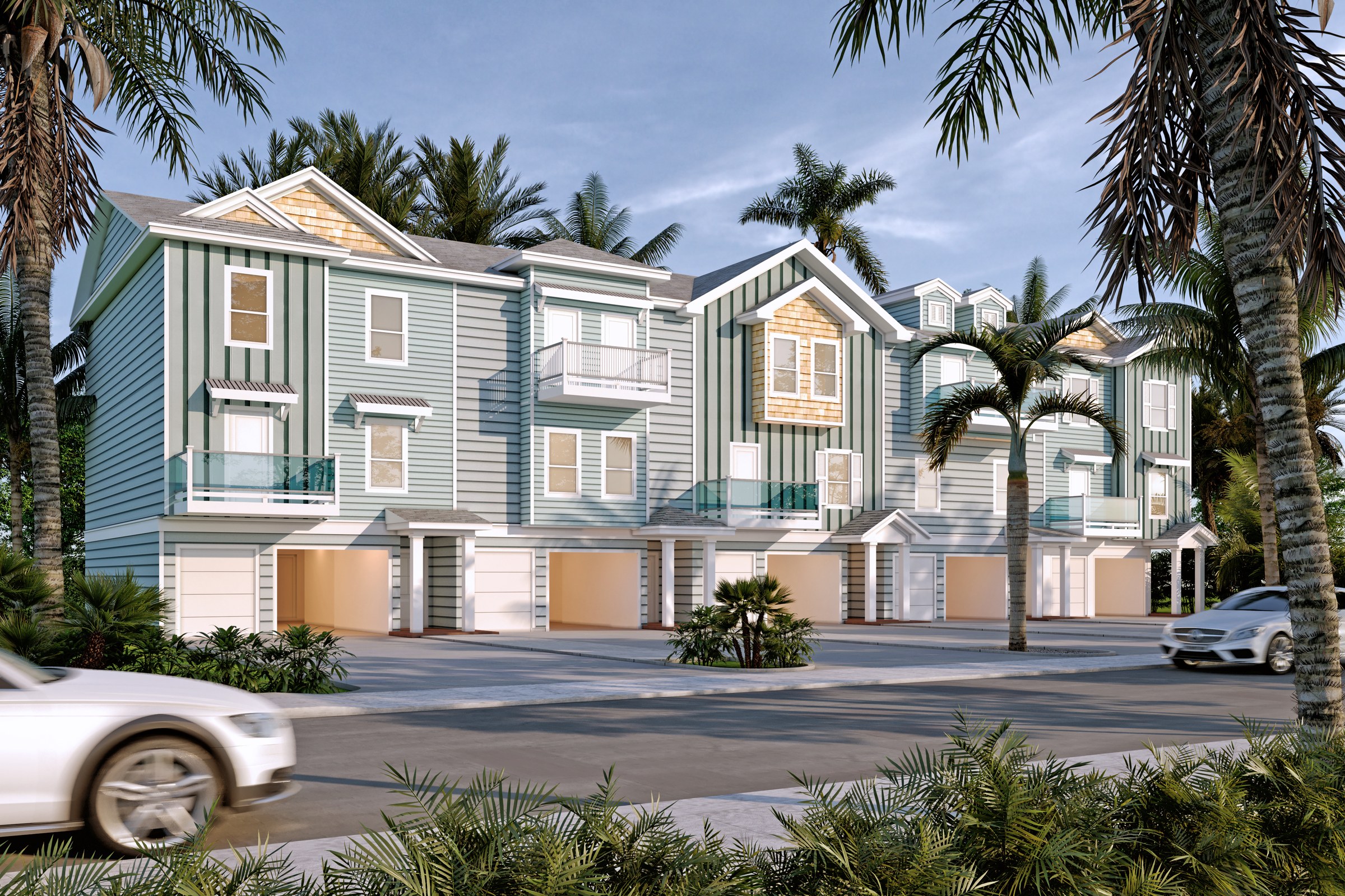
Same for this one: a row of three-storey coastal townhouses over ground-floor garages, nothing taller than the palm trees around it. It's not a landmark commission, and it wasn't rendered like one had to apologize for that. The board-and-batten siding, the shingled gables, the glass balcony rails each read as their own material rather than one shared "house finish" texture stretched across every unit. The facade reads correctly in flat daylight, which is the harder lighting condition to fake, not the dusk glamour shot the hero-image instinct usually reaches for.
The tell isn't whether a studio can make a landmark look good. It's whether an ordinary building still gets looked at twice.
What to actually look for in a scale-matched sample
Neither of these two images is trying to sell you on drama. Looked at side by side against a hero shot, though, three things hold steady across both scales — and they're the three worth checking before you hire, not after.
- The materials are still specific. Clay tile reads as clay tile, render reads as render, the balcony railing has a real section — not a generic placeholder finish standing in because the job was small.
- The context is still handled, not cropped out. Both buildings sit inside a real garden, a real street, existing planting and neighbouring rooflines — not floated on a blank plate because a modest job "doesn't need" a site.
- The lighting logic wasn't simplified. A dusk interior glow and a flat-daylight facade are two different lighting problems, and both are solved properly here rather than defaulted to whichever preset is fastest.
A portfolio's biggest render tells you what a studio is capable of once. A studio's ordinary work tells you what it actually does every time — which is the sample worth asking for if the project on your desk looks more like these two than the one on the homepage.


