Modern Convenience Store — Case Study
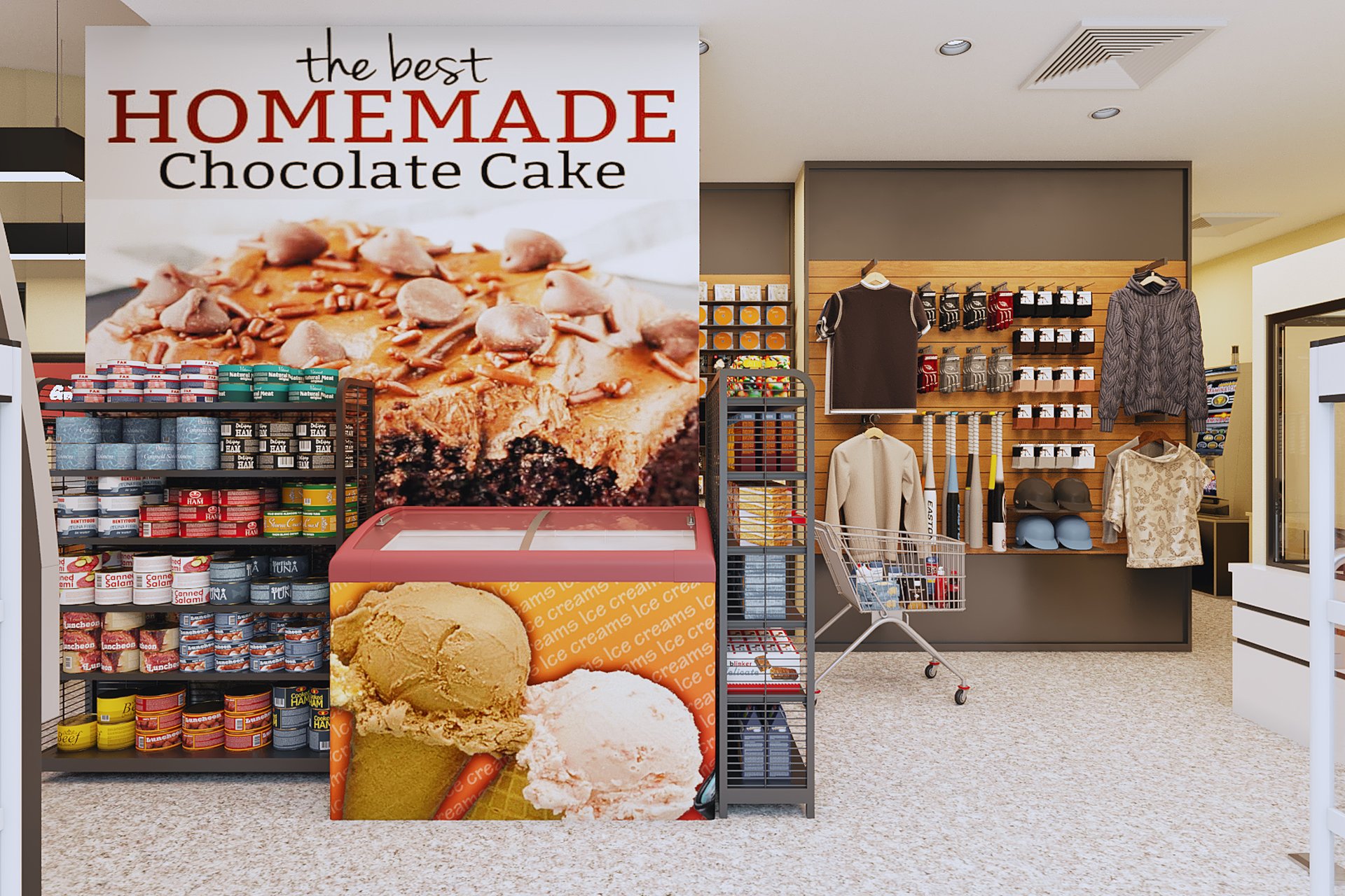
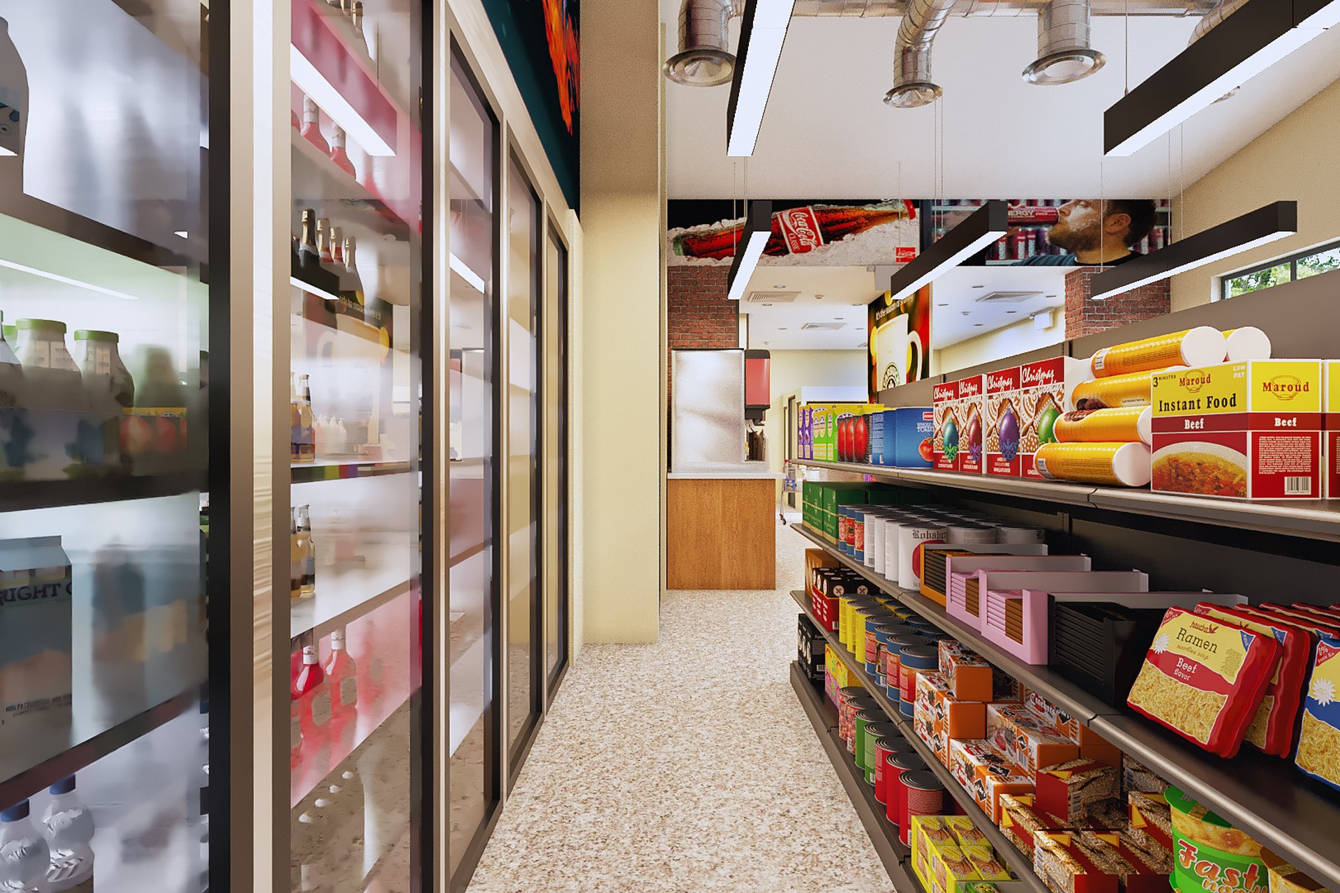
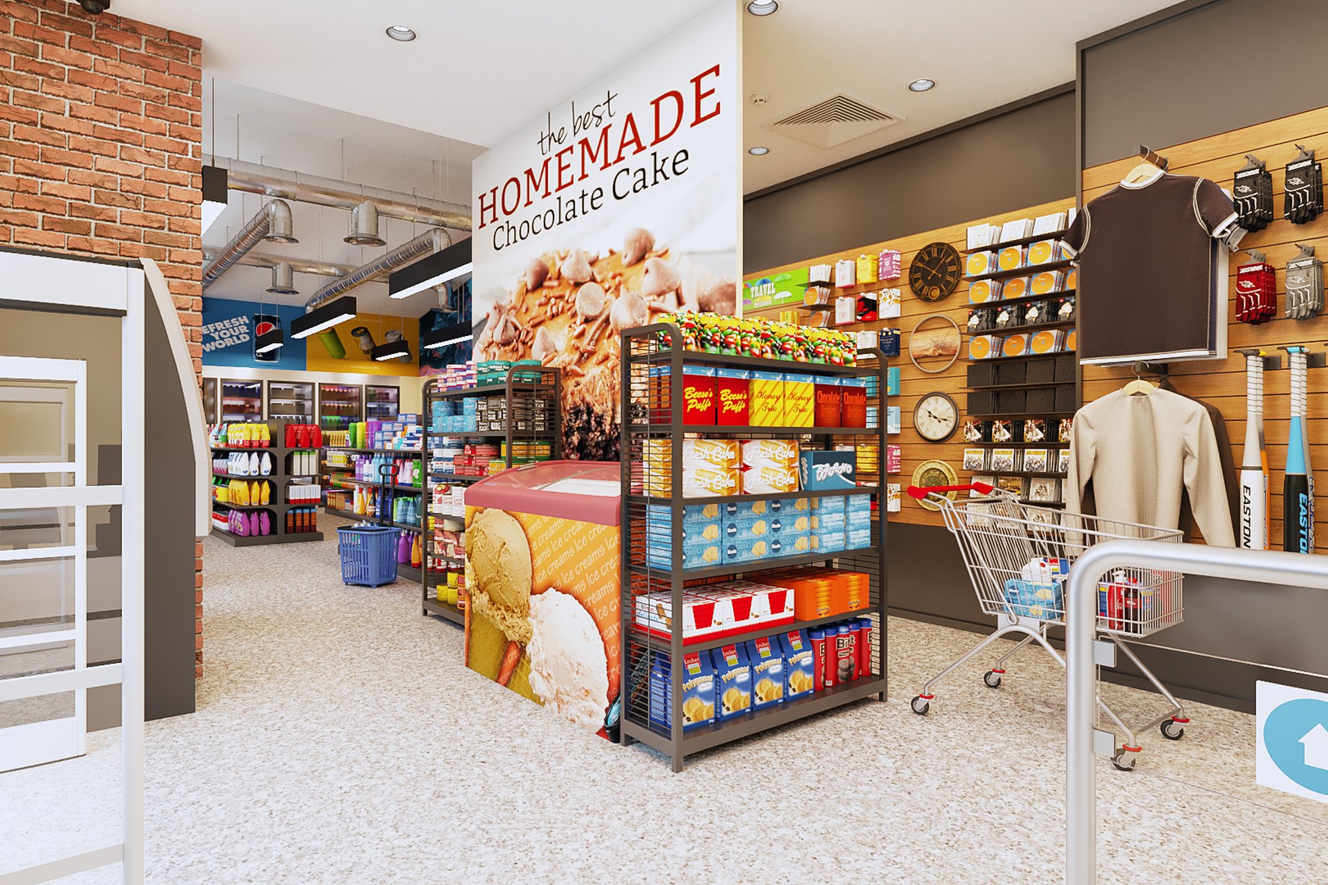
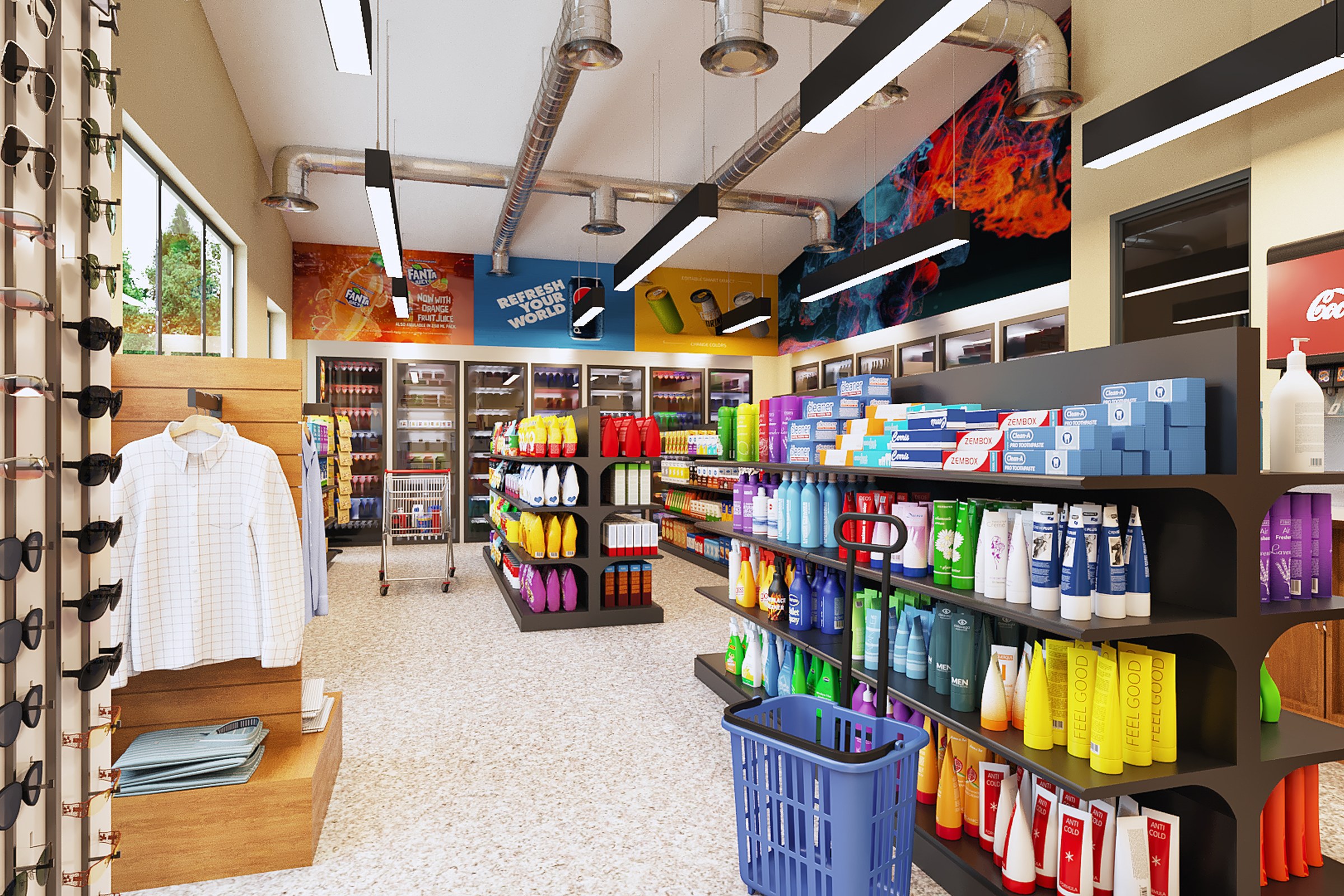
Same convenience store from another angle. Shows sunglasses display rack, clothing on hangers, beverage coolers with Fanta/Coca-Cola branding, health and beauty products on dark metal shelving, expose
Client
Atkins Architects
Industry
Retail & Showroom Design
Objective
Design visualization and marketing collateral for a retail & showroom design project in San Francisco, CA
Deliverables
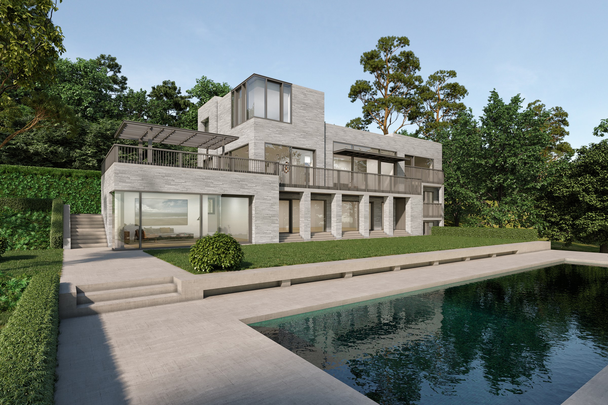
4 photorealistic interior renders across wide-angle from entrance, aisle perspective from right side, three-quarter angle from right, frontal wide-angle viewpoints
Project Overview
This is one of those projects where the visualization had to work as hard as the design itself. Modern Convenience Store came to us when the Atkins Architects needed images that could move a retail & showroom design project through approvals, into marketing, and onto investors’ desks — all at once.
The Challenge
The challenges here were layered. Some were technical, some were practical, and some came down to managing expectations across multiple stakeholders who each wanted the renders to do something slightly different.
The design had details that only become visible at close range — joinery, hardware, texture variation. These details are exactly what separates a good render from a great one, and the Atkins Architects knew it.
Environmental context was critical. This project doesn’t exist on a white background — it sits in a real place with real neighbours, real vegetation, real light. Getting that wrong would make even perfect architecture look like a toy model.
Scale was deceptive in this project. Spaces that look modest in plan felt expansive in three dimensions, and communicating that spatial quality through a flat image required very deliberate camera work.
Our Approach
Final delivery was staged. Hero images shipped first for immediate marketing use. The complete gallery followed shortly after, formatted for web, print, and presentation deck use.
The 3D model was built methodically from architectural plans, elevations, and sections. We cross-referenced everything to catch discrepancies that could show up as visual errors in the final renders.
We started with an extended briefing — not just the drawings, but the thinking behind them. Understanding why the architect made certain material choices or oriented spaces in a particular way informed every creative decision downstream.
Material development was a dedicated phase, not an afterthought. We sourced or created every texture to match the specification documents, testing each one under the project’s target lighting conditions before locking it in.
Camera positions were proposed based on what the architecture does best — the moments where form, material, and light come together most compellingly. We presented grey-shaded compositions for approval before adding materials and entourage.
The Result
What started as a visualization brief became the foundation of the project’s brand identity. The renders are the first thing anyone sees when they encounter Modern Convenience Store — and they’re designed to make that first impression count.
Got a project that needs this kind of visual clarity? Get in touch or see more examples.
Project Gallery