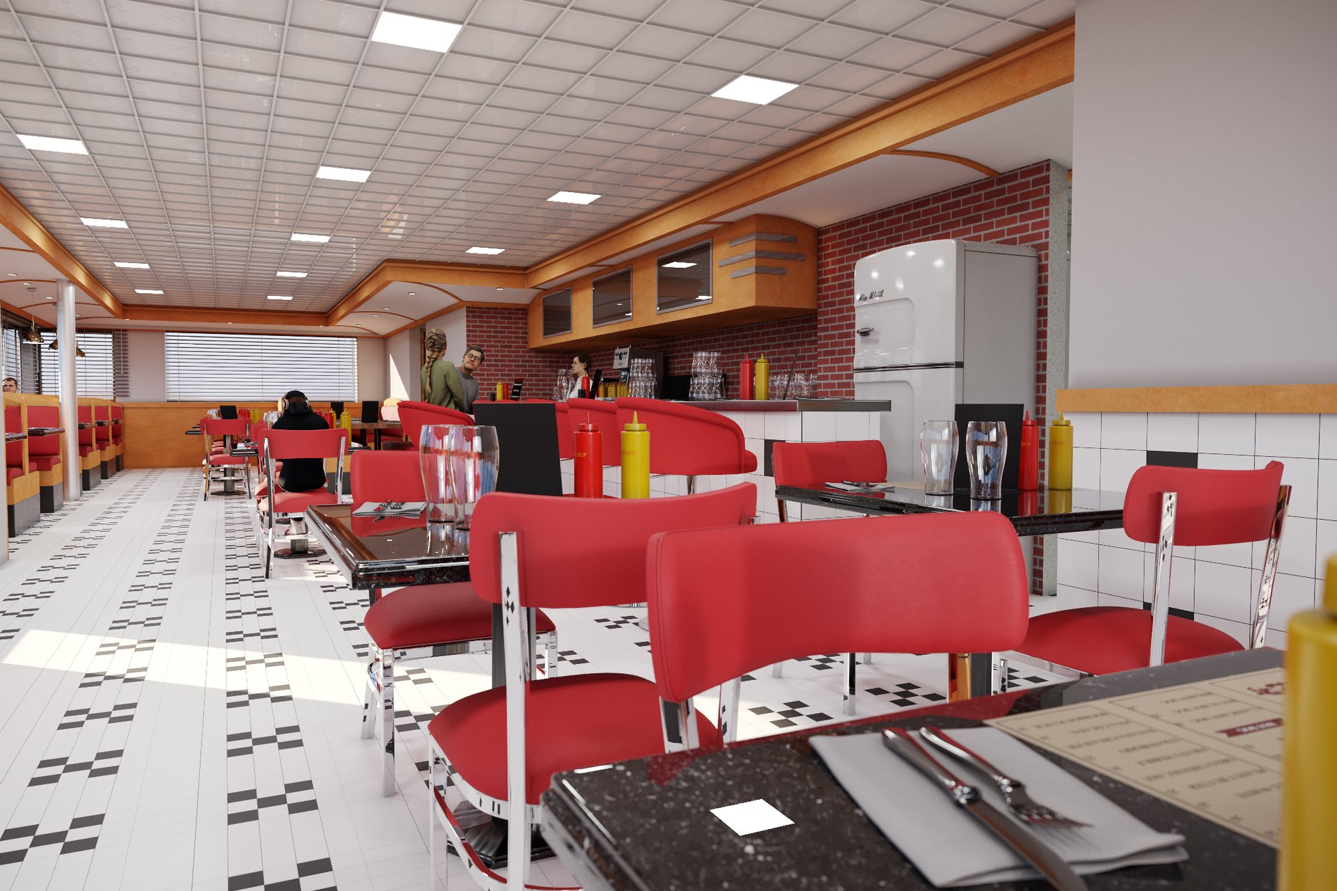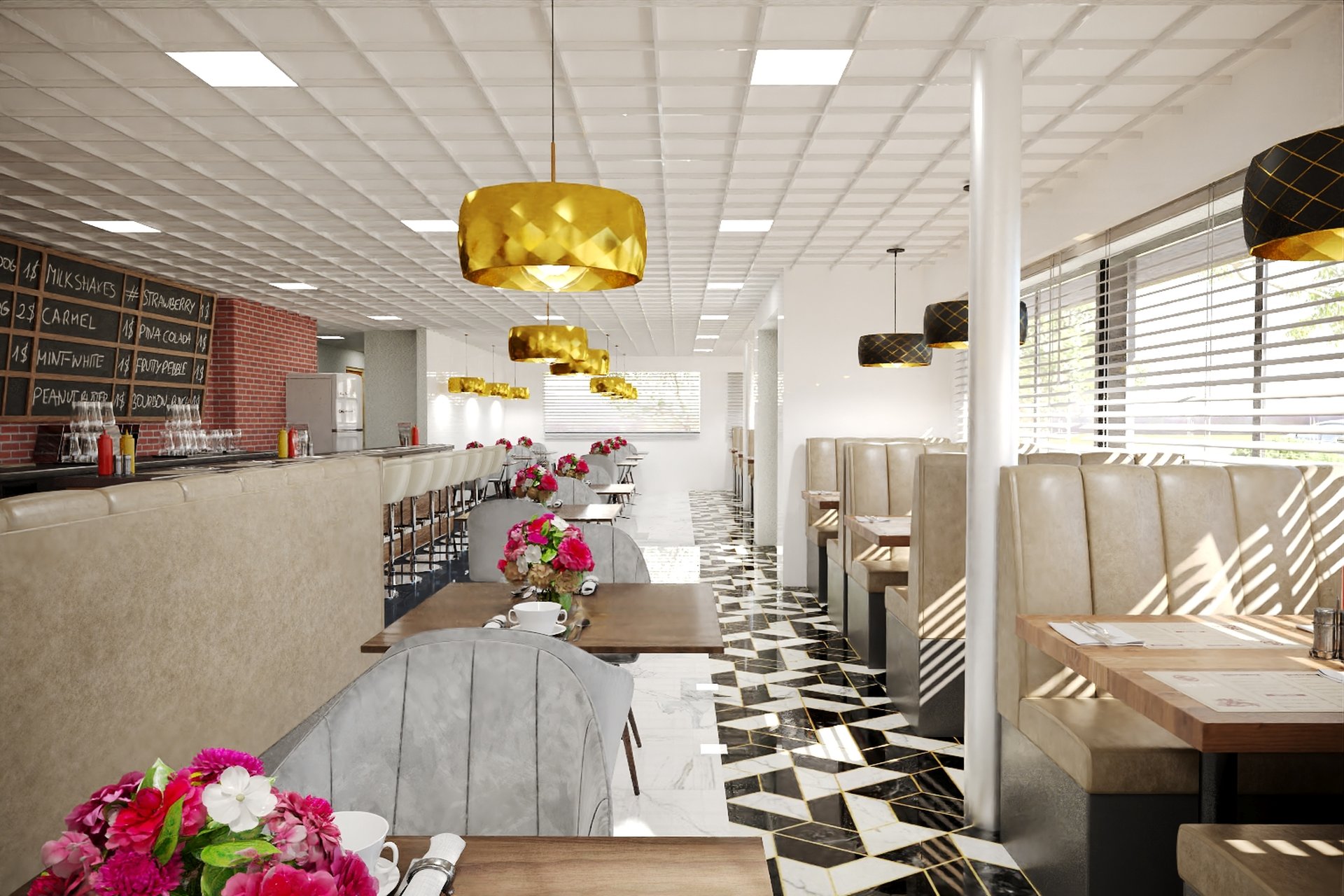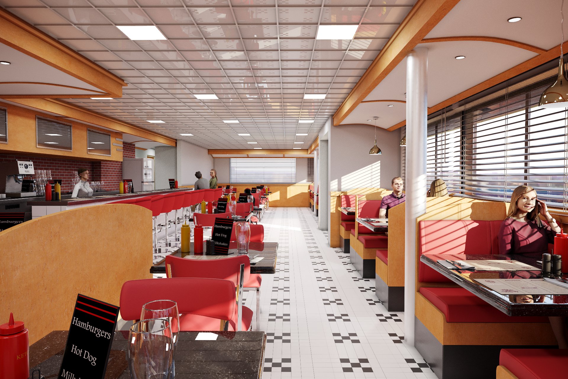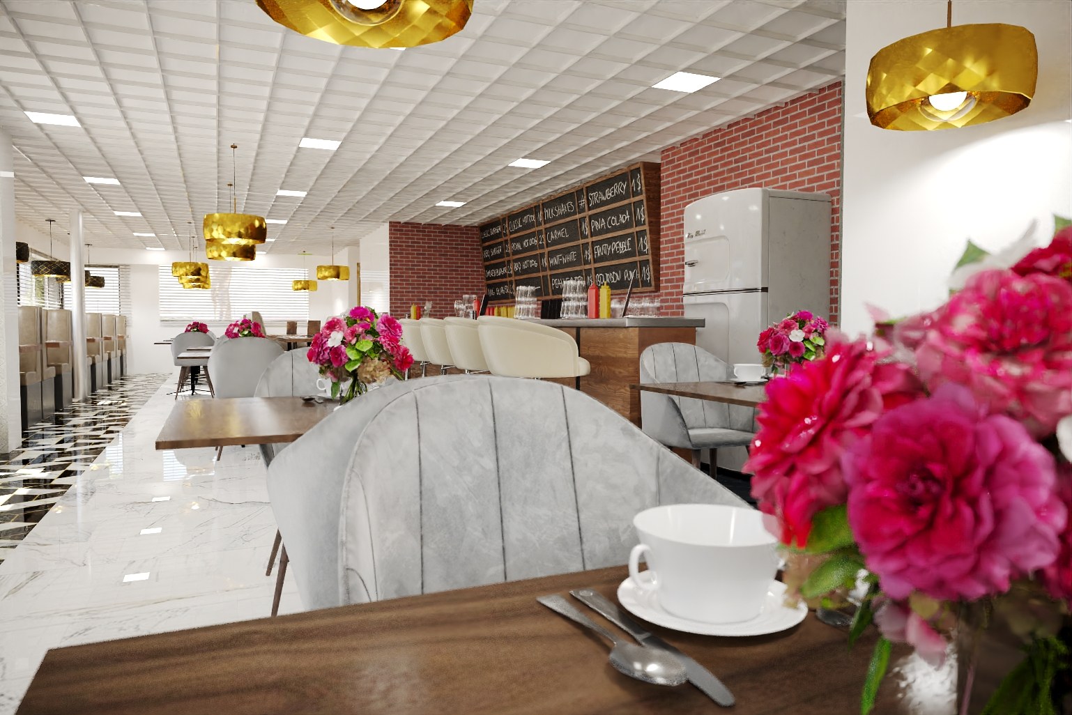
Retro Diner — Case Study
Upscale diner/restaurant interior with chalkboard menu on brick wall, gold pendant lights, grey velvet chairs, marble-patterned floor, pink flowers on tables. Menu lists milkshake flavors. Same projec
Client
Gehry Architects
Industry
Hospitality Interior Design
Objective
Design visualization and marketing collateral for a hospitality interior design project in Aspen, CO
Deliverables
4 photorealistic interior renders across eye-level viewpoints
Project Overview
Retro Diner is a hospitality interior design project where the stakes were tangible. The Gehry Architects had a design they believed in, a timeline that wasn’t flexible, and an audience that needed to see what this would actually look like before committing.
The Challenge
Several factors made this project demanding. None of them were insurmountable, but together they required careful planning and constant communication.
The material palette was specific and unforgiving. Certain finishes — the way light catches a particular stone, how a timber grain reads at different scales — had to be precise or the entire image would feel off to anyone who knows the real thing.
The design had details that only become visible at close range — joinery, hardware, texture variation. These details are exactly what separates a good render from a great one, and the Gehry Architects knew it.
Multiple audiences meant multiple priorities. The investor deck needed aspiration. The planning submission needed accuracy. The marketing brochure needed lifestyle. One set of images, three different jobs.
Our Approach
Camera positions were proposed based on what the architecture does best — the moments where form, material, and light come together most compellingly. We presented grey-shaded compositions for approval before adding materials and entourage.
We delivered work-in-progress renders at two structured milestones. The first review caught composition and material issues. The second refined atmosphere and detail. By the time we hit final production, there were no surprises.
The 3D model was built methodically from architectural plans, elevations, and sections. We cross-referenced everything to catch discrepancies that could show up as visual errors in the final renders.
We started with an extended briefing — not just the drawings, but the thinking behind them. Understanding why the architect made certain material choices or oriented spaces in a particular way informed every creative decision downstream.
Post-production was intentional and restrained — subtle atmospheric haze, corrected colour temperature, refined contrast. The goal was always to enhance realism, not to fabricate it.
The Result
The delivered visualization package has become the primary visual identity for Retro Diner. It’s used across the project website, investor materials, printed brochures, and social media — a single visual language that holds together across every format.
Working on something similar? Let’s talk about your project — or browse more of our work.
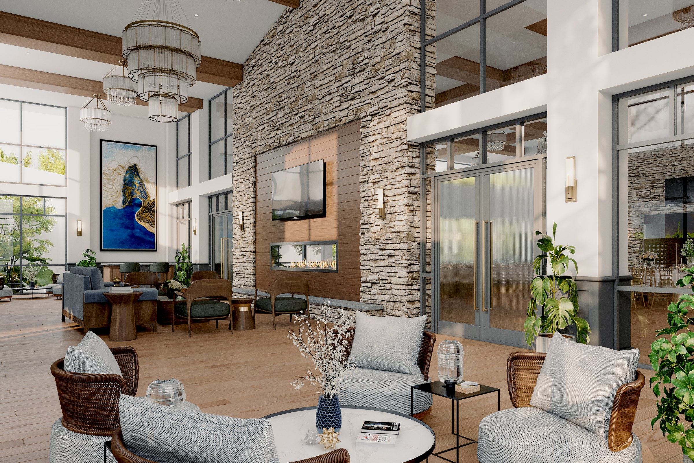
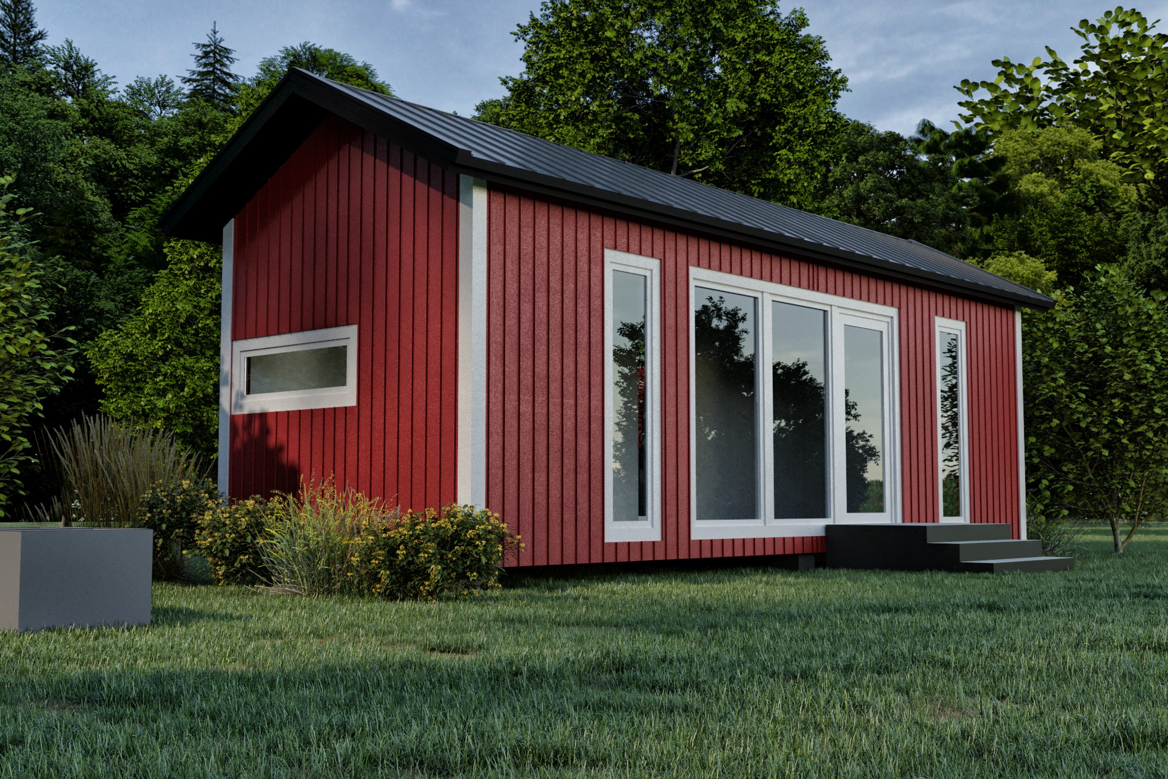
Project Gallery